


CDixonDesign
-
Posts
3,871 -
Joined
-
Last visited
Posts posted by CDixonDesign
-
-
Adding blue is fine, IMO, but those new logos are awful. They should have just introduced the blue as a highlight color and took the opportunity to fix their oddly italic wordmark at the same time.

-
 6
6
-
-
According to Reddit, this is the speculated Charlotte FC away kit:
-
4
-
-
Mayhem is Wide Latin. The Numeral font looks like a standard Russel Athletic style font.
-
If Bowling Green had combined the car logo with the roundel, and gave it a bit of a tweak, it would be infinitely better than the basic "BG".
-
Someone can confirm, but I was always under the impression all of the NHL stuff was just a modified version of Myriad.
-
Rumors swirling that the name for the Savannah Coastal Plain league team will be announced this week.
-
And the unnecessary double stroke, a 90s staple!
Triple stroke, actually on the numbers.
Apparently you can triple stroke a double stroke.
-
Any guesses for VOTE TCU/Purple Reign?
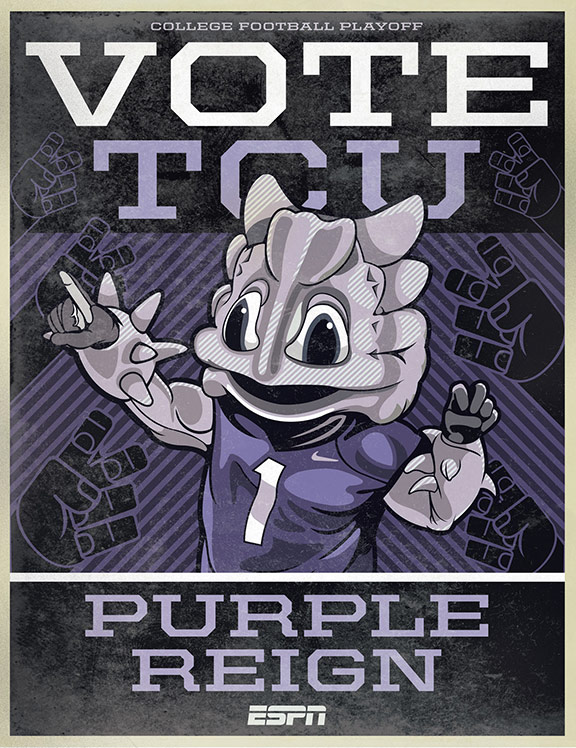
I know I have seen similar fonts but just cannot place it in my mind.
Thank you!
United Extended Bold:
http://www.houseind.com/fonts/unitedcollection/viewfonts
I need your help to figure out the fonts used in the logo for Premier Martial Arts.

Premiere is simply Times Bold that's been modified. Martial Arts is Eras Bold.
-
I know this was the number font of the Minnesota Timberwolves from the late 90's to the mid-2000's, but which font is similar to this one?:

Looks pretty unique to me. Any ideas?
There is a similar font called "Walshes" available here: http://www.1001fonts.com/walshes-font.html
There's also a font that someone has created that is also very similar to Walshes: http://famousfonts.org/download-font/timberwolves-font/%C2'>
-
Any ideas?

Closest I could come up with was Tempo Heavy Condensed Italic with some custom serifs:
http://www.myfonts.com/fonts/linotype/tempo/heavy-condensed-italic/
At that point, you may be better off recreating something using Futura Condensed Italic.
-

This is possibly the funniest logo I've ever seen.
Agreed. The "glass eyes" put it over the top.

-
I am working on finding a new font for our high school's athletic department.
The nickname is Cougars.
I want to use a font that has seraphs/details that looks like claws/teeth.
There are several fonts I have found that fit the bill but don't want to risk any legal problems.
Here are a few that I find attractive:

 -type in MONARCHS
Any suggestions on fonts that have similar looks that would be open source? Thank you!
Monarchs is a style that is simply called "Falcons" available here: http://www.dafont.com/falcons-font.font
I believe one of the members here made the Michigan State font into a true type form, someone may chime in with that info.
-
This is a font used by Dinamo Zagreb, a soccer club from Croatia.
They used to have it for download from their web page but they don't anymore.
I asume it's custom because the letter d is the main symbol of the club but if someone knows the name of this font or a simmilar font I would appreciate it.
Thank you in advance.

Looks like simply a modified Futura.
-
Looking to do a couple of t-shirts styled like these for the podcast.
I thought for Raw it was Agency FB and Impact, but neither seem to fit just right.
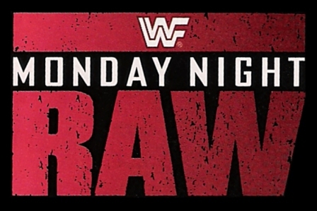
Then for Nitro, I'm at a total loss.
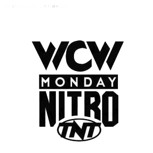
Bumping this up a little. Our store is open and I'd love to have more options.
"RAW" should just be basic Impact, but it may be stretched just a hair. Nitro would have to be recreated, but a standard athletic font such as Atrox should work.
-
Any ideas on this one? What the font gaveme a "penned" font:

I can provide additional letters if needed.
Helvetica Bold.
Good evening,
I was wondering if anyone knows what this font is that's used on the Pirelli P-Zero F1 tyre on this season's F1 cars? Is this a custom font created by Pirelli?


"Centurato" looks like a modified version of Microgramma. The P-Zero font is probably completely custom. Although it is similar to whatever Ok State uses.
-
With opening day right around the corner, any news on the Red Sox WS rings?
-
My vote, of course, is for TD Garden. But man, that Lidstrom banner is just fantastic.
-
Been looking without any luck. I would like to know what the United In Orange/TIme To Ride font is.

-
1
-
-
Anyone know what font the player names are in?

Looks to be a version of Knockout: http://www.typography.com/fonts/knockout/styles/
-
The numerals are also what Colorado uses in many Nike style guides. Not sure the name...
-
Rochester Red Wings (AAA affiliate / Minnesota Twins) will be unveiling a new logo (and merchandise) at a fan event on 11/1/13 at 3:30 PM.

The typography on this graphic doesn't exactly fill me with hope.
Don't read anything into it. Looks like it was simply put together by the marketing receptionist with Publisher.

-
Overall, Charlotte's identity is a huge upgrade, but...
-I'm disappointed they decided to drop the navy/green scheme for Gold.
-They decided to keep the "quirky" t in the Knights script. In the last wordmark, it represented a sword, it doesn't carry over to the new wordmark and just looks silly...
-
That Raven needs work...
Lots. Yeesh.

-
Does anyone know what fonts are used here?

"Vincent" is in the Mortal Kombat 3 font.
It's Renfrew. A style that has gone by many names: http://fontzone.net/font-details/renfrewI've also seen it called Revue, among others.


2022-2023 NHL Jersey Changes
in Sports Logo News
Posted
Honestly, I don't know if these are primary or alternates, or special edition, or reverse whatever, and at this point i'm too afraid to ask.
[Edit]: These are apparently thirds.