


knnhrvy16
-
Posts
2,686 -
Joined
-
Last visited
Posts posted by knnhrvy16
-
-
I don't post about the NFL here, so I'm not sure if this is unpopular, but I think the Broncos were much better off with navy at home as opposed to orange.
I was seriously coming here to post about this. Maybe it's me being a 90's kid and just being used to Denver wearing navy at home, but I don't like 'em in orange. It's not that it looks bad, it's more that I think the navy just looked better (at least when paired with white pants and not monochrome).
-
I share the same thought regarding the facemask, Josh. I mean, if I read "maroon helmet with black facemask" on paper, it'd sound bad. But looking at it in action, I think it actually works really well. The black doesn't stand out in a bad way at all like some make it out to do. It blends well with the helmet.
Anyways, another unpopular opinion I'll add:
Though my favorite Saints set will always be the inagurals, I think these were just as great:

Of course the one change I'd have made would be to match the pant and helmet stripes, but everything else is beautiful. Love the Louisiana logo on the sleeve (it really should be on the current sleeves, I say), love how the white numbers look with that set (provides, in my opinion, a great balance of color), and I prefer the single white outlined fleur-de-lis on the helmet to the current multiple outlined one. Much cleaner. I suppose I could also nominate this for the "Uniforms That Should Be Thrown Back To" thread, as I don't recall these ever being dusted off for a game.
-
apparently im the only one who really loves Minnesota's new look. i wouldnt change a single detail (maybe the brick number pattern) and their typography is beautiful
I'm with you actually. I think this is the best the Gophers have ever looked.
-

Greatest Hawks uniform of all time. I don't understand why anyone would want to bring back the McDonalds color scheme or the outdated Dominique era jerseys (Face it the tilted numbers/team name sucks.
Love the design, hate the bland, cliche color scheme. Those uniforms would look sharp in red, black, and yellow.

Change the home number to red outlined in gold and change the "ATL" on the red alts to "ATLANTA", and that'll be the perfect Hawks set.
-
Speaking of Barkley (and Drexler)
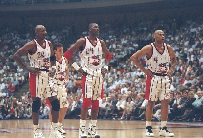
You know what's funny, Barkley has never looked that strange to me in a Rockets uniform. I was much too young to really pay any attention to basketball when he was in Phoenix, so Houston was the first team I really associated him with.
Now, retrospectually? Phoenix is his "right" uniform, but I still think of Houston right with Phoenix when thinking of Barkley.
-
I like this Grizzlies logo a lot more than the current (note: sans-wordmark!):

On a side note, I wonder how a black-brown-red color scheme using this logo would have worked for Memphis. Definitely would be rather unique for Memphis, and would have separated from the Vancouver days without deviating drastically. It'd have been interesting, I think.
-
I've always thought a good "bridge" of sorts between the present and past would've been to inverse the colors of the current "Twins" script to navy outlined in red. Put that on the front of the primary homes, remove the front number, then do the same color change to the back number. In that move, it'd look more like an update to the throwback while still retaining the present.
Oh, and I, too, miss the road pins. Liked them a lot better than the current road.
-
First picture I've ever seen of Frank Robinson in an Angels uniform:

-
I don't see the red-blue indecision you are talking about. I see a team that is red-first, navy-second. That is what they are supposed to be.
I was talking specifically about the current roads, rather than the identity as a whole. It's almost as if, with the red cap brim, undershirts, and socks (not to mention the red-dominant homes as well), they want to be a red team. The navy crown, however, gives off this idea that they're clinging by the fingertips to navy. I just figure they might as well let navy go at this point and throw the red cap onto the roads to finish it off, but alas, the navy crown's still there. The result isn't so much a red-navy balance to me personally as it is "RED!...but we kinda like navy too...maybe." Not sure if I explained that as well, but that's what I was referring to.
-
What I humbly think is the best Nats uniform:
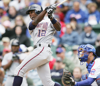
I had always wanted them to tweak the home colors to match, and was dissapointed when they added more red eventually instead. Not sure why, but I just loved this look. Loved the prominence of navy (helped to separate from the Angels-esque home), loved the script, loved the gold touches on the script and numbers, and just thought it was a sharp uniform. It especially looked great with navy high socks, as depicted by Soriano here. The current roads aren't bad, but the apparent blue-red indecision the look gives off is rather annoying. It also gives off a somewhat Braves-vibe, which as a division foe isn't too good. The inagural roads were much more distinct, in that particular regard.
-
Yep. The high socks add color to the uniform and personally, despite me being younger than most here, high socks/stirrups is just baseball to me. Probably has to do with the fact that I'm an avid baseball historian and love the Golden Age of baseball, but hey.
This could probably fall under an unpopular opinion: the view of what a baseball uniform is today by people my age kind of bugs me, come to think of it. I remember my junior year of high school (about three years ago), when I played varsity ball, my coach made it mandatory for every player to wear the full-legged pajama style. There wasn't too much opposition, but it sure bugged the crap out of me, especially being someone who wore high socks from little league and up. I preferred everything old-school - heck, I refused to even wear batting gloves. Then we had the chance to vote on an alternate uniform, and had the option of 70's throwback (pullover and all!), or basically our home whites but in our secondary color. I was the lone vote for the throwback and the lazy recolor won because "throwbacks look ridiculous". Ugh...from a uniform-junkie standpoint, I hate my generation!

P.S: As if my uniform experience didn't grind my gears enough, my team got a new coach the very year after I graduated who made high socks mandatory and introduced new throwback-inspired uniforms. Missed it by that much.
-
I think the Kings looked better when they had Laker colors, rather than the Raider colors they have now.
Kings best look
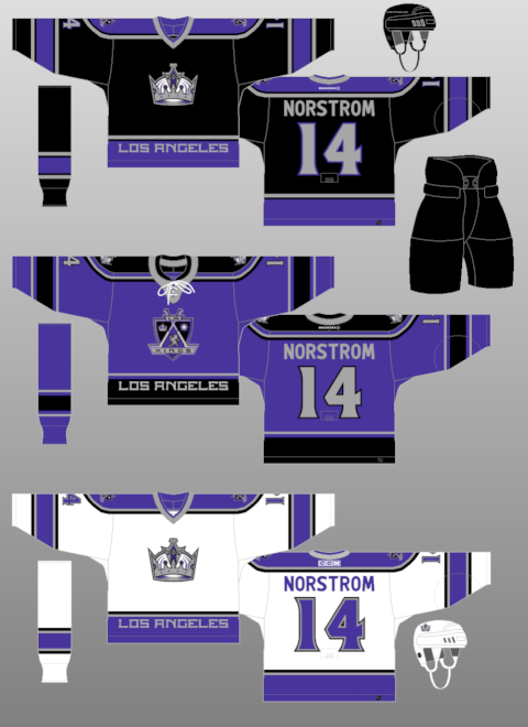
You know, the Kings are a tough case for me personally. I think each identity they have had is no better or worse than the other. They looked great in purple and gold. The looked/look great in black and silver. They looked great in purple and black.
I guess they're one of those select few teams that "got it right" every time.
-
I guess the unpopularity of my opinion has been verified! Haha

I will agree with you on the wing-sleeved originals though, Mockba. Those were really great.
-
My opinion on these wavered over the years, I'll admit, but in a "don't know what's there 'till it's gone" epiphany...
I think these were some of the neatest uniforms in the NHL.
I think if Atlanta were to have made a white roadie in that design to match and/or emphasized powder a little more, it'd have been a much more solid identity.
The side panels ruined it for me. The pre-edge version was far superior
Ah see, the side panels are what helped make them for me. The way I see it, side panels aren't always necessary -case in point, Colorado, who already has vertical panels on both arms. But for Atlanta whereas the arms were asymmetrical, the side panels, to me, helped to add flow to the uniform and made up for the asymmetrical arms. If they weren't there, the navy arm would just look too random as it wouldn't be vertically complimented.
The pre-edge version was great too, but my one problem with it was the hem stripe. The talon marks worked on the other jerseys because that same pattern adorned the collar which led to a balance, but without that same pattern anywhere else on the powders, it just looked random and slapped on. And the hem stripe being horizontal didn't help the uniform flow with the asymmetrical arms. Kinda looked unbalanced in that regard. I just think if your'e going to try what Atlanta did, your compliments (not sure if that's the right term) need to be vertical for it to work.
Different strokes, right?

-
My opinion on these wavered over the years, I'll admit, but in a "don't know what's there 'till it's gone" epiphany...
I think these were some of the neatest uniforms in the NHL.

I think if Atlanta were to have made a white roadie in that design to match and/or emphasized powder a little more, it'd have been a much more solid identity.
-
To each his own there, I guess. Like I said, his time as a Buck spanned the time I paid the most attention to basketball, so I still remember him very well as a Buck. That said, I have gotten used to him in a Celtics jersey and wouldn't consider it a "wrong" jersey by any means. He's just one of those rare cases that can be associated with more than one uniform. Jason Kidd is another player that fits that category to me personally, as him in a Suns, Nets, and (second-stint) Mavs uniform all look "right" to me at some degree.
-
This thread got me thinking, what is Ray Allen's "right" jersey? Or are all of them right for Ray, who spent his first 7 seasons in Milwaukee, 5 in Seattle, and is currently in his 5th season in Boston


Ray Allen is a rather strange case for me, because at some point I got used to him in each uniform. If I had to choose one that was more "right" to me, though, it'd be the Bucks for purely nostalgic reasons. I know he won a title in Boston, but his time as a Buck spanned the time I paid the most attention to basketball (which I guess is why Nash in a Mavs uni isn't that weird to me, either). The most "wrong" Allen uniform to me would be the Sonics, but even that isn't too strange a sight to me.
-
I don't think powder blue and gold go well together at all, even when accented with other colors. Hence my disdain for these looks:
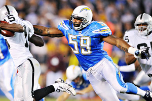
(and aside from the colors - gosh, that unnecessary powder background on the pants stripe! Terrible, annoying mismatch with the bolt against white on the rest of the uniform. Poorly designed.)

My opinion on powder blue is that it works much better with darker colors like navy, hunter green (though it looks good at times with kelly green), deep purple, burgundy, crimson, etc. When paired with lighter colors (excluding white, as it's neutral), the combo just looks faded out. And yes, I know both sets are accented with a darker color, but the accent isn't enough. The darker color needs a more bolder use for it to work for me.
-
I thought this uniform (and entire identity, for that matter) was terribly underrated:

Especially considering how rough the new uniforms came out, I wish these were never dropped. Great, fitting color schemes (still looked good when bronze was eventually switched for gold), clean design, all a very sharp look in my humble opinion. There's a reason this identity outlasted most of the other 90's identity products (Minnesota's is another that comes to mind).
-
Can't remember if I've mentioned this before, but here goes...

I loved this Pistons identity. The uniforms were "90's" enough to fit the era, yet relatively conservative (simple side panels, no gradients, etc.) enough to avoid being overly gaudy. The colors went great together, the logo was the best in team history, and the number font was fitting and well designed. I really don't think it was as bad an identity as it's made out to be - there were far, far worse identities in sports during that era.
Also, that particular Spurs/Pistons matchup looks incredible. I guess while I've mentioned the Spurs, I should add that I loved thier "Southwestern" colors and never minded that the uniforms didn't feature them. Thier usage of them in the logos, court, and stadium decor was unique and made for a great, festive identity that truly fit San Antonio. Thier moving away from the colors and decor really dulled thier identity.
-
The one thing that bugs me about the Blackhawks' set is how one jersey is predominantly red, while the whites are predominantly accented with black. I'll admit that if I had the authority to make changes, I'd be hesitant to, but I almost think red numbers outlined in black would be perfect for the home whites.
-
I'm with you guys on the Pacers pinstripes. Definetely a sharp uniform and much better than what they're in now.
And speaking of Washington State (briefly mentioned above), I LOVE thier current uniforms. They did a great job re-designing thier set over the summer, certainly my favorite change of the college offseason. Not to mention, I love thier identity as a whole. The logo is one of my favorite in the nation, and the colors just work so well together.
-
I love South Carolina's football uniforms, especially when they go garnet monochrome like today. There's just something about garnet, white, and black. A beautiful color scheme.
-
The jazz' current navy is the best shade of purple they've used. The others were too red or violet. Indigo works better with the green and yellow and the current set literally looks more classic than ever.
As a Jazz fan, the problem with the navy is that it is much too dark. It almost looks black in action (it certainly did at LA last night). I'd much rather prefer the Jazz in purple first and foremost, but if they had to go with something else, a slightly dark royal wouldn't have been too bad. This navy shade just has never worked for me, though. I can't wait until they start wearing the green alts on the road, hopefully they'll eventually replace the navy.
Unpopular Opinions
in Sports Logo General Discussion
Posted
I loved the Clemens set because it was simply green and yellow. No black, no carbon, no volt, just the school colors showcased in a good modern design. The only modern set, save the most recent Fighting Ducks set, that I felt they got completely right.