


Matito
-
Posts
540 -
Joined
-
Last visited
Posts posted by Matito
-
-
On 3/12/2019 at 3:01 PM, neo_prankster said:
Worn out his welcome, didn't he?I don't know many respectable people who ever liked him.
-
 1
1
-
-
58 minutes ago, neo_prankster said:
Name predictions:
Austin Rattlesnakes (instead of Dallas)
Houston Drillers
Los Angeles Terminators
New York Superheroes
Tampa Bay BubbasSt Louis Psychos
Seattle Grunge
Washington Weasels
Indiana can take Bubba back. We don't want him.
-
1
-
-
3 hours ago, AstroBull21 said:
The hats i understand, the jerseys make no sense.
I love the idea of hats in other local colors. I have a Rays cap in FSU garnet and gold that they sold at the team store alongside UF orange/blue, USF green/gold, and UCF black/gold.
But yeah, I would not buy a Rays jersey with Stamkos #91 on the back.
-
1
-
-
I read this early enough in the morning that I was confused why they were using ASL instead of Braille.
-
On 6/25/2018 at 8:47 PM, OaklandIsBack said:
With Edwin Jackson playing for his major league record tying 13th team today, what is his right uniform?
i picture him with Arizona, probably because of the no hitter
As a Rays fan, I remember him more for his no-hitter against Tampa Bay than for him actually playing in Tampa Bay, which is his second longest tenure in terms of games pitched.

-
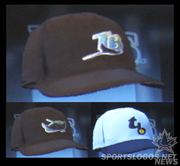
I'm totally buying one of these caps. It's completely ridiculous and I love it.
-
On 6/1/2018 at 4:17 PM, daniel75 said:
I love the Buccaneers current uni’s, minus the Bucs script on the sleeve and the pant stripe. I’ve even come around to their number font though some of the numbers need to be simplified. Besides those three things I think they look awesome. I’m honestly surprised by how much hate they get.
The numbers and Bucs sleeve script are the only things that make the uniform bad. There was no need for a uniform overhaul, but if they had to modernize it, what they did was fairly restrained outside of those two items. I've seen someone mock up photos of the current uniforms with block numbers, and they look miles better than what they use now.
I will say though that Nike made a huge mistake on their alternate pirate ship logo. Someone pointed out shortly after introduction that the rear mast is in front of the sails, and what was the best logo in the new set has been ruined for me ever since.

-
1
-
-
Wait, the Suns almost used that weird 90s "S" thing in their logo? Why is this not bigger news?

-
15
-
-
I won't consider sponsors/paint schemes as "uniforms" because of the ever-changing nature of NASCAR, but car numbers? Absolutely, and this may be the wrongest of all wrongs in NASCAR.
-
1
-
-
6 hours ago, TheBigFiz21 said:
2016 MLB season has started, but it doesn't look like the Fox Sports locals have upgraded to reflect what we saw in Super Bowl LI. Maybe we'll only see the new graphics on the national Saturday games and the postseason?
The FS1 broadcast from Wednesday night looked the same as last year, so maybe it's just the Fox Network broadcasts, if anything, that will be updated.
-
Ah that's right. It's been at least a decade since I played the game. I searched for a screenshot for a while but couldn't find any.
-
On 3/18/2017 at 1:01 AM, mcj882000 said:
From the days when game devs weren't given new uniforms before the games came out, here's 3 examples of "Inaccurate Colours/Uniforms In Video Games That Didn't Know Better":
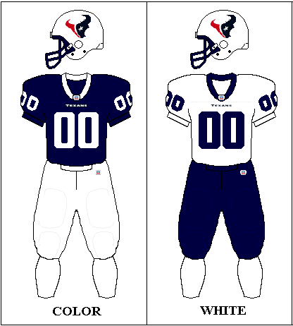
Don't forget Madden NFL 2002, making up jerseys (and a white helmet) for the expansion Houston Texans.
-
4
-
-
Wade Boggs in a Devil Rays uniform will always be his right uniform to me, but I'm the definition of bias in that regard.
-
2 hours ago, JerseyJosh said:
Devil Rays >>>>>>>>>>>> Rays
I think if the team had been called the Rays from 1998 and they considered rebranding to the Devil Rays, it would have been met with total opposition from this board. For the 90s, it fit, but if it happened in reverse, 2008-era baseball fans would have seen it as minor league-ish.
-
1
-
-
I'll be curious to see if Fox translates these graphics to their NASCAR coverage, since that was just redone two years ago.
-
On 2/4/2017 at 0:27 PM, wyopokes2 said:
As a Jags fan seeing Leftwich in any of these feels dirty

If it makes you feel any better, I didn't even remember him playing here until that picture.
-
2 hours ago, MCM0313 said:
What about the Millen-era Lions? Did they add black in or before 2002, or was it later? I don't recall right offhand.
The Lions added black in 2003, and redesigned their uniforms in 2009.
-
8 hours ago, SilverBullet1929 said:
Wait wait wait... the Joe Maddon Tampa Bay "wrong uniform" argument is skewed by Cubs fans and the media because of the history that was just made. Rays fans will never forget Maddon. I'm a Marlins fan and being in Florida I'm exposed to the Rays more than many and, while still understanding Maddon's huge accomplishment with the Cubs, I can't agree with any Rays uniform being a "wrong uniform" for Maddon. Remember it is possible to have more than one "right" uniform even if one uniform seemingly stands above the rest.
While I agree that I'll always remember him as the Rays' manager, I have to also agree that the green and black era uniforms are most certainly wrong for Maddon. The navy and Columbia blue are what I'll always think of with him.
-
1
-
-
MLB The Show is notorious for uniform errors. The Rays in particular have a few different problems. Like someone else said, their fauxback cap is all Columbia blue, when in reality, everything but the front panel is navy, not to mention the jersey being a button-down instead of a pullover.

Also, their 90s Devil Rays throwbacks have the incorrect cap for their away uniform. The team never wore the Devil Ray logo cap on the field. It was announced with their uniforms, but by the time the team started playing, they only ever used the TB monogram cap.
-
My unpopular opinion: The Bucs aren't that bad. They're not great, by any means, but their new uniforms aren't the worst thing that's happened to the NFL like most would have you believe. Let's break it down:
The helmet: The logo is too big. That said, the old one, I feel, was too small, so the new helmet was a step in the right direction, just taken a bit too far. I like the "chrome" (really brushed metal) facemask. It adds to the pirate feel and reminds me of a sword.
The jersey template: When Nike said they were tweaking the Bucs' look, I assumed it would be more akin to the Panthers' new logo. The jersey didn't need to be changed, but if you're gonna modernize a jersey, you could do a lot worse than a plain shoulder yoke with a small, angled accent color. The pewter contrasts nicely with the red or white, and the orange brightens up what is an otherwise dark look, even with the brighter red than before.
The numbers: Alright, there's no defending these. I'm all for non-traditional, non-block numbers, and to be honest, I think the double outline on the old numbers were too thick and made everything look muddy. But this was not the way to go. I tried to think of something other than the popular "alarm clock display" putdown, but it's too accurate.
The pants: I like them. No real complaint. The incomplete stripe up the side also reminds me of a sword, which fits.
The logos: Not bad, but not great either. The old logos were starting to show their age and look very late-90s. They could have been cleaned up a little better than this, though. The new logo looks less like a skull and more like a robot.
Altogether, it's not awful. It's mostly unnecessary, but not bad.
-
I always associate him with the newer red Falcons jersey. Many, many times I played as the Falcons in Madden simply because of Vick, and I always chose the alt red jerseys.

Inaccurate colors/uniforms in video games that should know better
in Sports Logo General Discussion
Posted
No screenshot, but MLB The Show 19 continues to use the wrong caps for the 1998 Devil Rays. The entire time that Tampa Bay wore the gradient uniform, they always wore the cap with the TB and the fish.
But for years, the game has used the fish-only caps that were unveiled at the uniform announcement a few years before the team began play, but were never actually worn on-field in the 90s or 2000.
For what it's worth, the Rays organization themselves seem to have trouble with this, as the team wore the fish-only caps during their first Devil Rays throwback game in 2009.
And since then, they've used that cap as the basis for their fauxback home Sunday cap (which is gorgeous enough to forgive).