


gsn93
-
Posts
111 -
Joined
-
Last visited
Posts posted by gsn93
-
-
On 3/8/2024 at 6:36 PM, ruttep said:
I agree that it shouldn't be the end all, but it is how a lot of teams and fanbases base their perceptions of certain uniforms. It's one of those things that will be relevant in uniform decision-making, whether you like it or not (along with other top hits such as players or owners preferring a certain look).
I understand why people say it and feel that way, but I just think it's a weak argument.
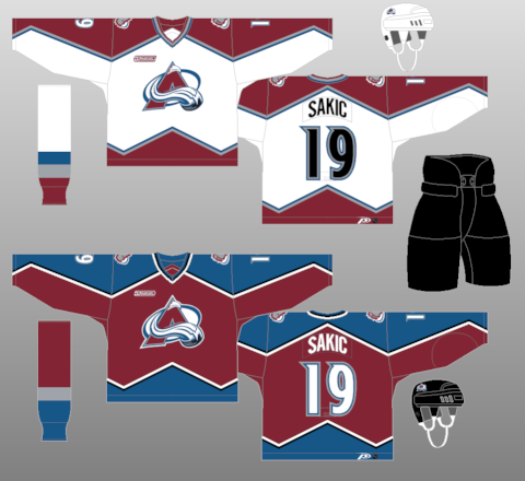
5 hours ago, DTConcepts said:I think the Avs would be better off doing the opposite and darkening their shade of blue, similar to the Nuggets. Would certainly solve their contrast problem. Here are some examples I hastily Photoshopped in 10 mins to illustrate.
I think this is probably the best option. While I do prefer their original uniforms, the navy helps as a nice composite between the black and blue. It also ends up matching the third jersey with the rest of the set.
3 hours ago, GriffinM6 said:If you're going to darken the blue, you've gotta lighten the red slightly.
The Avalanche actually did used a lighter shade for the burgundy between 1995-1999 before they darken it to the current shade.

I don't know if that helps with the contrasting problem going back to the lighter shade with navy or not but it's a nice starting point.
-
 1
1
-
-
56 minutes ago, CreamSoda said:
The Avs look a million times better in blue equipment and have a cup in them. They aren’t going back to those ugly mismatched uniforms.
I'm not ragging on you since you're not the only person who uses it, but I really dislike the notion of "team won a championship in 'XYZ' uniform" as the end all be all answer to anything uniform change related. Especially, since the Avalanche won twice wearing their original set.* What makes their current set untouchable compared the the 1996-2007 sets? It's a minor pet peeve but I see it all the time on the forums.
*I understand that the uniform changed slightly between the 1996 and 2001 cup wins. Whatever close enough.
-
4
-
-
4 hours ago, monkeypower said:
The jersey itself is fine, but the blue is fighting with the burgundy over being the dominant color with the rest of the uniform. The burgundy is clearly the primary color, but you have blue helmets and pants now and it overpowers the burgundy. The black helped break up the uniform for not being too blue heavy. It also looks like the players are wearing their pants all the way up their stomach it's not a great look.
-
3
-
-
I've been wondering for years what this font is and I can't seem to find it.
It was also used for the closing credits of the 1996 PC game Harvester. Anyone know what it's called?
-
I was hoping they would just reuse the designs from 2022. Arguably the best looking All Star set in years, alas.
-
3
-
-
3 hours ago, the admiral said:
Now that vivid colors are in and clunky beveling effects are out, it's time for the downward orange NHL to come back.
This. I'll even take the Reverse Retro version of the current logo. It looks so much better in orange and black.
-
An unpopular opinion but I didn't care for either of the Wild's Reverse Retro jerseys. Something just feels off about them. I'm in the boat of the Wild sticking with their current identity. It would be a shame to lose it over dressing up as the North Stars.
On 1/30/2023 at 3:17 PM, Ridleylash said:
If they did want to appease the whole North Stars crowd this jersey in the Wild's current color scheme would be a nice compromise as an alternate. There's just enough going on with the different stripes that it can easily be converted into the Wild's palette. Honestly what their Reverse Retro jersey should have been.
-
2
-
-
13 hours ago, M4One said:
I expect the striping pattern to be the same, or at the very least, as close as possible to the original.
It looks like they took the hem striping from the prototype version of the jersey instead of the final version. It matches almost exactly.
-
4
-
-
1 hour ago, IceCap said:
Nope, I just find "yOu HaVe To Be FrOm HeRe To UnDeRsTaNd" REALLY dumb and pretentious in the worst way.
Look. I'm proud of my home town too. But I don't have my head so far up my own
 that I'm going to tell you it's a magical special place where even the carpet has special significance to those of us who grew up there. Where I grew up, where I'm from, is pretty much like a lot of very similar places. Portland, as nice as it is, isn't some magically unique place either.
The insistence that we need to squeeze meaning out of these increasingly niche references just reinforces the worst aspects of the "WHERE I'M FROM IS SPECIAL" attitude that births just the worst platitudes in sports.
I mean, isn't that the whole point of the City uniforms in the first place? Taking imagery from landmarks from around the area and spinning it into a jersey. As crazy as it sounds the carpet at PDX is a bit of a local landmark. I'm not a fan of the over-saturation of uniforms in the NBA myself, but this is one of the better efforts I've seen from the City program.
1 hour ago, IceCap said:But insisting that carpet of all things is special is just dumb. Sorry.
The carpet is notable enough to have a Wikipedia article, so I guess some people think it's special. ¯\_(ツ)_/¯
-
8
-
-
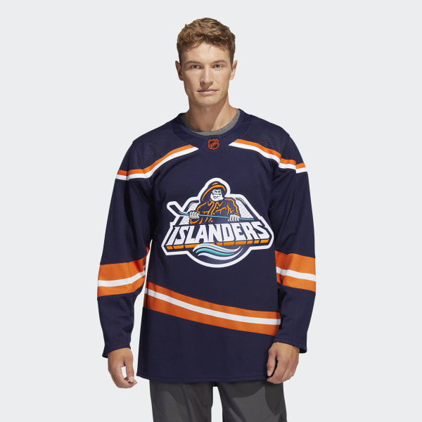
On 10/31/2022 at 5:40 PM, DTConcepts said:
Ooh, the edge of the hockey stick where the S used to be looks like a design flaw. It doesn't read as the handle of the stick and looks more like the designer stitch something over poorly with a clone stamp tool.
-
21 minutes ago, MinnyHockey said:
Coyotes burnt orange
I think I prefer this years' jersey over the 2020 one. Never care for the purple base color. The brunt color palette looks wonderful.
-
10 hours ago, IceCap said:
I suppose my point is that there's no evidence Nike's work will "look good" if the NBA, MLB, and NFL are any indication.
And I mean yeah sure they've butchered uniforms in those leagues but SURELY the NHL will reign them in, right?
Did I lose something along the way here? Where did I ever say that Nike would be this magical savior for NHL jerseys? If anything I said the complete opposite. By looking good I'm just talking about the base template design not the actual jersey designs. Using Nike's Olympics and college jerseys as a point of reference I feel that at best it's a lateral move for the NHL.
2 hours ago, Lights Out said:The idea that Adidas' departure is going to be some huge loss for the NHL's aesthetics is puzzling and seemingly backed by nothing other than people's kneejerk negative response to Nike - who, by the way, might not even end up getting the contract for all we know.
Pretty much this.
-
25 minutes ago, IceCap said:
Yeah.
If you think the Nike you're getting in 2022 is the Nike of 1997 then I have ocean-front property in Saskatchewan to sell you.
To be fair I never said that. I'm not expecting that at all. You can even say the same thing about CCM. As long as the template they use looks good and they're using quality materials I feel most people here won't have anything to worry about.
But, I'll take you up on that offer on that Saskatchewan "ocean-front" property. /S
-
I'll the odd one out and say that I feel completely indifferent to Nike possibly taking over the jersey contract. Sure CCM would be a better choice but I'm not going to lose sleep over it. I own a few Nike jerseys from the late '90s and they're among my favorites. I like the knitting fabric on them. Granted things have changed in 25 years.
I'm just hoping that whoever takes over the contract designs normal looking collars.
-
 1
1
-
-
11 hours ago, dont care said:
So the left designs?
No, the middle designs. The ones on the left use blue as the base color on the home jersey instead of burgundy. I prefer burgundy as the base color.
-
On 6/30/2022 at 10:59 PM, _RH_ said:
The two middle options are probably the best color balance wise. Just pair those two designs with burgundy colored helmet and pants.
-
Hoping for Colorado to pull it off this year.
18 minutes ago, tBBP said:(And yeah, the blue equipment is starting to look much better on ice than the black...)
I have to respectfully disagree with your statement. The blue pants might work better if the jersey striping was more traditional and not using the mountain zigzag pattern. The blue kinda awkwardly comes to a point and it looks like every player is tucking in their jerseys into their shorts. Looks off to me.
-
I didn't like the Avalanche downplaying black in the first place. It was one of those color quirks that worked. The use of black on the uniform was like the glue that hold all the colors together and it complemented the burgundy, blue, and silver well from head to toe. Never really felt out of place with me.
-
6
-
-
It's a slight upgrade in my eyes. I personally never cared for their previous logo.
-
1
-
-
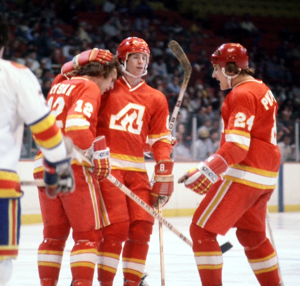
5 hours ago, M4One said:
Doesn't really go with the current set.
Their current set? The one that looks almost identical to this? I think using the Atlanta logo as the alternate captain "A" would look fine.
-
5
-
-
On 12/29/2021 at 7:36 PM, DTConcepts said:
A supposed Rangers Reverse Retro prototype has popped up on eBay.
I know I'm a few months late on this, but I don't think that was an early reverse retro design and more likely the rumored new third jersey that was planned. I seem to remember hearing about that years ago and then nothing ever came out from it.
-
I like option M: the NY torch. Wouldn't look out of place on the shoulders.
-
5
-
-
I feel like if the Ducks are going to stick to their current look then the beige/sand color looks better against black. Orange is only used in a small amount on the primary logo and it kind of messes with the color balance a little bit in my opinion. Of course the best solution is to just embrace the Mighty Ducks look full time again and use jade and eggplant, but that is just wishful thinking at this point.
These graphics also support my views that Nashville should go back to using navy as their primary color. Their logo pops wonderfully on a navy background. It's really a shame they don't have a proper navy jersey in their current rotation.
Overall, I like the current branding for the most part. At first, while I like both typefaces, I didn't like them paired together. However, after seeing all the team graphics, it changed my opinion and it works. The only thing I don't care for is the photo-realistic Cup. A more stylized version would look better.
-
6 minutes ago, officeglenn said:
Looks like the Sabres' Heritage Classic jerseys were leaked on Reddit:
Those don't look too bad. Maybe a little too similar to the Blues' Winter Classic jerseys. Not a huge fan of the cream/vintage/off-white color but it works here.


 that I'm going to tell you it's a magical special place where even the carpet has special significance to those of us who grew up there. Where I grew up, where I'm from, is pretty much like a lot of very similar places. Portland, as nice as it is, isn't some magically unique place either.


:format(webp):no_upscale()/cdn.vox-cdn.com/uploads/chorus_asset/file/22257885/07.jpg)
NHL Anti-Thread: Bad Business Decision Aggregator
in Sports In General
Posted
What an entertaining novel with all the twists and turns they had. Feels weird to actually be in this spot with the Coyotes.