

doctorpeligro
-
Posts
278 -
Joined
-
Last visited
Posts posted by doctorpeligro
-
-

Found it. It has a Reebok tag so it was from a few years ago.
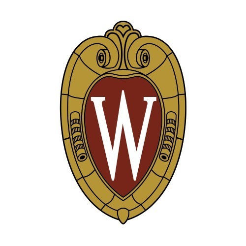
Looks like they simply created a gold version of the crest that was being used at the time by the Athletic Department (you can see the identical use of black to create shading).
-
 1
1
-
-
It’s a relatively simple change to make. The administration would have looked like d*cks if they hadn’t agreed to it.
The biggest problem: for how long do they have to keep using it?
-
19 hours ago, Gothamite said:
Thank you - I don't remember that at all.
Were you thinking of this one?
No, it was the crest, but an older version of the crest, similar to the version that was in use when I graduated:
The emblem originates from the athletics end of campus since it is a flourish on both ends of the UW Field House. It was actually a graphic designer hired by the medical school in the mid '80s who first turned the Field House "W" into a crest that would be used as a logo by an academic department.
https://news.wisc.edu/who-knew-19/
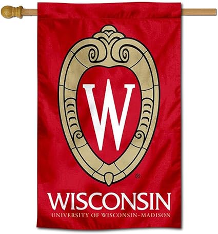
The two-dimensional version of the crest was soon adopted by the rest of campus and later refined. There used to be a complex version and a simplified version, but the complex version (seen on that flag in my previous post and in Madison Cone's tweet) is largely being phased out.
https://daniellelawry.com/portfolio_page/university-of-wisconsin-madison-rebrand/
Here is a newer flag with the latest updates to the crest and university wordmark:
-
1
-
-
On 7/17/2020 at 8:59 AM, Gothamite said:
It hasn't been in the past. https://brand.wisc.edu/print/logos/
This is the "institutional logo", used in different versions by the University as a whole.
I'm not aware that UW has ever "crossed the streams" like this before, using the institutional logo in a sports context. Wonder if this means the school will be using the black-W version in other applications; otherwise, why not just reverse the black and red on the helmet logo?
I can't find a picture of it right now, but the crest has been on an alternate jersey/sweater for the Women's Hockey team, generally considered to be the school's most successful athletic program.
As I recall, it was a white jersey featuring an older version of the crest over two horizontal red stripes.
-
I'm a big fan of the Field House "W"/UW-Madison crest and prefer it to the Motion W.
Aesthetically, the white "W" looks better, especially with the crest on a red background, but I have no problem with what our students are proposing.
-
1
-
-
Yes, they got their colors from the Pilots. So what? It's an improvement.
The script is okay, pretty Schlitzy, but why aren't there serifs on the WAU?
I think Chance's color scheme (dark blue with red trim) is more impressive than the Brewers' blue-with-yellow motif . . . but to each their own.
-
Funny, I thought people agreed there were too many red and blue teams already. I love the Brewers in royal blue and athletic gold. It's such a solid, no-nonsense pair of sports team colors. Flashy without being gaudy or overly complex, simple without being boring and overdone. The only other color combo I could entertain for the Brewers would be a German-inspired black/red/gold, and even that's not as cool as good old blue/yellow.
Interesting. I have always been bothered by the Brewers' blue-yellow scheme because it was a perpetuation of the color scheme of the Seattle Pilots.
I have always felt that Selig et al. should have changed the franchise's colors to the historic colors of the American Association Milwaukee Brewers.
Uni Watch Blog post about ideas to change Brewers' scheme
Chance Michaels' beautiful concept:

-
Even less popularly, I think the "M" used in this logo was the Brewers' best cap logo ever. The ball-in-glove is overrated and the Motre Bame logo is too intricate.
I agree with your opinion about the Motre Bame logo: too many colors and too many lines.
The concept, however, is underrated, and a simplified (and recolored?) version would have looked pretty good:

-
My own heresy is about the Packers' untouchable uniforms. I was terribly disappointed that the rumored early 1990s switch-to-navy never happened, and I still wish that Ron Wolf had the guts to pull the trigger on his redesign in 1994.
It's not too late, Green Bay. The Rodgers era is just beginning.
Agreed.
Personally, I have an odd fondness for the Motre Bame logo, which I think would have looked good on the left chest of a jersey:

I think it would have looked better in red and navy blue, the historic colors of the American Association Milwaukee Brewers.


College Football 2020
in Sports Logo News
Posted
For all the news it got back in July, underwhelmed by the Social Justice version of the UW-Madison crest. Grouped in with a lot of other symbols on the back of the helmet.
Would have preferred that the crest had a 1.5" x 1.5" space over the stripes on the left sleeve, as allowed by the new NCAA rules.
Also, those helmet screw caps should be white.
The "FM" sticker is for Father Mike.