


Jimmy!
-
Posts
7,947 -
Joined
-
Last visited
-
Days Won
3
Posts posted by Jimmy!
-
-
Serious note... Are coyotes in Seattle/Washington?
Yep. Ran by a dead one on the side of the road the other day.
-
Out of the blue last night any image I copied and tried to paste into Illustrator (I use CS3) shows the code or web address of the copied image instead of the image itself, when pasted and I can't figure out why it started doing this or how I fix it. Did I accidentally use a keyboard shortcut to start doing this? How do I return it to the point where I can see the image I copied instead of words and symbols? I need to paste in some reference shots for a template I am working on. Any help is appreciated.
UniJ
Try dragging the image from your web browser into Illustrator or saving it to your local drive. That happens to me on rare occasions.
-
Only happens when I access the board via PC.
-
Clicking on a link, while on the boards, brings up the same page twice. Anyone else experiencing this?
-
And to think the Twins, Giants, White Sox, and Mariners almost moved there.
-
You can ungroup the background layer (after you offset) and get rid of the original letters.
-
The text is not in a group.
And it still occurs.
Jimmy, what I am doing is outling a bunch of letters, not sure how you mean paste them in place when it selects not only the outline but also the paths I am offsetting.
See how it automatically selects both what I have just created and what I was Offsetting? I don't want that.
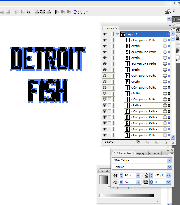
You want your letters to be one group, and the outline to be another. The easiest way to do this is to take your text (shape or object), copy it, and lock the layer it's on (layer 1). Create a new layer BEHIND the text (so layer 2 is under layer 1) and paste on that layer in front or paste in back (Apple F or Apple
 . It won't matter which command you do because the new layer is under/behind the original layer.
You should now have two layers with the same text in the exact same place. Offset the bottom layer and leave the top layer locked.
-
Good day to you all.
Here is my situation.
I have upgraded to CS3.
(Not what everyone would prefer, but maybe what some could afford/justify.
My problem
When I do an Offset Path, I do Object>Path>Offset Path
This works fine.
But what I am left with is both Paths remain highlighted.
So if I am outlining text, I have to de-select every letter that I want to remain one colour, while selecting the new outlined letter.
Is it possible to change this to simply highlighting the new Path I have made with Offset, like CS2 does?
If so, how?
I think if you ungroup your outlined type before you do the offset path, this fixes your issue.
I paste (in place) the same path on a separate layer and lock it. The "Offset Path" layer is behind the original. You'll have a bit more freedom that way.
-
Does anyone know what font this is?

-
Good place to find a quick and dirty contract? I have a potential freelance job with a non-friend client, and I want to protect myself.
Get this book: http://www.amazon.co...93718055&sr=1-1
There is a contract inside along with many other good things including pricing and other practices you should follow. You can get them at most big book stores in the store so you can have one in your hands by the end of the day.
Hopefully this isn't too late! Good Luck!
Thanks! Still in discussion mode with this guy.
Any advice/issues/things to look out for? This job will have a fair amount of outsourcing (printing, mail house, and web development) and the client is looking for me to run point on all of it. It's been awhile since I've done a project of this magnitude, so I want to go into it as prepared as I can.
-
Good place to find a quick and dirty contract? I have a potential freelance job with a non-friend client, and I want to protect myself.
-
Mburmy:
Pretty good, I agree with Portland and Charlotte if there have to be two more teams, but why the insistence on eight divisions of four? It's not nice. I'd rather have four clunky divisions of eight than eight divisions of four.
AMERICAN LEAGUE
Expansion Circuit
Los Angeles, Portland, Oakland, Seattle, Texas, Toronto, Charlotte, Tampa Bay
Charter Circuit
Baltimore, Boston, New York, , Chicago, Detroit, Cleveland, Minnesota, Kansas City
NATIONAL LEAGUE
Expansion Circuit
Colorado, Los Angeles, San Diego, San Francisco, Houston, Arizona, Washington, Miami
Charter Circuit
Chicago, Cincinnati, St. Louis, Milwaukee, Atlanta, New York, Philadelphia, Pittsburgh
Wouldn't Oakland be part of the Charter Circuit as they started as the Philadelphia A's
And, for the sake of argument, if you're sticking with "Charter" and "Expansion," it would make more sense to move LA and San Fran to Charter and Milwaukee and New York to Expansion.
Just my meaningless two cents.

-
Pitt joined the Big East in 1982 3 years after it was started with Georgetown,St.John's,Providence and Syracuse inviting Uconn,Seton Hall,BC,Holy Cross and Rutgers to join. Rutgers and Holy Cross actually declined at that point.
Holy Cross denied the Big East? What the hell were they smoking?
Get your @$$ handed to you on a regular basis by Georgetown, St. John's, and Syracuse or have a chance at competing with Lehigh and American U. Not a tough choice there.
-
Just thought of another reason Pitt might not want to move. Over the past 10 years some of their best basketball recruits have come from NYC. Would these players be less likely to choose Pitt if they aren't going to be playing infront of their hometown fans every year at MSG during the Big East tournament?
If their goal is to play in the NBA, does it matter?
Since 2000, Pitt's men's basketball team has been in the top 25 for eight of those seasons and been to the NCAA tourney every year except 2000-01. Their football team has been to six bowl games (seven if you count this year) and nationally ranked five of those years.
I don't know about you, but I don't think anyone would consider the Big Ten tournament in Indianapolis a step down from MSG.
-
Another question: Will the Big Ten change their name? Or will they shoehorn a "12" into the logo? What names could be used?
Big Midwest Conference
Great 12 Conference
The Western Conference
Big North Conference
The Northern Conference
Anything?
I had the same question...that right there, corny as it may sound at first, seems like a decent answer. That works, at least in my mind, as a natural progression...from "Big" 10, to "Great" 12...especially since the Big XII already exists. It'll take time for people to make the adjustment--at one point the Big XII was the Big 8, but people have adjusted, so I think it might work.
As for who joins...I really have no rooting interest in the Big Ten, so I really don't care. Having said that, I think it'll eventually be Pitt...I just can't see ND leaving that NBC $$$ alone.
Who says they have to change the name at all? It didn't happen when they went to 11. Keep the name and work the number 12 into the logo. THAT would be genius.
-
I have been using Illustrator forever, and now use CS3. I went to school for Graphic Design and all that, so asking this is really embarrassing, but I have never seen something happen so crazy before. I was creating a logo for a client in another time zone late last night and we finally decided on a finished product. I emailed him over an .ai file, an .eps file, and a transparent background .png file that was exported from the exact .ai and .eps files. I didn't really think it was a problem until I saw them all together in the email, but the .png was more...washed out or faded than the other files. The .ai and .eps files were crisp colors and the .png looked like it had been through the wash. It looked horrible. I thought maybe I was using the wrong "document color mode", so I tried changing that to CMYK and I had the same problem, so I reverted back to RGB. Then instead of using his RGB values for the company colors I used the Pantone values. Wouldn't you know it the same thing happened. I was at a loss for words. I have never seen something look so strikingly different when doing this. I know nothing about color profiles, or color settings, or proof colors, or anything that I tried to read about on the web. Could somebody please tell me where I went wrong? I would greatly appreciate it. And again, I went File>Export>logo.png from the original .ai file. Maybe there is a better way to do it? Thank you.
Have you tried opening your .ai or .eps file in Photoshop and saving it out as a .png that way?
-
Anyone know where I could find the basketball court template (vector preferrably, but I'll take anything)? I did a quick search and came up empty.
-
How about an Australian Football template (vector)?
 . It won't matter which command you do because the new layer is under/behind the original layer.
NHL Anti-Thread: Bad Business Decision Aggregator
in Sports In General
Posted
I don't think it's that surprising. Basketball has a deeper history in Seattle and the "wounds" from the Sonics leaving are still pretty fresh. Have the Thunderbirds or Silvertips (or Rockets when they were here) ever been more of a footnote in the sports section? But then maybe that's not a fair comparison.