


Hat Boy
-
Posts
1,833 -
Joined
-
Last visited
-
Days Won
1
Posts posted by Hat Boy
-
-
On the TV broadcast, they often used an oversized logo framed in a small box and the Bears wishbone C is near unrecognizable as a logo (or a letter). I suppose the bear head solves some of that problem

-
 7
7
-
-
3 hours ago, the admiral said:
I'm glad someone is finally honoring "the 1968-69 Las Vegas team." Who can forget icons of the game like Bob "Brooksie" Brooker, Don "The Casket" Woodbury, and Roland "Accounts Receivable" Payment. People still talk about scoring a "Floyd Conrad hat trick."
I hope Brooksie does the ceremonial puck drop.
"It's been a wonderful ceremony here on behalf of our own Bob "Brooksie" Brooker! Bob was darn near death recently. He wasn't ashamed to admit to me that he had syphilis. Thank God he stopped it in its tracks. It takes a lot for a man... to admit where he got it from and how he got it. Look at him today. Bob, you look just wonderful."
-
2
-
-
Colts: "If we added our own black helmet, we'd be an even better looking team than we are now."
Me:
-
 2
2
-
-
On 6/28/2023 at 11:25 AM, Foxxtrot44 said:
I'm confused as this is the first I'm ever hearing of the Sacramento crown referencing the mountains.
Is this actually a thing or are people just misreading the overlapping crown elements ?The original crown logo dates back to their days in KC/Omaha. Any "mountains" connection to California is imagined by someone who does not realize that logos designed in the 1970s did not have a dozen "easter eggs" and hidden meanings contained in them.
-
2
-
-
10 minutes ago, neo_prankster said:
This is the best that the Anaheim Ducks have ever looked.
By default, maybe.
-
3
-
 1
1
-
-
33 minutes ago, DCarp1231 said:
All teams should have a logo that depicts their mascot or nickname swinging/holding a bat
You may want to rethink your position.
-
8
-
-
4 hours ago, adsarebad said:
And look at the sleeve patch, it's just a dark blue blob!
and a geography lesson.
-
2
-
7
-
-
19 hours ago, Ferdinand Cesarano said:
The hat should use the capital letter I from the wordmark that has appeared on the jersey
I don't know that I could identify that stand-alone letter as an "I". It is like the old Cleveland hat that looked more like a "J" than an "I" (at least to me, anyway).
Italy's block "I" is not very exciting, but it is very legible.
-
1
-
-
9 hours ago, DG_ThenNowForever said:
Why have people turned on Romo? I still think he's great. If CBS doesn't have the best booth, who does?
I don't think he ever was.
People talked about Romo because he would call out plays before the snap. Him fast-talking the formation and the QB reads as the play clock was winding down was just as annoying to me as the weird noises he makes when he is trying to determine on replay if a player stepped out of bounds.
-
2
-
1
-
-
9 hours ago, oldschoolvikings said:
Unfortunately, there's a better than average chance that a redesign would go very very badly, so maybe they should just hold tight for now.
Even if they redesigned everything to your liking, they would ruin it with mono-chrome purple, plain white socks with the white pants, and jerseys and undershirts not tucked in.
-
5
-
-
4 hours ago, Carolingian Steamroller said:
White pants and white socks paired with a dark jersey should be outlawed.
It's my absolute least favorite look in all of football and yes the Pats throwbacks are included.
I think stripes on white pants paired with striped, white socks is a good look. Where the the Jags, Saints and other go wrong is with plain white pants paired with plain white socks.
-
7
-
 1
1
-
-
13 hours ago, BC985 said:
I’ve always thought this would be a great sleeve patch:
It was....and could be again.
-
9
-
-
Sigh. I wish Army/Navy still looked like Army/Navy and not like a Nike fashion show.
-
8
-
 2
2
-
-
20 hours ago, DG_ThenNowForever said:
Lol Raiders. Big ass stadium, and they're broke?
What a life to be a broke NFL owner. Sell that :censored:. Make some money. Stop bothering people.
The Raiders are still paying Gruden and recently finished paying off Jack Del Rio. Lots of dead money if they fire Josh and are paying a third head coach, It makes sense financially, but it is a shame for their fan base.
-
3 hours ago, HopewellJones said:
What don’t you like?
The number font--too boxy , vertical shadow, and I do not like the "spike" serifs.
ATL front and center on the jersey.
Side panels.
Gradient jersey.
The matte (or is it satin?) helmet finish--I think it is a downgrade from the previous one.
-
10
-
-
5 hours ago, HopewellJones said:
It's like, "oh there's chrome, AUTOMATICALLY BAD."
No, it's not like that at all. There is at least a half dozen things wrong with that uniform set before getting to "chrome.".
-
6
-
1
-
-
10 hours ago, ripall90 said:
How is everything a mess? The helmet is amazing
Oversized logo on one side, number on the other is the opposite of amazing.
-
10
-
1
-
-
2 hours ago, dont care said:
What’s the guy with the peanut shaped head and Habsburg jaw suppose to be?
This guy?
-
4
-
-
6 minutes ago, See Red said:
Man, eff this guy...
No civilian is going to win that argument, especially right after taking a private jet to Robert Kraft's wedding.
-
3
-
1
-
-
That roundel is too detailed for a sleeve patch, but otherwise, I like Dog's jersey more than what they are wearing now.
-
3
-
-
11 hours ago, the admiral said:
Not 100% sure on your police work. So Kevin Costner plowed "Kelly Ripken Jr."?
and if Darius Slay, Jr. names his son Darius, he would be Darius Slay, Jr. II?
-
2
-
-
6 hours ago, SailorOfSilence102 said:
I feel like with Darius Slay, at least from what it seems, he's using "Slay" as his brand, well acknowledging "Slay Jr." as his birth name with it being the NOB, which sounds perfectly reasonable to me.
Yes, but Slay Jr. is not his surname. His wife isn't Betty Slay Jr, (or whatever her first name may be). Like BBTV, I think a lot of these guys are SFSS.
-
1
-
-
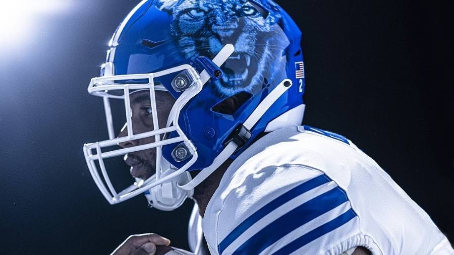
53 minutes ago, colinturner95 said:
well...
Getting a '70s custom van vibe from this helmet.
-
2
-
1
-
6
-
-
19 hours ago, HopewellJones said:
The new Falcons unis are 100000x better than the previous ones.
100000 x 0 is still 0
-
8
-


Random logo and uniform things
in Sports Logo General Discussion
Posted
The Colts wore gray pants at home for 5 years, but I am not familiar with the pants in your pic. The gray pants had a blue stripe and horseshoe logo/ numbers.