


aawagner011
-
Posts
3,874 -
Joined
-
Last visited
-
Days Won
5
Posts posted by aawagner011
-
-
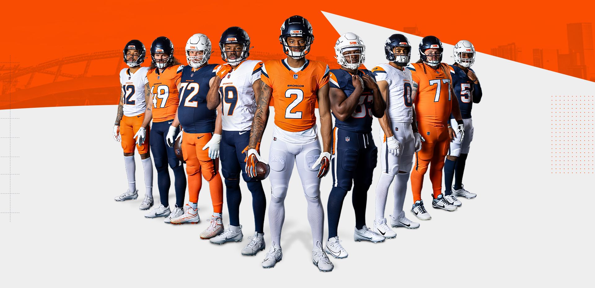
I’m not sure if I’d make this switch if it was up to me, but it makes the design feel a bit fresher. Then again, I’m 32 and navy blue is really all I remember the Broncos wearing besides the odd throwback here or there.
-
 16
16
-
 2
2
-
 3
3
-
 1
1
-
-
10 minutes ago, tBBP said:
Well, if anyone wants mini-reprieve from the ongoing Denver Colorados fiasco, how about a couple heaping tablespoons of steer-seasoned salt??
Wouldn't surprise me one bit to find out she was/is the reason for the "H-Town Blue" even being a thing in the first place...
I can’t listen to this crap and closed the video. She does realize the Titans literally own the Oilers and it’s a continuation of their franchise? They are one and the same entity. How can you be upset at the Titans wearing throwbacks from their own franchise history? Whether the Tennessee fans take to the Oilers history or not, it is rightfully theirs to do with it as they please. Do you see the Milwaukee Brewers moaning and complaining about the Braves wearing their city’s uniforms?-
2
-
-
Just because you have so many possible combos does not mean you need to show off all of them!

These have a couple redeeming qualities but definitely a few too many pieces of flair. They didn’t know when to stop and just said “give me all of it.”
And we have proven yet again the biggest epidemic to NFL uniforms remains what should be the easiest fix.
-
16
-
-
^ the Jaguars current uniforms are pretty harmless considering some of the horrid looks they’ve had in the past. Not as nice as the throwbacks they are about to debut, but probably one of their better looks. But those back of the knee mini stripes have got to be one of the stupidest design features I’ve seen on a football uniform. They aren’t ugly because of how subtle they are, but I have no idea what purpose they serve.
-
8
-
-
There is nothing new here and I recognize it’s just a spring game. But from a competition perspective, does UNC not see the contrast issue? Carolina blue is a very light shade. They could have helped with all Carolina blue against all white, or used some of their navy pieces.
-
1
-
-
Braves Friday reds are making their debut in the new template. At this point, the only one they haven’t worn is the new navy road alternate.
Edit - photo added.
-
3
-
-
1 minute ago, Germanshepherd said:
Would really like to see the Mets CC with pants that match the jersey. The white currently looks so out of place.
Exactly this. It looks good from the waist up, but the same pinstriped pants would have elevated this set.-
1
-
-
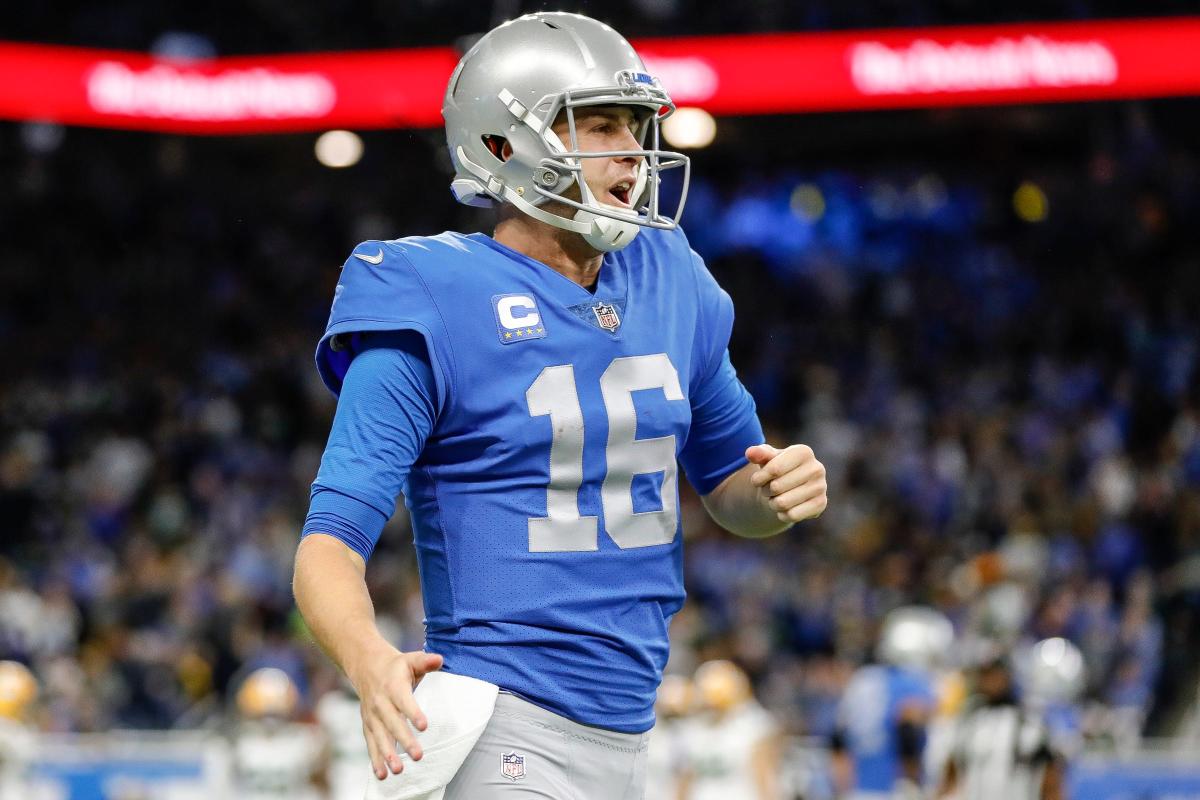
21 minutes ago, Cujo said:
Really. How fxxxing hard would it have been for the Lions to just have gone back to these instead?
Complain about the black jersey or blue helmet. But this? They nailed the home uniform.
Is it different than the Barry Sanders look? Sure, but it definitely gives off the same vibe. Not to mention that the double stripe they chose pays homage to this stripe application. They didn’t just pick it randomly.
-
17
-
 1
1
-
-
With all this talk about the sheen on the Lions silver pants, I did some digging. As a Georgia Bulldogs guy, I have been interested in this topic because it’s often a point of contention amongst fans who long for the “true” silver britches to return.
Lo and behold, according to the Detroit News:
QuoteBeyond the blue, the Lions expressed a desire to Nike's design team to bring silver back to their color scheme after drifting more toward gray in their recent uniform incarnations. While the helmets have maintained a metallic look, the new uniforms do a better job incorporating silver on the sleeve stripes and trim around the numbers.
The team's gray pants also are being updated to be closer to silver, although they will lack the sheen of some of the franchise's earlier looks because of limitations with the fabric Nike utilizes. The new, silver pants will be the same worn by the University of Georgia.
Looks like I quickly got my answer.Edit - all blue still appears to be an option.
-
3
-
 3
3
-
1
-
-
38 minutes ago, Raith said:
Shoulder striping is inconsistent. and one of the design elements they said they were going for was interchangeability/options. Hard to do when the stripes on the pants only match a specific jersey.
That said, I really wish they would have had stripes on all versions of their pants. But overall, the looks were very clean in person.
11 minutes ago, Dynasty said:That makes little sense to me. Inconsistency in terms of the colors of the stripes? I don't see a huge issue with that. Teams have interchanged with them before (even the Lions themselves), plus the striping is all the same in design. I'll take different colored stripes (if the design is consistent) over no stripes at all.
The problem appears that they wish to wear blue pants both on the road and with the black jersey. But if they use the same stripe pattern as the blue jersey, it would be a silver and white stripe, whereas the new blue helmet uses a silver and black stripe. So their option was to go stripeless. I think the better option would have been to use proper stripes on the blue and white pants and only use black pants with the black jersey, but I don’t necessarily think the blue pants look bad. The white pants are unnecessary. -
6 hours ago, Chi-Tex_Kidd said:
Gotta say this is a huge downgrade. Their current unis were my favorite for them all-time minus the white pants.
18 minutes ago, Chi-Tex_Kidd said:Gonna go ahead and double down. HUGE downgrade.
Chi Tex Kidd is a poster to watch in 2024.-
8
-
 2
2
-
 1
1
-
-
Looks like we are starting the offseason with our best (Jets, Browns facemask, and Lions) and saving the dumpster fires (Broncos, Texans) for last. The only thing I’m looking forward to for the Broncos is the possibility to mix and match pants. The Texans leaks look terrible and I’m still mourning the loss of red numbers. The away is too bland.
-
2
-
-
2 minutes ago, RichardWitham said:
hopefully they livestream the reveal
I was looking for this, too. Nothing on their site, Twitter, or their YouTube leads me to believe it’ll be streamed. Most reveals the last few years have been. Can’t recall the last one that wasn’t.
-
5 minutes ago, bowld said:
There is a video a few posts back showing a player wearing the blue jersey with NO wordmark so this is not some fanatics error. The blue has no wordmark
And @McCall had a post a few minutes ago (also quoted at the top of this page) showing the front. No wordmark. This was a genuine leak.
-
4 minutes ago, Raith said:
Based on what I've read, those Fanatics pictures are AI mock up's based on the actual jerseys. So the wordmarks could have been added by the AI. Not having them on the blue seems to prove that out. Otherwise, it doesn't make sense why the white and black would have it but the home doesn't.
I want to know what you’ve been reading because that makes no sense. AI mockups “leak” which nail every single detail from the stripe pattern, the shiny silver application, the perforated numbers, and the omission of the wordmark from one single jersey. And then the Lions post a video, which just so happens to match the AI videos? Lmao. These were genuine leaks with nothing to do with AI.-
4
-
-
My guess on how this leak happened is teams want the product available immediately (we saw this with the Jets) upon reveal, they were probably slated to launch at 9 or 10 AM and then it got changed to a 7 PM unveiling. There was probably a disconnect between the Lions and the retail side.
-
The wordmark being present on only 2 of the 3 is weird, but not a deal breaker. I don’t mind the perforated numbers. It’s a silly detail, but the general effect looks essentially like the old mesh jerseys, as long as they don’t introduce a stupid pattern like I’m afraid the Texans will feature.
It seemed like we were in an era 15-20 years ago where black was the popular new thing in sports graphic design. A lot of teams started to introduce it into their standard color palette in addition to black alternate jerseys. I thought that was dying, but I think it’s fully back, especially in this era of merchandising and multiple alternate jerseys. The Jets and Lions have shown us the best of both worlds with their new releases. Keep black alternates (because clearly they aren’t going away, teams will say they need a new jersey to sell) but don’t integrate black into the normal home and road looks. It’s a good compromise. Would it still fall under Uni Watch’s BFBS tag line? Absolutely, but it is probably the best option for aesthetics because we all know teams aren’t going to reveal just a home and road jersey in this day and age.
-
4
-
-
1 hour ago, WBeltz said:
Paul mentioned it on UW, and it is interesting that 4 years after this debuted, it shows up. Because their cap is not anywhere NEAR what the helmet is:
So it makes me wonder if they'll have that "s" logo as an alternate cap for the CC down the line, or if they couldn't get a batting helmet to match the cap specifically? Has there been any team (regardless of league) that has introduced a new element to a uniform years after its debuted?
Without getting into the weeds of normal uniforms (there would be countless examples), I can think of a couple recent changes to City Connect uniforms.The Dodgers reverting from all blue with a script cap to a more traditional cap (albeit with a black bill) and white pants.
The Rockies introducing white pants.
-
10
-
-
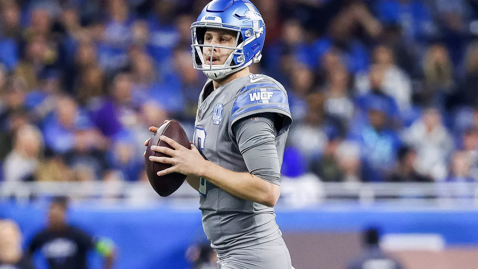
The Lions leak looks fantastic. I am loving the emphasis on blue, silver, and white. Also, I don’t think we have ever seen a striping pattern quite like that one. Pretty sure it’s a custom job. The new look gives an air of the Barry Sanders look while not being a straight throwback. It still feels fresh.
And while, I don’t love the black jersey, I think it’ll look fine on the field. Definitely a helluva lot better than these nasty things, regardless of which helmet they pair it with.
I hope these are sticking around. I rate them as one of the best throwbacks in the league. Perfection.
-
14
-
-
13 minutes ago, Brave-Bird 08 said:
So the Braves have still not worn blue jerseys -- 10 out of 10 road games so far in the greys. I am holding out hope that the fan backlash on the piping change was loud enough that they are going to just to go without them this season, but I am sure it's more to do with the Fanatics delays
The post above yours shows they have them hanging in their lockers. -
Not sure if this was an issue across MLB, but the Braves and Astros both had 42 positioned much lower than I recall in years prior. The number was in the spot assuming a name will be applied. They need to take the Yankees approach and apply the number higher when there isn’t a name.
The Braves have still not worn the new navy blue jerseys. I’m assuming the regular season versions haven’t come in, seeing as they were worn in ST.
Also, how is no one talking about their mismatching home and road belt loops? I haven’t seen anyone reporting on it. I did a deep dive on it a couple weeks ago but the home pants do not match the home pants worn in ST (which were on Nike’s new template) and the homes are also different than the aways.@SportsLogos.Net News any help?
-
1
-
-
I didn’t realize the previous posts were club related in the international thread. Whoops!
I picked up a pair of the new Germany shorts and they are very bizarre. I love the design, but the construction is unlike any other shorts I’ve had before - and I’ve got plenty of player spec shorts! This was my first look at adidas’s new template. The waistband is my main gripe. All of the stretchiness is limited to just the front. The sides and back of the waistband have zero stretch at all. It’s very weird. Once you are wearing the shorts, they fit fine, but even pulling them on, they feel very different. Not really a fan.
-
1
-
-
Teams should not wear perma-memorials. If the owner passes away, sure, wear a patch for that season. But the team does not need to wear a patch 20-30 years after they have passed and ownership has changed hands. I liked how the Ricketts described their ownership of the Cubs. They described themselves as stewards of the ball club. They recognize they are in control right now, but their ownership is really just a moment in time until their time ends.
-
5
-
-
41 minutes ago, upperV03 said:
Arsenal’s home shirt for next season has leaked and, much like the leaked Bayern kit, it is absolutely dreadful. The cannon is great, but the rest is garbage. This template is going to butcher a lot of teams’ looks.
With the navy blue panels and how pronounced the white panels are, it looks like a modern, crappy interpretation of this shirt from 25 heads ago.
-
3
-


:format(webp)/cdn.vox-cdn.com/uploads/chorus_image/image/73291878/usa_today_23066131.0.jpg)


:format(webp)/cdn.vox-cdn.com/uploads/chorus_image/image/73276575/2139232681.0.jpg)
:format(webp)/cdn.vox-cdn.com/uploads/chorus_image/image/73275692/2148455887.0.jpg)


2024 NFL Changes
in Sports Logo News
Posted
These are not as wild as I anticipated. The way they described them as four unique sets made me think they’d be like the Commanders with little to no similar design principles across the set. They do have some differences but enough similarities that they feel related.
That doesn’t mean they are great. They are absolutely a downgrade from the previous set. While fairly safe, the old designs were one of the better NFL uniforms and had little to no flaws.
The new set has several issues. The number font is a step down. Some digits look ok, but others look absolutely horrible (the 2 and 3 in particular). Then there are several inconsistencies where I’d just like them to pick a style and apply it across the entire closet. The navy blue home has a two tone collar. The H Town set has a slightly different single color collar. The away and red alt do not have contrasting collars.
The home jersey looks fine, but the logos on the sleeves are boring when they used to have a flash of red there previously. The away doesn’t look bad, but it looks boring with too much navy. It’s really missing the red numbers. Also, this application of the horn looks best with the blue and red contrasting starkly against the white.
The red set is close but it’s over stimulating with too much red. My OCD is on overdrive because the numbers and pants stripe use both navy and white, while the helmet and jersey horns are strictly navy blue and red. Pop some white in there and it might be good. Also, white numbers would be a better choice, but it looks like they still contrast fairly well.
The H Town uni is its own mess. Don’t need to get into that.
Overall, I’d say a 6/10. Not horrible, but a marked step down from what they had. A few key decisions and these could have been much better.