


UnclearInitial
-
Posts
2,740 -
Joined
-
Last visited
Posts posted by UnclearInitial
-
-
Even if the logo has its flaws, actually having a logo and not whatever squiggly lines and clip art they had is a massive upgrade, and it’s about damn time the Clippers had a nautical inspired logo again.
Not a massive fan of the switch from royal to navy, and of the two new blues I would have rather they switched to light blue with navy in a supporting role.
The wordmarks are probably the biggest miss for me, the entire brand is very similar to the Twins but the wordmark especially run into the computer-generated uncanny valley problem the Twins wordmark has had for decades. The cursive doesn’t look like nautical ropes like the 2010 script. I do like the stacked Los Angeles
Uniforms are fine, especially the red one seems good, but I’m a bit baffled by the monocolor flags when they could have mimicked their own colors. We’ll see how well single color reads. Like how the shorts on the red shorts seem inspired by this pretty underrated uniform
 Spoiler
Pretty surprising that they revealed a massive rebrand as they go into a new arena with an ESPN article 60 games into the previous season. Definitely not how I expected Ballmer to want to make a splash. I’m just glad the new identity isn’t based on blackletter
-
 1
1
-
-
Really sucks that not even national TV games are a reprieve from baseline ads like in the past. The arc of commercialization is long but it bends towards ads being everywhere all the time.
FWIW I’m really enjoying these Knicks City uniforms. The double script is kind of dumb but at least makes a modicum of sense for New York and it’s relatively inoffensive. And the taller arch and letters are so much better than the current compressed version
-
2
-
-
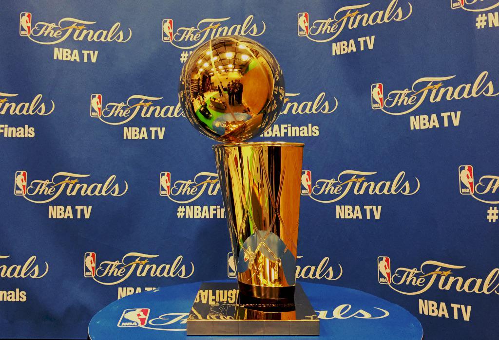
I do like the “NBA Cup” Trophy, it’s a bland name but if it survives until it’s renamed it’s a decent enough trophy. The real atrocity is calling it the “In Season Tournament”, just call it NBA Cup like the trophy or even just The Tournament. In Season makes it sound even more worthless than it actually is
-
3
-
-
Second straight year we’ve seen a team outright acknowledge that they messed up their primary colors in a uniform reveal. Pretty funny video but I realllllly hope they didn’t actually purposefully mess it up for a Twitter video that will be seen by a few thousand people and forgotten a couple hours later
-
2
-
-
Really dumb to sideline the purple like this, especially when the beam had become such a part of their brand.
The new wordmark is great, the updated side paneling is better, but they should have switched purple and black on the wordmark, numbers, arm and collar trim. And obviously the away (sorry, the “Icon”) should be purple. Overall this can’t be anything but a downgrade since they went away from their signature color.
-
7
-
-
What does “We Are 26” even :censored:ing mean as a marketing slogan? How is it memorable or inspiring in any way? There’s 3 countries, 16 host cities, 48 teams. It will be the 23rd World Cup, 96 years since the first one. WHO is 26?
and the “regional logos” are just as uninspired and bad as the main one. I can’t stand this trend where everything needs to be a blank canvas so it has “intermodularity”, “flexibility” and other BS marketing speak that some exec who half-listened to some tech bro’s inane thoughts about the direction of the future of branding wanted to impose
-
1
-
 1
1
-
-
The Knicks City sans-serified version of NBA athletic block is really bizarre, the numbers that don’t have serifs especially took me ages to figure out why it was so uncanny valley until I realized the difference was that the hole in the 9 etc. have an NFL-like 90 degree angle unlike the normal NBA block (notwithstanding the poor choice of numbers in this particular tweet)
-
2
-
-
These instantly become the best jerseys the Magic currently have in their set (although it seems like it’s missing a pinstripe on the front of the shorts). Huge upgrade on the previous Statement and they should make this the primary away with a matching white if they’re intent on keeping the Dwight-era logos. It was always confusing why the T-Mac jerseys had pinstripes side panels and stars on the front when the way it was done here is so much better
-
13
-
-
The inline lettering is better than bevels and at least the dated swooshes are gone… but it’s baffling how they thought this would be received as anything but plain shirts with a script printed on them.
I really like the wine uniforms colors and choosing to have just wine and gold was the right choice (as it was on the LeBron II set)… but it is desperately needing SOME flair. It looks like they’re applying color on color stripes that recall the LeBron II set, so just… actually make them visible? Candy cane striping on the arm cuff could also have worked -
I’d forgotten that the template of the Summer League jersey is also two stripes of the same color that cut off, which is pretty close to the Jazz template if you take out 2 colors like the Jazz did. The templated summer league look is way too similar to the regular uniforms to
-
1
-
-
14 hours ago, mattb6 said:
Recently relegated from Serie A, Venezia has unveiled a new logo.
Really giving me Miami Hurricanes vibes with the orange on the left and green on the right.
Personally I think it’s a clear upgrade, it seems more 80s style conceptual than 10s minimalist for minimalist sake. The profile Lion of St. Marco is way better than the frontal version, I love the grooves that recall the Venetian flag fringes and the ornament of a gondola, and the green for Venice, Orange for Mestre being aligned right-left aligning geographically.
But most of all the previous one was just a mess that had way too many elements, random orange-green stripes and a goofy grinning lion, last years application that did away with the roundel was their best in years. I think the late 00s one with the winged lion holding a ball would have the most potential if they cleaned it up though
-
3
-
-
4 hours ago, JuicedSportsNow said:
From the article: "At first, Smith wanted the team to rebrand to simply black and white, but the league office and Nike refused that, seeing as the San Antonio Spurs and Brooklyn Nets already own that color scheme. Their compromise was this: the Jazz could go to black and white if they added a third primary color. So instead of choosing any one of the colors the team had already worn, he picked a new one: a unique highlighter yellow."
Jazz didn't even want yellow. But they had to pick something. Did they go to the 2014 Nike Store when they did it?Of :censored:ing course the tech bro wanted plain white and black, liked Brooklyn’s brand, and chose highlighter yellow when they told him to pick a real color.
Theres also too much purple in the NBA for the Jazz to claim it as their own distinctive feature without a secondary color like those remix jerseys show.-
4
-
-
I’ve never seen a team ashamed of the rebrand it’s releasing. If this was 25 years ago they probably would have been scrapped at the last minute and become a collectors item. At least when the Suns figured out they were making a mistake ditching purple they managed to make the away jerseys purple.
Kind of emblematic that the face of the rebrand is a bench player and not either of the franchise cornerstones because they’re not even sure if they’ll ever wear these.
-
6
-
-
Got to think it’s between LA and NY for the final, with the loser hosting one semifinal+ the opening match and Mexico City the other. Will Canada host any knockout stage games? Can’t see them hosting more than a round of 16, probably in Vancouver
-
I don’t hate the Cavs going back to metallic gold, but a more brassy color would have been better than this drab Vegas gold. The shadowed C doesn’t work in 2 colors, just use the outlined version. Trying to be 5 different identities at once doesn’t work, the 2003 C Sticks out like a sore thumb, too bad it’s by far the most unique and recognizable part of the Cavs brand, which is why they should simply base their identity on that
-
1
-
-
Why is the Larry O’Bryant trophy base… not the Larry O’Bryan Trophy base?
Huge upgrade nonetheless, but it’s a bizarre decision
-
7
-
-
19 minutes ago, WSU151 said:
You think they'll have a black association and a black statement (with the Jumpman)?
Ryan Smith looks like the type of rich douche who wears plain $500 “luxury” t shirts and baseball caps and desperately wants to look cool. Wade isn’t going to care about the history of the Jazz as much as what can look good on the runways and black is always a fashionable color. I would be shocked if the Jazz didn’t have a black primary if their color scheme is black/white/yellow
-
4
-
-
2 minutes ago, pepis21 said:
Too many to comment so only one question at this moment. Utah has Jumpman and Jumpman is on Statements unis.
Is that mean their away(icon) would be yellow?!
Yellow seems pretty marginal to what they’re pushing this year so I think it means they’ll play Brooklyn Nets dress up in black/white with only some small highlighter yellow details on the home and away
-
The PDX carpet one and the Spurs 96 All Star game fauxbacks look like the only really strong uniforms that will come out of this year. There’s other interesting ones like the cherry blossoms and the Denver Rockets tribute but the NBA needs to give up the fiction that new city uniforms every year work
-
5
-
-
Good G-d, they somehow :censored:ed it up even more (though TBF it might look better, if it wasn’t THE LAKERS)
A simple jersey with just a state name already looks like a college jersey (looking at you Utah), but if your name already sounds collegiate…
-
2
-
-
-
5 hours ago, Conrad. said:
So, is that 1996 All Star Game jersey for the All Star game (unlikely) or will the Spurs use it as a Classic or City? Also looks like the Suns will use shooting sun throwbacks, which will just bring up the question of why they didn’t do something closer to that for the new jerseys
-
8 hours ago, Kramerica Industries said:
You can add Bologna, Crotone, Genoa, and Cagliari in Italy as well.
There might be subtle enough differences on some of those kits just based on which season those pictures might be from, but if you didn't know which team any of these players played for (I purposely chose pictures that didn't show club crests for this reason), you'd have a
 of a time knowing which one was which. And there are years, like last year, when all three are in the same league.
EDIT - apparently I don't know how to properly "hide" photos on this new forum design.
EDIT #2 - add Cagliari to that as well. Actually four teams last year in Serie A with almost identical kit concepts.
In most countries, there’s a color scheme that was used by the most successful soccer clubs in the early 1900’s and everyone copied them, the team the founders were fans of, or just what was available by the sports equipment stores at the time. So in England claret and blue (a “tribute” to Aston Villa, used by West Ham, Burnley, S:censored:horpe) and red and white stripes are popular, as well as yellow away kits. A sizeable number of Spanish teams wear either red and white stripes, blue and white stripes, white, or red and blue stripes. In Italy black and white stripes (inspired by Juventus), maroon (from Torino) and red and blue stripes or halves (both Genoa and Bologna were sources of inspiration) and away kits are almost always white. In the Netherlands, red/ white and black/yellow are very common color combination.
It’s just comparing two very different things, most European soccer teams were started by small groups of people who met at clubs/gyms/factories, branding wasn’t a consideration at all. It’s more similar to a little league team wearing Yankees jerseys because the dad who bought the uniforms is a fan. Even nowadays, teams might change a thing or two from a kit or divert from the traditional design for a few seasons but the traditional design is known to every fan.
And so even the Italian kits presented above, for a fan they wouldn’t be too hard to figure out. Genoa is extremely conservative with their halves and hardly ever changes anything except collars or trims and even their away kit is usually white with a horizontal red and blue stripe, Cagliari is also usually halves but might be more willing to experiment, Bologna is traditionally 4 stripes, Crotone was a lower level team without much support until recently so they’ee allowed to experiment more. (BTW, Serie A 2005/06 had up to SIX teams out of 20 that could be argued being as being black and white. Luckily, only 2 wore traditional stripes, 2 wore “modern versions” of stripes and 2 had non-stripes designs (with one of those frequently wearing another color combination).
-
4
-
-
Didn’t realize that the Memphis wordmark has clawmarks, like the Vancouver Grizzlies one. Pretty cool detail
-
9
-
:format(webp)/cdn.vox-cdn.com/uploads/chorus_image/image/66673555/98198029.jpg.0.jpg)


.jpg)

 of a time knowing which one was which. And there are years, like last year, when all three are in the same league.
24-25 NBA changes
in Sports Logo News
Posted
I wouldn’t mind the Jazz using lavander at all. Hell, pair it with dark green, call it a modern reinterpretation of the Mardi Gras color scheme with distinctively outdoorsy vibes, and you have about as good a fusion of Utah and Jazz as you can have. I doubt they would be able to use lavander as a primary so they’d might get Bucks comparisons but the Bucks aren’t using purple and green as primary colors anytime soon.
And considering the amount of purple in the NBA and paucity of green, especially in the western conference, it would be smart to focus on green instead of purple.