


BigRed618
-
Posts
1,412 -
Joined
-
Last visited
Posts posted by BigRed618
-
-
4 minutes ago, BrySmalls said:
Maybe it's the lighting, but shouldn't the
pinkred be darker? Also, yellow, though not an official club color, was added to the jersey trim because of the city flag?
It is one of their colors, it’s just not used on the badge. The colors are City Red, River Blue, Energy Yellow, and Arch Steel (gray) -
Good job on St. Louis SC. That stadium you made for them looks almost just like the shoebox we have irl! XD
-
 1
1
-
-
You aren’t the first one to try to revive the ASL, but I always love seeing people's different ideas on what might have been. Boston is my favorite so far
-
2
-
-
I’ve always preferred special uniforms for an all-star game. MLB has always had their players wear their team uniforms for an ASG, but had special uniforms just for the Home Run Derby, and I always felt it should be the opposite. When the NFL pitted conference all-stars against each other in the Pro Bowl, they had special jerseys, pants, and socks, but they wore their usual team helmets. Again I always thought that was odd.
-
I read the regulations… it IS legal…
Article 15, Paragraph 03: The team or country name may be used in place of the team emblem, in which case the stipulations of Paragraph 14.03 apply and the height of the letters must not exceed 5cm.
incredibly stupid, but legal
-
2
-
-
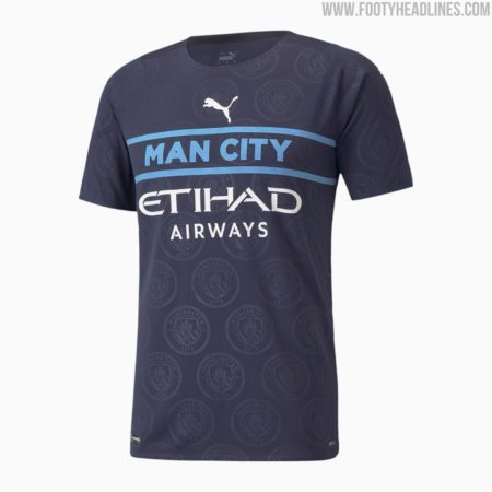
On 8/18/2021 at 1:00 PM, officeglenn said:
Puma's only gone and bloody done it: 10 new third kits all using the same template
- Manchester City (Premier League)
- AC Milan (Serie A)
- OIympique Marseille (Ligue 1)
- Stade Rennais (Ligue 1)
- Valencia (La Liga)
- Borussia Mönchengladbach (Bundesliga)
- PSV Eindhoven (Dutch Eredivisie)
- Shakhtar Donetsk (Ukrainian Premier League)
- Krasnodar (Russian Premier League)
- Fenerbahçe (Turkish Süper Lig)
Man City, par example:

As I said over in the news article, I’m surprised this sort of thing is even allowed. Doesn’t UEFA or FIFA have some kind convention on what a soccer kit is supposed to look like? -
Not a bad take here. The lily looks interesting, and the color scheme is unique. Most concepts I’ve seen for Louisville teams like to use purple, a mix of red and blue which represent the city's two major colleges (Louisville and Xavier.) I can see this being a fun design for their inaugural season, before going with solid pink hoops thereafter.
-
1
-
-
Sorry, but I think they look better with the logos matching. "It’s what they’ve always done" isn’t a very good reason to continue using branding that doesn’t make sense.
Take my own Cardinals as an example. I started following them in my early childhood in the early 90s. By then, they were 30 or so years into a branding that even though it looked okay and there was nothing glaringly wrong with it, it did use no less than 3 different drawings of a cardinal in the same set. (The primary, the Sluggerbird, and the jersey wordmark.) When they updated their brand in '97, most of us, myself included, agreed that it was an upgrade.
-
3
-
-
Edit: nevermind, you already found it
-
3 minutes ago, BC985 said:
I would have preferred this:
I know a certain restaurant that would very much NOT prefer that.Anyway, I do like the colors, though I find it kinda troubling to see so many people mistaking the red for pink. The arch and rivers design is a beauty, I think I just need to get used to seeing it for a bit.
-
Welp... at least we're an SC and not an FC
-
I do like the font they’re using. Very bold, very energetic. Anyway, looks like we have one week left to speculate. A glorious future, or a world of disappointment, is just around the next corner.
-
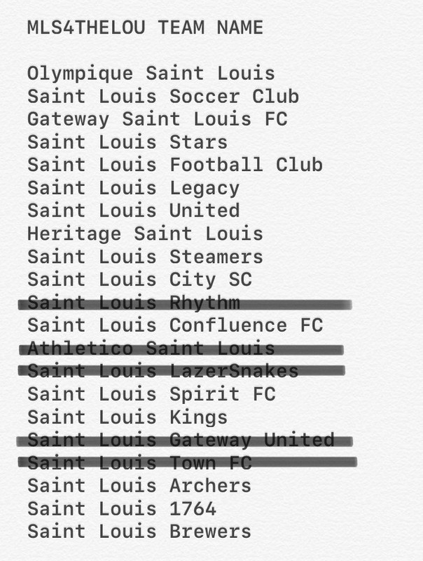
Looking at the list again I just noticed the last one. I can’t believe they’re considering calling them the Brewers! I mean, we have a big brewery, and a good microbrewer community here, but still...
-
1
-
-
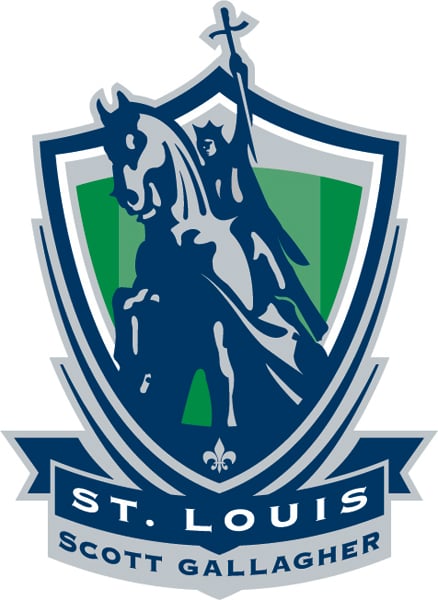
1 hour ago, BC985 said:
Anyone else getting a St. Louis Browns vibe?
This would not be new for St. Louis either. Local club soccer uses the King Louis statue in their logo:
The short lived Athletica also used it for inspiration:
Fun fact: The Scott Gallagher logo was used as the emblem for St. Louis Soccer United, the first serious ownership group dedicated to landing an MLS team in the STL back in the late '00s. Word is they would’ve used that as the crest for the new team if we were awarded the franchise then. -
I’ve seen this list floating around as "official," as in, the team would most certainly have one of these names.
-
If the league is still in the mood to use references from other soccer clubs, Athletic or Wanderers would be a nice fit for the team.
-
Any word from Sacramento about their identity? We'll be all set once they come up with something.
-
The way things are looking, they might become a green team, like the USL team. I was an advocate of them wearing brown at one point, but that might be more suitable to the Sacramento club.
I've come up with a lot of concepts for this team since the conversation for one first began about 12 years ago, I may say since I first even heard of MLS, and I’ve tried out a wide variety of color combos for this hypothetical team. I’m excited to see how the real thing will turn out, and how close it came to any of my "predictions."
I'm a little distraught to hear that their debut will be rolled back a year because of The Cough, but I understand why they have to. I feel a little better knowing that I’ll at least know what they’ll look like soon.
-
3
-
-
On 7/1/2020 at 2:03 PM, nelroy78 said:
Nashville to the Southeast, DC to the Eastern and Montreal to the Central. I know the latter is a bit of a stretch but it puts the Eastern Canadian teams together. But really, I just don’t like having a Washington, DC team in a southern division like they are in the NBA. Here’s my version that I did back when they first announced the expansion.
Atlantic
New England
New York Red Bulls
DC United
Philly
NYC FC
Northeast (or Central)
Montreal
Toronto
Cincinnati
Columbus
Chicago
Southeast
Atlanta
Charlotte
Miami
Nashville SC
Orlando
Here’s how I did the West. I know my Southwest looks wonky but you just can’t split Vancouver from Seattle and Portland and Sacramento from San Jose.Southwest
Dallas
Houston
Austin
LAFC
LA Galaxy
Pacific
Vancouver
Portland
Seattle
San Jose
Sacramento
Northwest
Minnesota
St. Louis
Kansas City
Salt Lake
Colorado
I think I like yours better. It solves all the problems I was having. I wouldn’t have thought of putting the mountain teams in with St. Louis and KC. Putting the Cascadian teams with Northern California was another nice move.-
1
-
-
It’s a beautiful flag. I’m guessing the twelve points of the burst is just for aesthetics?
-
MLS if they implemented division play:
EASTERN
Metropolitan
- NYCFC
- NY Red Bulls
- New England
- Philadelphia
- Montreal
Southeast
- DC United
- Charlotte
- Atlanta
- Orlando
- Miami
Central
- Chicago
- FC Cincinnati
- SC Nashville
- Columbus
- Toronto FC
WESTERN
Midwest
- Kansas City
- St. Louis
- FC Dallas
- Austin
- Houston
Northern
- Minnesota
- Colorado
- Salt Lake
- Sacramento
- Vancouver
Pacific
- LA Galaxy
- LAFC
- San Jose
- Portland
- Seattle
Had a bit of trouble deciding how to sort the western teams. It was between putting MinnU in a division with teams in the Rockies and one on the west coast, or putting the Loons in the Midwest and having to split up either the KC/STL rivalry or the Texas three-way.
-
I never liked the Atlanta Falcons' '90s uniforms. It drove me nuts that they had no red whatsoever in their helmets, and that they had silver pants for some reason.
-
7
-
-
I’m surprised they aren’t putting ads on the jerseys, like NFL Europe did.
-
1
-
-
Okay, I admit it, BattleHawks is kinda silly, but you can not deny that their logo is the best one. It reminds me of the emblem of the British Special Air Service...


Playing Around with the Twins' New Look
in Concepts
Posted
The stars over the I's is what that look needed. Nice job