


ThePreacher
-
Posts
457 -
Joined
-
Last visited
Posts posted by ThePreacher
-
-
I actually love this logo http://www.sportslogos.net/logo.php?id=o6qyjofnhqsmxdrs96f9uxceg
The more I look at it, the more it reminds me of Max Headroom.
In the words of one "Chum Lee", ...Awesome.
-
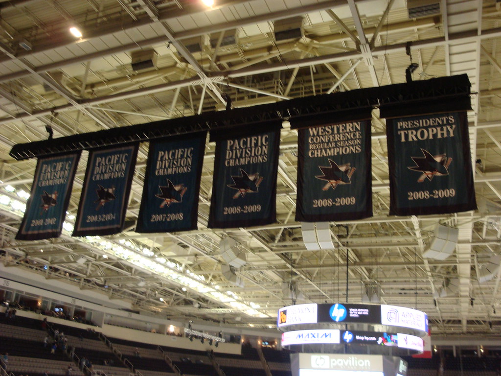
Current San Jose Sharks Banners
[img removed]
God i wish they'd take taht western conf reg season banner down... if you won the Pres. Trophy.. of course you won your conf.
This perfectly exemplifies why the San Jose Chokes Sharks are the biggest joke of a franchise in the National Hockey League. The fact that Northern California has an unrequited hatred of Southern California, coupled with the fact that the Kings played the first SCF in CA hockey history, and the Ducks both appeared in the 2003 and 2007 SCF (winning the latter), gives San Jose Sharks fans the most massive inferiority complex in sports (this side of Boston's penis envy with New York, of course.)
Oh, San Jose, how very pathetic you are.
The city's official motto should be: "San Jose - The Minor League Sports Capital of California!"
And the Sharks should update their wikipedia entry to reflect their biggest rivals to be: The Ducks, Predators and, umm... the second round of the NHL playoffs.
If you can't put your immature team / city partisanship aside and make objective posts in the logos board, then you should join Panny in the kiddie board until you learn how to behave.
Yes, I know - backseat mod. It's just really annoying.
Oh, pardon me. For a second there I forgot my sports fan manual... let me just turn to the page where it prohibits trash-talking...
Turning...
Turning...
Turning...
Hmmm..
I can't find it!
Perhaps you could direct me to which chapter it's filed under?
-
Current San Jose Sharks Banners
God i wish they'd take taht western conf reg season banner down... if you won the Pres. Trophy.. of course you won your conf.
This perfectly exemplifies why the San Jose Chokes Sharks are the biggest joke of a franchise in the National Hockey League. The fact that Northern California has an unrequited hatred of Southern California, coupled with the fact that the Kings played the first SCF in CA hockey history, and the Ducks both appeared in the 2003 and 2007 SCF (winning the latter), gives San Jose Sharks fans the most massive inferiority complex in sports (this side of Boston's penis envy with New York, of course.)
Oh, San Jose, how very pathetic you are.
The city's official motto should be: "San Jose - The Minor League Sports Capital of California!"
And the Sharks should update their wikipedia entry to reflect their biggest rivals to be: The Ducks, Predators and, umm... the second round of the NHL playoffs.
-
One of my favorite China fakes:
This is my favorite Blues uni of all-time. Yes, I know they are called the "BLUES", but I like the red accents. Bring it back!!! (Even though their current alt is pretty cool - it does feature the overused circular fauxback logo)
-
Don't worry. I think LA Angels of Anaheim is pretty dumb too.
That makes two of us.
Not sure I understand your beef here... it sounds like you don't like contrived "species" like Mighty Ducks and Golden Gophers, but Timberwolves and Devil Rays are actual animals.
I understand they're actual animals (or rather, sub-species?), I just think it's dumb. For instance, Anaheim Ducks sounds cool. Anaheim Mallard Ducks sound retarded.
-
Minnesota's Christmas jerseys suck.
/nodding head vigorously.
I don't understand how people think the Wild are the best expansion team (aesthetically) of the last 12 years.
not only is this one of my favorite expansion unis, it's one of my favorite non-original six sweaters in the NHL:

And it's waaayyyyy better than this:

This:

and this...

...I would probably like the WIld a helluva lot more if they didn't have such a stupid name. Vikings? Rad. Tons of Scandinavians in Minnesota. Twins? Awesome. Classic, and makes sense geographically speaking. Timberwolves? Eh... not too hot on this or any other names like it (see: MIGHTY Ducks, DEVIL Rays, GOLDEN Gophers, etc. etc.) ... But the Wild? Easily one of the worst names in professional sports. Sounds like a WNBA name. So does Thunder.
*Yawn*
-
Second of all, this is the "Unpopular Opinions" thread. What were you expecting, popular ones?
I think that 80% of us are legitimately posting "unpopular" logos, uniforms and color palettes that we genuinely like, and then 20% of the people are here are just attempting to post the most outrageous uniforms they can find and claim they like them. I don't know if they're attempting to be funny, or if they're doing it for attention, but IMHO it qualifies as quasi-hijacking, and I find it obnoxious. That being said, I'm no misanthrope - I just have a low tolerance for incompetence and intentional stupidity.
No blue please, I hate the blue.Couldn't agree more! The Penguins, much like the San Diego Chargers (and many MLB teams & the Denver Nuggets) all looked AWESOME for like the first 3 months they came out with this PBFPBS (Powder Blue for Powder Blue's Sake), but now it just looks boring, uninspired and homogeneous. They need to go back to their original Penguins logo with the scarf. That is classic and AWESOME (and quite frankly, it should be the template the Ducks should have followed when designing their new uniforms, instead of this dumb, minor league baseball wordmark logo they have currently.)
-
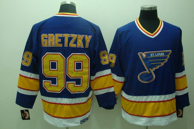
abso-freaking-lutely. I love the yellow home uniform they had up until the year before Gretzky.
Were the Kings one of the first BFBS teams in the NHL??? It's hard to believe it's been, what, almost 20 years since "The Trade"...
-
Posted Image Posted Image
And these were the Ducks' second-best. This would have made a nice everyday-use set, honestly.
Ok, honestly.. at this point, I think a lot of these posts are hyperbole. Or just who can come up with the most absurd/ugly uni they can find and then claim they "loved" it just for the sake of being (in their mind) funny.
-
The more time goes back, the more I miss these, and the more I loathe their current set. Especially the white roads. Ew. And NO, the webbed "D" alone would NOT make a "good" logo. They have one of the best names in the NHL (you know, an actual animal - instead of an adjective like "Wild") and they choose a WORDMARK!?? Baffling.

-
And these NEED to come back ASAP - The NHL needs more color, and this would work quite nicely:

One of the best NHL logos/color combos/uniforms in the history of the league IMO. And no, that is not hyperbole. And yes, this is coming from a Ducks fan.
-
This is the best uni set in Anaheim Ducks history:

-
Terrible analogy. ManU has been successful for more than 50 years. The Angels have not been in business half as long that Man U has been. Plus, while the population of Manchester has gone down, they are still a draw on TV. Meanwhile, the Angels ca get good attendance, they are bottom 3 in local TV ratings. Nice job with 6 million "fans".
Look who else is towards the bottom there (26th out of 29th - No ratings available for Toronto): The Los Angeles Dodgers (and LA is home to over 9,000,000 people!!!)
Also, look at the undisputed "most popular team in baseball", the New York Yankees who OWN their own freakin network and NY is home to over 15,000,000 people! (Not to mention hundreds of thousands of fans nationwide and worldwide) - they are ranked TWELFTH!!!
However, let's look at attendance for the Angels and Dodgers:
2009: 1. LA Dodgers (3,761,653); 5. Anaheim Angels (3,240,374)
2008: 3. LA Dodgers (3,730,553); 6. Anaheim Angels (3,336,744)
2007: 2. LA Dodgers (3,857,036); 5. Anaheim Angels (3,365,632)
2006: 2. LA Dodgers (3,758,545); 5. Anaheim Angels (3,406,790)
2005: 2. LA Dodgers (3,603,646); 4. Anaheim Angels (3,404,686)
Look, in Southern California (arguably one of the most beautiful places on Earth, and also one of the largest vacation destinations in the world), people have better things to do than sit inside watching television. Clearly, we ATTEND our team's games, and sellout routinely, but with so many entertainment options (not to mention the thousands of specialty networks, channels, programs, etc. on television today - AND the internet), I'm honestly not surprised that TV ratings are so low for the Angels and Dodgers.
Frankly, your point is moot.
I rest my case.
ps) These are your Top Five Attendance Rankings for the 2010 season thus far -
1 LA Dodgers - (2,375,826)
2 NY Yankees - (2,303,395)
3 Philadelphia - (2,205,950)
4 Anaheim -(2,072,331)
5 St. Louis - (2,052,809)
-
I understand many don't like the Disney looks of either the Angels or the Ducks, but in my opinion, I really think both of those identities were great.
Completely disagree with your assessment of the Periwinkle look, but I LOVED Disney's idea to change then name from "California" Angels to "Anaheim" Angels (as there are FOUR other baseball clubs in California.)
ps) Did you know they almost changed the name to the "Mighty Angels of Anaheim"??? Haha! How AWFUL would that have been!?
Also, here's a great argument in favor of retaining the Anaheim identity and dropping Los Angeles from the name...
"During his testimony this week, Moreno put on an exhibition of how not to win over friends in Anaheim. At one point, he noted that the name changed was focused around drawing fans from the ?L.A. media market.? In doing so, he compared the Los Angeles Angels of Anaheim to the New York Yankees and Mets. Those two teams don?t pay homage to the Bronx and Queens respectively; why should he pay homage to Anaheim?
Of course, what Moreno failed to mention contains a little lesson in geography. The Bronx and Queens are part of New York City while Anaheim is part of the O.C. It?s not a borough in Los Angeles; it?s not a suburb of Los Angeles; and in fact, it?s a good 30 miles away from Los Angeles. The New York Jets and Giants of New Jersey are closer to their namesake than the Los Angeles Angels of Anaheim are to theirs."
-
They did start life as the Los Angeles Angels, though. And it's not like people who live in LA really accept the Angels as "LA's baseball team," anyway.
Precisely why the name change is so dumb.
It's not like Anaheim/Orange County is a "small" market! Orange County is home to 3,000,000+ residents (as of 2008), and surrounding Riverside and San Bernadino Counties (which are primarily Angels fans - especially in Riverside), are home to 2,073,571 and 2,060,950 citizens, respectively.
So you imagine 3,000,000 OC fans, 2.1 million Riverside fans, and HALF of San Bernadino rooting for them (the other half swearing allegiance to Los Doyers), that's OVER 6,000,000 people right there! It was absolutely ludicrous to change the name! (Even if he did it to appeal more to an international [see: Mexican] audience, and the rest of the US) It's not like Anaheim has had more televised games because of it, or sold more merch. All they need to do is continue to keep winning the AL West and remaining competitive (and hey, maybe beat those damn Sawx for once in the postseason), and they'll have plenty of fans!
I mean, look at Manchester United! One of the most RECOGNIZABLE sports brands on Earth, and it's because they're successful, NOT because they're from a big city like London (home of powerhouses like Chelski and Arsenal, but also lesser-known clubs in the U.S. like Tottenham, Fulham and West Ham United. Manchester has a population of 394,269, which is good for SEVENTH in England (and slightly larger than Anaheim), however, Greater Manchester has a population of 2,240,230, which is nearly a MILLION less than Orange County, yet look how famous MANU are world wide!!!
ARE YOU TAKING NOTES, MR. MORENO!??
-
ps) You know what, when they actually played in Los Angeles (at Wrigley, and then later Chavez Ravine aka "Dodger Stadium") they had a nice set of unis:
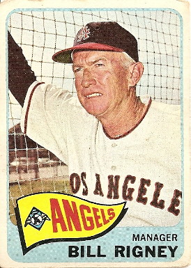
Plus this is cool.
Here's a cool guide to the evolution of Angels logos since their introduction from the Pacific Coast League to the American League in 1961:
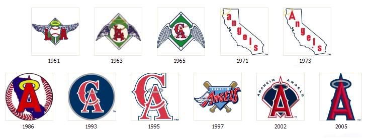
...which do you guys like best?
I'm going with their short lived 1971-73, 1993-97 and 2002-05 looks.
-
Despite the fact that EVERYONE seems to love him and he is routinely ranked as one of the best owners in North American professional sports, I absolutely LOATHE Arte Moreno slapping the faces of 353,643 citizens of Anaheim and the 3,010,759 citizens of Orange County (not to mention 9,848,011 Angelenos) by changing the ANAHEIM Angels to the "Los Angeles Angels of Anaheim."
Not cool, Phoenix Arte Moreno of Tuscon, not cool at all.
Go ahead and lower beer prices some more. I still hate you.
ps) Really Reagins? Is Hideki Matsui and Dan Haren all you got??? (ESPECIALLY after letting go of Garret Anderson, Vlad "Breakout Season in Texas" Guerrero, John "If You Can't Beat 'em Join 'em" Lackey and Chone "9-Tool" Figgins)!?
Ugh.
It's been tough being an Angels fan over the last 8 years. And the 41 years before that. And although I despised the periwinkle set that so many of you seem to love, I also don't care for a team ORANGE County called the ANGELS primary color being RED. They did that just to be the "red team" to the Dodgers' blue.
Time to go back to this:
 ...
... OR Possibly this!!! --->
 (I cannot believe this was the ONLY "lowercase A" pic I could find of the '71 Angels)!
 ---END RANT---
Unpopular Opinions
in Sports Logo General Discussion
Posted
//Double Sigh...