


hockey week
-
Posts
2,445 -
Joined
-
Last visited
-
Days Won
2
Posts posted by hockey week
-
-
On 3/18/2019 at 2:22 AM, PepMan33Conde said:
Didn't know the Blue Jackets once sold their home jerseys that featured a sublimated mesh that was patterned after the US flag. What's funny also is it's a Pro Player jersey.

I've never heard the flag thing, but they did use these for their first few seasons. I was told it was a little soccer-centric nod to the very popular soccer teams of the area. Even wearing it, you'd probably never notice the stripes unless you're in very bright light.
-
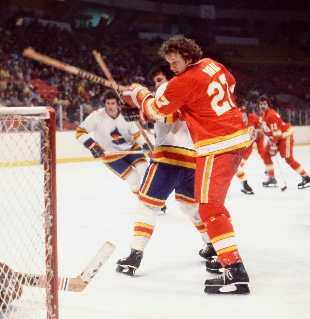
I've posted on this before, and the links that had evidence have all since gone dead, but the Penguins' logo was often rotated incorrectly because people thought the penguin was running instead of skating.
You can find the occasional really old Pens jersey with this rotation, because stores were merely sold the rights to make the jersey and the crests to put on them
For the image to come from the league is embarrassing, obviously they hired an American who wasn't all that familiar with what skating looks like.
-
 2
2
-
-
7 hours ago, SFGiants58 said:
I would be totally cool with the NHL dropping the requirement for NOB's, especially for Original Six teams. It could really help teams with traditional aesthetics evoke an additional vintage style. I'd advocate for teams to try it out during an outdoor game, be it the Winter Classic or Heritage Classic.
Besides, they're not as important as TV numbers (pre-empting a @hockey week reminder on the importance of TV numbers for sportscasters).
I'm glad I'm getting a bit of a reputation around here lol. Look, they're important! 5 hours ago, infrared41 said:
I'm not a fan of monochrome looks (except all white) but I really like the Jags black jersey with white pants combo. I guess that's half an unpopular opinion.
Me too. I'm actually not a big fan of monochrome white, with rare exceptions I think it looks odd (I have to say the Colts are probably the biggest exception). So I'll join you on that one.
-
1
-
-
Based on the arrangement of that first photo of them, they might rearrange them. Maybe it's difficult to do a dramatic raising ceremony from anywhere but the centered position.
-
2
-
-
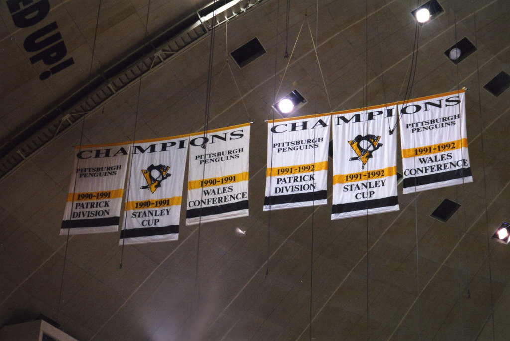
Penguins have changed their banners AGAIN. I was against it last time, but at least they looked good. Can't say that this time.

Previous change:
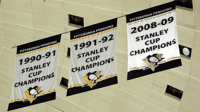
Originals:
-
1
-
-
Holy crap
1) how have this many huge finds happened in just a few days? Why this sudden concept bonanza?2) How was the flushing toilet bowl of a logo that the Thrashers used THE BEST idea they had?! Those are all TERRIBLE.
-
and for whatever reason, this was posted in the Blues' jersey thread, so I'm moving it where it belongs

Note the lack of gold in the white jersey. They're just discarded Leafs sweaters with a new logo
-
1
-
-
I posted this in the thread about the unused Blues uniform, but I wanted to put it here, where it belongs. I'm shocked that it still exists and more shocked at the timing of it, considering that thread was just created.
http://www.stlouisgametime.com/2016/3/25/11306036/the-first-blues-jersey-is-found
/cdn0.vox-cdn.com/uploads/chorus_asset/file/6246043/white_original_blues_jersey.0.jpg)
/cdn0.vox-cdn.com/uploads/chorus_asset/file/6246045/original_blues_jersey_closeup.0.jpg)
-
5
-
-
There also seems to be some issues with past quoted posts. I hope some of the imagery of the board returns, banners and whatnot, but it seems alright.
-
1
-
-
When the Penguins first unveiled their new logo, it was separate from when they unveiled the new jerseys. There were some instances of the new logo on old jerseys. Somewhere I have a Penguins Kids Club hat from that year where Iceburgh (the Pens' mascot) is wearing this jersey.
It's a bit weird to see, knowing that this look never happened.

-
I'm pretty sure the Penguins logo seen here was the prototype logo for 1967.
I first saw that logo waaaay back in the 1990s when I was watching a documentary about the 1967 expansion. They showed rare footage of the six expansion teams playing each other and then doing interviews for the press. It was in this video the Seals were still wearing their WHL uniforms. They then showed a graphic showing all the logos for the new teams. This logo flashed on the screen for the Penguins.
I always remembered that and spent years on the Internet trying to find it (thinking it was all my imagination). Until I stumbled across this ad from 1967.
I always remembered the triangle looking like a normal triangle in that the point was facing upwards and the Penguin was leaning back with his stick in the air.
Then they modified the logo before the season to this
 - Penguin with scarf in a white outlined circle and yellow triangle")
Changing the triangles position and having the Penguins with his stick on the ice. As well as a roundel being added to the logo.
I actually know exactly what the deal is with that tilted Penguins logo. It was explained to me at one point and then I saw a purchased jersey from that era that fully corroborated the story.
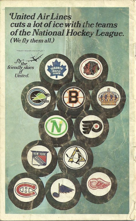
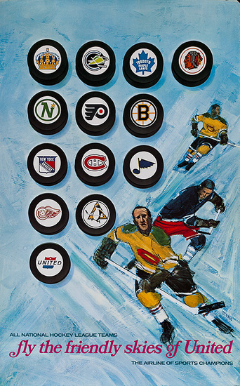
Way back, before jerseys were common products, department stores like Sears or Hornes were given contracts to make jerseys, rather than just sell them. They'd be given patterns and the jerseys would be made in that stores' distribution system, sometimes the crests would be made elsewhere and added (which is why you can still find the old 8" Penguins crest loose if you look around). In those early days in areas where hockey wasn't well known, it was a very common mistake to put the penguin sideways, as though the penguin were running because it never occurred to them what skating looks like. If you see a Pittsburgh jersey from the late 60s, it's not uncommon to find a crooked logo on it.
United clearly had little experience watching hockey and thought the same thing.
I'll have to try find a photo, it was so cool seeing that story come to life
-
1
-
-
From Uni Watch Blog todayUser ActionsFollow
 Vintage MN Hockey@VintageMNHockey
This photo surfaced @UniWatch from a @9modano & Smith signing in 1989 (Never seen ☆ prototype jersey in background)?

I know I've never seen these jerseys before, has anyone else? There's some snazzy elements to them, but probably an overall mess. Thoughts?
If I recall this jersey was proposed for the North Stars because they played in the Norris Division which at the time was dubbed the Black and Blue division due to the fact that all the teams in that division played tough hard hitting hockey. The designer came up with a black jersey to reflect that and a corresponding white. The plan was to actually have it be an alternate uniform set to the classic green/gold set. But when they found out they couldn't use it without making it a full time home/away set, it was dropped.
The secondary logo on the arm was the inspiration for their uniform change 3 years later.
Looking at those stripes that go from the shoulders down to the gloves, I wonder if the Wild's original jerseys were inspired by these prototypes.
And the color of the stripe is the same color as the jersey (as opposed to the stripe being opposite color a la Winnipeg)? You might be on to something.
-
-
I just realized that the logo has no words on it, which is not what they went with in 2007.
Strangely, now I can't take my eyes off of it...I like it. I actually like this logo.
-
One of the Starter fashion jerseys, one of many. You'll see the blue/blue treatment of the Flyers, yellow jerseys for the Panthers and Blackhawks, black Red Wings, and a pretty decent royal/navy jersey with the robopen Penguins. Just a fashion jersey that time kinda forgot.
-
honestly, I think you dropped the purple, it'd be the best Yotes concept I've seenn
-
1
-
-
you need some white in the collar of the blues, a lightning bolt on the pants (people loved that feature so much that they demanded it came back for the current unis, and the team actually listened), and that's really it. I really like it, it looks unique for the NHL, and makes that logo pop a whole lot more. Nice work.
-
Just realized that the Colorado Rockies and the Calgary Flames overlapped for a season, but the closest I've come to finding photos from those matchups (if they did happen) are these:
Which is obviously the Atlanta Flames (there's a handful of Atlanta vs Colorado photos out there)
and

-
The NBA needs a lot of work, all the uniforms need to be updated with the NBA logo on the back and add the gold tags to the teams that feature one for the previously won championships.
The new Atlanta Hawks uniforms need to be added, along with the new PacMan logo, and their new PacMan court.
The new road Boston Celtic uniform, the sleeved St. Patricks Day uni, and the mental illness that is their pride uniform need to be uploaded.
The Charlotte Hornets new uniforms need to be uploaded.
The Cleveland Cavaliers need the navy uniform they played against the Hawks in a few seasons back as well as their new navy alternate they are wearing this year. They also need the court they used during 10/11-11/12 as well as the new court for this season.
The Dallas Mavericks need the new 15/16 uniforms uploaded although I'm not sure if you plan to wait until next season to upload those.
The Golden State Warriors need their new 'slate' uniform uploaded.
The Los Angeles Lakers need their atrocious sleeved Hollywood Nights uniforms added.
The Miami Heat need the MIAMI script road uniforms added as they no longer wear the black road uniforms that say HEAT.
The Milwaukee Bucks primary logo needs to be updated. It says BUCKS not BuckS, along with their road and home uniforms.
The Minnesota Timberwolves need their sleeved black uniform uploaded.
The New Orleans Pelicans need their red alt. uniform added.
The New York Knicks orange alt. now has a blue NOB rather than a white NOB.
The Orlando Magic need their silver/grey sleeved pride uniform added.
The Portland Trailblazers need the sleeved Rip City uniform added.
The Sacramento Kings new uniforms for this season need to be added.
The San Antonio Spurs need the sleeved and non-sleeved cameo uniforms added.
I believe the Jazz had a slight change in uniform this year as well. I think something extremely minor changed colors.
The Washington Wizards no longer have the stripe on the back side of their home and road uniforms and they need the new blue alt. uniform added.
The BIG Color christmas uniforms from 2012 need to be added along with the disease that was last years Christmas uniforms.
The sleeved and non sleeved Latin Nights uniforms need to be added.
After that laundry list, my requests to correct the info on the Mercyhurst University page looks tame lol. I even gave the correct descriptions.
I have read your Mercyhurst posts, and I'll get to those corrections and updates soon. BTW, do you happen to have or know where I can find the currnet Mercyhurst University Athletics style guide or Graphics Standards manual?
I don't, but I will send a few emails and see if I can track one down.
-
The NBA needs a lot of work, all the uniforms need to be updated with the NBA logo on the back and add the gold tags to the teams that feature one for the previously won championships.
The new Atlanta Hawks uniforms need to be added, along with the new PacMan logo, and their new PacMan court.
The new road Boston Celtic uniform, the sleeved St. Patricks Day uni, and the mental illness that is their pride uniform need to be uploaded.
The Charlotte Hornets new uniforms need to be uploaded.
The Cleveland Cavaliers need the navy uniform they played against the Hawks in a few seasons back as well as their new navy alternate they are wearing this year. They also need the court they used during 10/11-11/12 as well as the new court for this season.
The Dallas Mavericks need the new 15/16 uniforms uploaded although I'm not sure if you plan to wait until next season to upload those.
The Golden State Warriors need their new 'slate' uniform uploaded.
The Los Angeles Lakers need their atrocious sleeved Hollywood Nights uniforms added.
The Miami Heat need the MIAMI script road uniforms added as they no longer wear the black road uniforms that say HEAT.
The Milwaukee Bucks primary logo needs to be updated. It says BUCKS not BuckS, along with their road and home uniforms.
The Minnesota Timberwolves need their sleeved black uniform uploaded.
The New Orleans Pelicans need their red alt. uniform added.
The New York Knicks orange alt. now has a blue NOB rather than a white NOB.
The Orlando Magic need their silver/grey sleeved pride uniform added.
The Portland Trailblazers need the sleeved Rip City uniform added.
The Sacramento Kings new uniforms for this season need to be added.
The San Antonio Spurs need the sleeved and non-sleeved cameo uniforms added.
I believe the Jazz had a slight change in uniform this year as well. I think something extremely minor changed colors.
The Washington Wizards no longer have the stripe on the back side of their home and road uniforms and they need the new blue alt. uniform added.
The BIG Color christmas uniforms from 2012 need to be added along with the disease that was last years Christmas uniforms.
The sleeved and non sleeved Latin Nights uniforms need to be added.
After that laundry list, my requests to correct the info on the Mercyhurst University page looks tame lol. I even gave the correct descriptions.
-
Information for your Mercyhurst University Page
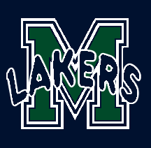
This logo was the Primary logo of Mercyhurst Athletics from 2000-2012
http://www.sportslogos.net/logos/view/532846000/Mercyhurst_Lakers/0/Alternate_Logo
This logo was the alternate logo of Mercyhurst Athletics from 2004-2012
http://www.sportslogos.net/logos/view/532890970/Mercyhurst_Lakers/0/Primary_Logo
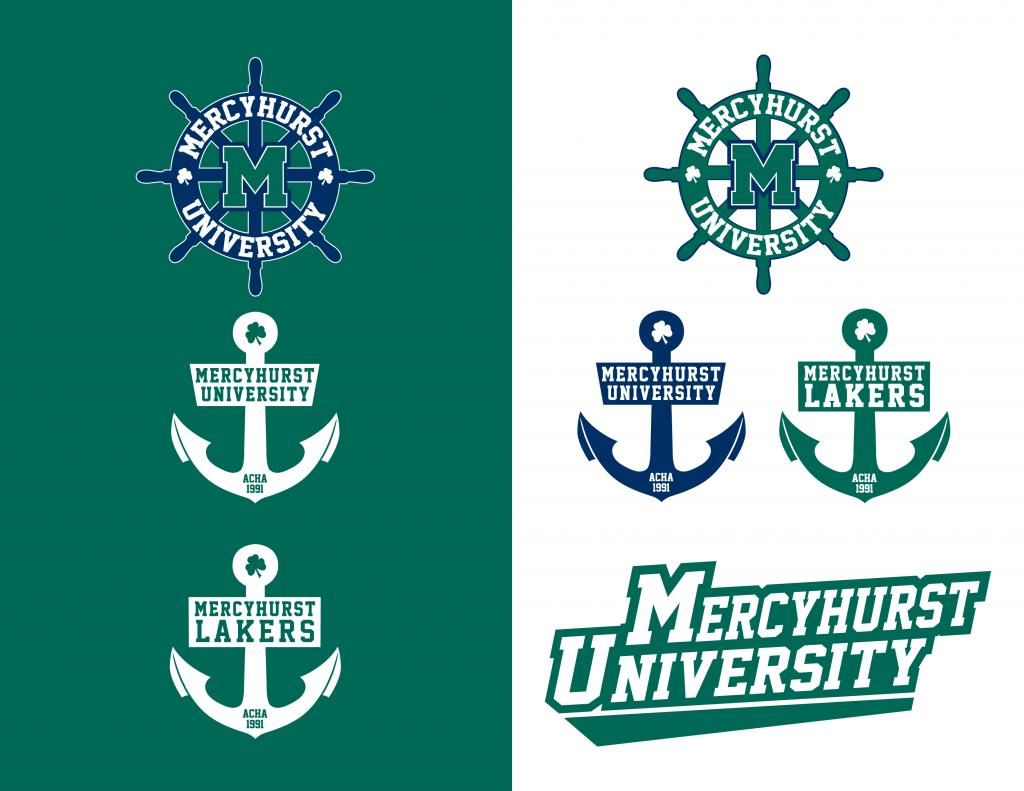
This logo became the Wordmark of Mercyhurst Athletics with a major rebrand. Mercyhurst College became Mercyhurst University and so the logos and wordmarks had to reflect this. This logo is the current wordmark
http://www.sportslogos.net/logos/view/532881002009/Mercyhurst_Lakers/2009/Primary_Logo
THIS is the Primary Logo of Mercyhust athletics. It is a unique M that they worked very hard to distinguish from other schools. It was implemented in the College-to-University rebrand of 2012. It is the current Primary Logo.
http://www.sportslogos.net/logos/view/532856012005/Mercyhurst_Lakers/2009/Alternate_Logo
These two logos have been the primary identity of the NCAA DI hockey teams at Mercyhurst from 1987-2012
http://www.sportslogos.net/logos/view/532857610/Mercyhurst_Lakers/0/Alternate_Logo
http://www.sportslogos.net/logos/view/532862590/Mercyhurst_Lakers/0/Alternate_Logo
This is the new primary logo of the NCAA DI hockey teams at Mercyhurst since the rebrand in 2012
http://www.sportslogos.net/logos/view/532815982005/Mercyhurst_Lakers/2009/Alternate_Logo
Primary Wordmark since the rebrand, 2012-present
http://www.sportslogos.net/logos/view/532845152009/Mercyhurst_Lakers/2009/Alternate_Logo
This is the new logo of the University, it is used by the college teams as an alternate logo and is seen on the shoulders of the NCAA DI hockey teams.
http://www.sportslogos.net/logos/view/532819032012/Mercyhurst_Lakers/2012/Alternate_Logo
This is the alternate logo of the ACHA DI hockey team at Mercyhurst. The primary is a green ships wheel as posted in the previous post, but because most of the websites are green, the blue wheel is used for publications. It has been used from 2012-present
http://www.sportslogos.net/logos/view/532846602005/Mercyhurst_Lakers/2012/Alternate_Logo
-
I was SO excited to see Mercyhurst University added to the site!
I want to add everything I know about the logos and their history so that they can be properly noted.
The following need to be added:
The original athletics logo lasted from 1973 through 1994.

1994-2000

This secondary logo was used from 2009-2012
And this logo was the hockey team's first logo, used from 1986-88
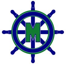
These were added in 2012 and are the current logo of the ACHA hockey team at Mercyhurst University. The Ships Wheels are the primary, the Anchors the secondaries, and the wordmark is a tertiary
-
Holy mother of god, two absolutely horrific never-used third jerseys that the Penguins rejected in 1994:

icethetics source: http://www.icethetics.co/blog/2014/10/22/designing-the-90s-part-5-history-blue
Original source: http://pittsburghhockey.net/penguins/uniforms-overview/1994-95-pittsburgh-penguins-alternate-jersey-prototypes
-
2
-
-

http://auctions.frozenpond.com/vintage-los-angeles-kings-jersey---21--lot330.aspx
I think these are actually quite nice. Could be from before the team's original identity was created.
-
2
-


2021-2022 NHL Jersey Changes
in Sports Logo News
Posted
I think the jersey just needs to be simplified. The green shoulders disappear on tv anyway, time to scrap those. Everyone complained about Carolina's original jerseys being too much, the Kachina Coyote is far more busy.
Keep the Kachina, simplify the elements around it.