


-Akronite-
-
Posts
1,256 -
Joined
-
Last visited
Posts posted by -Akronite-
-
-
3 hours ago, Krona said:
The hill I'll die on is the should swap grey, white and brown facemasks depending on combos. Grey with brown jersey/white pants, white with brown/orange & white/orange, brown with white throwbacks & any time the insist on brown pants.
Not all that concerned with attaching facemasks to jerseys, but I think the Browns have the ability to look good with brown, white, and gray facemasks, so why not mix and match.
-
Baby NOB look like :censored:.
-
 6
6
-
-
On 3/24/2024 at 1:00 PM, henburg said:
This just looks so bad to me, the colors don't complement each other whatsoever. They look like the non-contact practice jerseys that QBs wearYeah, I don't like it at all. And the torquoise doesn't even seem right, there should be some green in the hue. Don't mind the meaning/use of an alternate color.
-
1
-
-
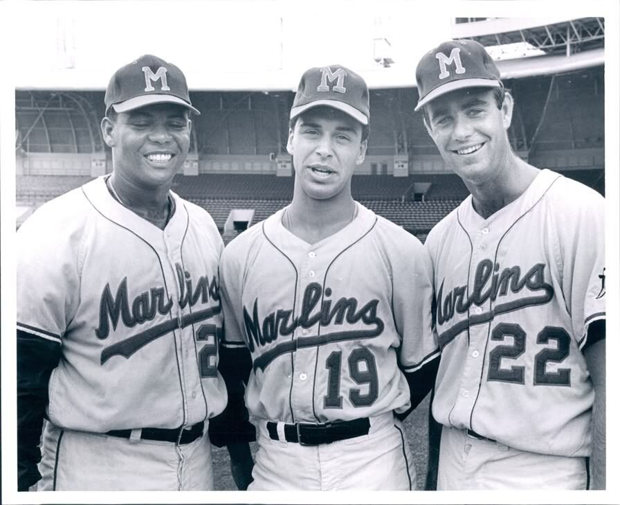
On 3/12/2024 at 11:10 AM, MJD7 said:
Miami Marlins
This jersey is based on the Triple-A Miami Marlins that existed from 1956-1960. Pairing the design with the modern colors personally reminds me a bit of the Miami Art Deco District.

I adore that sleeve logo! Was that something the old minor league team used or did you make it? It's head and shoulders ahead of anything the modern franchise has done and, honestly, better than any iteration of the dolphin either.
-
12 minutes ago, Brave-Bird 08 said:
We could be getting a perfect matchup of silver and blue vs gold and red, but Detroit has to be dumb
If they make the SB they will probably make a similar error. But there's a chance we get something gorgeous. Don't need another red bowl.
-
On 1/23/2024 at 10:43 AM, LMU said:
Dropping unnecessary outlines and trim on road gray jerseys is always a positive. See: Dodgers.
Apples and orange. Yankees didn't use a double outline and don't have a vibrant blue. Same with the Tigers, the orange can do the job which makes the white redundant. Don't feel the same applies for the Yankees.
In modern gray, I think the stripes worked better. The classic look was lovely on the flannel gray. But I guess I'd land at "lateral move."
-
2
-
 1
1
-
-
On 1/24/2024 at 9:08 PM, MCM0313 said:
You know what I wish they’d do? Bring back the purple as a nod to their New Orleans origins, and the baby blue from the mid-aughts since jazz music is based on the blues, plus a nice sky blue seems appropriate for Utah. The cool color scheme complements the mountainous terrain. If they need a warm color for balance, bring back the copper from the Purple Mountains’ Majesty set. For a bit more of a New Orleans flavor, use green as a trim color, or don’t.
I still feel like their double-blue from the mid-aughts was a missed opportunity, and the dark blue should instead have been purple (which stayed in that logo anyway).
I've always liked this suggestion and I love that the NBA has so much purple. Pairing the Red Rocks format with the cool color scheme has been my preferred modernization route (90s look is fun but not worth bringing back full time IMO).
Have never understood the clamoring for copper, personally. The contrast between a bright blue and a darker purple would be plenty to work with.
-
It's been a long journey for Michigan to get back to the national championship. They haven't played in a title game before and Harbaugh was dogged for years about losing big games (against rivals and in bowls). Not to mention everything that went down this season.
And they choose not to wear their classic, iconic uniform in favor of alternate monochrome pants. They are so easy to hate. Go Huskies!
-
5
-
-
8 hours ago, BBTV said:
Only when Christmas is a Saturday, Sunday, or Monday. NFL isn't going to have a triple header on a Wednesday.
I think they came out and said they wouldn't do Tues or Wednesday. But most years in the near future would be on other days when it would be in play.
I don't think the NBA will drop Christmas games, though, even if playing second fiddle in the ratings.
Adjacent opinion: I wish the Bucks still used Christmas colors.
-
2
-
-
This was a great looking game. Most special Christmas uniforms don't do much for me though. Love the snowflake logo and don't mind a traditional looking marquee matchup.
-
6
-
-
On 10/24/2023 at 8:18 PM, PERRIN said:
I don't get the vitriolic hate for this logo. Might not be the best option for Pepsi, and it's definitely a bit generic given the trends at the time, but there's literally nothing inherently bad about the design itself. The wordmark could use better execution but it's really strong and recognizable. The icon is perfectly fine.
I actually really like the wordmark from this era and the logo in a vacuum is fine. But it was an odd choice for Pepsi and I think everyone knew they'd eventually go back to the classic logo in some form. A strange futurist detour.
-
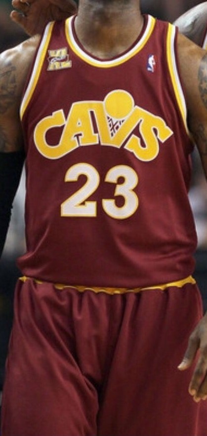
21 hours ago, the admiral said:
The first CavFanatic uniform I remember was the old feather-script Cavaliers jersey in kindergarten-fingerpaint red, yellow, and blue, which I don't recall ever being a color scheme of theirs, so even then they weren't really mashing up so much as making up.
It was wine & gold but with a brighter, more royal blue. Felt like a mashup of the original colors & look with the original Cavs blue from the 80s/90s. Looking at pictures though, seems a bit lighter than even those Mark Price era blues.
The original CavFanatic jersey:
The following season's CavFanatic was a less confusing mash-up:
Love talking football jerseys!
-
3
-
 1
1
-
-
1 hour ago, kaleb_girod said:
If they continue doing the all-gray set, but used the normal shade of gray they use for their current pants, they could do a similar “Wolf Gray” set like the Seahawks had.
I thought they looked decent but would be curious what the set would look like if the jersey matched the normal pants.
I also wouldn't mind a non-monochrome gray jersey look. And/or perhaps a version using the double-decker stripes? They've basically exhausted the "color rush" looks they've been doing, so I'm curious if they'll continue to rotate them like they have with the blackout or what they might move to next in terms of developing alts.
-
13 minutes ago, pepis21 said:
Who cares about Kyrie and Luka if it's still the best league in the world with the best players in the world. Mavs should've won easily even without them.
Anyway I'd strongly recommend to watch some EuroLeague games, is really enjoyment, maybe even more than NBA nowadays. Today there is El Clasico, good game to start.
EuroLeague has an improved talent level and it can be argued their rules are smarter/better enforced for a more watchable product.
That said, there's no reason to put any weight in an exhibition game. The fact that the stars barely played showed the level of intensity the entire team was at.
-
Because of the colors involved I'd absolutely bump Chargers-Chiefs to the top.
Most agree the Indy alt is unnecessary but it seems to be surprisingly well liked. I feel like they could either incorporate black or go all blue, but this feels like a meh compromise to me.
That NOLA-Jax game is hilarious. Teal & gold pants would've done wonders even for two uniforms that I don't love in a vacuum.
-
19 hours ago, TrueYankee26 said:
Ironically it is a Penn State & Steelers bar. What's up with that lol
Dunno but I went in there once to hit the bathroom after getting off the PATH and it was the worst bar experience of my life. Toilet paper seemed to be covering the floor (the main room, not the bathroom). When I got downstairs for the toilet there was a stall with no door and some chode offering a bump while I tried to take a piss. I'm sure the gameday atmosphere is... sufferable.
-
1
-
 2
2
-
-
3 hours ago, WBeltz said:
Western Kentucky going absolutely bananas. But I love it.
Big Red is among the greatest mascots in sports to me. I've felt this way since those mid-aughts mascot brackets Capital One (I think?) used to do.
-
1
-
-
Shocked, SHOCKED I say that there has been no mention of the Bills in a "worst NFL uniforms of all time" discussion. Maybe so much time has passed with their current proper look that we've washed it from our collective memories.
Bucs don't even sniff these sets IMO.
-
16
-
 2
2
-
-
Nice work!
Agreed with all selections with the exception of Denver-KC. I understand your reasoning but Denver looks cohesive and balanced, and the all-red couldn't ask for a much better matchup than navy/white. Maybe not a top placement but a solid looking game to me.
Now in terms of placement, it makes no sense to drop TB-Detroit to 3rd. It won the weekend easily IMO. First, Detroit wearing white socks to match the jersey and contrast the silver pants is a much better choice than pairing purple/navy socks with the same colored pants in the other matchups. Second, the colors are just undeniable.* Gorgeous game, arguably the best of the season.
*subjectively...lol
-
1
-
-
13 hours ago, CitizenTino said:
Cavs city edition unveiled at a season ticket holder event tonight. It’s a collab with the Playhouse Square theater district down the street from the arena.
Mostly safe as they use team colors here and it isn't an outlandish design. Interested in seeing higher quality photos of that trim. When I first saw it, my assumption was that it was some Slovenian pattern since there is a large population in Cleveland.
Imagining the reactions if they did some sort of chandelier look.
-
All-maroon seems like a smart choice against USC. Just feel very strongly that Sparky should be the primary logo.
-
1
-
-
7 minutes ago, MJD7 said:
Ohio State vs. Notre Dame would be a perfect matchup if Notre Dame went with gold pants. Green & gold vs. red & silver.
Primary home uniforms also would've been perfection. A shame.
-
3
-
-
6 hours ago, GriffinM6 said:
There are some really good looking games today. Clemson vs. FSU, Cincy vs. Oklahoma, Michigan vs. Rutgers, Marshall vs. VT, etc.
If only ND wore gold pants.
-
7
-
-
Love it, including the emphasis on vibrancy. For me, the color matchup is always a big factor because you're not just watching two uniforms in a vacuum, but always appreciate the varied strong opinions.
Looks like the Cards choice to go all red from the shoulders down is gonna keep them stuck in the worst pile after years in the dog house lol.
Also, re: Jets, their throwback helmet logo looked fantastic but actually would fit better with their current uniform. The uniform itself did not move the needle for me, just the choice to wear green socks (idk how often they do that with their primaries).
-
1
-


/cdn.vox-cdn.com/uploads/chorus_asset/file/22891446/1342345440.jpg)


2024 NFL Changes
in Sports Logo News
Posted
If the flag was just the beaver it'd have a top 5 case. And I'm happy for the movement away from seals in recent years.
Biased toward Ohio but have always loved the burgee and feel it pairs best with the American flag. #1 aesthetically is probably between New Mexico and Alaska.
Anyway, we don't really need more sports teams relying on state iconography. Create your own identity.