


Ricky_Roby
-
Posts
277 -
Joined
-
Last visited
Posts posted by Ricky_Roby
-
-
I'm actually really digging the Capitals outdoor jersey - as long as it's just a one-off. Nice, big, bold - Weagle gets its time to shine, it's perfect for an outdoor game and a cool collector's item for fans and something neat to add to Washington's jersey history.
-
 3
3
-
-
Merry Christmas! I pulled a higher resolution version of the Senators' 30th anniversary logo in bloack - haven't really seen this one get used much, so sticking it here for posterity in case it never shows up again before the season's over (which, if you're a Senators fan like me... is already over! lol!)

-
2
-
-
NHL's Ottawa Senators 30th anniversary logo:
-
Corporate needs you to find the difference between this jersey (regular home) and this jersey (Reverse Retro).
I love my Senators, but my goodness guys, would it have killed you to design something that would have maybe stood out a bit more?
-
On 11/10/2022 at 3:28 PM, spartacat_12 said:
That would be kind of tricky since their current home & aways are pretty much the same as their inaugural uniforms, and they already did a red version for the last RR.True, which is kind of why I was hoping Ottawa's Reverse Retro would bring the pre-launch Peace Tower jersey back with some modern touches. It would have made for a way better RR than the one they actually went with, and would double as a cool nod to the team's roots in its 30th anniversary.
Side note, I still can't get over how bad the Sens' RR is. It's mind boggling to me that they looked at that design and thought that it was cool or different enough in any way that fans would shell out close to $300 for one. The worst part is how close it is to being something really cool... I've seen fan mockups with some white added to it (y'know, one of their other official team colours that they keep forgetting they have), and it makes all the difference in the world and magically becomes one of their nicest jerseys ever. But as it stands now, it's a bland, uninspired failure that looks like it was generated by an AI.
-
1
-
-
I've been keeping an eye on the Senators to see if they would ever do anything with their 30th anniversary logo we only ever got the odd glimpse of (I also keep an eye on the Senators because they are my team). So far for this 30th logo, there's been no patches on the jersey, nothing in the arena, nothing on merchandise... but all of a sudden on a post advertising Alfredsson's hall of fame induction, they stuck a black version on the footer of the poster (when previously we only ever saw the white version on a black background)
Is this earth-shattering logo news? No. No it isn't. But I like the logo and wanted to see more, so here it is in black. Hopefully we see more of it and get a nice high-res version as well...
-
1
-
-
Y'know, I was skeptical of the program at first, but I'm actually going to miss this Reverse Retro stuff when it's done (assuming this is the last round of it).
It's been fun to see the fan designs and guess how teams would look back on the history with a twist, and since all the clubs take part, fans everywhere - no matter your team - can get excited. Sure, it's a money grab, but unlike the ads on the boards and jerseys, this one is actually, legitimately, just fun.
-
2
-
 2
2
-
-
On 10/17/2022 at 12:09 PM, spartacat_12 said:
They're definitely playing it safe with this choice, which is a bit disappointing. Maybe they'll go with red numbers outlined in white to make it stand out from the home jersey.
Yeah, that's sort of my issue with it too - and my issue with Ottawa's last RR (although comparing the two, I prefer their first RR to this one). Playing it safe is one thing if you're doing a full rebrand, or coming up with an alternate you're going to wear 12 times a year for 3 to 5 years... but the allure of the Reverse Retros, for me, is that it's an excuse to throw caution to the wind and do weird and risky stuff you wouldn't normally do.
The teams are only going to wear this, what, three times in a season? All they needed to do to here was just swap out the main logo for the old pre-launch Peace Tower script, and at least then you'd have a cool conversation piece and a wink-and-a-nod to the team's history, instead of just... the home jerseys with red sleeves.
EDIT:
Like this? I'm not in love with the peace tower logo, but at least this is something different...
-
2
-
-
According to @AliMurji - his source suggest this is what the Senators Reverse Retro will be.
If so... that's a shame. So boring. I thought their last RR in red was ok but lacked any sense of fun or originality. This one even more so. Not a bad design on its own, just a missed opportunity to maybe use the peace tower script as part of their 30th season... this just feels like their regular home jersey with red sleeves. Woopity doo.
-
10 hours ago, Ridleylash said:
QC has a much better argument since not only can they capture Atlantic Canada by extension
As someone who has lived in Atlantic Canada their whole life, I think folks might overestimate the allure of the Quebec Nordiques here. Fans here have almost universally been split 3-ways between Toronto/Montreal/Boston.
If Quebec City ever got a team, I can't imagine it would make a big splash in Atlantic Canada. We would, by and large, think "we'll that's interesting" but then go back to cheering for the Leafs, Habs or Bruins. Even when the Nordiques were around, they had as much presence in the Maritimes as, say, the Senators do now. Which is to say not zero, but also not enough to really register anything on a scale.
-
4
-
-
Here's one for my fellow Senators fans if they missed it, but the team shop has a new logo that incorporates the logo into the O... or, wait, was it the logo that incorporated the O first? Anyway, it's kinda neat and a step up from their previous logo, which was no logo at all.
-
3
-
-
On 9/9/2022 at 5:42 PM, spartacat_12 said:
Otherwise I'm not sure why they felt the need to add hands to the clock when they weren't on the original logo.
I thought about that too, but maybe they did so that other people would know that it's a clock tower? 30 years ago when Ottawa was launching a team, maybe that level of detail wasn't necessary - but perhaps now they are thinking of outside audiences (especially in the U.S.) looking at it and not realizing what the Peace Tower is.
Changing gears a bit - and maybe this has been covered before - but is it just me or do the leaked shirts seem to suggest that the Arizona Coyotes are going back to the brick red and sand colours (at least that's what my eyes see in the lettering) for the RR?
I've always liked that colour scheme and thought the Kachina coyote would look good in those colours - does anyone else think that's what's going to happen here? Maybe they are taking their old black alternate with the running coyote and putting the space coyote head on there instead in those old colours? Would look nice!
-
Better look at the Senators 30th anniversary logo - instead of a blurry phone photo of a screen.
Looks good! I'm really digging it. Hope it actually makes it on the jerseys... I assume there will be a black variant of the logo just like the old peace tower script had a white version for the black jersey, and a black version for the white jersey.
EDIT: Hmm, anyone notice the clock hands? Do they mean anything? The original doesn't have that detail (it's just a solid block), but had they moved the hour and minute hand, they could have made the clock read 20:22 in military time. Wasted opportunity!
-
2
-
-
3 hours ago, spartacat_12 said:
It looks like the Sens have unveiled their 30th anniversary logo.
Pretty minimalist, but I like it. Should make for a nice looking patch on the jerseys (although with the ads who knows where it will be placed). I wonder if it's a hint at the Peace Tower script potentially being used on the reverse retro.
Love it! I'm a lifelong Sens fan and was waiting with excitement to see what they'd do, and it's great. Nice, clean, crisp - a subtle nod to the early days and the campaign to get the team back. Also hoping it teases the old Parliament logo coming back on the Reverse Retro - it seems like such an obvious idea for the RR, it's the perfect place for it to finally see some ice time after all these years.
-
16 hours ago, bowld said:
Looks like it's actually Navy. Also, can't really tell but looks like it might actually be vintage white/cream stripes..
Intentional or not - am I the one who sees Johnny's pants looking a bit like snow-covered mountain peaks? Interesting design if that is indeed what they were going for...
-
On 7/20/2022 at 9:34 AM, Sport said:
If I had to put money on what they'll be wearing in ten years, though, my guess would be this will be the full-time home look and they'll have a matching white version for the road.
Good gravy, that is still - after all these years - one of my favourite NHL jerseys.
Wish they'd go to that cannon logo full-time too.
-
3
-
 1
1
-
-
17 hours ago, Wackyriderfan14 said:
New Rider Logo has been leaked
Can we also change the name of this topic to 2022
Interesting. Their current one feels so cool and timeless, I don't see the need for a change - especially when the new one doesn't really feel like a huge step forward the way the Alouettes and the Elks ones did.
I'll reserve judgment until I see it in colour - with the RR fanbase being what it is, I wonder how resistant/welcoming they'll be to the change...
-
3
-
-
I misplaced my login info and months behind on this thread! I'm assuming nothing has been announced for 30th anniversary logos for the Senators and Lightning? I saw a mockup of a Lightning one recently but it looked maybe fake? I haven't seen anything official - here or anywhere else - and wondering if I'm just losing my mind...
Re: Golden Knights - makes me kind of sad. Their grey jerseys were one of my all-time favourites of the modern era. The gold ones are nice but.. they work better as a third jersey. Having the greys at home, and gold alternates was so perfect, why change it...
-
1
-
1
-
-
17 hours ago, AFirestormToPurify said:
Other than the Samuelis, does anyone else in the whole wide world prefer the webbed D to the classic logo? lol
I can count myself in the minority there, I guess. I always liked the webbed-D for its simplicity - I think in terms of logo it's just a better and cleaner design (now if you want to talk about jerseys, that's a different story... nothing on the ice with the D ever quite looked right, the Mighty Ducks era was clearly better for uniforms).
A lot of people like the Mighty Ducks logo for the same reason I actually dislike it... it's very dated, very 90s, but not in a way that looks good or timeless to me... it just reminds me of the Disney movies and I think something that belongs on an AHL jersey, not the professional big leagues...
*sits back and waits to have rocks thrown at him*-
4
-
-
Since we're talking about SJ, this was always my favourite Sharks logo and think it would work better as a primary than the current one.
Imagine this, but without the hockey stick. I think that would be pretty sharp on the front of a jersey.
-
3
-
-
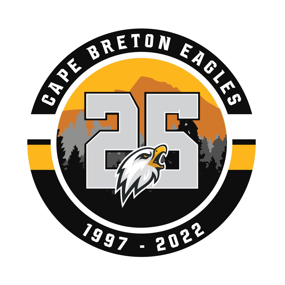
Did anybody post this already? Cape Breton Eagles, formerly Screaming Eagles, 25th anniversary patch:
-
14 hours ago, TheRealPepman said:
It's amazing how we see this uniform match-up first before the Golden Knights face the retro red Flames.
What a gorgeous uniform match-up there! I'm surprised at how much I really like the Seattle road uniforms. They looked fine enough in the original press photos, but seeing them on the ice - they really look great and give the darker home ones a run for their money.
The socks are really what make that set. That's a weird thing for an adult human male sportsfan to say, but there, I said it.
-
12
-
-
36 minutes ago, spartacat_12 said:
To be fair, the Sens almost did look like that when they first re-entered the league.
People roll their eyes at me, but I said from day 1 (of last season) that that should have been Ottawa's Reverse Retro jersey (maybe just a red version of it?) They could have had fun with it as a one-off instead of going the safe and boring route.
-
On 9/21/2021 at 12:15 PM, habsfan1 said:
They didn't do like other teams and clean up the logo tracing, make it sharper, and remove the excessive outlines.
I mean that's true, but most fans don't notice details like that the way people on a sports branding forum do. Senators fans, myself included, were just happy the old logo they always loved was back and the 2010s logo that was, at best, tolerable, and at worst, an eyesore, was gone along with those ugly jerseys.
Most Ottawa fans barely even realize the outline of the new logo is gold instead of red, unless you pull the logo up to their face and point at it. They don't really care about tracing or the symmetry of the laurels.
All I know is that, seemingly overnight, every Senators fan I met was rocking a new hat or something with the 2D logo again and 2010s logo just disappeared completely, hopefully never to be seen again. That's a team "getting it right" in my book.
-
4
-


/cdn.vox-cdn.com/uploads/chorus_asset/file/22030038/1074479402.jpg)


2022-2023 NHL Jersey Changes
in Sports Logo News
Posted
Yeah, Vegas always had a great colour combination and beautiful jerseys - but I do miss the dark grey at home. That one is still one of my favourite jerseys of the modern era - everything about it just clicked. The gold is nice too, but would have preferred it stayed an alternate - but that's what they're wearing in their Stanley Cup team photo, so I don't expect that one to lose it's top spot anytime soon.