

chrysleraspen08
-
Posts
989 -
Joined
-
Last visited
-
Days Won
1
Posts posted by chrysleraspen08
-
-
A couple of OHL ones that aren't up. The Sudbury Wolves 20th Anniversary logo from 1991/92 (can be seen in this Tweet):
Also, during the 1983/84 season, the Soo Greyhounds changed their primary logo. They only used this logo and uniform combo for one season before going back to their original look:

-
 1
1
-
-
The Ottawa 67's changed up the numbers on the new quicklite jerseys. They are bolder and now on the shoulder.
-
The Sarnia Sting jerseys have been unveiled. I wish they would've used a logo as a shoulder patch instead of the wordmark. Still a huge upgrade for them.
-
The Barrie Colts are currently selling these in their team store. While there's nothing yet saying that they're wearing them during the season, judging by the quality of this jersey (stitched crest, CCM tag, etc.) I'd say it's more likely than not.
Also, the Sarnia Sting just tweeted this teaser for a new jersey:
-
London Knights just unveiled their new uniforms:
While I do like the use of the old Late 80's-Early 90's template, it just looks really out of place with the 2000's logo. I'm sure it'll grow on me and I'll have a different opinion in a couple of months. Right now though, I don't love it, but I don't hate it either.
-
2
-
-
16 hours ago, monkeypower said:
Calgary Hitmen 25th anniversary logo.
Keeping the white under the eyes is a little odd with the all silver logo. They’ve used an all white mask logo in the past for marketing where the under eye was the same colour as the mask.
The white under the eyes makes him look tired.
-
18 minutes ago, rmc523 said:
He said a renovation/expansion of "Al Lang Stadium" is a possibility for the new Tampa park.
I'm the furthest thing from an expert on this, but I don't think that would work as a major league park, unless they're going to spend the money (probably at least 200-300 million) to only play there for 5 years because they're contractually obligated. The stadium only seats around 7,500 and is situated between 2 large roads and a concert hall. Even if they were to expand it, I can't see them being able to fit more than 20,000 seats there, which is well below MLB standards.
EDIT: Even after looking at renovation photos I'm still skeptical of this move. Considering those renovations are soccer, those are going to be some crappy sightlines. Like Exhibition Stadium outfield level bad.
-
1
-
-
I love the new Otters logo. I didn't mind the most recent one even though it was just a word mark. As for the new one I like how they went back to the original look, but cleaned it up and made it look not as dated. It looks great in yellow, and the Erie helmet thing was a great touch.
6 hours ago, the admiral said:You ain't kiddin'. How did this not get sent back to the drawing board?
You can't do italic in a shape where one line is going the other way! Now you have to put those weird Flyers lines on the E to fill the space. Looks awful..
The line in the top left corner of each letter doesn't work either. Looks like it says Er1e. I loved it at first, but every time I look at it, it seems to get worse. It's too bad because it has so much potential, but the wording choices ruined it.
-
The 3 lottery winners got leaked and posted on Twitter 20 minutes before the winners were announced. Only the NHL would manage to let this happen.
-
4
-
-
10 hours ago, OMMF said:
The auctions for them would appear to say otherwise
Thanks for finding that. While I'm still excited to see them wear the old jerseys, the fact that they're screen print is pretty disappointing.
-
1
-
-
On 7/5/2018 at 3:07 PM, chrysleraspen08 said:
So I happened to be on the London Knights Twitter page today and stumbled across this tweet, in reference to the Spider Knight jerseys from the mid-90's:
I might be reading too much into this, but it would be fantastic if they brought back that glorious abomination in some way (unless it's a screen print jersey). Even if they just sold it in the store like Guelph did with their 90's jerseys, they would make a killing on those from collectors such as myself.
On 7/5/2018 at 5:10 PM, philcar1994 said:I belong to a London Knights game worn jersey group and posted a mock-up of what I think it to be, also tweeted at the team directly and they like my tweet. Was somewhat confirmed by a member with very close ties to the team. Don't know if what capacity, but I'm certain there will be a Knightro jersey this season
 On 7/5/2018 at 9:36 PM, OMMF said:
I think the days of stitched one-offs are over (save for the Memorial Cup hosts tribute jersey). If it isn't a full alternate jersey, teams don't want to spend for (or CCM can't make) non-sublimated special occasion jerseys. It's too bad, too, because in jersey auctions it seems people will pay more for a real jersey. An extra $100-200 spent could see the team get that back 4x-5x when sold.
IT'S OFFICIALLY HAPPENING!
-
Kitchener Rangers unveil their annual Remembrance Day jersey:

-
7
-
-
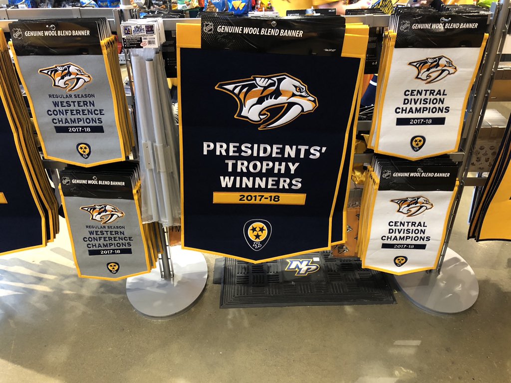
On 10/9/2018 at 11:18 PM, Still MIGHTY said:
Regular Season Western Conference Champion Nashville Predators.
You can even purchase your own Regular Season Western Conference Champions banner from the team store.
-
2
-
-
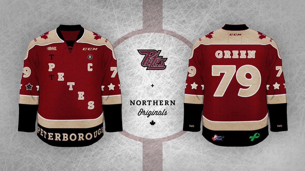
A couple of one-offs coming up soon in the OHL. Kitchener is wearing a special jersey to celebrate the 50th anniversary of Oktoberfest:

Also, Peterborough is wearing jerseys to celebrate their alumni:
-
11 hours ago, rams80 said:
Wake me when we get the logo with the bat-swinging cartoon raccoon.
I wouldn't be the least bit shocked if the raccoon was swinging a rocket or a trash can instead of a bat.
-
So I happened to be on the London Knights Twitter page today and stumbled across this tweet, in reference to the Spider Knight jerseys from the mid-90's:
I might be reading too much into this, but it would be fantastic if they brought back that glorious abomination in some way (unless it's a screen print jersey). Even if they just sold it in the store like Guelph did with their 90's jerseys, they would make a killing on those from collectors such as myself.
-
I read Twitter first, so this is all I see now.
As for the logo itself, it looks more like a Jr. B team's logo than one you'd see an OHL team wearing IMO. At the same time though, Guelph is one of those teams that I feel are hard to find a suitable replacement logo from the last one. There was one in the concepts here like 5 years back (made by @sparky chewbarky I believe, though I may be mistaken) that would've been much better of a replacement for the Storm, though I can't really judge what they came up with here too much until I've seen it in action a couple of times.
EDIT: Yeah it was Sparky who made that one I was referencing:
-
I liked them until I noticed the old primary logos on the sleeve. They just look very out of place there.
-
13 hours ago, tigerslionspistonshabs said:
Thunderbirds would be great, but would an NHL franchise absolutely mean the demise of the WHL team, or would we have a Chicago Wolves, Edmonton Oil Kings, etc. type of situation?
Not likely in Seattle's case since the Thunderbirds play in Kent (which is 20 Miles south of Downtown Seattle) and from what I've heard have developed a solid following since moving there from the city. It would probably be a concern if they still played at Key Arena. They also have the Everett Silvertips 30 miles to the north of downtown too.
-
6 minutes ago, DustDevil61 said:
Then maybe, just maybe, they'll be renamed the Las Vegas Knights. But I'm not getting my hopes up.
Not unless they get approval from London on the name, since they hold the trademark in Canada. I'm betting they'll just use the Sand Knights trademark that they already have from a while back.
-
The glowing puck might be making a return soon.
QuoteBettman mentioned this with some pride on Monday as he was inducted into the Broadcasting & Cable Hall of Fame, which counts Edward R. Murrow, Lucille Ball and Pat Sajak among its honorees.
"While it was the subject of much discussion, and some derision, in 1996, the technology of Fox Sports' glowing puck was the precursor of the first-down line that has become standard practice for any football broadcast, and any number of innovations," he said. "Actually, we are working on a dramatically updated version of that technology, and we have plans to roll out updated player and puck tracking. We are literally going back to the future."
-
8 hours ago, Ice_Cap said:
I'm sure it's letter-grade meat.

-
6
-
-
http://www.sportsnet.ca/hockey/nhl/new-rockets-owner-interested-bringing-nhl-team-houston/
Looks like the Houston Hurricanes dream is still alive. Knowing the NHL, they'll be an expansion team because the game still needs to grow in Raleigh.
-
6 hours ago, Sodboy13 said:
Can't wait until the upper deck curtains come out in Raleigh.
I'm sure they got Party City already lined up to sponsor them.


sportslogos.net missing logo thread
in Sports Logo News
Posted
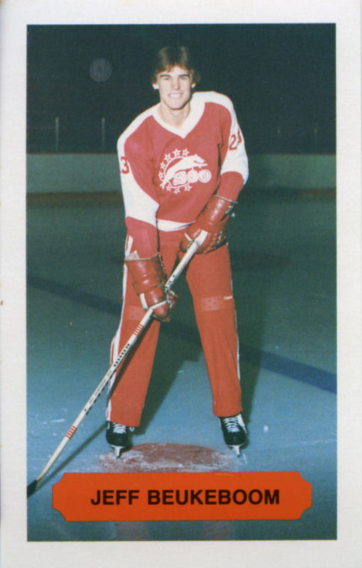
Clearest one I got is this. I posted it above, but it didn't seem to come through, so here's the link (it's on the back of the card):
https://www.worthpoint.com/worthopedia/1984-85-soo-greyhounds-juniors-16-bob-512881456
Also here is the logo on a white jersey: