DeFrank
-
Posts
2,923 -
Joined
-
Last visited
-
Days Won
1
Everything posted by DeFrank
-
Could people have been worried under certain 1965-era TV lighting conditions this would have turned the team into the Houston Ches
-

Players in the "wrong" uniforms
DeFrank replied to larrypep's topic in Sports Logo General Discussion
-
You know that tweet that goes viral every year around the Super Bowl showing “when the NFL stopped being fun” through the standardized logo? Yeah, this photo just screams Post-Fun NFL
-
This might be one of my favorite helmets in football.
-
I like the Weagle a lot but it's always bugged me how incorrect the point/spire/(actually a statue) is...
-
I was a big fan of the screaming eagle logo. Although I would imagine a blue/black/bronze Weagle could look good:
-
The "federal" color schemes of the Caps and Wizards were great because they were DC-specific without being generic RWB.
-
forum questions Ask A Moderator
DeFrank replied to Nick 1733's topic in Forum Policies and Announcements
@CC97 Chris, I think you ought to change your mind about this. At the very least, "people not being able to be rational or logical when discussing" this issue can be <MOD EDITED> on the back end rather than preventing anybody from engaging in a substantive discussion about something that is so so so prevalent and important to the topics of this forum which we all care so much about. -
forum questions Ask A Moderator
DeFrank replied to Nick 1733's topic in Forum Policies and Announcements
We ought to allow for Native American nickname/logo discussion on *sportslogos.net.* It isn’t “political.” It’s respect and dignity-based. Is banning discussion of other forms of racism in historical sports branding “political?” Seriously, would we ban discussion of a nickname or logo that disrespected black or Latinx people? -
Thats the goal. Trying to design a t-shirt based on the fictional Sunday morning news program in “The West Wing,” Capital Beat.
-
Thank you! I actually figured it out just about a day ago. Had no idea there were websites that helped you find fonts.
-
-
Players on the "RIGHT" Team, but "WRONG" Uniform
DeFrank replied to kimball's topic in Sports Logo General Discussion
-
Also I think that if a thread balloons into what is clearly going to be a long-running thread (Cleveland Browns redo in the works for 2020? comes to mind), it wouldn't be a bad idea to change the name to something more general ("Cleveland Browns 2020 rumors and speculation"). Pre-Titans unveil, that thread, plus the Titans and Jags speculation threads all had different titles with different tones. It wouldn't be a bad idea to somewhat clean that up after it becomes clear what the thread is leading towards.
-
-
Here's the correct link, I think. The above isn't right. https://www.behance.net/gallery/61221339/The-Denver-Broncos-Identity
-
All the fonts in this logo
-
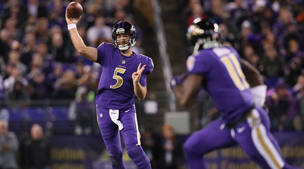
Players in the "wrong" uniforms
DeFrank replied to larrypep's topic in Sports Logo General Discussion
Can you believe this one? Is this guy in the "wrong"" uniform or wat???? -
Oldschoolvikings' NFL concepts - Commanders concept added
DeFrank replied to oldschoolvikings's topic in Concepts
Upon further reflection, I think most of my dislike comes from how the gold appears on a concept. Because when I look at the Ravens' color rush, I like the increased use a lot!
-
Oldschoolvikings' NFL concepts - Commanders concept added
DeFrank replied to oldschoolvikings's topic in Concepts
I really like the broad color combos you chose for the Ravens. I also really like the logo change. I really don't like the use of gold though. Really feels like a bad use of the gold, which I thought should stay relegated to tertiary status. -
I agree with everyone that says the gold pants look good. I still think they should drop them. The Redskins introduced uniforms in 1970 that are very similar to the home uniform now in terms of color Shades, helmet logo, striping waist down. In 1978, they dropped gold pants and didn’t wear them again regularly till 2010. Time for a new cycle! 2010-2017 gold pants, and a new era of just burgundy and white (plus three more Super Bowls?) for 30 years.
-
It's time. The Redskins should drop the gold pants, just like they did in the 1970s.
-
-
Players on the "RIGHT" Team, but "WRONG" Uniform
DeFrank replied to kimball's topic in Sports Logo General Discussion
This one is pretty incredible. It's so odd how dramatically the perception surrounding the Seahawks shifted in 2012. Russel Wilson, the face of the Nike takeover, etc. I feel like it started with the "beastquake" but there's something so "Every team in the NFC West finishes 8-8" about this photo that just does not match "Richard Sherman" at all.