


DeFrank
-
Posts
2,923 -
Joined
-
Last visited
-
Days Won
1
Posts posted by DeFrank
-
-
22 hours ago, VDizzle12 said:
I don't understand why people go through so much work with these photoshops of newly acquired players. Just wait a few months and you'll get a real photo of these guys on the field. Just looking at some of the OBJ ones make my uniform OCD go crazy.
-
 1
1
-
-
On 1/5/2019 at 1:35 AM, johnnysama said:
The 2015 Browns set met the 2013-17 Jaguars set just once, in 2017.
You know that tweet that goes viral every year around the Super Bowl showing “when the NFL stopped being fun” through the standardized logo? Yeah, this photo just screams Post-Fun NFL
-
4
-
-
On 7/2/2018 at 7:51 PM, DNAsports said:
Script logo football helmets are underrated

This might be one of my favorite helmets in football.
-
8
-
-
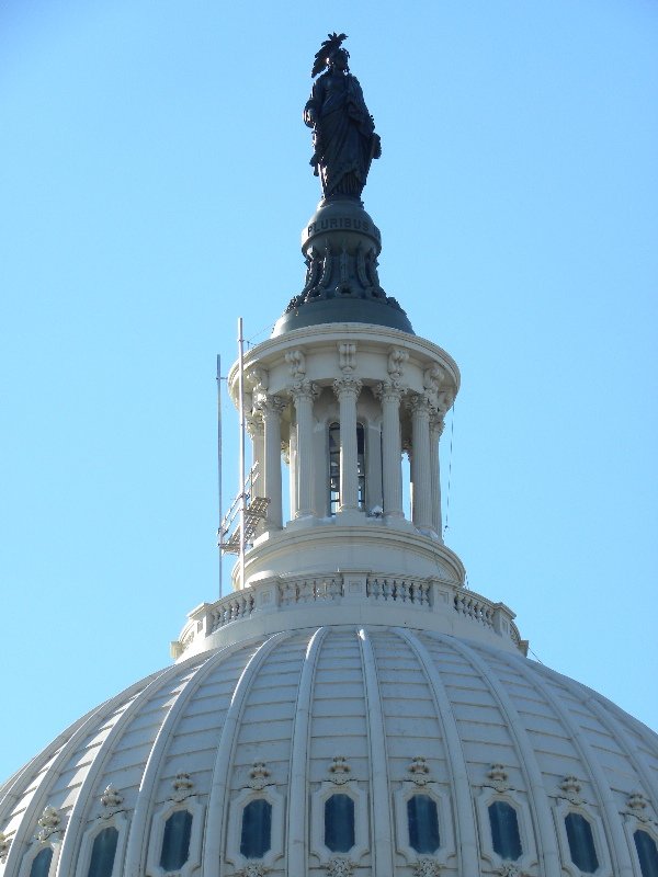
5 hours ago, KRZYBDGRZ said:
Yes! The capitols on the jersey is somewhat cool up close, but on tv it’s just a mess.
I like the Weagle a lot but it's always bugged me how incorrect the point/spire/(actually a statue) is...
-
10 hours ago, Vitalogy26 said:
Count me in: the only problem I had with the federal look for the Caps was the screaming eagle logo. For some reason it just seems boring and flawed. To be fair though, i’ve Yet to see a suggestion or a concept in the federal colors with a better logo. Maybe the Weagle? I’m not sure.
I was a big fan of the screaming eagle logo. Although I would imagine a blue/black/bronze Weagle could look good:

-
3
-
-
On 6/5/2018 at 8:58 PM, Cujo said:
The Washington Capitals have never looked better than this.

The "federal" color schemes of the Caps and Wizards were great because they were DC-specific without being generic RWB.
-
11
-
-
1 hour ago, Atomic said:
It’s in the rules:
So until Chris changes his mind about it, this discussion is over.
@CC97 Chris, I think you ought to change your mind about this. At the very least, "people not being able to be rational or logical when discussing" this issue can be <MOD EDITED> on the back end rather than preventing anybody from engaging in a substantive discussion about something that is so so so prevalent and important to the topics of this forum which we all care so much about.
-
2
-
-
We ought to allow for Native American nickname/logo discussion on *sportslogos.net.* It isn’t “political.” It’s respect and dignity-based. Is banning discussion of other forms of racism in historical sports branding “political?” Seriously, would we ban discussion of a nickname or logo that disrespected black or Latinx people?
-
1
-
-
46 minutes ago, pagan696 said:
cool! yes, there are whatthefont and whatfontis web pages if you have a good image (or can isolate characters in photoshop and make high contrast). another great tool is 'Find My Font', a desktop app that will query local and online type to find a match. after many years and a good memory you'll start to know many off the top of your head
")
Thats the goal. Trying to design a t-shirt based on the fictional Sunday morning news program in “The West Wing,” Capital Beat.
-
9 hours ago, pagan696 said:
Compacta
Thank you!
I actually figured it out just about a day ago. Had no idea there were websites that helped you find fonts.
-
23 hours ago, TrueYankee26 said:


-
1
-
-
-
-
-
3 minutes ago, raysox said:
Here’s a big reveal from the Broncos logo designer with a ton of sketches of potential logos
https://www.behance.net/gallery/61122101/LUNARIA-HOTEL-ROME-LogoBranding
Here's the correct link, I think. The above isn't right.
https://www.behance.net/gallery/61221339/The-Denver-Broncos-Identity
-

All the fonts in this logo
-
Can you believe this one?
Is this guy in the "wrong"" uniform or wat????
-
13 hours ago, oldschoolvikings said:
Here it is with white numbers... what do you think?
Upon further reflection, I think most of my dislike comes from how the gold appears on a concept. Because when I look at the Ravens' color rush, I like the increased use a lot!
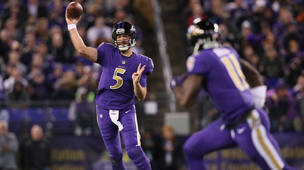
-
I really like the broad color combos you chose for the Ravens. I also really like the logo change. I really don't like the use of gold though. Really feels like a bad use of the gold, which I thought should stay relegated to tertiary status.
-
10 hours ago, the admiral said:
Gold pants at home, burgundy on the road is the right way to go.
I agree with everyone that says the gold pants look good. I still think they should drop them. The Redskins introduced uniforms in 1970 that are very similar to the home uniform now in terms of color Shades, helmet logo, striping waist down. In 1978, they dropped gold pants and didn’t wear them again regularly till 2010.
Time for a new cycle! 2010-2017 gold pants, and a new era of just burgundy and white (plus three more Super Bowls?) for 30 years.

-
It's time. The Redskins should drop the gold pants, just like they did in the 1970s.


-
10
-
-
-
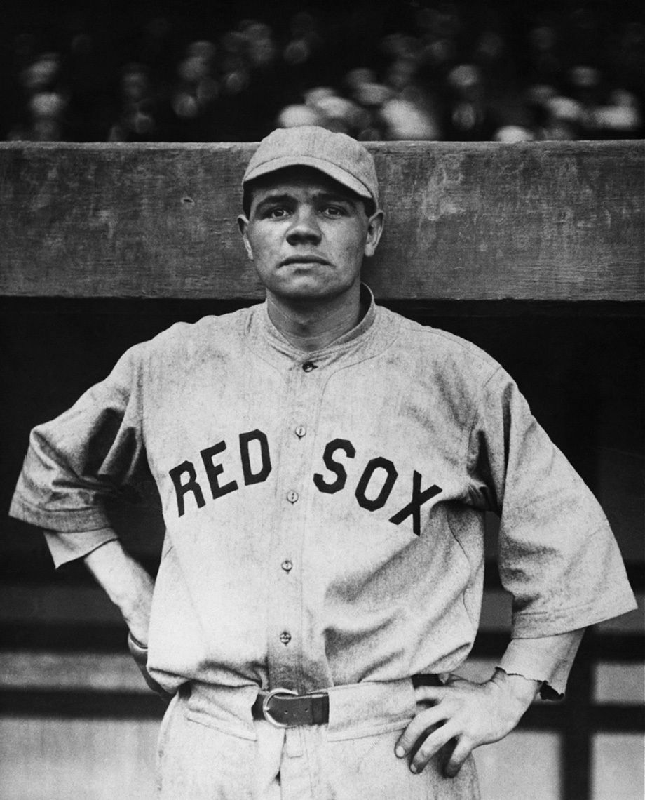
On 5/25/2017 at 1:07 PM, BJ Sands said:
Richard Sherman as a rookie before the Nike makeover.
(If you get a chance, read this about Sherman and the Seahawks: https://t.co/uwpNDuLXAS)
This one is pretty incredible. It's so odd how dramatically the perception surrounding the Seahawks shifted in 2012. Russel Wilson, the face of the Nike takeover, etc. I feel like it started with the "beastquake" but there's something so "Every team in the NFC West finishes 8-8" about this photo that just does not match "Richard Sherman" at all.
-
3
-
-


Unused Logos and Uniforms
in Sports Logo General Discussion
Posted
Could people have been worried under certain 1965-era TV lighting conditions this would have turned the team into the Houston Ches