


ARTnSocal
-
Posts
1,748 -
Joined
-
Last visited
Posts posted by ARTnSocal
-
-
On 12/25/2023 at 1:09 PM, BBTV said:
the silver looks too light, from the top down. Not sure if anything has actually changed over the years, but there seems to be less contrast against white than ever.
The numbers were a little hard to make out. I like the idea of the uniform, I just think there needs to be a little darker shade of silver, almost like a nickel.
In 1970, the last year that the RAIDERS wore the silver numbers on the white jerseys the numbers were darker. It was more of a silver-gray color. These current ones are a dull silver, so all they've gotta do it make them darker.
-
5 hours ago, MNtwins3 said:
I am once again asking @canzman to make his graphics smaller
It is NOT Canzman's job to post the probable weekly uniform combos, he's been doing it for the members for a great number of years.
For you to have the audacity to complain about it, a measly 3 fonts is beyond rude and highly disrespectful. to Canzman.
Next week I hope he makes them even larger and in the darkest shade of black. and If you don't like it try doing it yourself but I highly doubt you're capable.
-
 3
3
-
 1
1
-
-
13 hours ago, ruttep said:
The stripe combo doesn't match because a red monochrome combo was never meant to exist. The uniform was never designed with this in mind.
That's true. I've been watching the CHIEFS since the AFL days and other than moving their TV numbers on the jerseys from the sleeves to the shoulders, downsizing the KC decal on the helmet and going from a gray to a white face-mask when Arrowhead was opened they never changed the look of their socks.from my memory.
When wearing white pants they'd have on red socks at the top with stripes, and with the red pants they'd have white striped socks. I also used to like their bigger logo they once wore on their helmets, only to somehow downsize it in 1974. Dunno why they felt to do that since they wear no helmet stripe.
-
17 hours ago, the admiral said:
I didn't even know the Lions had white pants. Well, I wish they didn't, because no one needs blue, silver, grey, and white pants. They only need one!
I like when Detroit wears the white pants, but ... they ruin the look by not wearing Honolulu blue socks and instead opting for white socks. Not only that but the pants are stripe-less which looks too generic, just like JAX with their white pants.
-
1
-
-
This thing with wearing socks that match the pants is an eye-sore and getting on my last nerves.
I hate the BILLS in mono royal-blue but can at least tolerate it if they were to wear white socks like they did in Dallas on Thanksgiving a few seasons ago, but it just looks so ridiculous when these teams wear matching socks to the color of the pants.
-
2
-
-
40 minutes ago, Pigskin12 said:
I was also really hoping this was a teal jersey vs. purple pants game. Between the Dolphins, Jaguars, Vikings and Ravens, that still has not happened once. There have been several chances too.
I think Baltimore should always wear the purple pants when donning their white jerseys. Those black stripeless pants are awful.
-
3
-
-
4 hours ago, Froob said:
No word on if we’ll get lions throwbacks? I love those unis.
Word has it that the Lions will be wearing silver/silver/silver and the BILLS will be in white/blue/blue. I wish the socks were white, I hate the leggings look when these teams wear the same color socks as the pants, there's just no contrast.
-
2
-
-
The BILLS are doing it again for Sunday nights PACKERS game ...

Blue jerseys
Blue pants
Blue socks
Source: Twitter (@BuffaloBills)
-
On 1/16/2022 at 12:35 PM, Ninoners said:
Maybe I'm an optimist. Maybe I'm being naive, but I don't think the NFL is going to turn into College FB with regards to the multiple helmets. I think we will see the majority of teams have 1 alternate shell, and some won't have any.
I just don't see the league allowing a free for all where we see a team like the Jets having green, white, black, and anthracite/gray options in one year.
That won't happen (everyone with multiple helmets) for the simple reason that that NFL said the new policy would be that teams can only have an alternate 2nd helmet IF it's part of a set that goes with a throwback. Example: The NY JETS cannot have a black helmet because they'd never before worn one. Buffalo can only have a white, red, or silver helmet (1960, 1961) ....
This is what was said by the NFL when it was first announced.
-
49 minutes ago, VikWings said:
I loved these uniforms too. But Nike
can'twon't make shiny pants. So they would look dull and muted and not as good.That doesn't necessarily hold true. From 1965-1968 the pants on the (Washington Football Team) uniforms were closer to a khaki color and looked great IMO. Then in 1969 the pants were modified into a more shiny and brighter mustard yellow for the final season in 1969 before their Lombardi uniform change. Similar to the ones worn in the photo from 2002, I was hoping they'd name the team the 'Arrows' or something like that and use the 1965-1969 uni's that looked just like the ones worn in 2002 for their 70th anniversary season.
-
On 4/1/2021 at 4:34 PM, hormone said:
But why can’t they have different masks? The chargers do and before the jets changed, they wore gray (for a throwback) white, green, and chrome green (with color rush). I see no problem with swapping masks and that would still stay true to the “nfl brand”
I’m sure the Bills will have different masks and revert to the gray ones when wearing the AFL faux throwbacks.
-
4
-
-
2 hours ago, NormMacdonald said:
The Bills seriously need to just go with a blue mask
NO .... the BILLS seriously do not. Been there, done that.
With the white helmets we had the blue facemask from 1977-1983 before changing to the red helmets.
The blue facemask looked good with the white jerseys, but not good when wearing the blue jerseys. It was overkill.
I’d just assume stick with the gray masks ... but my main issue are those stupid mono-red color-rush uniforms, I hate them!!
Also, the 1965 faux throwbacks should be worn more than just once per season. I’d like to see the return of home throwback, and then have both versions of the AFL look, just like Miami has.
-
1
-
 1
1
-
-
Thurman Thomas ... wearing the uniform of enemy # 1

. . . and without his trademark face-mask

-
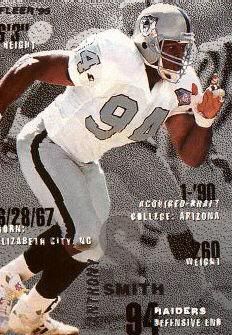
I HATE the Raiders' throwbacks with silver numbers

>>>>>>
No me ... I think they're great, but they looked better when they wore 'em in 1994 for NFL-75
For AFL-50 in 2009 they made the outline with way too much black (except the sleeved numbers), that's probably why you don't like them.
-
Judging by the College Football thread, this seems to be an unpopular opinion. With a couple minor tweaks here and there, I think these are easily VT's best uniforms.

>>>>
Now those I like!

Especially that
 utility belt
 -
That opinion is not all that unpopular.
If it's the Buffaslug logo you're quite correct ...
25,000 + signatures on a petition pretty much backs that up

Now new owner Mr Pegula is having it completely removed from the scoreboard and throughout HSBC arena to rid everyone the site of it.
The Ducks alternate 'D' webbed logo I like ... but do we have to have yet another uniform set using black as the primary color??
-
I like the WILD alternate uniforms, I've said this before ....
Only thing about it as they look more like a college look with the script-logo .... IMO

-
Ok, here goes. I know ya'll will disagree with a few of these!
NFL:
I loved the Broncos in mustard and brown. Now I've seen color evidence of every uniform my team has ever worn.
I dont like gray facemasks, or white helmets.
I hate the Chargers, but their previous look was better.
MLB:
Classic 3 color paneled hats are beautiful. Ex: Expos and Orioles
Pinstriped & Winged Angels are STILL my favorite logo/uniform set (other than the Yankees of course)
NHL:
I really dont like the Wild logo. Sure its creative, but ive never liked it. All of their uniforms seem bland to me, while some people cream in their pants.
I liked Buffalo better when they were red & black
Wow! I've never heard anyone say that liked those, unless you're just having a laugh.
The roadies were tolerable as a 50-year event throwback if it weren't for then vertical striped bowling sock.


-
I LOVE

The overall reviews when the wore that uniform set I can only describe as 'mockery' ... I thought they looked really bad too.
When the Bengals first wore their alternate Orange jerseys they wore 'em with black pants, didn't like ... I thought it had a potential to work if they wore white pants. Well they tried that next, and they were so much better they didn't shelf 'em. Cincinnati belongs in orange, not black, only for striping. Bengal Tigers are orange with black stripes.
It appears that Seattle will probably be NIKEs first project for 2012. This upcoming season, and before giving up on the fluorescent green jerseys I'd like to see how they look with white pants. Word has it that they're talking about throwbacks in 2012, Pete Carroll is very much involved in the process, just as he was when at USC. Too bad he didn't used his excess time monitoring the activities of Reggie Bush.
-
Things I like ... that are loved by Johnny:
- The Cavaliers 90's logo and uniforms
- The Browns brown pants (but ONLY with the white striped socks)
- Chief Wahoo
- The Jaguars all-black uniform set
- The Seahawks alternate uniform set
- The Dolphins alternate uniform set
- The Owens-era 49ers uniforms
- LA Galaxy third uniform jersey w/ matching colored american flag (I don't support messing with our flag)
- The Buccaneers Bucco Bruce-era uniforms
- The Indians vest uni from the 2000's *** I don't like vest uniforms on any club ***
- The Tillman-era Cardinals uniforms *** with red pants away ***
Things that I have no problem with and actually like:
- The current Vikings uniforms
- The current Falcons uniforms
- The current Cardinals uniforms ** I only have a dislike of their white jersey, and white on white roadies **
- The Seahawks "death by blue" uniform set *** I like the color of the blue, I like the all-white roadies with the blue sleeves, I dislike the monochrome-blue, and fluorescent green jerseys ***
- The current Bengals uniforms (minus their helmet) *** All I like is their alternate orange jersey / white pants, but they need a slight tweaking ***
- The current Indians alternate cream uniform set
I so loved the latter 2000 Buffalo Sabres uniform set ... just minus the Buffaslug and using the alternate logo, which to me is way better than the darkened throwbacks that fans in WNY can't seem to wanna get away from.
-
Michael actually had hair at one point
Just in case any people thought he came into the world totally bald and wearing Hanes

-
.
A big club like that in the NBA without backup jerseys for their players, that's bizarre.
Seeing him return from his baseball adventure wearing number 45 was just sooooo wrong!
I'm glad he smartened up and went back to 23 ....

-
That's not only the wrong uniform; it's the wrong facemask. I'll always associate Thomas with the "NOPO" (nose and oral protection only) facemask with a bar down the middle, since he seemed to be one of the only skill-position players (or at least the most prominent) who wore one.
.
You're right ... Good spot!!

That was indeed his trademark™ face-mask .... maybe I'll ask my nephew to inquire about it the next time he calls into his radio program.
To me, I was gutted just seeing him in that uniform. He never wore it at the Ralph, was out injured and up in the press box.
Please put names with the pictures. Not everyone who is well known in your world is well known to anyone else.
Yes, they ought to,
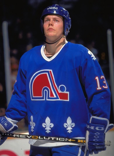
I know that player on BRAVES card but the name just isn't coming to me, but the hockey player posted is Mats Sundin who played around 15 years with the MAPLE LEAFS.
As odd it may look seeing him in anything but a Toronto uniform I think some hockey fans may be forgetting that when he came to the NHL it was with Quebec NORDIQUES first. He was traded after a few seasons in a package that brought Wendel Clark to Quebec for a short time before their move to Denver. That was a big trade at that time.
-
.
The Bambino in a Boston Braves uniform at the Polo Grounds in NY in 1935 . .. Then in a Brooklyn Dodgers uniform at Ebbetts Field as 1B coach in 1938


2023 NFL Season week by week uniform match-up combos: From HOF Game to Super Bowl LVIII
in Sports Logo News
Posted
This NIKE Honolulu Blue looks darker, and I don't like them in monochrome blue one bit. I like the older block numbers too.
The LIONS should have gone with silver pants and Honolulu blue socks, perhaps with northwestern striping.
The RAMS look like LA on the road (pre-1995) again with the bright yellow pants and blue socks, way ta go!!
True LA RAMS.