


Silent Wind of Doom
-
Posts
1,814 -
Joined
-
Last visited
-
Days Won
1
Posts posted by Silent Wind of Doom
-
-
5 hours ago, CardsFan79 said:
The Cardinals are unveiling their CC on May 20, and debuting them May 25. This is going to be bad.
https://www.facebook.com/share/fBXVbGh2vr94qhDe/?mibextid=WC7FNe
"For the Lou"? Is that a thing?
-
Whoa! It looks like the Texas Flag only goes one way. The Rangers have their ad patch and flag patch on the same sleeves for every player no matter the handedness.

(Also, I forgot to list the Pittsburgh City Connect and Seattle Cream we've already been told is delayed to the earlier list.)
-
 2
2
-
-
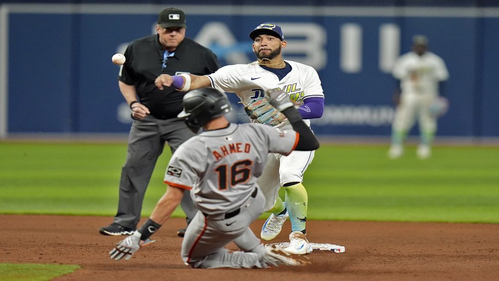
25 minutes ago, TBGKon said:
Rays throwbacks are in use and worn on home Fridays, and have been worn twice so far.
Huh. I went through every game on Getty two days ago. How the crap did I miss that?!
Well, the first had this as the thumbnail for the game and I didn't realize that wasn't the regular home white.
And the other I just must have accidentally not clicked thinking I did. The thumbnail for that is a Giants player.
-
22 hours ago, Sodboy13 said:
Diamondbacks' City Connects are certifiably banana yellow.
Come on... Those things are clearly butterscotch.

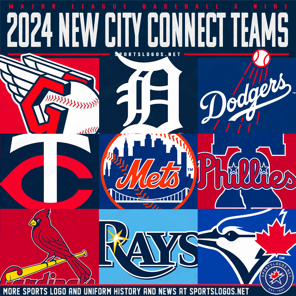
I've been watching the uniforms to update the current lineup for each teams. Here's the jerseys still MIA at the moment...
Boston Red (although it was worn as Spring Training) and Navy
Tampa Bay Gradient
Toronto Powder Blue
Angels City Connect
Seattle Cream
Texas City Connect
Cubs City Connect
Milwaukee Pinstripe and City Connect
Pittsburgh City Connect
St. Louis Cream and Powder Blue
Atlanta Red and Navy
Washington Pullover
Dodgers Los Angeles Gray
San Francisco Orange and City Connect
Obviously, this early in the season there's plenty of chance some teams just haven't gotten the day to line up (usually home Friday) for them to wear their City Connect uniform and we've gotten direct word that some are delayed, but anyone heard any news on the rest of these? And inside scoop or official word I've missed on any of these being trashed?
-
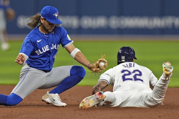
5 hours ago, SilverBullet1929 said:
Marlins blue jerseys are for home day games (except for Opening day) so every Sunday but also any weekday day games.
Home Friday games are the black alternate. Home Saturdays are the City Connect.
Gray is obviously road with black as the road alternate. They tend to use gray for road night games and black for road day games but they don't always stick to the road jersey schedule for various reasons.
They're very consistent with their home uniform schedule.
Wow. Everyone else is having trouble and the Marlins seem to have gotten every single one of their uniforms. They wore everything, like, within the first week.
-
3
-
-
On 3/29/2024 at 12:39 PM, Krona said:
I'm old and probably thinking of 2K14

All-Star Baseball 2000
On 4/1/2024 at 10:28 AM, floydnimrod said:I'm not sure what I think of the New Yankees gray uniforms. As someone who values parallel looks between homes and roads when possible I guess it's good that both and home and away uniforms have no cuff stirpes.
More of an overall question: not considering the new template, are there any teams whose road grays are better, or at least on par with the home whites? I can't think of a single team where the road gray isn't just a worse uniform design than the home uniform
I much prefer the Bronx Zoo away grays, but I do have to admit that the change has been... okay. I just kinda don't notice.
On 4/3/2024 at 4:00 PM, burgundy said:I expect it to be an all-navy uniform mixed with elements of away uniforms from three World Series winning seasons.
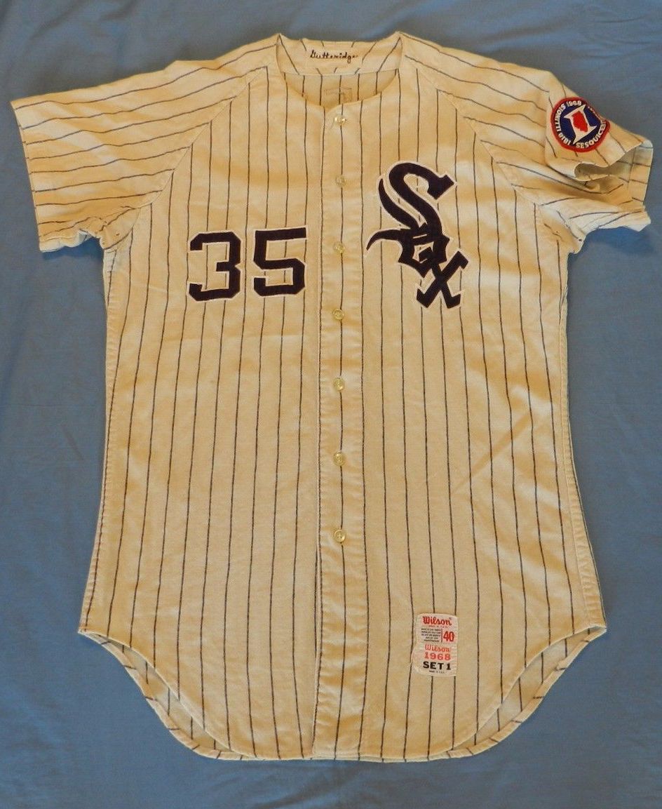
Gray hats from 1935
Sleeve numbers from 1968
Arched script style from 1984, but probably "Motor City" instead of Detroit
I wonder what the chances are that we'll see a "Motor City Kitties" somewhere?
On 4/6/2024 at 12:26 AM, tBBP said:Yeah, um...the readability of this thing is off. "City of Brotherly"?? I know that's supposed to connect (ha--"connect") to the LOVE, but the execution of this concept is...nah, man.
They'd have been better off surrounding it with either 26 or 40 stars...of course then it'd look even more like the Union, but whatevs.

Man, that LOVE logo is the only local reference that wouldn't be put together by people on the West Coast who've never visited the city (bell, skyline, nickname), huh? I know we have a lot of natives of the area around here. Are we missing something?
4 hours ago, coco1997 said:
Apparently this art has been on the MTA for years, but it would be funny if this more or less wound up being the Mets' design.The weirdest part of this is that this is a ballgame between the 7 train and the Staten Island Railroad in Corona, but that's clearly the Bronx Courthouse on the right that stood in the outfield of the old Yankee Stadium. Perhaps an easter egg by an artist who's a rival fan.
I honestly expected for the Yankees' CC to be the home pinstripe uniform with NEW YORK across the chest in dripping graffiti and a white cap insignia in the same style. (I know I've seen a spray painted interlocking NY somewhere, but I can't for the life of me remember where) I was wondering, though, as the Mets were coming first whether they'd go with that idea. Looks like I was wrong.
-
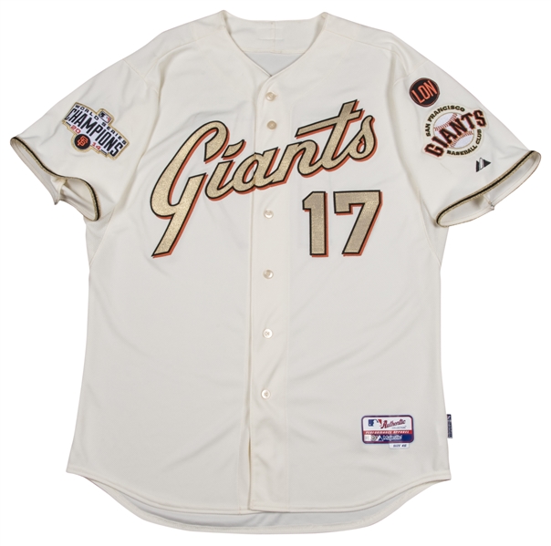
7 hours ago, Old School Fool said:
Still the best champion uniform that ever existed.
-
7
-
-
On 3/4/2024 at 2:44 PM, Bmac said:
From that article:
“But what of the Yankees! Think of the Tigers!” I hear the commenters tapping away. Both the Yankees and Tigers used their two available uniform slots on a set of home and road Spring Training jerseys, and yes, Spring jerseys count against the four.
Wow... That is very stupid, but at least it does confirm for us that most of what we're seeing is officially new on-field in-season alternates.
On 3/7/2024 at 10:56 AM, namefornamesake said:How did they manage to get the LA script break right if they couldn't with the regular Dodgers script?
On 3/7/2024 at 11:38 AM, cemps said:This is a replica jersey, so keep that in mind. The home white Dodgers replica also shows a well-placed script break. So don't count out the on-field jersey having a terrible one!
Or, excuse me, not a replica, but a *limited* jersey! (Calling it limited makes no sense to me, but what else is new)
Those shop images have looked 110% computer generated from the start to me. I'm not trusting a thing on them until I see them in photos or video.
3 hours ago, SilverBullet1929 said:I can't tell the difference in the Dodgers helmets.
2 hours ago, Sec19Row53 said:I *think* it's more of a stitched style logo rather than a puffy sticker. More like cloth and less like foam.
PS - You clearly weren't the only one who wasn't sure on the difference.
3 minutes ago, Survival79 said:
One of the articles linked mentioned that, while the Japan link is the application of the logo, the true identity change that is happening here is that the helmet logo and cap logo now match. The helmet logo has always been wider. One of those little quirks, likely not a purposeful design choice like the Detroit D.
I remember the Yankees having a similar situation, with the cap logo seeming to be the "print logo" but much chonkier. Sadly, I believe that went away with the change from the lovely shiny helmets that reflected the grand circle of lights around the Stadium.
-
Also I didn't think that or the White Sox because it was high enough to at least overlap whereas I thought we were specifically talking about severely lower numbers. Although that Oakland example may be just as low and the A is just huuuuuuge. It seems taller than the usual chest logo.
Besides the URL and the lack of alternates, what makes Dressed to the Nines obsolete, especially when it's still getting updated? I've always found it useful for finding trends. Set to the larges amount of unis per page and see what year a change was made in a few seconds/the rise of powder blue and pullovers/etc. Besides, alternates exploded in this millennium and I have my own records past 2007.
-
8 hours ago, BBTV said:
But historically, teams with chest logos never put the number low. It's actually a more recent thing.
Huh. You're right. I'd forgotten how far back some of those examples go.
I went to the Dressed to the Nines archive and unfortunately it doesn't show alternates and it turns out all of the examples nowadays seem to be alternates. But, it did show that those who do it nowadays wore them alongside or after wearing wordmarks with front numbers, so perhaps it was just a matter of one team saying "we put the numbers here, so keep doing it" and others following or just a number of people coming to that same conclusion.
-
15 hours ago, BBTV said:
why on earth do some teams put the front number so low when it's on the right (viewer's left) side? I can't think of any scenario where that's preferable to putting it parallel with the logo.
I've never really found this odd and the Reds having the number up at the same level seemed unique and different. But I just realized looking at it why it is the way it is. Front numbers came into existence on uniforms with wordmarks across the chest.
When they were put on uniforms with just a logo on one side of the chest, I imagine no one thought to switch the numbers from where they originally were even though there now wasn't a wordmark in the way of higher placement. It just felt like the natural place where front numbers go. Probably why until you asked I never thought it was an oddity in any way.
-
1
-
-
On 2/24/2024 at 5:36 PM, NickSixers said:
Teams are PREPARING for ads. The preparation isn't connected to their ad sales team finding an acceptable deal. But you have to prepare so that you can introduce the ad patch when you find an acceptable deal.
I'm sure all teams are looking. But whether patches are switching sides or not means nothing in terms of whether ads are immediately coming, as last year proved.
I have to say, watching two teams that didn't have names on their back under the sun yesterday, the change really didn't seem noticeable. The collar cut is obvious, but I mean the drop in quality/transparency. Dunno if we made out due to our design practices or it was just looking from a distance during the day. I wonder if there's any chance someone inside thought the old roads would look stupid with the new sleeve design and that was behind the update.
The Twins navy today looks all right except for that stupid arching of the name. Santana's name has plenty of room to fit with a less dramatic curve. But red lettering on navy is hard to read in any manner of shade on a good day.
-
3 hours ago, tBBP said:
(In other words, an ad patch is definitely coming...)
This actually proved false last year, but I can't for the love of me remember the exact examples. I watched carefully through every team's patches because I gotta show something in the Wikipedia uniform images. I decided to go with every example being right-handed, and so for teams with switching patches the patches showed on the left sleeve, but there were a number of teams who did not switch patches. I know Minnesota and Kansas City were two , and indeed did not get an ad patch last year.
But I do know for sure there was at least one team who switched patches without getting an ad... or had fixed patches but then got an ad. Unfortunately, my memory is failing me. I do know for sure that Philly ditched their sleeve numbers to seemingly make way but never did.
-
1 hour ago, aawagner011 said:
Paul mentioned this on Uni Watch today, but man, the slightly see through pants need a total rework. You can see the jersey material under the pants, including the silhouette, jock tags, and pinstripes. This is not the move, Nike!
Apparently the see through pants are not a new thing, though. Here are some images from the Majestic era (check out #70 and #63) where you can see the jocktags just as easily as the 2024 Nike pants.
I should not be able to know the type and color of underwear of my pitcher.
-
5
-
-
Does anyone know what causes some sleeves to bunch up and shrink and others to stick out? Sometimes they look like an elastic band tighter than the rest and others like that Reds sleeve seem the opposite.
-
Just now, OnWis97 said:
...and the upside helmet logos???
You know, there's no other teams in the state, the upside-down trident is bad luck, and the DC natives keep saying they don't want the name.
Screw it! Washington Mariners!
-
17 hours ago, MJD7 said:
- I really don't think the smaller player names look bad at all. If anything, I think it illuminates that the former player names were at least a bit too big.
Honestly, I'm not too worried about the size, although the size is causing finer details to get really messed up.
The thing that's messing with me is the odd arching. It feels like all the names are being kerned over the same space and arc and it looks like it doesn't fit with the numbers AT ALL in many instances.
-
1
-
2 hours ago, monkeypower said:
Have... have I never seen a 4 on the team all these years? That looks so wrong and I thought it was part of what people were complaining about, but apparently that's the way it's always been. The extra serif at the top looks like it's off a completely different team's font. It's all just so weird looking.-
1
-
-
@maxwasson, the top level finally got too long so I had to shift things around a little. Hope you don't mind. But congrats!
@thebutkiker, not only did it all fit, but it all fit exactly on one line! Any more wins and it's two lines for you.
-
1
-
 1
1
-
-
1 hour ago, VampyrRabbit said:
Hrm... I can see them not wanting to feature the pinstripes on the road, but having a grey alt cap only to have a bright white logo? I'd had rather they gone grey crown with navy brim, button, and logo.
-
2 hours ago, Sport said:
Can't get over how dumb and bad the names look on these.
There's an easy solution to that.
1 hour ago, TrueYankee26 said:This is their flag:
If they do it right I can only imagine how beautiful it would look.
Imagine the old gradients using these colors. I... can't decide whether that would be awesome or the ugliest thing ever.
I think using a gradient of these colors in a 70's fauxback style would world really well for the team's identity and history. Dunno if it would be good, but it would be fitting.
-
1
-
-
12 hours ago, CC97 said:
Wow... I really thought they'd roll out 5 and 5. Could this actually mean... Dare I hope?
-
On 2/9/2024 at 8:31 AM, BBTV said:
Rocky is a goddam movie character and that stupid statue is just a prop, I don't know.
Given your thumbs down, I'm not sure if you didn't see the progression of the joke or you think Rickety Cricket should be on the Phillies' batting practice hats.
-
10 hours ago, Ferdinand Cesarano said:
The real real answer:
10 hours ago, Ferdinand Cesarano said:The building is so grandiose that it cannot adequately be captured in pictures. You really have to go there and just marvel at its splendour. From all angles — including from within, in the passages to the internal courtyard — it is breathtaking. I've never been so awed by any other work of art.
It and the layout of the city with the central streets and the grand diagonal to the art museum are works of art. I love the city. And considering my other favorite is Notre Dame de Paris (the third is the Forbidden City but wear and modern photography and other issues are dulling my taste for it), I regard it highly.
-
1
-


MLB 2024 Uniform/Logo Changes
in Sports Logo News
Posted
Oof. That makes if even worse. If it's just started now, then it sounds like they're ripping off Cleveland. But, if you're going to keep changing hashtags every year, eventually you're going to run out.