


GriffinM6
-
Posts
8,556 -
Joined
-
Last visited
-
Days Won
3
Posts posted by GriffinM6
-
-
15 hours ago, dont care said:
Only one I’d say that isn’t an improvement is the Colorado one. Colorados current one is completely unique and immediately identifiable. Yours looks like any other blue license plate at a distance, only thing that makes it slightly different is the jagged line.
I agree with this as well. I think you could keep the same design, but use green, white, and grey instead of the flag colors. Colorado is the only Western state that uses green as far as I'm aware. The only other two state that use it are Vermont and New Hampshire AFAIK.
-
 3
3
-
-
2 hours ago, officeglenn said:
We got new Ireland home kits today:
I like the sleeve cuffs design, but it reminds me more of a rugby jersey than a soccer one.
-
4 hours ago, sayahh said:
The new all-yellow/black jersey might be better in yellow and green and just rename them as the Utah Ducks and get it over with.

There it is! I couldn't figure out what it was about the new Jazz font that looked so familiar. It's just Baylor's but without the notches.
-
3
-
 2
2
-
-
55 minutes ago, DG_ThenNowForever said:
LA, Atlanta and Boston look like old Christmas uniform designs.
I'd guess Atlanta is inspired by the hit show on FX created by Donald Glover. The font looks very similar and it appears they've brought back peach as a city edition color.
-
2
-
-
The uniforms for TCU are a hit, but the updated horned frog is lacking in depth and detail. It seems like you removed too much from the original version, leaving the one you decided on looking over simplified. A happy medium between the two would be your best bet IMO.
-
2
-
-
18 hours ago, upperV03 said:
I really do not like this at all.
I'm so annoyed they didn't unveil dark green shorts with this. Hopefully they bust some out during the season.
-
4
-
-
11 minutes ago, DrJack said:
There isn't some special Atlanta United Bespoke Design Task Force at Adidas Headquarters. You're a black and red team with vertical stripes that plays in an NFL stadium... let's not complain about using recycled colors and designs. This is a good looking kit. Congrats.
Sounds like someone is still salty about 2018

Regarding the shirt, I like the colorway, but I'm still disappointed they used a 4 year old pattern for the front. I'll probably end up buying it though.
-
The recent updates to Akron and Wake look great. I like that you gave Florida some cohesiveness as well, but I'm just not a fan of the Gator logo on the helmet. If you're not gonna go with the Gators script, then I'd suggest using the F that they used on their 2009 pro combat helmets.
-
5 hours ago, gosioux76 said:
I can see how it's close, but to be honest, it doesn't look fundamentally different from what they've always worn, color-wise anyway. It just goes from white to a slightly off-white.
If the Cardinals go down the "desert gray" path, I fear they'd be inviting another "bone" situation.
I've been under the impression that if the Cardinals were to use the desert cardinal theme. then they would use the same sand color that the Padres use on their road uniforms.
-
7
-
-
Recently found a European Football Club to start rooting for in Sunderland (Yes, I watched the Netflix docuseries). I decided to get a jersey and wound up finding a Lorik Cana 2009-10 Premier League kit for $10 on eBay. I'm lead to believe this is a replica because the on-field kits had an overlapping crewneck collar and the cuff striping was cut off by the middle white sleeve stripe extending all the way down the the end of the sleeve.
-
1
-
-
5 minutes ago, upperV03 said:
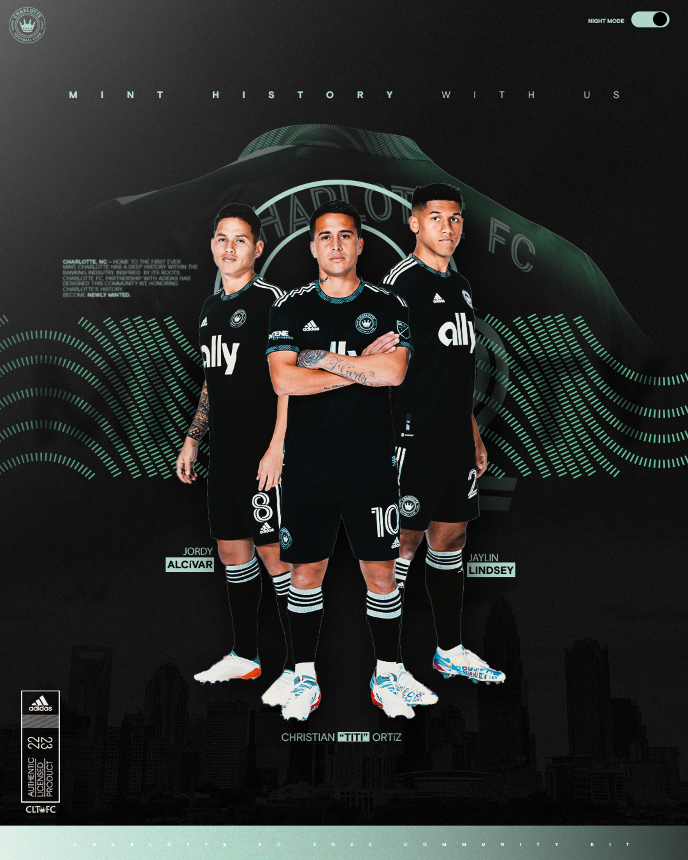
Full Charlotte secondary:
I do really like the patterned collar & cuffs. Wasn’t sold on it just being on the cuffs, but the authentic version having the pattern on the collar as well really makes it. All told, they have to have one of the better inaugural sets we’ve seen from an expansion team.
Looks nice. I'm having trouble figuring out the shade of green on the cuffs though. It's clearly darker than the mint color of the Adidas stripes.
-
13 minutes ago, Magic Dynasty said:
Orlando City away coming Friday. They haven't teased anything about it yet, but 99.99% chance it's another plain white shirt.
They really need to go with a lavender away shirt like the color of the text in the logo in that tweet. It would be unique and match well with the darker purple and gold.
-
1
-
-
There's speculation on twitter that the Cardinals are unveiling new uniforms soon. Amid the Kyler Murray Instagram drama, the Cardinals page only has two pictures up. One of Kyler on draft day and one of him at the Pro Bowl. People think he's using the drama as a stunt to get people talking and then bam, the Cardinals unveil new uniforms while people are already engaged.
-
4
-
-
9 hours ago, Bruhammydude said:
My ideal Arizona Cardinals would look similar to this, courtesy of @oldschoolvikings
This is just Ohio State without helmet stripes and silver.
-
3
-
-
I'd like to see the Penguins use the throwback double blue again in some capacity.
My vote is they use this uniform design:
With the original colors and maybe some more athletic gold splashed in:
-
We're 3 weeks from opening weekend and there's been like 2 unveilings so far. You'd think the clubs would have wanted to get new merch sales in earlier due to the quick turnaround for this season. Guess not...
-
1 minute ago, Brian E said:
some of the dugout jackets for 2022 are visible on MLB shop. noteworthy things, i guess, would be 1) the blue jays' is navy, 2) they're longer, 3) the price is hilarious:
https://www.mlbshop.com/?query=dugout performance full-zip jacket&_ref=p-PDP:m-SEARCH
-
9
-
-
The new number font looks great and I definitely like the wings better on the sleeves as well! Just a suggestion, but I guess if you wanted to differentiate the BFBS alt from the primaries more, you could make the wings come out of the collar kind of like the old Oregon uniforms.
-
1
-
-
14 hours ago, upperV03 said:
Prediction mockup of the full Miami kit, with both pink and black shorts. Wouldn’t even shock me to see white shorts.
Would love to see them go Pink/White/Black for a game or two as well.
-
30 minutes ago, aawagner011 said:
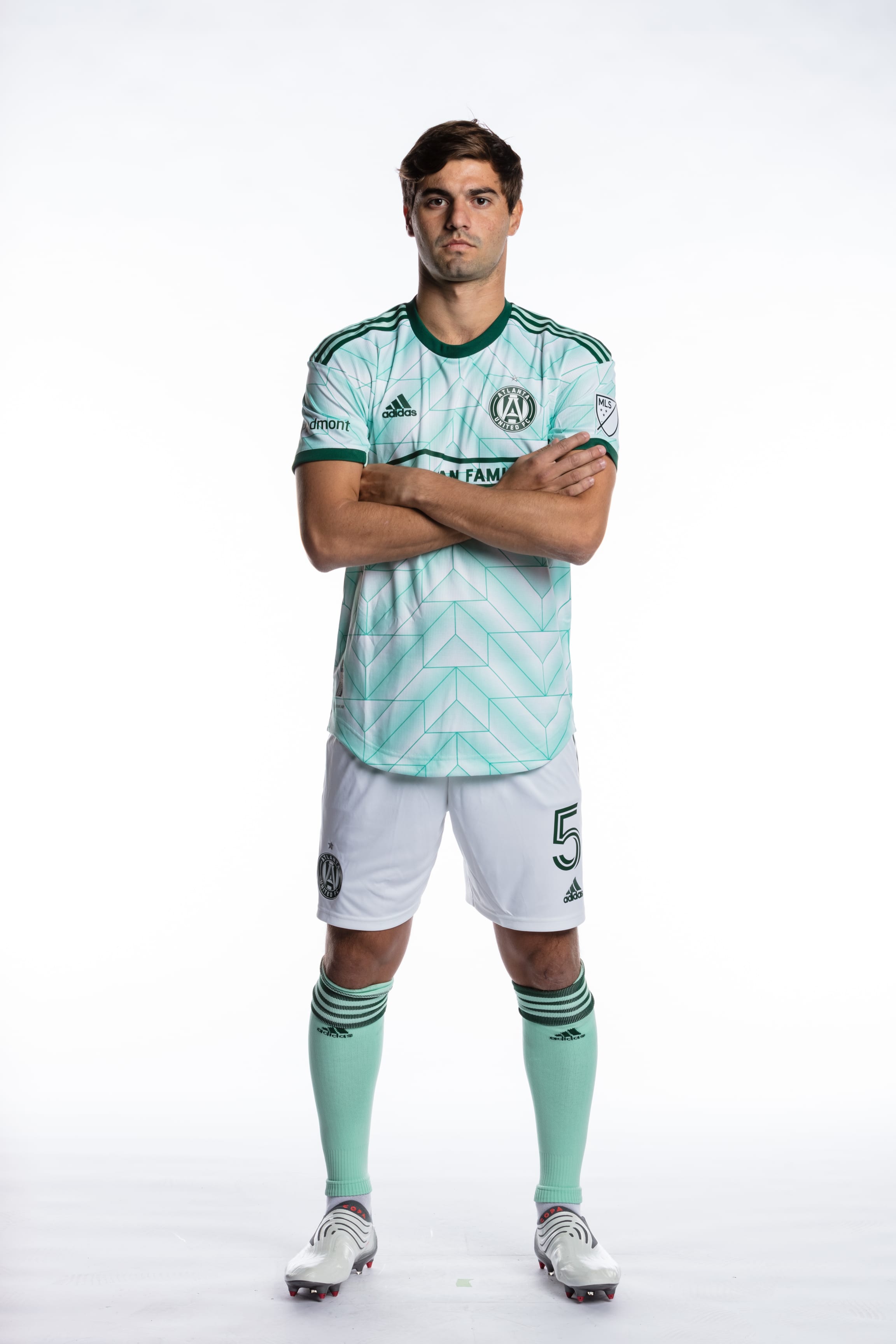
Atlanta has begun preseason training and their training gear appears to use shades of green (I’m color blind), which matches the rumors about a mint based away kit.
That's actually just a grey training shirt with an extremely pale gold on the team crest.
-
1
-
-
10 hours ago, PK22 said:
Now hearing that we qualified to get a third jersey, I will be really interested in seeing what direction they go in. So far (I know its only been one year) the team hasn't ventured outside green, black and white, and the team markets so heavily around the being " the verde and black", that it will be interesting what other color they would pick.
A unique direction they could choose to go in is with an Irish rainbow type colorway.
It would give them a solid alternate looks that's way different than anything else in MLS IMO.
-
1
-
-
3 hours ago, BlazerBlaze said:
This actually makes sense and works for those of us from Atlanta. We're known as the City in the Forest which I fully expect to be the "theme" of this kit. The base might be mint, but expect the marketing and the team to focus in on the Forest Green aspect. They sent us these stickers last season as what we're all realizing was a teaser.
That's a pretty sweet sticker. Maybe the use of green will also entice them to use some Olympic themed colors in the kit as well...
-
2
-
-
The start of the season is like a month and a half away and we've seen basically nothing besides Charlotte's primary and an announcement from Miami. I'm sure the league wants to get enough new merch sales in before the start of the season, so I'm surprised we haven't seen anything hinting towards new kit unveilings yet.
-
I really like everything on ODU except for the removal of silver. I honestly think it fits in quite well with their identity.
-
1
-


College Football Uniform Concepts FBS, FCS, D2 & D3- Lehigh Mountain Hawks
in Concepts
Posted
UCLA needs a Clarendon font. Other than that, not much you can do with either of the LA schools.