


GriffinM6
-
Posts
8,375 -
Joined
-
Last visited
-
Days Won
2
Posts posted by GriffinM6
-
-
The Lions jerseys look great, even the black one. The striping is also unique and stands out from other teams in the league. Looking forward to seeing the uniforms as a whole.
-
 2
2
-
-
2 hours ago, DCarp1231 said:
I still think about this.

Has anyone ever photoshopped this and replaced the red socks with black ones? Always wanted to see them wear these.
-
Gotta say, I'm not a fan of the Browns going back to their old shade of brown. It looks way too drab and almost black. The now former shade was much closer to a milk chocolate color, which I thought looked good on tv.
-
4
-
-
2 hours ago, GhostOfNormMacdonald said:
Okay, I shouldn't say this, but I kind of like it
Oh no, it's a great helmet. Most people here would agree I think. It works because the red is so dark. The Jags took this idea and failed miserably.
-
1
-
-
I remember when the rumors came out about that gradient Jags helmet back in 2013. Everyone thought it was gonna be like the early 2000s San Diego State helmet. Boy, how wrong were we?
Also, seeing the new Jets uniforms, I can't help but feel there's something missing from them. I can't put my finger on what, but they kind of feel incomplete. Maybe a small chest wordmark with the beautiful new updated logo. would do the trick.
-
If they have to go with Utah in the nickname, I think Utah Talons (like someone mentioned a few pages back) would be great. They can have uniforms inspired by the former Salt Lake City Golden Eagles.
-
3
-
-
I'm at the Atlanta vs. Philadelphia game right now and it's an absolutely gorgeous kit match-up.
-
1
-
-
I doubt they'd let a team be called the Cutthroats after last year's Adam Johnson incident.
-
2
-
-
Salt Lake Stingers would be a great name.
-
3
-
 1
1
-
-
7 hours ago, GDAWG said:
Wow, I had no clue they brought back the Force. I may have to go to a game this year. The logo and uniform are a huge downgrade though.
-
2
-
-
1 hour ago, charger77 said:
Isn’t Utah the Bee Hive State… maybe there is something that can be done with that?
-
Wow, this Philly area beer league team is gonna look great now that they have actual uniforms!
-
They should just go by Athletics Baseball Club during the period a la Washington Football Team.
-
5
-
-
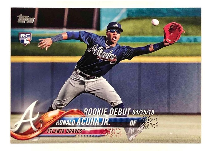
Ronald Acuna was a rookie during the final year of the Braves' cream home alternate and all-navy road alt.
-
2
-
-
Absolutely love the uniqueness of the Omaha jerseys. You really made them stand out despite being a red and black team. The interlocking UNH logo is one of the best things you've done in this series as well.
-
The Pirates have yet to wear their road greys this year. I wonder if they're one of the teams that had issues with shipments as well.Nevermind, they wore them in game 2 against the Marlins.
-
Did we just see an intentional leak of the Dodgers new city connect?
-
 2
2
-
-
Puma basically copied Adidas with this template huh?
-
2 hours ago, DCarp1231 said:
Oversized shoulder logos or bust
A horse themed team with shoulder logos huh?
-
1
-
 3
3
-
-
I'm really hoping that the off-center numbers were only for this weekend because of the CONCACAF badge on the shirt. I can't STAND having the numbers underneath the Nike logo. England's look is similar and looks way better because of the centered numbers.
-
2
-
-
50 minutes ago, Patchey13 said:
Phantom yokes are one of the few Reebok designs that I don't mind.
I'm in the opposite boat. I used to not mind them, but now after they haven't been around for almost 10 years, I can't stand how they look when I see old pics of them.
-
1
-
-
8 minutes ago, Anubis2051 said:
Drop the white from the patch and the swoosh and I don't hate it. Drop the blue as well and I start to love it.
Here you go then.
-
4
-
3
-
-
Dude that LSS logo is amazing. They should pay you for it. The uniforms are pretty damn good as well.
-
2
-
-
5 hours ago, Old School Fool said:
Aside from the Seahawks, the 49ers are the only other team I can recall working around the manufacturer logo. When the 49ers wore Montana throwbacks in the mid 2000's. They put the Reebok logo in the stripes and I'm not sure why because the Reebok logo was usually in the position above the sleeve number on all the NFL jerseys at the time. I assume they wanted the logo to bleed into the stripes so that you wouldn't notice it and it looked like a clean design or something.
I feel like it may be some sort of Mandela effect, but I swear I've seen pics on here where the Steelers put the Nike logo inside their sleeve striping rather than above it when they became a Nike team in the late 90s.


2024 NFL Changes
in Sports Logo News
Posted
Those Broncos leaks are a lot tamer than what the rumors made them out to be. Like Cujo said too, it seems they're a modern take on these uniforms. We'll have to wait and see the entire set, but I honestly think the jerseys are pretty good.