


NH4
-
Posts
775 -
Joined
-
Last visited
-
Days Won
5
Posts posted by NH4
-
-
UCONN going military…
-
 1
1
-
 1
1
-
 3
3
-
-
1 hour ago, upperV03 said:
After debuting new jerseys the last two weeks, Colorado is wearing their old black jerseys on the Elite 51 template tonight. Thought that they had finally moved on, but the flywire just will. not. go. away. Strange move, especially when they could’ve just added a gold outline to the numbers on the new black jerseys. The Buffs are wearing gold helmets tonight (with black pants), so that’s a plus.
Colorado looking much better with some gold
-
 1
1
-
 1
1
-
-
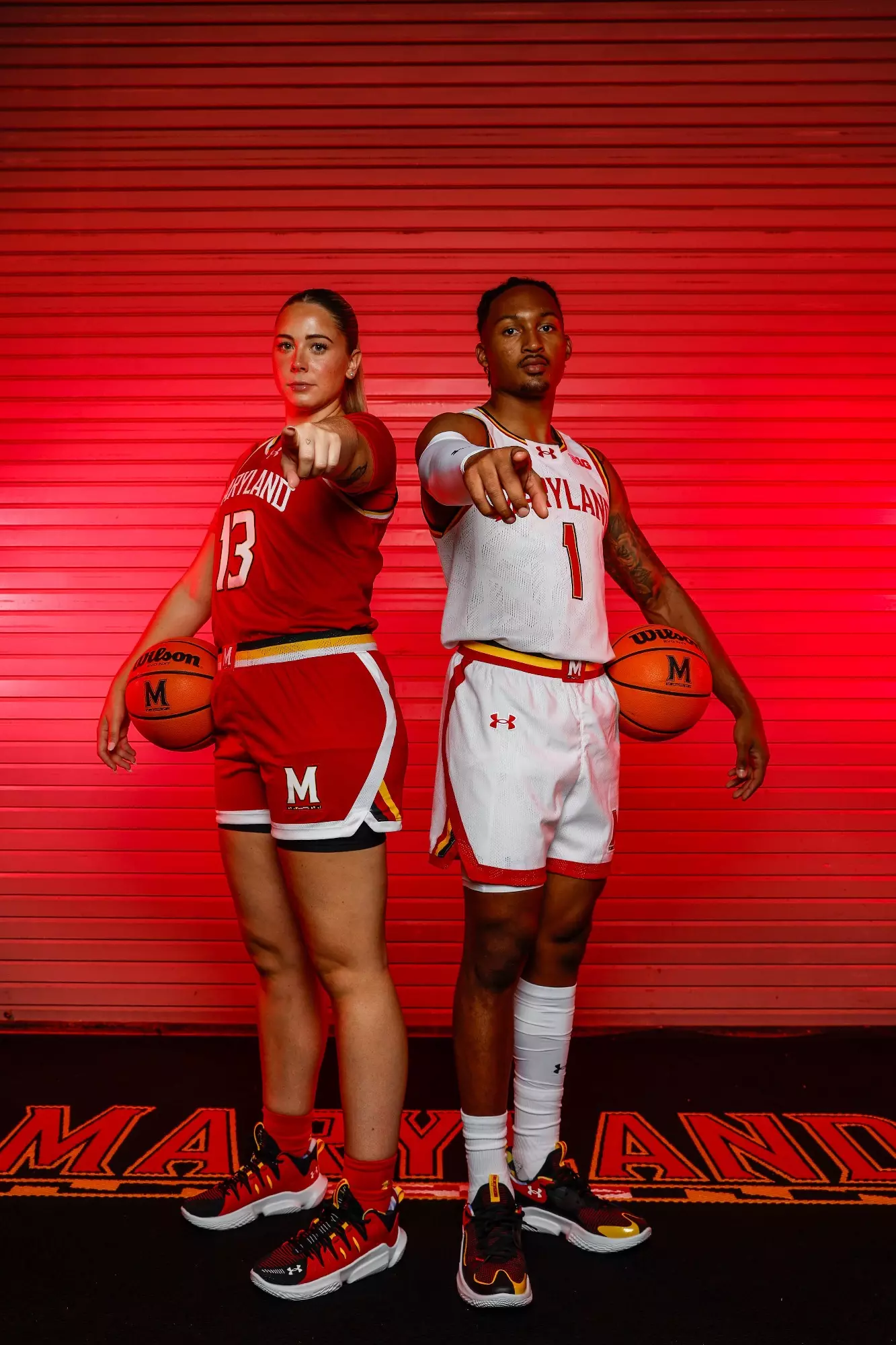
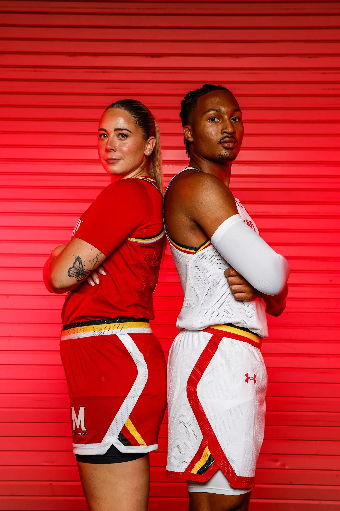
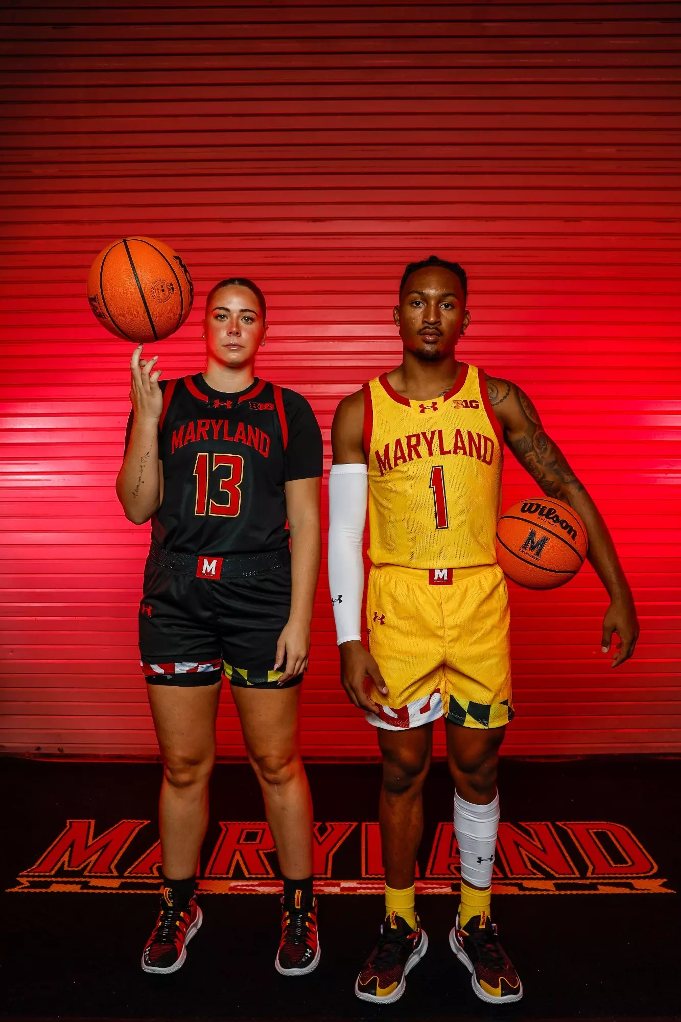
4 hours ago, leopard88 said:
And here they are . . .
Maryland basketball reveals new-look uniforms ahead of 2023-24 season
Maryland Basketball Unveils New Uniforms For 2023-24 Campaigns

I really like the whole set. In particular, the white and red are an interesting blend of early-mid 80s and UnderArmour.
Between the football and basketball team, I love that Maryland is embracing the 3 different color stripe design
-
7
-
-
well that didn’t last long
now it looks like an anime or pokémon design
-
8
-
 1
1
-
-
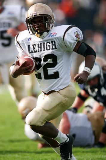
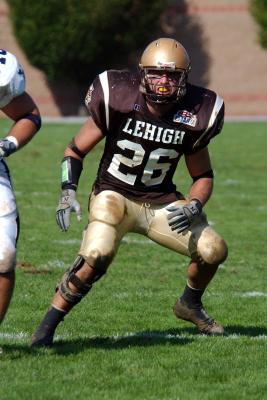
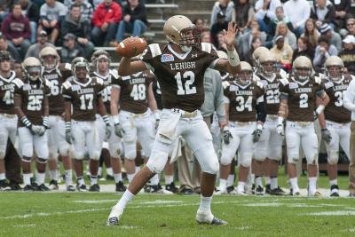
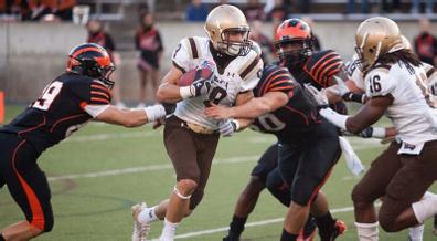
LEHIGH MOUNTAIN HAWKS
DESIGN
- Drew inspiration from two eras of Lehigh uniforms
- The '04-'09 uniforms had a Houston Texans-esque stripe and the '10-'14 uniforms had UCLA stripes
- I took the '04-'09 stripe but didn't taper it just like the closest stripe to the shoulder cap like the '10-'14 stripe
- Kept the same font
HELMET
- Gold and white helmet with brown facemask
- Replaced the script on the white helmet with the primary logo
- Alternate logo on the front bumper and "LEHIGH" on the back bumper
JERSEY
- Added the stripes
PANTS
- Gold, white, and brown pants
- No stripes to match the helmet
Up next will be Northwestern State. Thanks for looking and as always C&C is greatly appreciated!
-
4
-
New helmet for Duke
-
6
-
 1
1
-
-
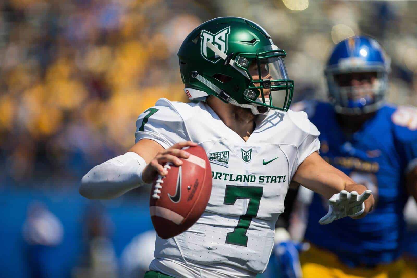
1 hour ago, gosioux76 said:
Nice job on this! Personally, though, I've never liked the Portland State monogram -- in general, but especially on a helmet. A "P" and "S" aren't shapes that fit together seamlessly, and the resulting space under the top of the "P" is an eyesore on this logo.
I'd go with the far superior viking head as the primary helmet art. Use the monogram as a secondary, or not at all.
Just my two cents. Keep up the good work.
Oh I really like that idea, I'm surprised I didn't think about that because I love that logo too.
-
4
-
-
22 minutes ago, tBBP said:
All these years and Phoenix is still rolling out Berthold City??
Death, taxes, and Phoenix using Berthold City with too many bevels
-
3
-
-
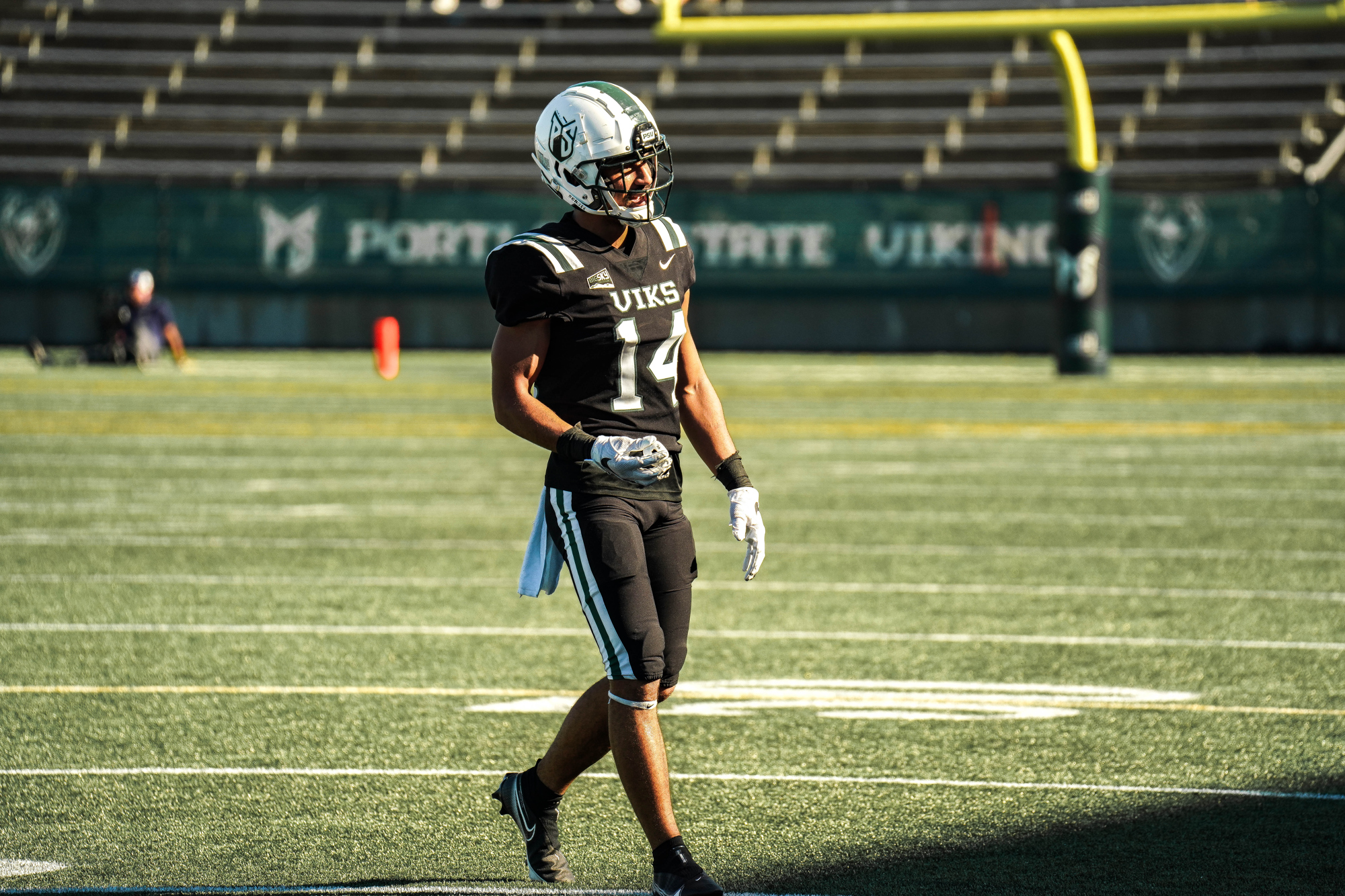
PORTLAND STATE VIKINGS
DESIGN
- Took the helmet stripe and added a subliminated nordic pattern
- Went back to the old jersey with no stripes but added the pattern on the sleeve cap
- Kept the same font
HELMET
- Green and white helmet with green facemask
- Added the pattern to the stripe and kept the Viking logo on the back
- "VIKS" on the front bumper and "PORTLAND STATE" on the back bumper
JERSEY
- Removed the UCLA stripes
- Added the pattern and re-added numbers to the sleeve caps
- Re-added the school name to the chest text
PANTS
Up next will be Lehigh. Thanks for looking and as always, C&C is greatly appreciated!
-
4
-
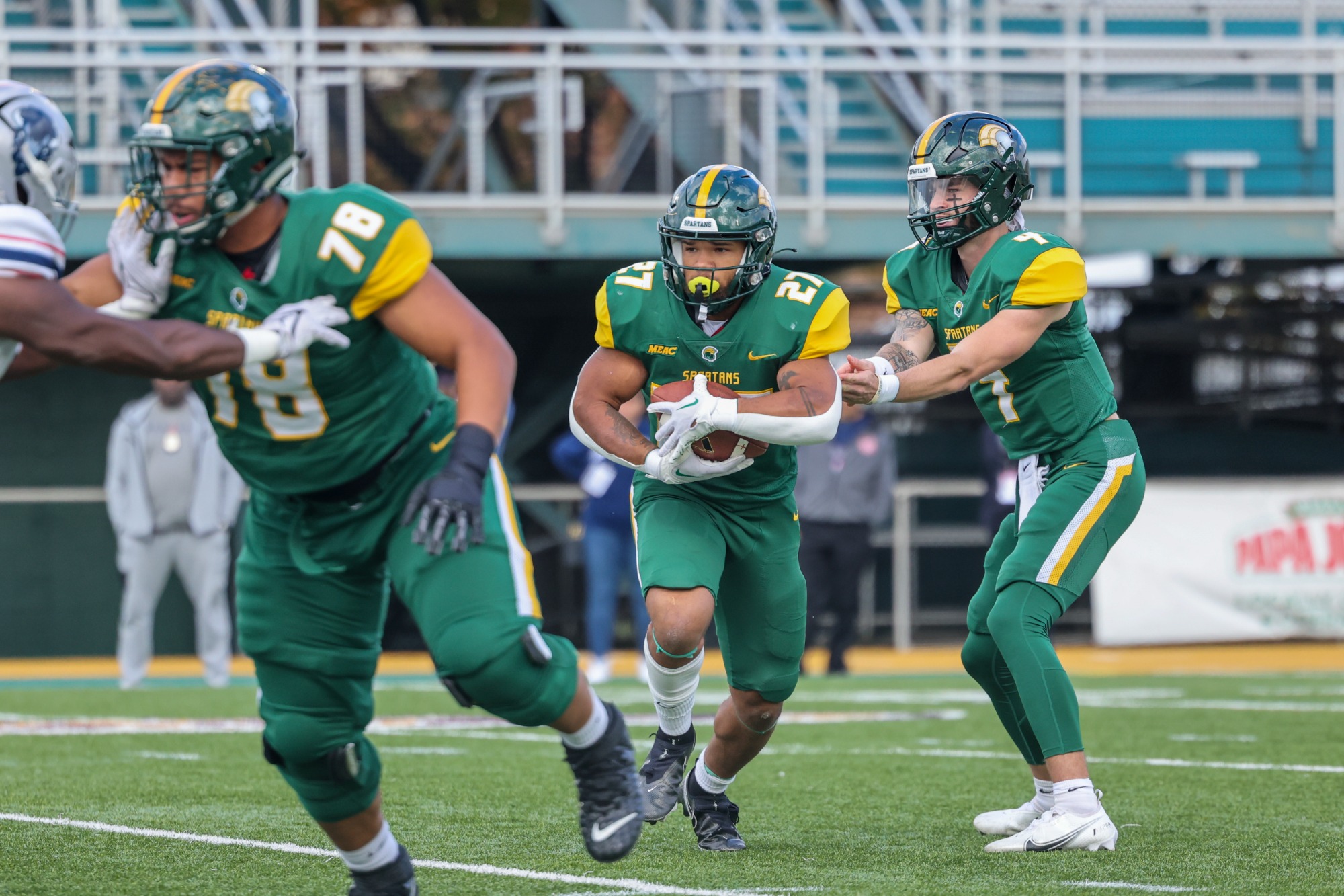
NORFOLK STATE SPARTANS
DESIGN
- Just like all smaller schools, Norfolk State has just had templated looks
- When looking for inspiration, I found their track and loved the design of it
- I turned the design into a stripe
- Used a different version of the current font
HELMET
- Green helmet with green facemask
- Added the new stripe and an updated logo
- "NSU" on the front bumper and "SPARTANS" on the back bumper
JERSEY
- Added the new stripes and font
PANTS
- Gold, green, and white pants
- Added the new stripe
Up next will be Portland State. Thanks for looking and as always, C&C is greatly appreciated!
-
3
-
1
-
On 8/15/2023 at 9:20 AM, stumpygremlin said:
I just want to say how much I love this entire series and how much thought you put into the whole thing. You clearly take your time and consider every element of the uniform, and don't churn out a bunch of concepts with similar number fonts (like someone else on here does).
Thank you! I hate all the same templated looks so creating unique elements including fonts, stripes, and the overall look was the main reason why I wanted to start this project.
-
4 hours ago, solvetica said:

nobody hates the color in their nickname more than the GOLDEN gophers
-
3
-
-
Delaware State received a new logo
-
3
-
-
PRINCETON TIGERS
DESIGN
- Princeton currently has 2 stripes on the jerseys but I went back to the traditional 4 stripes
- Updated the font to a more traditional block font
HELMET
- Same helmet
JERSEY
- Added the new stripes and font
- Changed the number colors on the away jerseys
PANTS
- Black and orange pants
- Removed the stripes
Up next will be Norfolk State. Thanks for looking and as always, C&C is greatly appreciated!
-
5
-
1
-
On 8/7/2023 at 6:14 PM, DCarp1231 said:
Stellar stuff!
With news of Roanoke College getting a football team, would you consider giving them a shot?
Yeah definitely, when I get to D3 I'll have to remember they now have a team and include them. Thanks for the heads up!
-
Basically what everyone pretty much predicted. No stripes but a red collar and sleeve cuffs and the logo on the sleeve caps
-
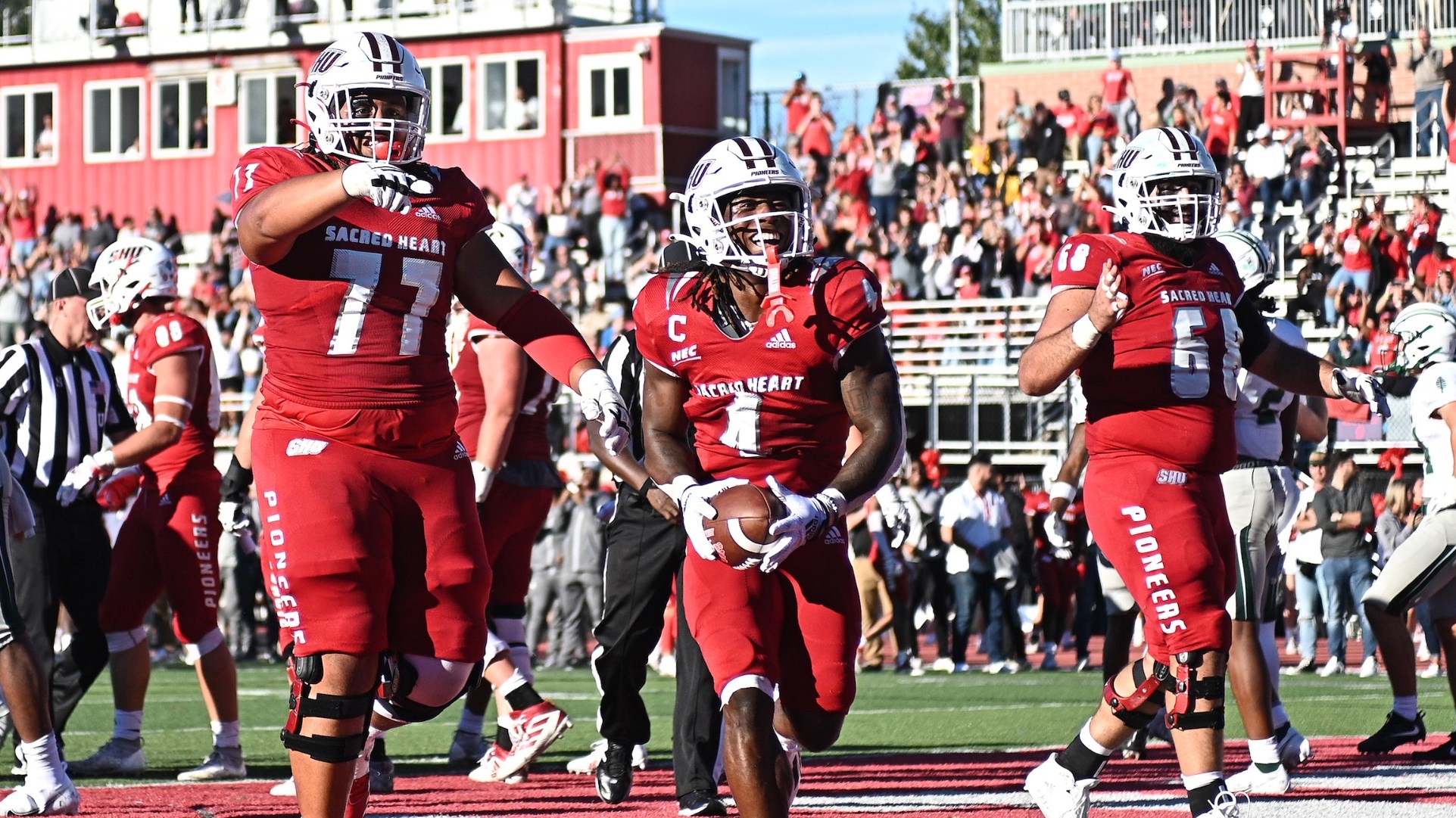
SACRED HEART PIONEERS
DESIGN
- Other than the helmet stripe, Sacred Heart hasn't had any designs that stand out, just Adidas templated designs
- I took the double helmet stripe and made that the stripe throughout
- Kept the same font
HELMET
- Same helmet
- Primary logo on the front bumper and "PIONEERS" on the back bumper
- School shield on the back
JERSEY
- Added the new stripes
- Updated the chest text and number font to the school's font
PANTS
- White and red pants
- Added the stripes
Up next will be Princeton. Thanks for looking and as always, C&C is greatly appreciated!
-
1
-
4 hours ago, GriffinM6 said:
Absolutely love Richmond. Surprised they've never done something with that web design in real life.
Thank you! Same I had that idea way before I started the concept so researching and finding out they never had a web design was very surprising. Especially when they have multiple logos with spider webs
-
1
-
-
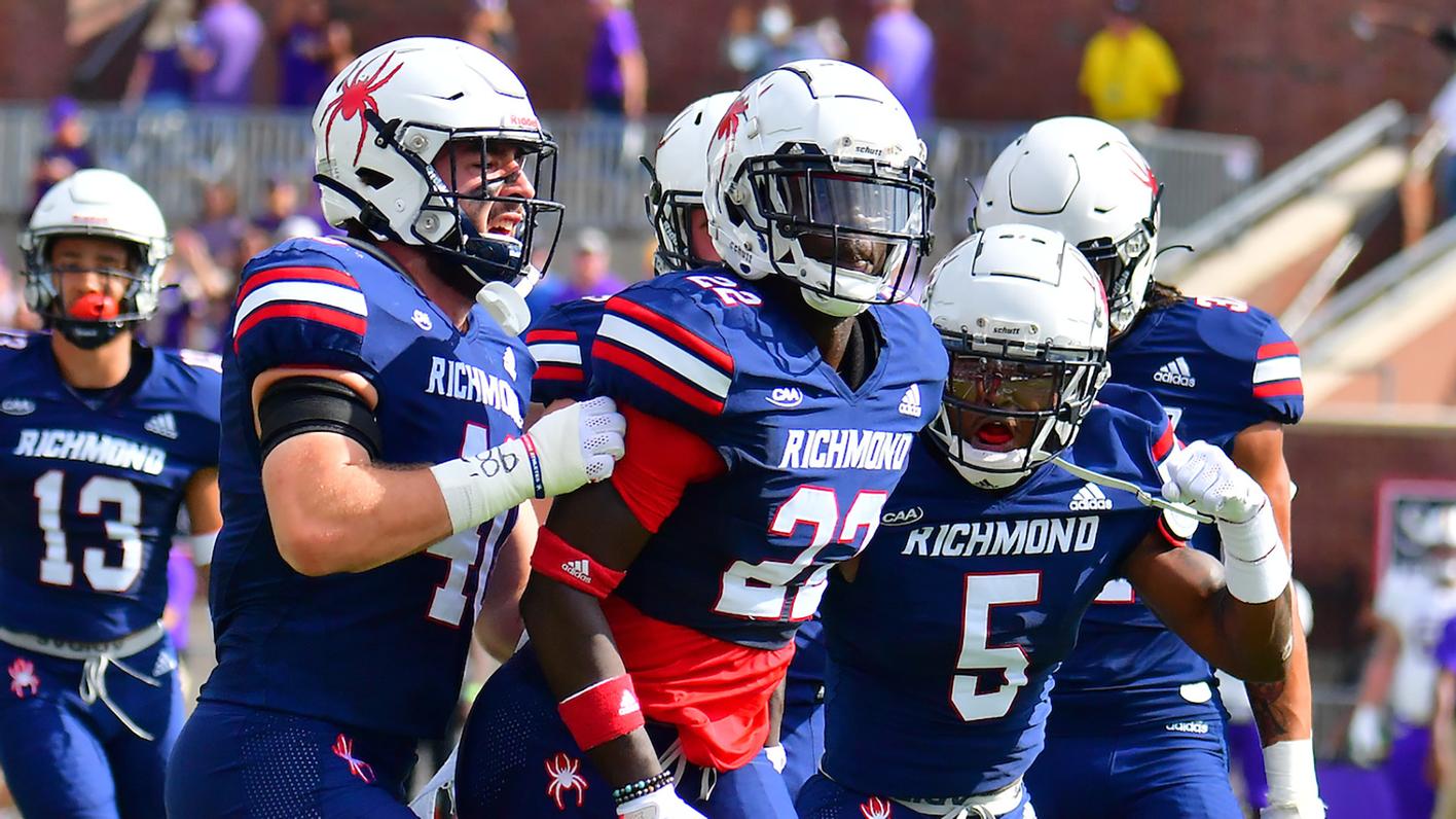
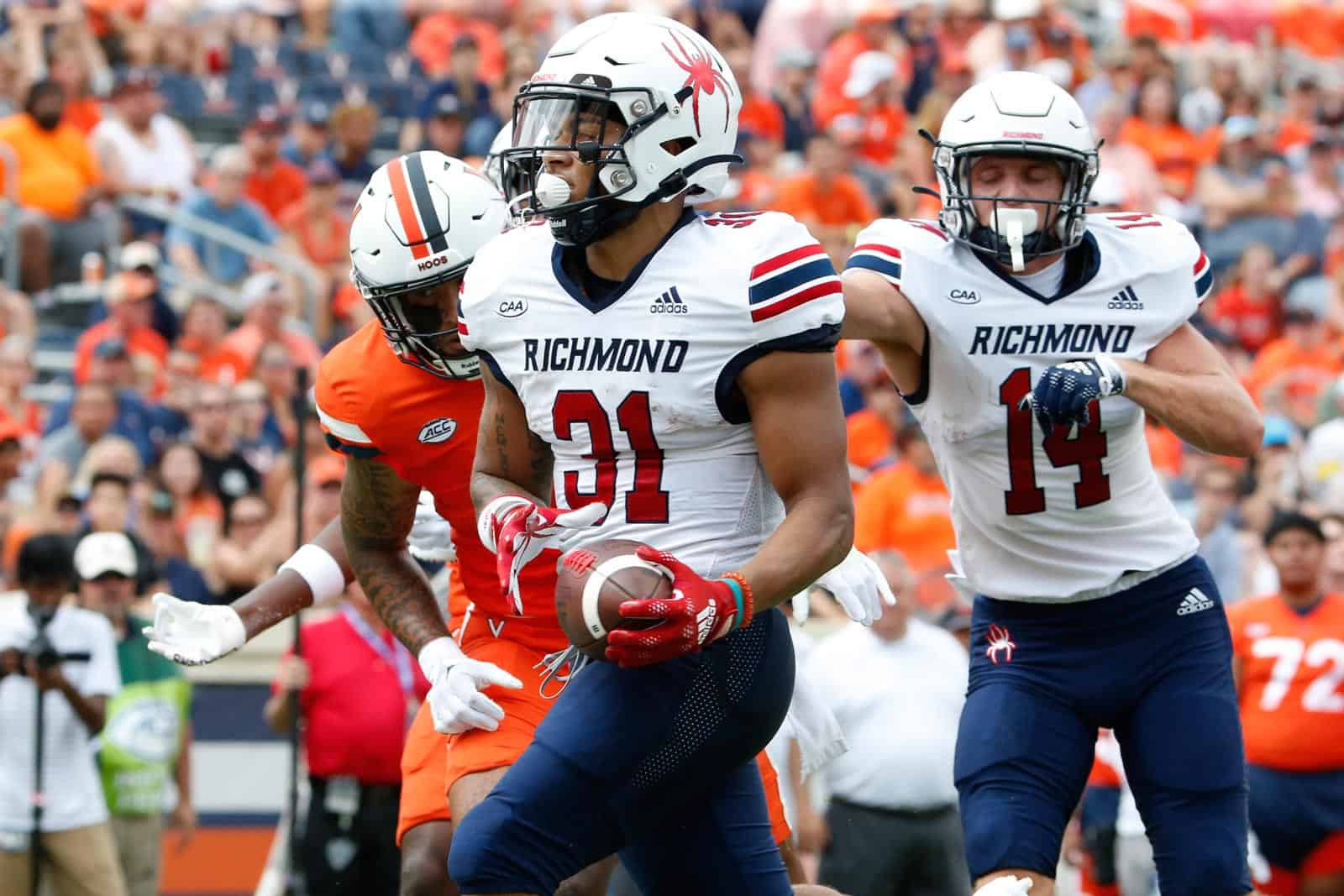
RICHMOND SPIDERS
DESIGN
- Richmond has a traditional look but I think for the only NCAA team named "Spiders", they need a creepy crawly look
- Put the spider web and spider on the shoulder cap
- Kept the same font
HELMET
- White and navy helmet
- Removed the white logo outline on the navy helmet
- "SPIDERS" on the front bumper and "RICHMOND" on the back bumper
- Richmond flag on the back
JERSEY
- Cobweb and spider replace the stripes
- Updated the number font to the school font
- Added a red jersey
PANTS
- White, red, and navy pants
I'm going to try to get to updating Incarnate Word but if I don't have the time, Sacred Heart will be up next. Thanks for looking and as always, C&C is greatly appreciated!
-
3
-
43 minutes ago, TrueYankee26 said:
Not sure I have seen that W logo with the state before. New logo?
Now that you mention it, I don’t think I’ve seen it either. I just looked on their brand guidelines and it doesn’t appear so it must be a new logo. I really like it though
-
I didn’t see a 23/24 thread so I thought I’d start it with new uniforms for Wisconsin
compared to last year’s
No side stripes on the jerseys and shorts, updated collar and sleeve stripes, and the W/state logo on the back collar. Really good upgrade.
Also, the Under Armour logo is on the collar instead of the chest which might be a thing to watch out for other UA schools
-
6
-
-
UTAH TECH TRAILBLAZERS
DESIGN
- Utah Tech has a really good look and I wanted to keep the same feel but with minor changes
- Kept the UCLA stripes but cut them off at the bottom and then I did the same with the pants and helmet stripe
- Updated the helmet stripe to match
- Kept the same school font and switched the numbers to it
HELMET
- Same helmet but updated the colors of the logo
- Updated the stripe
- UT logo on the front bumper and "UTAH TECH" on the back bymper
JERSEY
- Updated the stripes and number font
- Replaced the numbers on the sleeves with the buffalo head. I just liked this better maybe because of the charging motion of the logo
PANTS
- White, red, and blue pants
Up next will be Richmond. Thanks for looking and as always, C&C is greatly appreciated!
-
1
-
2 minutes ago, MJWalker45 said:
No problem, I love that so many of these teams have their own identities instead of being stuck with catalog options.
Thanks, that's what I've tried to do with all these teams. It's tough creating a lot of unique identities but that's what also makes it fun.
-
5 minutes ago, MJWalker45 said:
For the striping, I'd probably round off those windows instead of leaving them as rectangles. Without seeing your explanation, I was trying to figure out why they had semaphore codes as part of the stripes.
That's a great idea, I'll admit UIW wasn't my best but I'll make these changes. Thank you!
-
1
-


:format(jpeg)/cdn.vox-cdn.com/uploads/chorus_image/image/50632511/487013336.0.jpg)
2024 NFL Changes
in Sports Logo News
Posted
I did some digging because I wanted to see how different the new logo was from some concepts and I found this by Empery Designs on Behance.
It's identical but it's a great logo so hopefully (if it is real) they paid him great