


joekono
-
Posts
484 -
Joined
-
Last visited
Posts posted by joekono
-
-
On 5/4/2022 at 11:57 AM, IceCap said:
Toronto and Tampa both look good...they're just too similar.
And that's 100% on the Lightning. You know what you did.
-
6 hours ago, dont care said:
How do you get to the point of tip off and not realize both teams are wearing white. I get that they wear warmups but they usually take them off at or right before lineups are announced. Then In shoot around. Typically a few players don’t wear the pants so you see what shorts their wearing. This is a complete circus.
Totally agree and it has been for years now.

-
 1
1
-
 1
1
-
-
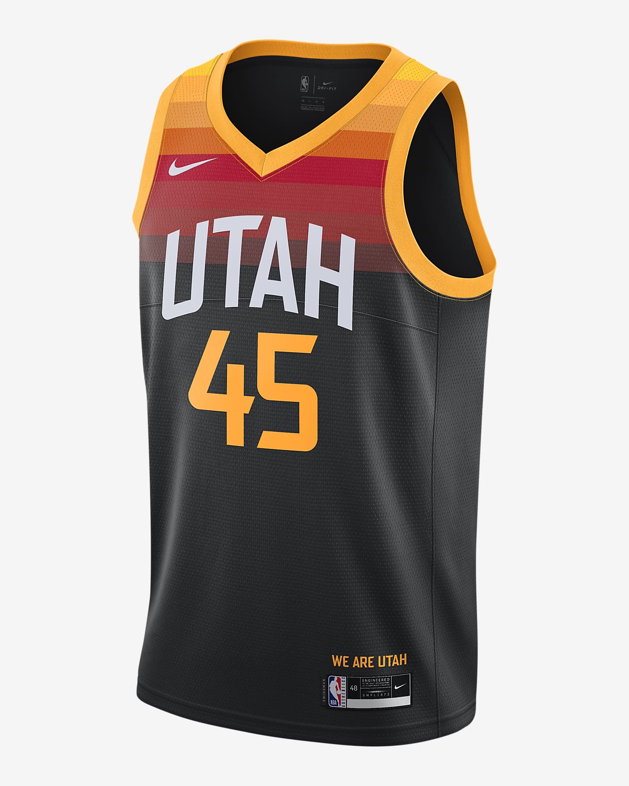
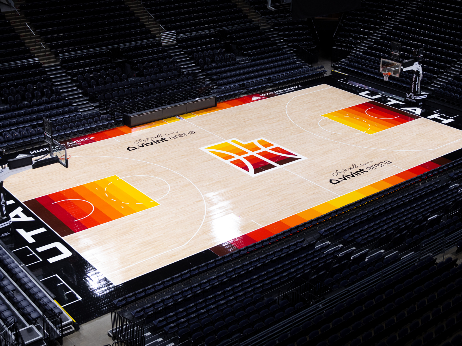
On 2/27/2022 at 7:39 PM, pelicanfan said:
the new jazz colors have slowly grown on me. but then again it's just black and yellow
it just still really baffles me how they decided not to rebrand around the redrock jerseys. everything they need minus a white jersey is already there for them.
this could be their association edition
keep these and move them down to become the icon edition
bring these back and make them the statement edition. and then boom you have yourself a top 5 jersey set in the league
the logos are already there (they could make more matching ones if they want)
and they already have one of the best looking basketball courts ever.
This would be a great identity and uniform!!!! Too bad Nike or the NBA would change them in 2 years. In 2024 they will probably have red and blue uniforms.
-
 1
1
-
 1
1
-
-
On 2/23/2022 at 11:27 AM, beachperroAZ said:
The Jazz are the Canucks and Padres of NBA. They can't freaking decide on an identity and stick with it long term. Although it looks like the Padres might have finally figured it out.
Oh, how I wish the NBA would read this text. Some team identities shouldn't be touched, while yes, maybe over the last few years some teams have finally found it's niche only to get rid of it a year later. I can't help but thinking what a great LONG TERM identity this would have been for OKC.
-
14
-
 1
1
-
-
3 hours ago, dont care said:
It’s just like most things. K.I.S.S. Or Keep It Simple Stupid. When you try to get too cute, and follow trends and over complicate things you ultimately come up with worse looks than doing the obvious things.
So true, whoever the leagues are hiring to design these new uniforms (and probably have never watched a game in their lives) seem to overthink everything from trying to to add something pertaining to the city seems all the time, and I especially laugh when describing a color, it's not blue but BOLD blue or ANGRY red. THEY ARE FREAKIN COLORS! K.I.S.S., amen!!!
-
1
-
-
16 hours ago, nash61 said:
Not my concept, but this is really the only way to make the Fisherman work as a RR
http://wxornotbg.com/wp-content/uploads/2019/07/giphy-5.gif
-
12 hours ago, IceCap said:
The amazing thing is that there's not one part of this I like.
The W- it's fine on its own but this is a ninety-year old franchise. You look at the older teams with monogram logos and they all use something that's far more traditional than this very modern typeface.
The helmets. The fact that's there's two is an unforgivable sin and ushers in the great degradation of NFL identities. The black one is total garbage.
The burgundy one is ruined by the satin finish and the single stripe that matches nothing else.
Burgundy jersey- Probably the best jersey, but ruined for me by the giant COMMANDERS wordmark.
White jersey- Dot matrix gradient? The hell? The team and Nike describe it as forward thinking. In what way is dot matrix forward thinking in 2022?
Black jersey- trash. Just...trash. They're going to look awful in black head to toe.
Pants- monochrome always sucks, and the fact that these don't have stripes makes them worse.
What's even more egregious is that the team openly admitted to replacing gold on the whites with black to justify a black alternate. That's the most blatant case of BFBS as I've ever heard.
Great post. So many good points that if I try to type them out, I won't have fingers left!!! I will break my record for using the bold icon more than I ever have for any post, in any forum that I've ever belonged to.
-
1
-
-
On 1/30/2022 at 9:41 PM, ManillaToad said:
Flames look the best they ever have right now

-
2
-
-
1 hour ago, nuordr said:
I just found another issue with the rebrand. Apparently, the team put the wrong years in their secondary logo for years they won the Super Bowl.
1983 should be 1982
1998 should be 1987
1992 should be 1991
Holy crap!!!!!! How did I miss that??? Oh, it was the sh#$%y uniforms. I want to pile on but I really don't think your Super Bowl years wrong is funny. Wow. Tremendous job nuordr
-
2
-
-
-
48 minutes ago, Needschat said:
It's 2022, not 1992!
Enough with the black third/special/alternate jersey!!
Burgundy and gold are fine. I mean, I preferred the Philadelphia Fury burgundy, but hey!
I'm sick of them too. Pick an identity and stick with it. They killed it.
-
2
-
-
2 minutes ago, Mingjai said:
The should have taken these uniforms, swapped the spear for something from their new identity, and called it a day.
2 minutes ago, Mingjai said:The should have taken these uniforms, swapped the spear for something from their new identity, and called it a day.
That would be fine too.
-
Should have taken the feather off spear(as to not insult the American Indian), call them the "Washington Warriors", done.
-
8
-
-
3 hours ago, AFirestormToPurify said:
I think the years were in reference to a Cup or at least a Cup final appearance in most cases
Mostly agree as both teams look great but I am the only one who misses the yellow numbers?
BETTER THAN
-
12
-
-
7 hours ago, PlayGloria said:
I almost made a similar post recently about numbers of colors and how it correlates to a clean look, but could articulate it right. You are spot on though. The Blues are a strange one because having multiple blues fits the team name while also differentiating them from the league a bit.
Also, it was great timing as last night, my Blues were playing the Flames. If you didn't see that game, the uniform matchup was superb. Neither team should change a thing. Gorgeous.
Absolutely right, this was one of the best games visually in recent times.
-
On 1/24/2022 at 7:38 PM, SFGiants58 said:
The Flames finally look like themselves again after all the years with black. They never needed black and nor did the North Stars.
Great post. Plus add the fact that most teams just need two primary colors to look fine as teams went back to throwbacks recently because maybe they made mistakes along the way(see 2007 Reebok takeover).
Penguins-Black/yellow
Islanders-Royal/orange
Devils-Red/Black
Rangers-Royal/red
Capitals-Royal/red
Red wings-Red
Leafs-Blue
Canadians-Red/royal
Bruins-Black/yellow
Sabres-Royal/yellow
Canucks-Royal/green
Kings-Black/silver
Oilers-Navy(shoulda kept royal)/orange
Lightning-Blue
Blue Jackets-blue/red
Flyers-Orange/black
Black Hawks-red/black
other than the Blues(two blues/yellow), the rest of the league has mashed 3 or more colors together, some look
fine but some are a mess. Of the 17 teams listed above, the Oilers and Blues comment along with the Kings terrible logo, I'd
have to say that less color is more when it come to how good a team uniform looks.
-
2
-
-
3 hours ago, Cujo said:
Stranger than Jerry in any other uniform *not* the 49ers, is him *not* wearing #80.
He even had the balls to ask Largent for 80 when he went to Seattle(not a classy move but that's just my opinion).
-
4
-
-
13 hours ago, WSU151 said:
LOL well done
AHHHH yes. The uniform that started the introduction of really stupid NFL uniforms. Looking at you Cardinals, 2002 Bills, 2004 Falcons just to name a few. Yes, also they took the identity of the Broncos away by going to navy jerseys. That Elway may be an important figure in NFL lure someday. Seems to know what he's speaking about.

-
2
-
-
On 11/23/2021 at 11:42 AM, insert name said:
Black Fridays for the Mets are here to stay.
It was quickly pointed out that the replicas shown in the video and website are missing the neck piping. A slight redesign maybe? Seems weird to remove an element that's been on nearly every Mets alternative.
Terrible news!!!
-
3
-
-
I've said since the Padres and Brewers corrected their boring drab uniforms(and added some nostalgia while they were at it) and the Diamondbacks tapered down those terrible uniforms before these, the league has looked the best it has in a loooong time as a whole. Yes, Miami might be a mess but I don't think we are going to see the 1993 uniforms anymore. I think we hopefully won't see any major changes. It's refreshing unlike other leagues(lookin at you NBA) to be able tell what teams are playing. I just would be happy with home, road grays(or powder blues) and a single alternate jersey. Being a Mets fan, there's no need for two blue alternates. So, I've heard the Rockies might do something with their alternate but they got it right the first time, no need to change. The MLB looks really good now. Root for the laundry!
-
4
-
-
On 10/27/2021 at 6:34 PM, Lumbergh said:
One my first fitted caps as a youngster. I'd love to see it come back in some fashion.
Fun team too, two great championships.
-
Who knew ten years ago that the players would be wearing fashion jerseys disguised as uniforms. Oh, and I forgot the Ads too. I really wonder if this cash grab the NBA has overly done really made a HUGE difference in revenue. I find it hard to believe, even if you're a jersey nut like we all are, that the line had to be drawn somewhere as far as purchasing every jersey that a team or even your own team drops. I'm sure someone here could make a "poster" of every jersey since the NBA started this crap, what it would look like. It sure would take up a lot of space.
-
3
-
-
1 hour ago, MCM0313 said:
By the time I got to the end of this comment, I knew who its author was. That isn’t a bad thing, necessarily.
Also, by “shiny sublimated shoulder spikes”, did you mean the ends of the toilet bowl collars Nike was all about in 2012-13?
Yeah, that ended up just being another Nike BS ploy stating the collars as "Flywire". What purpose did it serve other than to look ugly and I never heard a player say "gee, my collar is too tight, I wish it was flywire".
-
1
-
-
21 hours ago, dont care said:
but when you have city uniforms that change every year, and constantly wear throwbacks that just isn't going to happen
One of the best post on this site EVER!
-
1
-


/cdn.vox-cdn.com/uploads/chorus_image/image/54506161/Sanford_2017_Blues_jersey_2017_04_27_002.0.jpeg)


NFL 2022 Changes
in Sports Logo News
Posted
The Patriot's best look ever!!!!