


panthers_2012
-
Posts
1,603 -
Joined
-
Last visited
Posts posted by panthers_2012
-
-
Am I one of the outsiders that really liked the Jaguars helmet that was black, but then went teal when the sun hit it?
The big issue I have with their uniforms is that they're boring. And I'm gonna be honest, they need more teal.
-
 1
1
-
-
Finally!! Return of RoboPenguin!!
-
2
-
-
11 hours ago, Kramerica Industries said:
I mean, wouldn't a proper throwback feature the old NFL shield logo at midfield? I know why it doesn't - the franchise doesn't want to associate with Jerry Richardson's preferences any more than they absolutely have to - but the field design as-is isn't one that Sam Mills ever played on coached on, right? Wasn't it 2018 after Tepper became owner that the Panthers finally put their logo at midfield?
Yes, when Tepper became the owner, he put the logo at mid field. I never liked the shield at midfield. I thought it was lazy and not practical on Richardson's part. If I recall (and this was years ago), I read that he put the shield at midfield as a thank you to the NFL for giving them a franchise. And yes, Mills never played/coached with the panther head at midfield. I enjoyed seeing the old designs today.
-
4
-
-
43 minutes ago, BBTV said:
Are they using the original logo on the helmet / sleeves too - like a "throwback" uniform (that hardly anyone would recognize as a throwback)?
Nope. Using the current logo on the helmets.
-
I love it! And they have the original logo at midfield also.
-
5
-
 1
1
-
-
The Steelers tweeted out about their Alumni weekend and had this logo for their 90th season.
-
1
-
-
4 hours ago, GriffinM6 said:

Leaks for 26 teams are in the mothership article. Looks like the Rangers are doing Lady Liberty in royal blue and the Wild will be an inverse of the previous RR. I see Arizona is in black. Not really sure why they'd do that since their primary look already uses black. Would've been a good opportunity to go green or even use sand as the base color, but knowing them, they can't do anything right.
ROBO PENGUIN!!!!
I wish the Blue Jackets used their old logo, and the Kings shirt looks out of place with the others.
-
Moose please
-
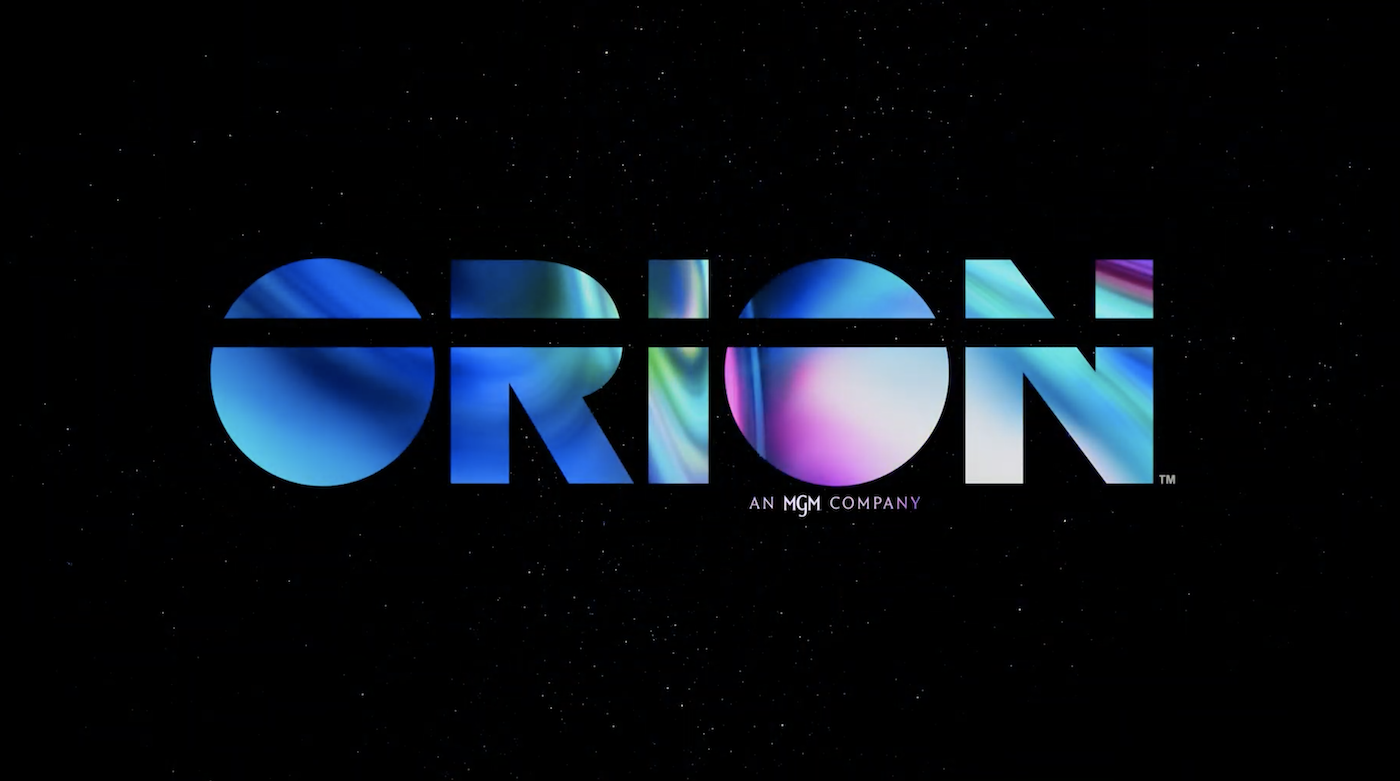
On 7/21/2022 at 8:32 PM, TrueYankee26 said:
Even Orion Pictures (I did not expect that) gets a brand new logo.
Old logo
New logo
And the video of the new logo
All I can think is Adam West from Family Guy
"That's right. All you are is a failed production company."
-
1
-
-
It's gonna be Nike. I have a bad feeling they'll get the contact.
-
On 6/9/2022 at 5:58 PM, CaliforniaGlowin said:
And it reacts to black light! Sick
-
It's beautiful
-
9
-
 1
1
-
 1
1
-
 2
2
-
-
Lake Erie Crushers introduced a green jersey a couple months ago. Totally forgot to post here about it.
-
On 7/6/2022 at 12:00 AM, 29texan said:
How the tables have turned.
-
 1
1
-
-
9 hours ago, pepis21 said:
Not now but when free agency window become open they would need to resolve Gobert-Mitchell case somehow.
New sponsor for Spurs:
So you can say the Spurs are "self sponsored"?

-
2
-
 1
1
-
6
-
-
4 hours ago, Ridleylash said:
The Atlanta Gladiators have released their 20th anniversary logo;
That outline..... Ouch.
-
2
-
1
-
-
-
23 hours ago, TheGiantsFan said:
Ohio's newest license plates are honestly such a trainwreck
It's true. I have the "old" one, the one with all the gray wording on it. Even though I miss my bicentennial plates from my old car. I liked those plates.
This concept is a whole lot better and this is what should be used for the plates. Nice job!
-
17 minutes ago, Hat Boy said:
Maybe he meant to write "POOP"?
-
1
-
3
-
5
-
-
I have a feeling in the next few days, the Cavs might release the C sword logo. A lot of people are upset that the logo is gone, including me.
But I really like the logos. I think this fits the Cavs. As much as I liked the navy, I'm okay with the black since it is such an important piece in Cavs, not to mention Cleveland, history.
-
56 minutes ago, Germanshepherd said:
Yeah no sword is very disappointing, and the 3 colors work better with the C, something about the gold touching wine looks off.
But that new Cavsketball wordmark slaps
I'm holding onto hope that the sword C is still part of the set.
-
3
-
-
8 hours ago, Conrad. said:
New logo being used on the top nav of Cavs.com:
Okay, I like it. And again, if they keep the black and drop the navy, I'm cool with it. All signs point to them going towards this and I'm okay with it.
-
37 minutes ago, CitizenTino said:
Rumor has it the Cavs are unveiling a new logo and updated colors on Thursday.
If they do, they need to drop the black or navy. They shouldn't have both.
-
7
-
-
15 hours ago, TenaciousG said:
Are they even allowed to cover the hashmarks like that? This is a marching band’s worst nightmare lol.
Yes, that's our worst fear. No hash marks, or working with hash marks that don't match up when you get to the field. I had that a couple of years at college and my director wasn't happy with the grounds crew because we had to practice in a parking lot and when we got to the main field, we had to re-learn the drill because we were going off the parking lot hash marks.
My issue is the logo. That logo, IMHO, is too big for a football field for it to be the center logo.


Warner Bros. 100th anniversary logo
in General Design
Posted
Let's focus on the happy stuff from Warner Bros.
They released a logo for their 100th anniversary coming up next year.
It's okay at best. I wish the WB logo was in the middle, splitting the 1 and the other 0, but they didn't hire me to design it.
I don't know why, but the gold logo looks a lot better than the blue one.
Probably because this will be the one used for theatrical releases.