


panthers_2012
-
Posts
1,602 -
Joined
-
Last visited
Posts posted by panthers_2012
-
-
6 hours ago, IceCap said:
Listen TheSoundOfThrowingPennies, do you have nothing better to do then come here every other NFL off-season and spread a bunch of fake "leaks"?
TheSoundofThrowingPennies brought me back. Damn... Forgot about them.
-
 1
1
-
-
I like it. I think it's a lot better than the previous logo.
-
2 hours ago, Brave-Bird 08 said:
For the Panthers, trying to retain their original uniform actually just doesn't fit on the modern template. The contrasting collar is gaudy, the sleeve swoops don't work, and the jersey is so crowded near the shoulders that their TV numbers are the size of a laptop sticker.
Agreed. I like the swoops on the sleeve, but I think they can do one color instead of two. I know that won't solve the issue, but I think the Panthers are trying to walk that fine line of changing the uniform, but also not making drastic changes, like the Browns did.
-
They're going to be like the Hawks and drop highlighter yellow after 5 years.
-
 5
5
-
 1
1
-
-
Cavs are getting a new jersey sponsor

From press release: The NBA Cleveland Cavaliers and Cleveland-Cliffs Inc., the largest flat-rolled steel producer in North America, today announced an expansion of their existing multi-year marketing agreement to put the Cliffs logo on the Cavs player uniforms beginning with the 2022-23 season.
I don't like sponsors in the uniforms, but the Goodyear logo fit perfectly because it was small and they matched the colors to the jersey. I know when I watch the games, I forget that it's there because it blends in with the jersey. But this won't. I don't like it.
-
1
-
 1
1
-
-
On 3/31/2022 at 6:04 PM, TheGiantsFan said:
Lastly, the 190 residents of Ni’ihau have a faded gray color to signify its isolation from the rest of the state.
Damn, that's brutal.
Awesome job with these! Cant wait to see the rest!
-
Boo. Do these companies feel the need to rebrand to a logo that sucks?
-
3
-
1
-
-
On 2/20/2022 at 1:52 AM, Big Yellow Flag said:
Grays was, as I recall, the name used by the Frontier League's last travelling team (a common strategy used when a team unexpectedly folds, to keep things even).
Yeah. The Greys were on the schedule this year, but then were "replaced" by the Empire State Greys.
-
New team out of the Frontier League: The Empire State Greys
And yes, I do find it weird that they are still a traveling team.
-
If the second helmet is true for Carolina, I would want it to be black. I think that would look better with their look than the blue.
And here's hoping that if the black helmet is well received, they'll replace the silver helmets as the primary.
-
1
-
1
-
-
1 hour ago, MNtwins3 said:
NFL teams need to stop going "what can we change about our uniforms that will make us hip with the youths!"
God it's so true. I'm not surprised no one in the NFL learned from the Browns mistake.
-
6
-
-
10 hours ago, Survival79 said:
These can't be real, right?
"The black number outline and stripe on the sleeve paved the way for the black alternate jersey."
Oh Lord. I hate these even more.
12 hours ago, nuordr said:I just found another issue with the rebrand. Apparently, the team put the wrong years in their secondary logo for years they won the Super Bowl.
1983 should be 1982
1998 should be 1987
1992 should be 1991
They can't get anything right. I get the point for the years, but I like subtle references, like in the Islanders logo. It's just too many elements going on in this logo.
-
1
-
-
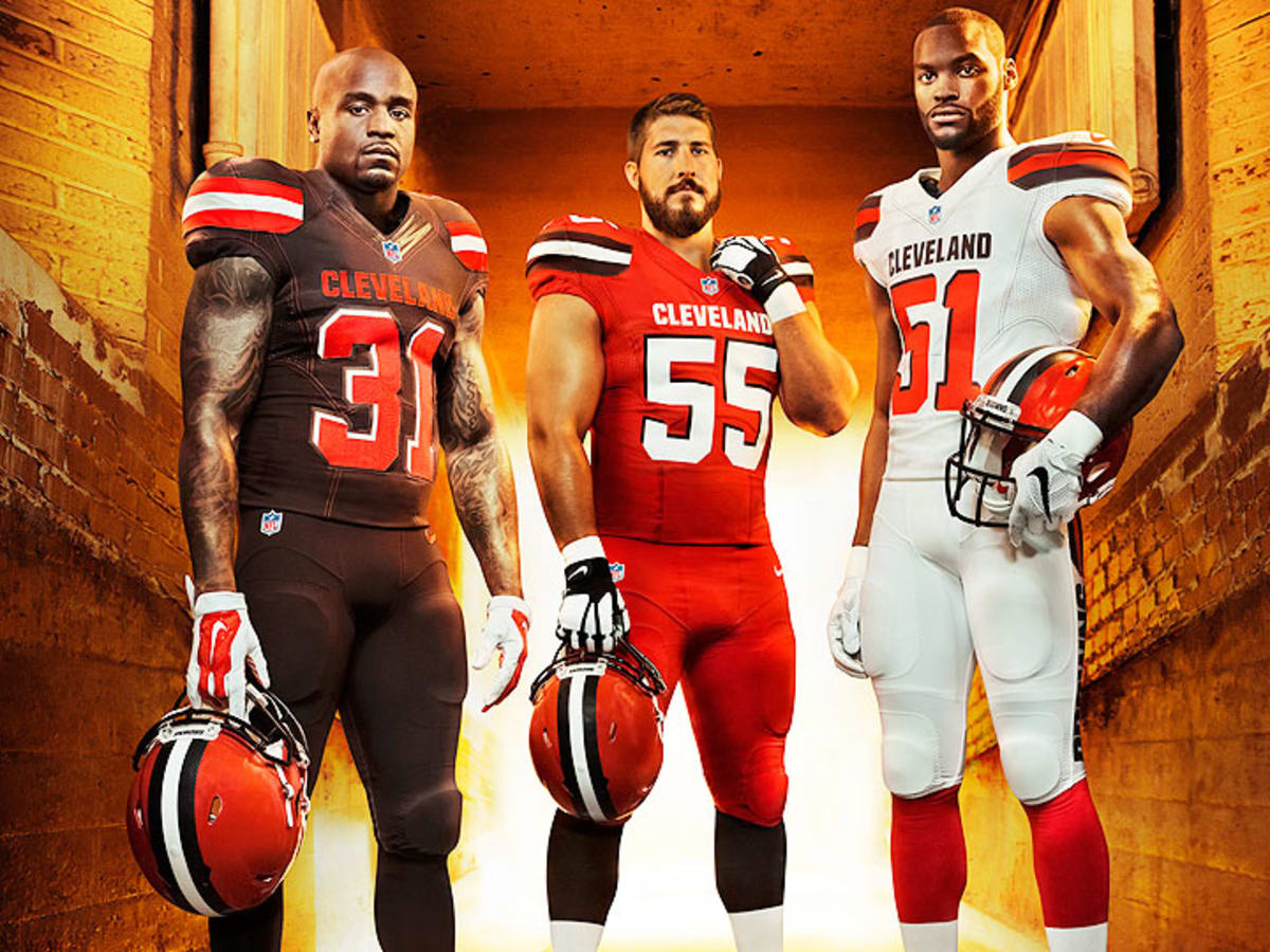
Welcome to the Browns 2.0.... Should've kept the traditional look of the old team. They went way too far on the crazy end, but hey, fans will buy jerseys right??
And I hate the black uniform. God, why do they think black uniforms look cool for a team whose primary colors are burgundy and gold? Ugh, just make me mad.
-
2
-
-
34 minutes ago, selgy said:
Did they think this out?
It's Dan Snyder. He doesn't think anything out. It took them this long to get rid of the name so it'll be interesting to see how this goes.
-
3
-
-
Yes, they relocated this season to Cleveland. Current trend of NBAGL teams being closer to parent team.
-
1
-
-
1 hour ago, habsfan1 said:
This could be just another concept. I saw this posted yesterday.
-
3
-
-
4 hours ago, Discrim said:
Why not, there are already Sock Puppets and Mighty Mussels, among others. Team Absurdity for the win!
And Rubber Ducks, Rumble Ponies, Yard Goats...etc. Just imagine how funny the Balloon Animal logo could be.
-
Balloon animals.
-
On 11/19/2021 at 1:34 PM, DCarp1231 said:
Reminder that Nike helped create these
They better not screw up Washington
-
6
-
-
I don't know if anyone has noticed this...The Cavs city court has the logo of the Coliseum and Gund Arena on it.
-
8
-
-
2 hours ago, YELDARBfield said:
Savannah's ECHL team is officially the Ghost Pirates.
I'm getting strong Savannah Bananas logo vibe
Is it just me?
-
2
-
-
2 hours ago, Conrad. said:
Intriguing logo on these tees, with the OG Raptor wearing a chevron jersey...maybe it has something to do with the City unis

Please bring the logo back.
-
2
-
-
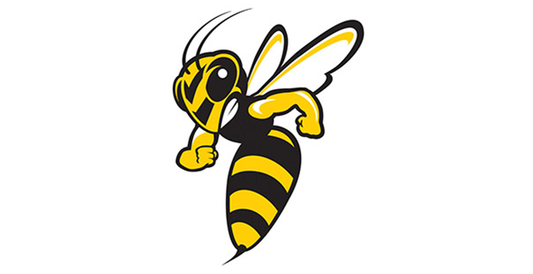
3 hours ago, stumpygremlin said:
Hot take:
That old yellow jacket is better than the current one:
I like the "new" one, but I grew up with the the old logo so I like it. I like to call it "the praying mantis" logo.
-
I REALLY like both of them, but Seal Slingers holds a slight edge as the favorite for me.


College athletics identity changes
in Sports Logo News
Posted
Dull. I liked the kangaroo logo and I wish they would use that more.