


TheOldRoman
-
Posts
6,938 -
Joined
-
Last visited
-
Days Won
20
Posts posted by TheOldRoman
-
-
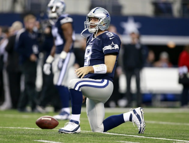
The Cowboys current blue jerseys. Most people on here seem to love them. but I think they're terrible. It's incredibly dumb that they use navy instead of royal blue, which the Cowboys have always worn and continue to wear 95% of the time. Going with white numbers with a white detached outline is dumb, particularly when they could have used silver in there somewhere. The sleeves are a mess, and shouldn't differ from the design of the white jerseys. They look like Walmart kids' jerseys where they slap the logo on the sleeves over the striping. Logos should never be combined with stripes, and they certainly shouldn't overlap stripes. Also, the star isn't even centered on the stripes, it just awkwardly hangs off at the top. The only somewhat-redeeming quality of these jerseys is that they match the silver to the helmet, but even with that, it might be better for the Cowboys to just change their helmets to the silver-green at this point (or preferably bluish silver like they used to be). This is closer to what they should look like:

-
 1
1
-
-
Here's one I don't think anyone has mentioned: I dislike the Colts' road uniforms (although I like their homes). I know they get a lot of love around here, but they look unbalanced to me. White helmet, white jersey, white pants, blue socks. Everything is white except for this block blue on the socks, which actually looks worse now that players break the rules and wear solid blue socks. The Jets all white look worked with green socks because their sleeves are green. I think the Colts could improve their road set by doing what the Jets do now and wearing striped white socks with it. I loved the Colts' short-lived blue pants, but I think the time has passed for the Colts to be drastically altering their look.
-
Hulsizer is gonna try to fax a contract to Minnesota but it's just gonna send sc49erfan15's avatar a hundred times.
Okay, I had to look up his avatar, but I laughed for a solid minute afterwards. Good work.
-
I don't think it's a horrible idea at all. Navy pinstriped suits are always in style, and give them kind of a mob element that's kidna cool.
What I don't like is the NY on it. Just the New York wordmark would work better, or a Yankees wordmark (either block, or the script.)
It wouldn't be a terrible look, but having the navy uniform with white pinstripes would contrast with the solid navy hat. Like, imagine the Yankees (or any pinstriped team) wearing a solid white hat with their home jerseys. It would look off, and I don't know that there'd be a way to make it work.
-
These are three of my favorite alt jerseys of all time, even if they may be BFBS:
An alternate jersey that died out too quickly. BFBS or not...that was one of my favorite uniforms. Funny, though, that we'd probably say "Oh man...just another team jumping on the black jersey trend" if it was released today.
They should have worn those jerseys longer instead of switching to the Steve Nash-era wide shouldered crap, sure. But the black alternate came about a year after that set was unveiled (1993) and lasted until they rebranded. And by the 94/95 season, the black jerseys became the default roads and the purples were rarely seen.
I also love that Suns set, but I would like to see someone remove the black from the home and road, going with just purple, orange and white. I think it could make them even better.
-
The jerseys may be garish, but the Buccaneers' combination game is something I really like. White on white is especially sharp.
The only change they need to make is the number font. And they would have a nice, modern uniforms
Dude, no. Pick any font you want - a thick block, a thin block, a rounded block, a different custom font - their current set is absolutely the worst in the NFL no matter what font you slap on it. The horrific font is just sewage-icing on the crap cake that is the current Buccaneers uniforms (and team, really).
-
1
-
-

This one doesn't seem rare, but in the 3 seasons these jerseys coincided, the Penguins only wore that black uni twice against the Blues here and once in 1997-98 (I did some research for this one- when the Pens played at Kiel Center in 1995-96 and 1996-97, they wore the old diagonal PITTSBURGH jerseys)
The mid-1990's summed up in one picture.
Needs more Coolio.
-
Yeah, we had high hopes for him in Minnesota. My memory of him struggling, then hitting like 4 homers in 5 games and promptly getting injured. Then coming back from IR and repeating. When the Twins finally gave up on him, I did not dispute it...then, well...
It could be wrong, but I remember hearing that Ortiz was poor fundamentally and refused to do things "the Twins way", such as sacrifice power to hit to the opposite field. Either way, the steroids had a huge role in him becoming such a star hitter.
-
1
-
-
I mean, I understand liking the red helmet more than white, but if you placed a red helmet on top of a steaming pile of elephant crap, it wouldn't look better than the Bills' current unis. There is just so, so much wrong with the last Bills set that I can't see how anybody could prefer it to their current one. And even the red helmet was bad in that era as it was muddied and had seven freaking stripes.
-
I really, REALLY miss those Broncos unis. They were incredible.
I also really miss that Wilson-era block font with the diagonal S. Off the top of my head, the Chiefs and Broncos used it in the '90s, but I can't think of other teams. I wouldn't want every team using it, but it was a nice divergence while still being a block font.
-
The Royals' previous road script was better. The current one looks too small and weak.

The Orioles' old road script was also better than the current one.
I don't think either of those opinions are unpopular, and both are correct. The Royals change was a big blunder that didn't need to be made. That Baltimore script was too tapered, so instead of fixing it by making the right side wider, they just tilted it clockwise. Dumb.
-
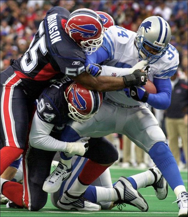
First year of those Bills uniforms, last year of those Lions uniforms
Good one! That's the second biggest "wow" moment for me on this thread after pewter Bucs vs. old Jets.
PS: How good do the Lions look here? So very, very good.
Put the new lion on that set and we're good.
I could take or leave the new logo. That old set was incredible. The only thing keeping it from being perfect (just barely) was how the helmet decals were too dark, not really Honolulu blue. Then again, the Lions STILL haven't figured out how to make decals that aren't royal blue.
-
Can't be any worse than this:
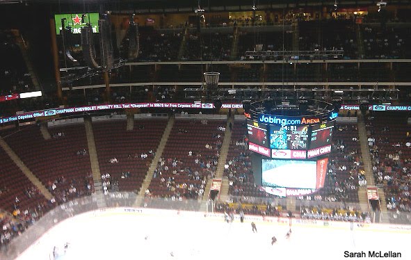
Getting go the Key may be a pain, but it's a nice arena.
No, the Jobberdome is a really nice new arena in a terrible location. The KeyArena is an old, inadequate stadium that would come with no guarantees that a region which hasn't had the NHL in 90 years would jump right in, especially since it looks like the Coyotes' window of being competitive may have closed. Maybe Seattle would have taken to the Coyotes, but within five years the Sonics will likely be back, and the hockey team might not be faring much better than they currently are in Glendale. I'm not calling for the Coyotes to stay in the desert, but I don't think moving them to Seattle would be a good option, either.
-

Sigh. I miss that Seahawks set.
-
1
-
-
Um, yes, there were striping inconsistencies. The helmet, sleeves, and collar/pants all clearly use different striping patterns.There were no striping inconsistencies. The stripes on blue jersey was red surrounding thick white. The stripes on all other elements were red surrounding thick blue, with white stripes added to the helmet to show the red stripes. Unless you desire the consistent to a fault crap like Florida's stripes, I can't see any way that Bills set was inconsistent. Even the numbers were consistent with the striping colors on each jersey, and that's not even necessary.
My only issue with that set was that it was too red-heavy on the road. It would have looked incredible with blue pants and white socks matching the stripes on the white jerseys.
I do agree with your point about the road uniforms being too red-heavy. However, when that set was first introduced, they had the perfect solution:

Please explain the inconsistencies. The stripes, collar and numbers on the blue jersey are thick white with a thin red outline. The stripes, collar and numbers on all other elements (white jerseys, white pants and red helmets) featured a thick blue with a thin red outline, surrounded by white. They literally couldn't get any more consistent unless they went the stupid route of Florida football and put thick blue stripes on the blue jersey just to say they were being really consistent.
-
There were no striping inconsistencies. The stripes on blue jersey was red surrounding thick white. The stripes on all other elements were red surrounding thick blue, with white stripes added to the helmet to show the red stripes. Unless you desire the consistent to a fault crap like Florida's stripes, I can't see any way that Bills set was inconsistent. Even the numbers were consistent with the striping colors on each jersey, and that's not even necessary.
My only issue with that set was that it was too red-heavy on the road. It would have looked incredible with blue pants and white socks matching the stripes on the white jerseys.
-
Yes, the Cardinals' black jersey is very much BFBS. They've had black accents on the road jerseys for a while, and in the recent rebrand they added black outlines to the home jersey and some black piping, too. Still, they are the Cardinals and their identity has always been cardinal red. Them taking the field in white helmets and pants with a black jersey, with a tiny bit of red you can't see from any distance is definitely not any kind of organic alternate for them. I'm only surprised they didn't double down on stupid and pair them with black pants, to make the players that much more intimidating.
-
I don't think there will ever be a time when I read the name "Vinnie Viola" without laughing. Vinnie Viola! He stands among Boots DelBiaggio with names so comically appropriate of criminal stereotypes, they should actually be professional wrestlers. I'm assuming the NHL also uses the legal counsel of Dewey, Cheatum and Howe.
-
2
-
-
I'd agree that a lot of the people don't know the jerseys are fake. I have one friend who had multiple fakes, who tried to argue with me that they looked nearly identical to my authentic jersey. He didn't care. Another friend at work sent around an email that a friend of his found a website selling cheap jerseys. I told him they were fake, and he said he knew and didn't care. But on the other hand, a few ladies at work were genuinely shocked when I suggested that the $30 Bears jerseys they bought off a folding table from a guy in the subway were fake. And like Mr. Negative said, it's not just the fans buying these things, it's parents, grandparents, wives and others buying them as gifts.
-
^ Yeah, that looks every bit as bad as the monochromes. The Seahawks of that era had the same problem the Eagles still have. They have a good, unique color which doesn't work in the way it's used. Both colors look great on the helmets in nearly every setting. However, they had a problem with the jerseys looking much, much darker than the helmets, especially once they got sweaty. I think the only way to rectify this issue would have been for both teams to use the secondary color for the jerseys. The Seahawks should have used a navy jersey with that helmet, and the Eagles the black jersey with theirs. I don't like the Eagles wearing black jerseys, but that would be the best way to utilize the current colors.
As for the Seahawks, not only would a navy jersey have eliminated the monochrome, it would have allowed them to wear their blue pants and end up with a classic football layout: light(er) helmet with matching pants, dark jersey with matching socks. And they could have worn the blue pants home and road, essentially a modern take on what the Niners, Packers, Cowboys, Raiders and Lions do. Also, the navy with slate blue pants would have still given off the "dreary as hell" vibe they were looking for with that set.
-
The second outline might be the same width as the black outline. It could just be distortion in the picture.
As for who has two outlines? The White Sox on their black alts. They have the same issue as you see with the D and R above - the negative space completely fills in on several of the letters.
-
It's a classic look. It's somewhat cluttered, but not too much. Much, much better than their fauxbacks.
-
I'm one of the weird ones who prefers the Packers' road look. I get that the road look is "too yellow", but to me, the home look is not as good. Even with the white numbers, it feels like it's too saturated. I can't explain it. It's probably just bad memories from seeing the hated Packers be a perennial playoff team which was unbeatable at home, going to two Superbowls in my youth.
-
Right team, wrong uniform:

I disagree. That's his "right" uniform. It was an incredible uniform that was won by a burgeoning superstar QB with a loaded team on the rise. Then they changed to their current awful uniforms and coincidentally had huge collapses, failed greatly, got old and injured, and in the case of Rivers, became run-of-the-mill. Even if those unis weren't light years better than the current set, they'd be right for him because they represented something.

Unpopular Opinions
in Sports Logo General Discussion
Posted
Yeah, because the pinstripes were in a ballpark located in Uglyville.
I do have an irrational love for the FloJo set, but I always hated the pinstriped set. They just looked so ugly to me; overly-busy yet bland. Way too much going on with the pinstripes AND full-length side panels AND five-stripe collars AND double outlines.