-
Posts
1,690 -
Joined
-
Last visited
-
Days Won
1
Posts posted by BrianLion
-
-
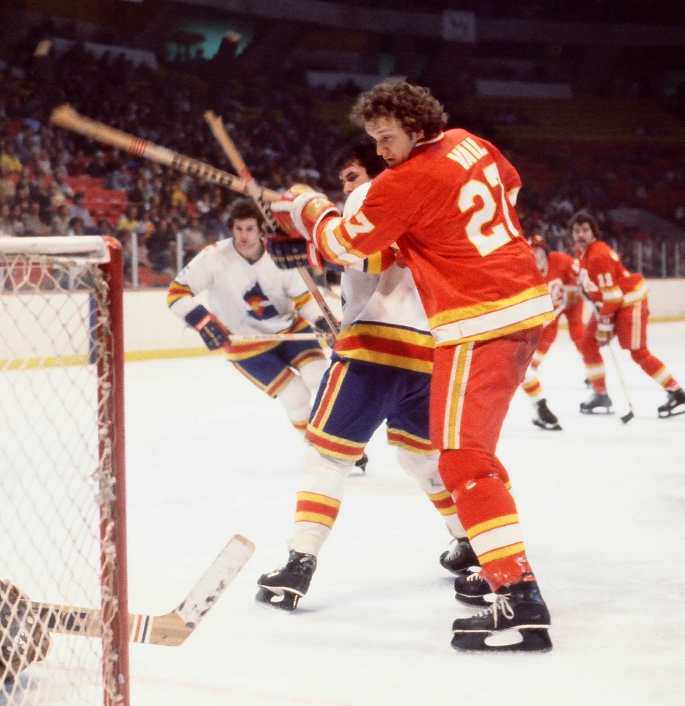
only played a few times from '76-'77 until the Flames left after '79-'80.
-
While I like their colors from the Golden Seals era better, I prefer the O because it is better balanced. Criminally underrated regardless of which iteration.

regardless of the "O" or the "C" all I ever see if a fish head on an ice cream cone in front of a watermelon.
I can only imagine the amount of acid the artist who rendered that was on for it to look like a "seal" to him.

-
 1
1
-
-

First year for those Leafs unis with the bigger lettering/numbering, last year of the original Shark jerseys
eh same Leafs uniform just a different numerical font.
-
Sabo is only in the wrong uniform if he's wearing contact lenses.
-
That's John Tavares. Not exactly obscure.
Seriously everyone...post names of hockey/soccer/obscure players.
The file name "Islanders-Fisherman-Fishsticks-Logo-2015.jpg" tells us nothing.
or ya know one could use the Google
-
Brewers vs twins
June 5 2014
Correct me if I'm wrong, but didn't the Twins and Brewers play in the same division these uniforms threw back to?
They weren't in the same Division, but they were both in the AL so they played about 12-13 times a year so this match-up wasn't all too "unique"
-
 1
1
-
-
Pretty sure Lightning v Whalers isn't common

Lightning came into the NHL in 92-93, Whalers moved to Carolina for the 97-98 season, so you have roughly 5 seasons of that matchup. Teams were in the same conference for four of those years so this likely occurred about 20 times.
-
Juan Gonzalez and Pudge Rodriguez in any Uniform other than a Texas Rangers Uniform....
Pudge went to World Series' with the Marlins and the Tigers. And then played for about 4 other teams before he retired. He played nearly half his career in a uniform other than Texas.
You can keep, Juan Gonzalez.
-
 1
1
-
-
This is one that really bugged me at the time. Joe Juneau scored the goal that knocked the Sabres out of the conference finals in 1998 (the year the Caps got demolished by the Red Wings), then he was on the Sabres the next year.
Michael Peca as a Leaf was always a weird one for me.
Or as a Canuck,

or an Oiler,

or a Blue Jacket....

-
Yoenis Cespedes in a red sox uniform ....... #vomit
Ah yes, we'll never forget his epic and storied 2 and a 2/3 year career as an Oakland A.
-
jeez, can you atleast wait until the guy actually ya know, wears the actual jersey?
-
Jared Lorenzen, much like the Universe itself, is infinitely expanding.
Here's a fun fact, the "Hefty Lefty" has as many Super Bowl rings as Peyton Manning.
-
 2
2
-
-
Okay, this is probably a highly unpopular opinion, but whatever. This?

This is a horrible jersey. Now, I'm fully aware that the Falcons' current jerseys aren't exactly top-notch, but that hardly excuses these. There's a fine line between beautiful simplicity (Green Bay) and generic movie team (Miami Sharks), and these dance all over that line. First, the color balance is off. I've never really been a fan of the "nothing matches" combo, but these particularly annoy me. Bright red helmets, nice...but where's the rest of the red to bring this together? Why are primarily black socks being worn with this jersey, confining the rest of the red mainly to pants and sock stripes, giving the impression that this is a black/white team, with red as trim (save for the helmet, of course)? And speaking of stripes, why are there none at all on the jersey? There's a clear stripe on the jersey, pants, and socks, so why is the jersey bare, save for numbers and another pet peeve...a 95% black logo, with nothing else save thin white and red outlines, on a black jersey. Brilliant. Maybe this is where some modern looks got the idea from. Truth be told, this doesn't look like an NFL jersey. This looks like a retro Texas Tech knockoff, or some random college squad. I firmly believe that this is one of those looks that only gets praise due to the majority of modern designs going off the rails. Again, there are truly classic looks, and then there are those that pitifully try to imitate them. These are the latter, in my opinion.
Was never a fan of those Atlanta jerseys from 1966,, they did add stripes to sleeves at one point and it improved the look:
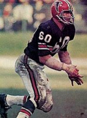
But for my money, they looked vastly better come 1971 when they went to a red uni.

-
Damn would've been a nice looking game.
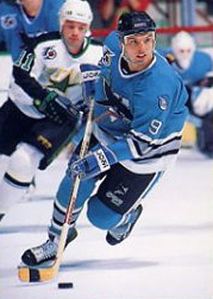
Nope. The final year of that logo was the last season pre-San Jose Sharks.Did the Old N logo North Stars ever play the Sharks?
the strange part is that many of the "N" North Stars actually became the Sharks. The teams first matchup looked like this:
-
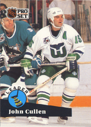
Again, no pics, but the San Jose Sharks and Hartford Whalers met three times in the 1991-92 season; the only season that the first-year Sharks met the Whalers in their mostly-green set. The Whalers would change their uniform the next year.
-
Christmas Devils vs the "Big V" Canucks

Only happened 6 times between 1982 (when Devils came into existence) and 1985 (when the Canucks went to the motion skate logo).
-
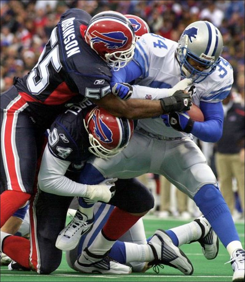
First year of those Bills uniforms, last year of those Lions uniforms
Good one! That's the second biggest "wow" moment for me on this thread after pewter Bucs vs. old Jets.
PS: How good do the Lions look here? So very, very good.
Put the new lion on that set and we're good.
-
The Jaguars helmet needs to be just one color.
GOLD is that color.

-
 2
2
-
-
Bucs and Jaguars uniforms are dope and Jonny Manziel is a beast.....
yeah he really lit up the Lions 2nd string defense with all those TD's...

-
 1
1
-
-
If somehow the Oakland Raiders end up relocating to a city outside of California, I think the team should do a total rebrand. Name, logos, colors, everything.
If they somehow end up in San Antonio, I'd definitely want them to keep the Silver & Black. Call them the Gunslingers if you must, but keep the Silver & Black.
Why not the San Antonio Riders? Didn't they have a WAFL team or something called the Riders once? Just drop the "a" ... problem solved.
Yes. And they actually had one of the better brown uniforms in recent memory.
Unfortunately, they also employed this guy

-
 1
1
-
-
The Jets are just a litany of wrong uniforms for about the last decade or so.
-
More like "EPPS READY FOR KERNING"
Amirite?
*crickets*
-
 1
1
-
-
This matchup isn't rare at all, it happened 2 a year for 10 years
2002 was the only season the Bills wore those unis on the old turf.
But the last time on old turf!
Matchups don't necessarily mean uniforms, it could be field or court designs as well. This is a rare matchup thread not rare uniform.
It's the thread of rare matchups of team uniforms. Pointing out differences in playing surface is a bit of a stretch.
-

I for one don't really really think the whole Blue Jays set from 2004-2011 was really that bad. It's a least better then that terrible "anthropomorphic, roided-out" Blue Jay they had the year previously.

The "Black Jays" would've been doable if they incorporated some more blue into the uniform. Like a blue cap with a black brim or a blue trim or something. As it was, they were unrecognizable as the "Blue Jays."
As for the Roid Jay, the mascot itself was fine, but it was a bit busy for a cap logo, and I've always appreciated how the Jays were one of the few teams who didn't have a letter on their caps.


Unpopular Opinions
in Sports Logo General Discussion
Posted
40+ years of a nostalgia and a Dynasty will cover up a lot.
at least it's indicative of the team's location and nickname unlike the Thunder...