


henburg
-
Posts
1,046 -
Joined
-
Last visited
-
Days Won
2
Posts posted by henburg
-
-
11 hours ago, oldschoolvikings said:
Only these, no others...

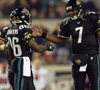
Hahaha I know that you've posted this a bit a few times before, but I think that seeing helmets like the Jaguars with a grey facemask will always force the same primal reaction of disgust out of me.
I mean, the grey facemask love is still mind-boggling to me. Outside of 5 or so teams that utilize grey/silver in the color scheme, it's always inferior to a color mask. The Bills just improved their uniforms tremendously with this change.
-
 20
20
-
-
It's kind of a bummer seeing (at least what feels like) a vast majority of minor league baseball teams adopting these ironic identities, because it really detracts from the other ones that actually work a lot better.
-
5
-
-
14 hours ago, tBBP said:
Let me get us back on topic.
Y'all really wanna know what greatness is?
Here...
That's greatness...uniform greatness, that is.
(It still ain't too late, Jacksonville...)
These uniforms are good for their emphasis on gold and use of the cool full-body sleeve logo, but they're also super dated and would need some updates to work for me today. The pants striping in particular is super uninspired all around and ugly on the black pants. The monochrome black look is also much worse in general because teal is completely lost in favor of white, which ironically mirrors the problems with the current set.
-
1
-
 1
1
-
-
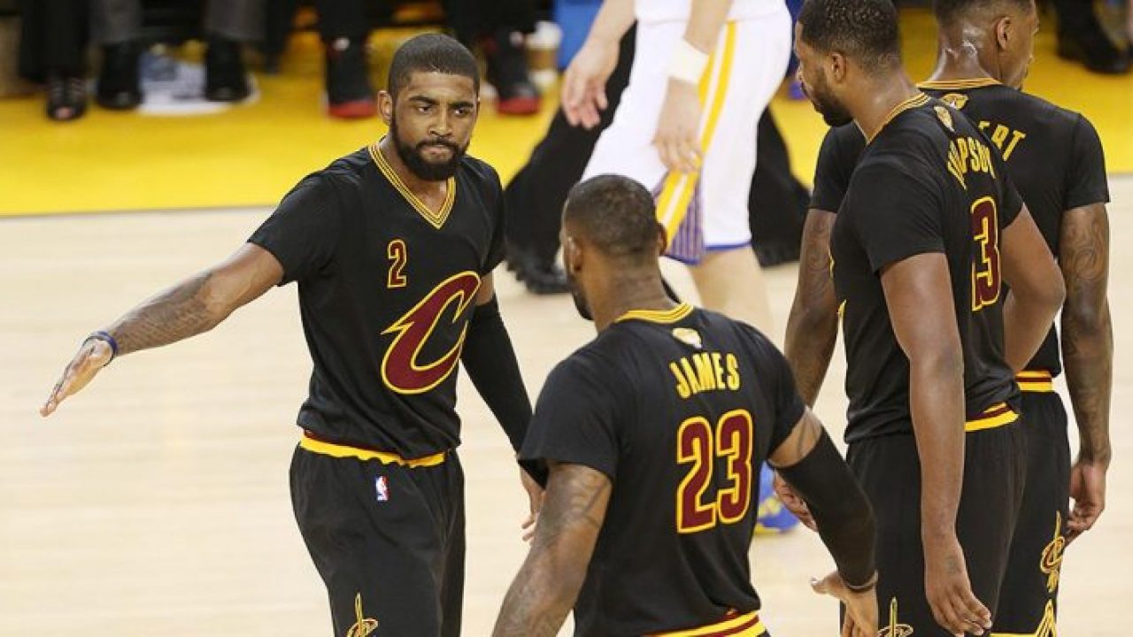
6 hours ago, phutmasterflex said:
Actually, they won a title wearing these and this launched their whole effort in making black a thing.
I still can't believe that LeBron James' greatest championship was won while wearing those stupid sleeved jerseys. Such a shame to immortalize these instead of literally any of their other looks.
-
11
-
-
20 minutes ago, Sec19Row53 said:
Why do they need freedom and variety? Pick your best look and wear it every freaking game.
I get it - this community is involved with logos and colors and uniforms and we like that stuff. That doesn't mean that we have to have teams wearing 8 looks over the course of 17 games. If we need that, we have the concepts forum
It all just depends on what you enjoy within sports aesthetics I guess. If standardization and tradition is your thing, then sticking to one set combo for home and away would be ideal and I get that. For me, I enjoy seeing new and different things over the course of a season. It allows for a team to expand its identity in interesting ways that keeps it all fresh.
That said, I'm not asking for every team to wear 20 combos, but limiting ourselves to 1 helmet, 2 jerseys, and 1-2 pairs of pants is just unnecessarily strict and arbitrary for a whole lot of teams. I see it much more similarly to how Baseball works now rather than College Football, where teams wear different color caps throughout the season that all compliment the identity in different ways.
-
I could get on board with a "two-helmet rule" that would essentially force teams to pick between using the second option as a throwback or an alternate team color of some kind. That way, most teams would simply be allowed to bring back their throwback looks that we miss, and teams lacking that history (Panthers, Ravens, Texans) could still mix it up and participate.
That's a win-win that limits the NFL from going full Oregon, but still gives teams a little more freedom and variety.
-
11
-
-
I think that Gradients CAN work for the right team, but a yellow to white gradient isn't the best idea due to obvious reasons. For example, I actually think that the Bengals uniforms could look really with some orange-white gradients mixed in under the stripes to further emulate their mascot visually-
There have been concepts on this board and elsewhere that have mocked this up before and I think it looks great. Unfortunately, I couldn't find any saved or on Google, but if anybody else could track them down for me then please do.
-
2
-
1
-
-
Multiple helmets should be allowed, and hypotheticals like the Rams abusing the rule to create black helmets shouldn't really scare any of us. After all, most of y'all already despise their look anyways. Seriously though, multiple helmets would allow for some of our favorite throwbacks to actually make a return, as well as smoothing some alternate looks that don't flow smoothly as they exist now, like the White Tiger Bengals or the Chargers in Navy. The benefits of it going away far outweigh any concerns I have of potentially gimmicky stuff.
-
8
-
-
11 hours ago, upperV03 said:
Arizona State going gold/white/white with white decals and facemasks on the gold helmets at OSU:
Really not a fan of this helmet setup at all. I just don’t think the white decals work on the gold shells.
It's really a shame that Arizona St took what was once a cool and coherent identity and just completely driven it into the dirt over the past several years. Pretty much the entire appeal is the combo of maroon and gold, so why take away your main color? It makes the cool pitchfork logo pretty impossible to see.
-
3
-
-
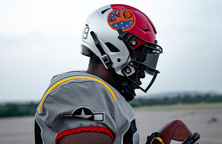
These are a great tribute as pretty much all of these military academy one-offs are, but shouldn't the silver and red be flipped on the helmet?
When reversed, the angle would even sort of mimic the red tails of the planes.
-
3
-
-
I really like the simplicity for them actually, I think it suits them. The number font is a very subtle improvement too by the looks of it. Only point of potential improvement is replacing the redundant sleeve logo with the Mountaineer.
(EDIT: This is in reference to the new App State look)
-
Yeah...unfortunately the mods may need to be on their toes for the next few months as more of these tributes are released and worn. Say it looks bad if you feel so, but this really isn't the right forum to delve into it further than that.
-
5
-
-
5 hours ago, SportsLogos.Net News said:
Iowa State Cyclones To Wear Jack Trice Uniform Patch
September 1, 2020 - 20:40 PM
In an act of solidarity against racism and discrimination, the Iowa State football program announced on Tuesday it will wear a symbolic Jack Trice patch on its football uniforms this fall. The first black athlete in Cyclones history, Trice tragically died from injuries suffered during a game at Minnesota on
That's a neat story and a nice subtle patch. That striping on his uniform could be adapted to today for a potentially cool alternate.
-
2
-
-
5 hours ago, docbrass said:
Is that close to Cardinals red? Looks like "SC" was stuck on at the bottom. could be better with year.
That is exactly what I first thought of when seeing it, and it makes sense too considering how popular the Cardinals are there. I really like the unique take on a boring color scheme.
Outside of that though, the name is ok bordering on dull and the crest is bad. I can't decipher any meaning out of it and all of the elements are so disjointed and tacked on. The crest shape shouldn't interact so weirdly with all of the symbols inside like this one does.
-
1
-
-
17 hours ago, cajunaggie08 said:
What a massive downgrade, this just sucks. The racing stripes and beveled font were a really good look for A&M, but now they can emulate Arkansas and Alabama in the name of nostalgia I guess. At this point Mississippi State might as well just remove all of their striping and secondary colors to show solidarity.
-
1
-
-
On 8/4/2020 at 1:55 PM, gosioux76 said:
That's interesting analysis, Brian. Thanks for sharing.
Interestingly, a prominent figure in the St. Louis soccer scene, Bill McDermott, trademarked the name Legacy St. Louis back in January. Best I can tell, he's not affiliated with team ownership. Here's the logo he trademarked. Based on this, I'd rule out Legacy.
That's a pretty slick crest actually, it's got a cool take on the river and the arch. Just tweak some the fonts and I'd really like to see something like this.
-
33 minutes ago, Lights Out said:
Not really.
Also these two, which I had never seen prior to yesterday while watching The Match-
It'd be essentially like turning down money for these athletes to not expand their personal brand.
-
5
-
-
(i'm just kidding please don't take this too seriously lol)
-
34
-
-
14 minutes ago, tron1013 said:
It's interesting that they specifically point out all of the colors utilized for shading in these logos, it's very LA Rams-esque in the case. I wonder if they'll really use those in any other places?
-
The Indiana State Sycamores going for an edgy, modern look is just misguided. Embrace something fun and vintage.
-
7
-
-
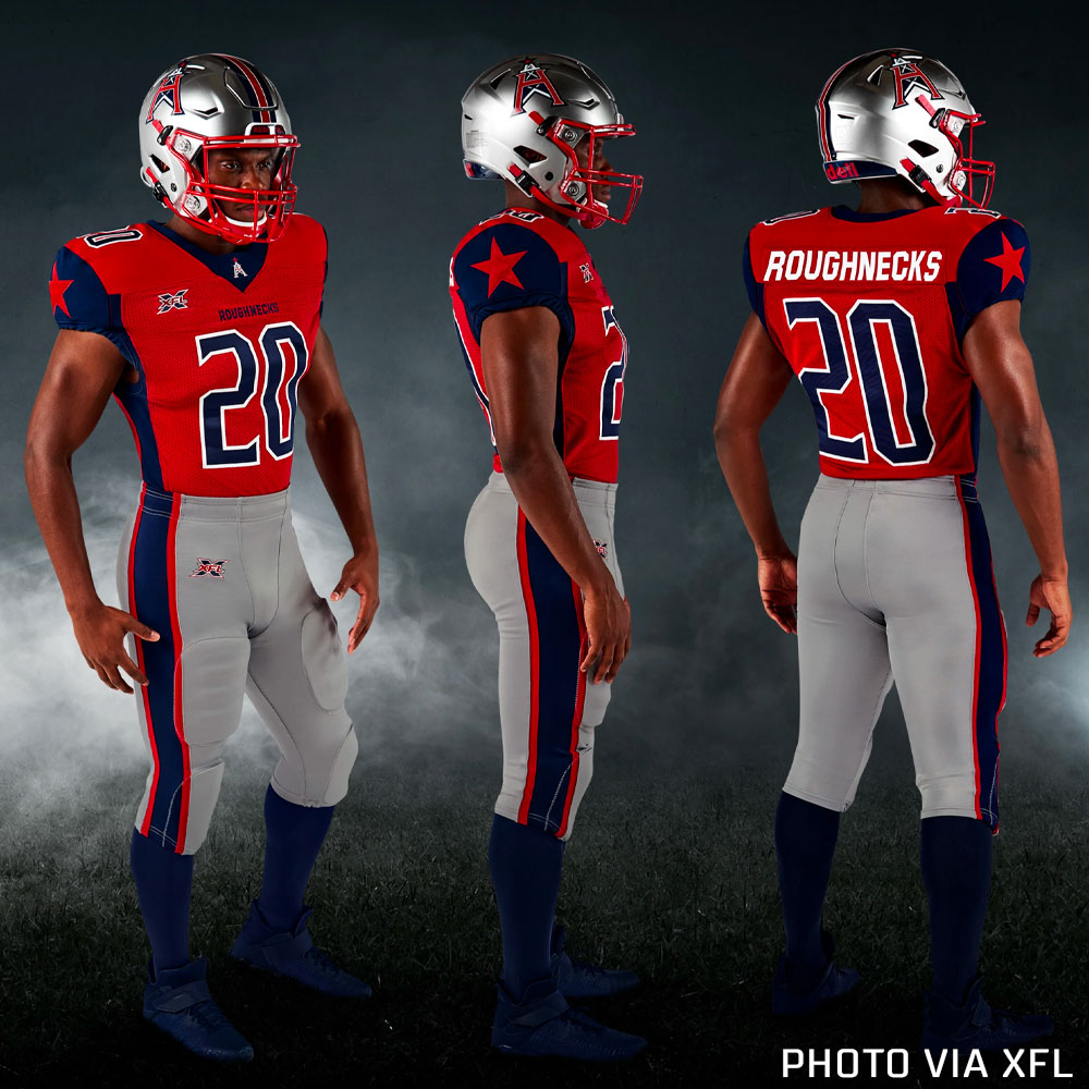
Very similarly to the AAF, if you cut the side panels off of these sets they'd instantly look 10x cleaner and some would actually be pretty solid. With the XFL in particular, Houston and LA go screwed by these awful clunky notches around the sleeves that represent one of my greatest uniform pet peeves-
-
5
-
-
On 2/3/2020 at 1:01 PM, pianoknight said:
Perhaps an unpopular opinion, but I like the blue and white checkerboard pattern for UK.
They may have stolen it from Tennessee, but when I think of blue and white checkerboard patterns I immediately think of Secretariat, horse racing and the Kentucky Derby.
I don't think the use of the pattern is bad looking in a vacuum, but within the context of being a visual staple for a rival it's an astronomically dumb decision to keep pushing it so hard.
(I'm very biased, but still.)
-
1
-
-
On 10/31/2019 at 10:14 PM, RyanMcD29 said:
Looks like Cortland's getting a revamp. Kinda odd to see them change their Block C essentially to the same one as Cornell and Colgate given they're all in the area, though (granted Colgate's been using the vintage C a lot more this year so far)
Are we sure deviantart didn't do this one? yeeeeesh
-
I love the helmet and use of the stars! The Titans used to sell hats just like that and it's a really nice take on the logo. I also get the use of gold, but I personally prefer the version with our current colors. Still, it's a super nice concept!


NFL Changes 2021
in Sports Logo News
Posted
I just don't see grey as a neutral color at all, regardless of the unique, old-fashioned traditions within baseball. I mean, this board coined terms like GFGS for a reason, right? Otherwise, I think that uniforms like these might wouldn't get so much hate.
Aside from that, you can't look at modern helmets like the Jags or expressive helmets like Bengals and tell me that a grey mask looks good for them. Any "one size fits all" mentality toward aesthetics is a bad idea.