


MellowTheMyth
-
Posts
745 -
Joined
-
Last visited
Posts posted by MellowTheMyth
-
-
Thoughts on the recent reveals:
Jets: The switch full-time to the "Sack Exchange" look is fine, I just wish they had used the basis as the foundation and took the time to modernize it a bit. There's a way to fuse modern and traditional, and they shied away from it, so that left me feeling a bit disappointed with it. I have no words for the black alternate, because it's unnecessary.
Lions: These are the best, so far, but would rank higher if in wasn't for the incongruency. The standard home set is perfect. All they had to do was add the same striping to the blue and white pants. Maybe add some stripes to the socks, and the Lions are tops of the league in uniform aesthetic. No comment on the alternate, I don't care for it.
Broncos: Very underwhelming to say the least. Just at a glance, their new look has a void that I can't quite find the word for. I was really holding out hope that they'd shift from navy blue and back to the royal blue, but it didn't come to be. I just don't have a lot of words for something that is lacking, creatively. At least the numerals have outlines, and the pants have stripes. Not a fan of the design on the helmet. What were they doing in the design process?????
Texans: I do like that the home and road sets didn't stray too far from the previous set, but I don't like that the home jersey doesn't mirror the road jersey, that should have been a no-brainer. Road jerseys should have retained the red numerals outlined in navy, to make it feel less "navy-heavy." The H-Town alternate should've featured a white helmet and a H-Town Blue or white jersey, because what's the point of two different navy jerseys in rotation? (I don't care about the compromise they came to) This set has potential, but they missed the mark in some areas.
-
 2
2
-
-
For Dallas, I'd combine the uniforms of Option 3, with the color palette of Option 2.
-
I can't lie... I'm really impressed with what the Clippers have done. The only misses are the Primary logo and the color scheme. I say the logo, because I think they could've chosen something with some more visual interest to illustrate what a "clipper" is; I agree with what others have said in that regard (and another roundel, yawn). As far as the color scheme, I wish they had gone a bit more vibrant, maybe going light blue and red-orange would've really separated themselves from the rest of the league.
Other than that, I think this ranks as one of the better rebrands in recent memory. The wordmarks, the LA monogram really flow well, the uniforms are solid and simple. I really like these for them.
-
Wizards new court. They're going with a navy based court, one toned flooring, red court lines, with the ball and monument partial logo at midcourt.

-
2
-
-
Suns going with a lowrider themed City jersey... Interesting.
-
I hope Michigan State keeps these stripes on their helmets, full-time.
-
6
-
-
41 minutes ago, Old School Fool said:
From NBA 2K24, the Sacramento Kings new court.
The Suns also are bringing in a new, gradient accented, court themselves.
-
3
-
 1
1
-
 1
1
-
-
The Washington Wizards and Capitals are looking at options for a new arena, with an option on the table to move into Virginia.
Wizards, Capitals Officials Have Discussed Move to Virginia, per Report
-
I would've preferred the Lions be smart and pair the helmet with the white jersey, blue pants look. It being restrained to the all grey uniform is not going to be visually pleasing. But, the helmet itself is a nice alternate.
-
Thrilled to see one of the community get recognition like this. All of your concepts from the past led you here, Congratulations!!
-
1
-
 1
1
-
-
I think this is ideal for the Rams, I'd just omit the logo patch on the jerseys and I'd make the wordmarks blue, on the road and alternate jerseys.
-
4
-
-
Adidas is in desperate need of new vision and a new direction when it comes to their uniform designs. I feel that they overcomplicate things too much, whether its the design in question, or uniform templates that they come up with; it's a problem when you have too much of your design catalog being subpar, while only a handful of it is actually nice.
-
If anyone has seen them before, check out Dr. Brian Sutterer MD and Dr. Chris Raynor MD on YouTube. They both have covered sports injuries and detail a lot of what happens, the recovery, the responsibility of medical staff, etc.
Sutterer recently posted about Hamlin, stating that he potentially suffered “Commotio Cordis.”
-
1
-
-
DeMar Hamlin’s injury and subsequent response maybe one of the most scary & somber things I’ve recently seen in football. I hope his condition improves & he makes it through.
-
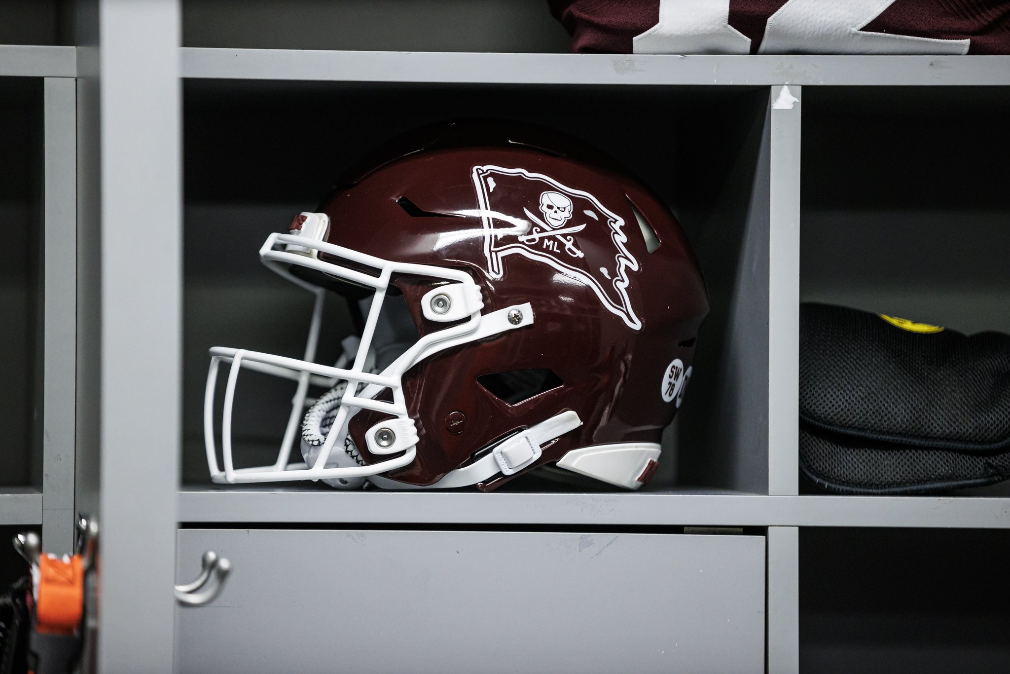
Mississippi State with a befitting tribute, to late head football coach Mike Leach, with a pirate flag decal on the helmets, featuring Leach’s initials.
They also won the Reliaquest Bowl vs Illinois.
-
4
-
7
-
 1
1
-
-
31 minutes ago, Dynasty said:
Is there a reason ESPN is using two different Utah logos? They have the circle and feather on their website, but have been using the double U for TV.
The Circle and Feather logo is their primary, the double U is being shown because that's the logo the Utes are currently wearing on their uniforms for the Rose Bowl.
-
1
-
-
10 hours ago, Webfooter said:
Utah HAS to make this their full-time set. It's too good.
-
7
-
-
To add on to your logo process with FAMU, test out changing the eye color. The eye can get lost, at times, with the scales that are also colored black.
-
1
-
-
I don't mind the players attached to these awards at all, my problem is the uniformity of them all. It sucks. They are traveling down the path of generic standardization, like the NFL and their Playoff and Super Bowl logos. And it's prevalence in the NBA has been creeping in within the last decade, with how they've had the terrible NBA Finals patch (and horrible placement on the back of the jerseys), the generic All-Star Game logos and lacking ASG uniforms, and the less decorative Playoff and Finals logos.
-
2
-
-
Tonight's Egg Bowl between Mississippi State & Mississippi is a solid uniform matchup. The Rebels FINALLY return to their regular combo of Navy/Navy/Grey, featuring the red and navy stripes on the pants. The Bulldogs opted for White/White/Grey.
-
7
-
-
15 hours ago, DCarp1231 said:
I think the Broncos need a new logo if they’re getting new uniforms.
No going back to the D logo, no updating the D logo, or keeping the current logo, or meshing the two together.
Something completely new.
You sure? I don't have the faith in Nike, as of now, to do a new logo that'll be appealing.
-
4
-
-
16 hours ago, pepis21 said:
PC or consoles?
I don't know how it looks in 2k but in real life Knicks City court a little bit different this year than in previous.
I'm using the Series X, so I saw them on console first. Not sure if they've appeared on PS4/Xbox One yet.
As far as the Knicks court, 2K using the wrong one, so hopefully they update it to the correct one. They also had an incorrect court for Orlando's set as well.
-
1
-
-
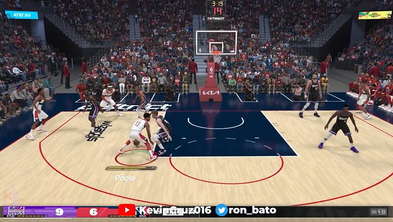
They finally made all of the City sets available in NBA 2K23, and with it, the courts that are dedicated to them are able to be used as well. Teams that have a specific court include:
Philadelphia, Milwaukee, Cleveland, LA Clippers, Atlanta, Miami, Charlotte, New York, Dallas, Brooklyn, Denver, Detroit, Toronto, Houston, San Antonio, Phoenix, Minnesota, Golden State, and Washington.
To note; Miami, Charlotte, New York, Brooklyn, Toronto, and Houston are reusing previous courts. The Clippers and Denver only swap their half-court logos. Detroit swaps mid-court logos and baseline design slightly.
-
41 minutes ago, Old School Fool said:
I think the Lakers ran out of ideas...
Reminds me of a low-budget film that uses this as a stand-in for licensing reasons.
-
10
-


2024 NFL Changes
in Sports Logo News
Posted
Lol in the real world, we don't see it much, but the guys on the forums here have done concepts of it plenty of times.