


ATLJ
-
Posts
42 -
Joined
-
Last visited
Posts posted by ATLJ
-
-
20 hours ago, BlazerBlaze said:
I can live with the White/Blue/Yellow ONLY if it has a phoenix. If they don't do a phoenix it's going to miss the mark like the City in The Forest Kits did. If RSL can have a custom Mtn/Old School Bears graphic, we can have a fire bird.
From what I am hearing, there WILL be a phoenix involved. I know Atlanta has had misses with their aways (I've yet to buy an away), but I thought the recent home was good so hopefully they'll produce something nice.
-
2 hours ago, BlazerBlaze said:
The ATLUTD fan pages are starting to say the new away kit will be inspired by the City of Atlanta flag. Has anybody else heard this outside of facebook?
This is what I heard from someone who knew people involved in the reveal material. Colors are white, blue, yellow - not sure which color is the most prevelant, but sounds like blue from what others have hinted at.
-
1 hour ago, Survival79 said:
Like it? I love it!
Does that make me crazy? Possibly.
I think its fine that people like it, eye of the beholder and all that. But it is undeniably a terrible "design" if you can even call it that. Its simply text slapped onto a blank and not in any creative way. No design went into this.
-
Yea, this is horrible. No defending it. I'm sure some people will like it, which is fine. But this isn't really a kit design, just some text.
-
Apparently new Atlanta kit. Matches advertising they had about the third kit.

-
 1
1
-
 1
1
-
-
Nashville has been rumored for a 3rd kit.
-
3 minutes ago, MJWalker45 said:
Seattle matches those numbers as well, but I think that most teams can probably hit the 100,000 number of jersey sales. I genuinely think adidas wants to do the bare minimum amd MLS doesn't care enough to argue over it.
I'm sure Seattle and some other teams sell over 100,000 per year, but I highly doubt half of MLS teams or even a 3rd are hitting that number annually. When the Athletic did an article on kits in 2020 and quoted people with knowledge, they mentioned many of the teams only sell 5,000 - 10,000 kits in a two-year cycle.
-
25 minutes ago, WBeltz said:
So is this a part of that whole 100,000 units of jerseys sold or is it because Atlanta is by far and away one of the more popular MLS teams? Because it’s mind boggling to me that Portland, LAFC, Austin and other teams aren’t getting 3rd kits seeing how successful they are/the number of jerseys sold to qualify for this.
Have we ever gotten or seen any confirmation of the 100,000 kit number? I believe all we have on that is a quote from Merritt Paulson, so that hurdle should probably be taken with a grain of salt. We also don't know if that is over a certain time period, does it count home and aways, etc. I assume at some basic level that Adidas wants to see a team's ability to sell a decent number of kits consistently over a consitent amount of time before investing in a 3rd run.
With that said, I wouldn't be surprised to see more teams get 3rd kits in the future. As to which teams, I don't know, I'm not sure how many kits teams like LAFC sell. Atlanta is a large metro and living here, you see a ton of Atlanta United gear in the city and suburbs.
-
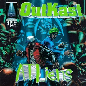
Per this Tweet by Doug Roberson of the AJC, Atlanta United will be getting 3rd kits in August:
Atlanta United has put up advertising / street art in town indicating it will be in collaboration with AIE (Atlanta Influences Everything) that suggests the direction the 3rd kits will go:
For reference, the colors appear to be influenced by Outkast's ATLiens album cover.
-
2
-
-
The Charlotte kits are fine, I like the colors. My only "issue" is this set really needed white shorts, it'd make colors pop a lot more.
I also don't dislike the Austin kit as much as others. And as an Atlanta fan, I think our kits look great. I love the set, socks look good.
-
1 hour ago, gosioux76 said:
Good effort. That’s some serious calisthenics in justifying those “Uniteds.”

The Manchester United you reference was purely made up, because they liked the name.
-
 1
1
-
-
This isn't directed at any one team, but I think MLS teams should focus more on cultivating brand identities with unique design elements incorporated into the uniform design that permeate through out the kit design year after year. Soccer has a rich history of teams with stripes, sashes, contrasting halves / sleeves, etc. and there are teams, such as MUNFC, that have a unique mark that should be capitalized on more often and its a shame MLS (and the teams) don't lean into this. While the 2022 kits definitely are a lot better than the all white kit fiasco, you're still left with a lot of solid color kits, many with matching shirts and shorts, as opposed to contrasting, which further contributes to a "blandness". This isn't to imply teams can't change things up once they've established "a look", but I think its unfortunate teams such as DC have strayed from unique indefinable markers and other teams trot out monocolored kits while historic design elements are ripe for the taking.
My Top Five:
Vancouver
Portland
Orlando
Salt Lake
Dallas
-
7
-
 2
2
-
 1
1
-
-
Count me among the group that things the current logo is dated and the colors are jarring. Looking at some of the older Sounders logos, there are a lot of color options they can revert to that I think would work lot better on kits and apparel while still retaining the team's history. However, at the end of the day, its about what the Seattle fans want and if they want to keep their color scheme - go ahead, its certainly unique.
-
1 hour ago, upperV03 said:
So mint base color with this graphic? Hopefully there’s more to it than that…
Damn, you're probably right. I know its a lot to ask, but I hope maybe the pattern is a darker tint than the mint to make it a little bit more pronounced? This is probably it though given pretty much everything we've seen is just plain color with some embossed print.


MLS Kits 2024
in Sports Logo News
Posted
New Atlanta United away kit leaked by local basketball team: