


Mr. Bojangles
-
Posts
93 -
Joined
-
Last visited
Posts posted by Mr. Bojangles
-
-
Nice video that the team showed leading up to the unveiling.
-
I think they checked off a lot of boxes. People were upset that the team wasn't going to be named after Dale anymore, so they made him part of the logo. They incorporated the Boll Weevils colors and have a very similar uniform set to what they had. They also got the Cannon name in there for the history that it brings.
I really like the road jersey and the alternate. I think having Cannon Ballers on two lines on the home jersey is a little too much. It would look much better with the CB logo on the chest, I think.
https://www.milb.com/kannapolis/history/on-field-uniforms

-
 1
1
-
-
14 hours ago, Rebuy said:
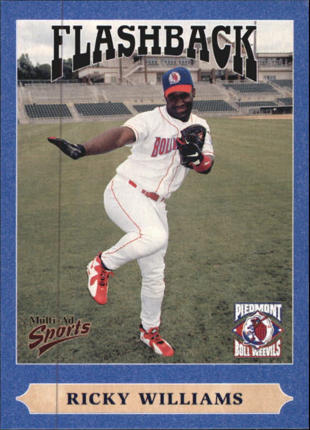
I have a Boll Wievels hat since I'm a huge Phillies fan. What a great identity that was and how sad that it's no longer around.
They had several throwback games as the Boll weevils this past season including several Boll Weevils themed giveaways. It was great!!
-
On 10/10/2019 at 11:57 PM, BigEd76 said:
1. You forgot the Kannapolis Intimidators, who will be getting a new name on October 23
2. The reason why there aren't many relocations or brand changes this offseason is because minor league affiliate deals are done in multiples of two years (assuming the major league affiliate doesn't own the team already) and run out after seasons in even-numbered years, and any potential relocations are planned during those times. As of now, the only one after 2020 is Pawtucket to Worcester.
Kannapolis Intimidators will be revealing their new name tomorrow. They were named the Intimidators after former owner Dale Earnhardt. Moving to a new ballpark in 2020 gives them a reason for a rebrand. Their announcement for the reveal looks to have a circus theme. I was kind of hoping they would go back to the Piedmont BollWeevils. We'll find out tomorrow.
-
1
-
-
They are wearing black pants with their black alternate unis?
http://nashville.sounds.milb.com/documents/0/7/0/107020070/Sounds_Logos_Jerseys_Caps_ycvjm0tk.pdf
-
Didn't see this posted anywhere, and if it is already, I apologize.
The Charlotte Knights unveiled their new unis this weekend.
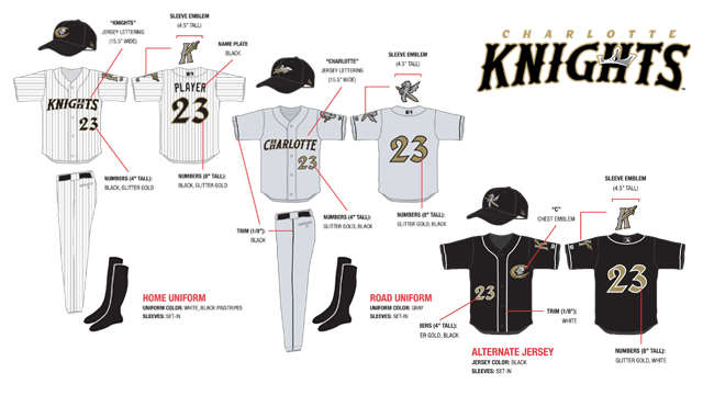
http://www.charlotteobserver.com/2014/03/22/4785537/new-knights-uniforms.html
-
Welcome back to the front of the line, white-panel hats!!!
I know they never disappeared completely, but since the Orioles decided to bring them back they now seem to be in every new set... even those where they obviously do not fit...
(and I love some of the designers'
lame excusesexplanations for including the white-panels: "Oh, it's part of the team's heritage, because in 1981, when the team was located in Poughkeepsie, a hot-dog vendor at the stadium mistakenly wore an Expos hat with a white panel... so, there you go!!!)The Bulls have worn the white panel hats for a few years now. I am not a fan.
I wish they would bring back the "texas orange" caps that they had in the mid 90's and get rid of the white panel one.
-
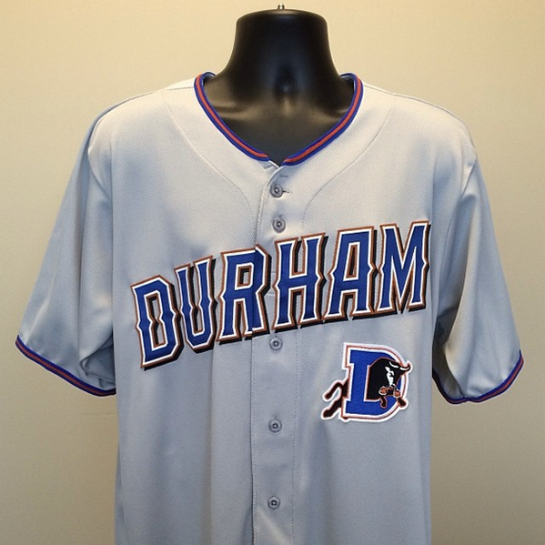
Durham's new set:
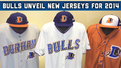
I like the Alt and the road jersey, but am having a hard time with the home white.
-
Durham Bulls Alt:

-
Durham Bulls road unis:
http://instagram.com/p/hJZYOZEKk7/
The Alternate will be released at 3 and the home jersey released at 5.
-
I looked around for a few on this forum but couldn't find a thread on the Durham Bulls new uniforms, so I thought I would post here.
Since this article was posted, the Bulls have revealed a few more pictures and it now looks like there will be an "orange" alternate.
http://news.sportslogos.net/2013/11/12/durham-bulls-to-get-new-look-in-2014/
Here are some of the latest sneak peaks at their new set:
http://instagram.com/durhambulls
I really hope they go away from the navy blue and stick with their classic royal blue. That blue and "Texas orange" combo is one of my favorite combos in sports.
Thoughts on what we will see in a few days...


College athletics identity changes
in Sports Logo News
Posted
Longtime 49er fan here. I wasn't thrilled when the C logo came out on Saturday, but after the entire re-brand was released yesterday, I love it.
Old logo had 4 colors and was difficult and expensive to produce. Now we have a much simpler logo, one shade of green (Jets green) that can be easily reproduced. No more 49 Shades of Green with our gear!!
I think the CLT logo will become a primary logo.