


fouhy12
-
Posts
2,335 -
Joined
-
Last visited
-
Days Won
11
Posts posted by fouhy12
-
-
As long as the Lions stick to silver/blue/silver/blue, silver/white/silver/blue, and silver/white/blue/white, these uniforms are an improvement. But I fear we're going to see a lot of mono-blue and mono-white, and it'll barely be different than last year. There's just no valid reason to not have stripes on the pants, and there's no valid reason for Detroit to wear monochrome.
Also, the blue/black/blue/black uniform looks good, but it feels like a 2012 Carolina Panthers concept.
-
 1
1
-
-
I'm assuming that Texans helmet is going to be the 2nd alternate used with uniform No. 4 from their graphic.
-
2
-
-
These look fantastic. Hopefully they don't insist on plain pants and monochrome to ruin it.
-
6
-
-
1 hour ago, DCarp1231 said:
Texans uniform descriptions

Taking a stab at some predictions here:
1. will be the classic blue over white, and a mirror of the road uniform but without the stripes. the "traditional" is sticking with blue over white, the "classic" is just a plain jersey design.
2. the new road uniform, as we know. "traditional" is white over blue, "modernized" is the bull stripe on the sleeve
3. some kind of all red uniform. will include the bull stripe on the sleeve and maybe bull horns on a red helmet like the eagles or rams helmets
4. an all blue uniform that incorporates h-town blue and uses some h-town logo on the helmet
-
2
-
-
Don't we already know almost exactly what the Jets are wearing? It's the white throwback they wore this year, the green version of it, and some variation of it in black.
As for Houston and the three helmets, I feel like we're getting all navy at home, the navy/white/navy/white on the road, an all-red alternate, and then likely an all-white alternate with the new, lighter blue used on it. The second alternate could also be all black, although that is definitely lower odds. If they still have to use the color of an alternate somewhere in the primary, that means we probably see a hint of the other blue in the home uniform.
-
2 hours ago, GFB said:
I mean, the full quote was that the Lions would have “one of the best uniforms in the NFL for the next 5 years or so” so it’s not like these even here and now these are being treated as a long term solution
Well, I'm awake now.
-
3 hours ago, PurpleHayes said:
From UniWatch:
Lions president Rod Wood says that the team’s forthcoming new unis will be “one of the great uniforms” in the NFL.
Pretty sure that's what reps from the Bills said in 2002...
...and the Jaguars in 2013
...and the Buccaneers in 2014
...and the Browns in 2015
...and the Titans in 2018
...and the Jets in 2019
...and the Falcons in 2020
...and the Commies in 2022
...and the Cardinals in 2023

Wake me up when an owner says "yeah these new uniforms are ok, we'll probably replace them soon" when hyping them up lol
-
6
-
 1
1
-
-
1 hour ago, oldschoolvikings said:
Put it this way… when the pants and jerseys are the same color, but the socks are a different color, the uniform sucks really bad. And when the pants and jerseys are the same color, and so are the socks, the uniform sucks really really bad. Not too much reason to split hairs.
I don't think any of these uniforms suck really bad.
Heck, I'll even throw these in there.
-
7
-
 1
1
-
 4
4
-
-
Looks like this is our uni matchup tonight:
UConn has made the Connecticut throwbacks their main postseason jersey the last two years, which is a good thing because those jerseys rock. The Purdue uniforms are pretty good, too.
-
2
-
-
14 hours ago, MNtwins3 said:
Teams that have not worn one of their alternates so far:
- Twins
- Royals
- A's
- Dodgers
- Angels
- Cardinals
- White Sox
- Braves
- Nationals
- Mets
- Red Sox
Teams that have only worn an alternate so far:
- Brewers
- Blue Jays
The Giants don't have a road alternate, so they are TBD. Some of the teams listed were wearing their alternates in spring training but have not worn them in the regular season. Not saying all of the teams listed are missing uniforms, because some teams go on runs of not wearing some uniforms. Also we're only 3-5 games into the season, so who knows
After the end of last season, the Red Sox said they'd use their alternates a lot more sparingly. They announced the yellow City Connect uniforms will only be worn for Saturday home games, and while specifics weren't given on the red and navy jerseys, it was said we'd see a lot more of the white and grey jerseys. Last year, they let the pitcher decide which jersey they were wearing and kept the yellow ones on during winning streaks.
At one point, the Red Sox wore yellow in 7 consecutive games and wore the white and grey jerseys a combined 9 times in a single month.
-
1
-
Given that the account in question on that Browns facemask lists themself as a parody in their bio, I'm going to assume there is no orange facemask.
-
1
-
-
Small news, but the Patriots are adding captain's patches to their jerseys starting next year.
I have personally always found them kind of tacky and was glad we didn't have them.
Are there any remaining holdouts in the NFL?
-
As someone who frequently goes through All-22 film for both college and the NFL, the shoulder and/or helmet numbers are very helpful. Players spend a lot of their time either horizontal to the camera or on the ground surrounded by bodies. Unless a player has distinctive gear, it can be hard to make out a specific player. For line play especially, the more identifying markers a player has, the easier it is.
I would much rather have shoulder numbers than a sleeve logo or something.
-
4
-
-
I'm very happy to see the default road uniform uses contrasting socks.
I know plain white socks aren't for everyone, but an ABAB pattern for a uniform works in terms of color blocking. I wish these had more red, but I don't really have serious complaints otherwise. I'm a fan of the font on first glance, will have to see what the other numbers look like.
-
2
-
-
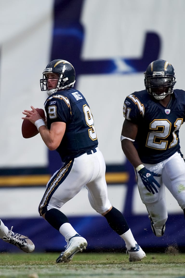
My only real issue with the current uniform for the Chargers is the size and location of the bolt on the shoulder.
I much prefer the 1990-2000s version where it sits up on the shoulder and goes up and around. If they tweaked the current uniform to make the bolt more like that, I would like them more. Although maybe you can't do that on a modern template.
-
2
-
 1
1
-
-
Wearing all one color is trendy in actual fashion and is largely the norm in all three other major professional sports in the US. I don't think it should be surprising that it came to the NFL.
-
3
-
-
For future reference, here's a cleaner version of the new logo.
Would love to see an early Super Bowl field concept with it.
-
It literally looks like one of the free ones they give away to fans.
-
12
-
-
-
-
4
-
1
-
1
-
-
So the Jets went the entire lifespan of these uniforms without wearing the main one against one of their division rivals, the Patriots. Went white at home against NE twice, blackout twice, and green/green/green/white once.
-
3
-
-
This doesn't match up with the other leak at all. And this one seems more reputable IMO.
-
1
-
-
21 hours ago, Weapon X said:
I hope I never actually start an NFL redesign series because a lot of my ideal looks for these teams look nearly identical to what you've posted.
The only CC I can think of that aren't just minor creative differences are:
Eagles
- Don't care for having the collars be colored while the cuffs aren't. Should be one or the other imo.
- Number font still isn't working for me. It maybe could be with just an outline instead of the drop shadow but the grey and white lose themselves within each other. (like the black, charcoal, and grey do for the birds rn)
Seahawks
- that green has to be more of an accent color with how dominant it is. (A shade closer to their throwback green would be nice but that probably wouldnt mesh well with the blue you have)
Jets
- the traditional stripes on the pants and socks clash with the sharp stripes on the shoulders a little.
Ravens
- would prefer TV numbers with some design on the sleeve caps. (could be a small sublimated pattern or just the B or the crest/sheild logo they use)
Lions
- maybe would see where white could fit on the home look (other than the numbers) if possible. Have no idea where it would come from though and it already looks great, so not a big deal.
Titans
- While the original look is 10x nicer than what they have now, I wouldnt consider it a great one. Would love to see what a unique take from you could look like. If you're going to go with this one thought, somehting on the sleeve cap would be nice. Maybe a one color wordmark too?
Overall, even if none of it is too ambitous, it looks great and is presented cleanly!
Figured I'd go through these one by one:
Eagles - fair critiques, just a difference of styles. I prefer to just have the collars colored with this color scheme, and I've always liked this current Eagles font. I do hear you on the grey and white losing themselves in one another, I can come back around when I make tweaks and see if I can clean that up.
Seahawks - I like the splash of neon green, but I see where it could be too much for some. I can look at toning that down a bit by using it more as an accent color.
Jets - this is the concept I like the least in here. very tough to blend the modern and the traditional with the Jets. may come back and re-do this entire thing at some point.
Ravens - I wanted to go simple here, with the number font and color scheme carrying the day. I also think the Maryland flag gets a bit overdone, and adding a logo just to add a logo doesn't do much. If I think of a design I like, I'll add it. Otherwise, this one is going to stay the same for me.
Lions - went through the same dilemma when making this. I think it looks good anyway, so I'm not going to try to shoehorn in white if it doesn't need to be there.
Titans - Similar to the Ravens, I was trying to let the color blocking and larger design carry this one and stick to simplicity. I could definitely add a wordmark on the front, but I do get worried that adding more to the shoulder design would actually take away from it. I'll mull that over, but the shoulder yoke like that is quintessential Titans to me, so I was always going to build around that.
Thank you for the feedback!
21 hours ago, WideRight said:These are all really solid. I like what you did with Seattle particularly. I am still not sold on silver being the secondary color for the Cardinals, but that is not on you. Absolutely wish the Titans would go back to something closer to their original uniforms. Now, the question, will you get rid of or keep Carolina's weird helmet swooshes. To me they are one of the weirdest and most dated elements of any current uni.
Thank you! I have a feeling Carolina is going to come later in my list, mostly because that's one team where I have a ton of different ideas I like a lot and I need time to narrow it down. But I can assure you, those helmet swooshes will be gone (just like they are for my Ravens and Titans concepts).
12 hours ago, Bomba Tomba said:Seeing the Ravens and Lions in those bangers makes it hurt even more that they didn't advance
Here's what that would have looked like for you.
-
2
-
 1
1
-
-


/cdn.vox-cdn.com/uploads/chorus_image/image/72956197/usa_today_22078865.0.jpg)


2024 NFL Changes
in Sports Logo News
Posted
If that Broncos one is real, the notch on the shoulder stripe reminds me a lot of the Chargers.
Also @Cujo that Albright moment is one of the funniest things I've ever seen.