


fouhy12
-
Posts
2,340 -
Joined
-
Last visited
-
Days Won
11
Posts posted by fouhy12
-
-
I love those Panthers uniforms without white. Just move the numbers to the sleeve to make more room for the stripe.
-
The Pats-Falcons one is from 2001.
The top photo is the Patriots' pre-2000, big-logo-on-shoulder set, while the Falcons' red-heavy road look and the presence of Jamal Anderson in the photo indicate that it was taken during the Dan Reeves era, perhaps during Atlanta's Super Bowl season of 1998. The presence of Tom Brady and Keith Brooking in the bottom photo tells me it's from 2001 or 2002. I'd only consider the bottom to be the "modernized" Patriots, as, while the logo and helmet are essentially the same, the uniform design is a lot different from the 1990s design. Also, holy cow was Jamal Anderson a beast.Speaking of Patriots rare uni matchups:
The one time they played the red number Falcons

And the modernized Patriots against the old-school black jersey Falcons

EDIT: I just realized that the two photos had two different descriptions. Sorry for correcting you on something you got right in the first place!
-
This series might be my favorite out of any on this forum, simply due to the time and effort you have put in to make every field as accurate as possible. It is seriously impressive. You're awesome!
-
 1
1
-
-

Bledsoe only wore these for a short time. This is clearly the Tom Brady era unis.
I was born in '98, so to me these are the correct uniforms for Drew. IIRC, that picture is from the AFC Championship in '01, which is the last time he saw playing time as a Patriot.
-
I would actually like to know, an i the only one who wants the jets to use green helmets?
Nope, I'm with you.
-
I swear there is a similar thread to this from not that long ago. But I cannot recall the title.
http://boards.sportslogos.net/topic/104001-your-favorite-stats/#entry2459112
I should've given it an Admiralian thread title. Then it would've stuck around more.
Wow I can't believe I missed that. I read through the last year's worth of threads looking for anything to do with stats or figures, and I didn't see anything. My bad.
San Diego @ Toronto is the only inter-league matchup that hasn't happened yet.
Wow, that's incredible. They've played 3 series against each other, all in San Diego. Most recently in 2013.
-
I searched through threads for the past year and couldn't find anything like this, so I figured I would post it. The idea behind this thread is to post interesting facts or statistics that a lot of people don't know. It'll essentially be the answers to trivia questions. I've got two interesting ones to start this thread off.
- The Minnesota Vikings were the first team to kick an extra point from the 15-yard line.
- Tom Brady has played two games at University of Phoenix Stadium, but he has never played the Cardinals there. The Pats have played two Super Bowls there, but only played the Cardinals at home since the stadium was built.
-
1
-
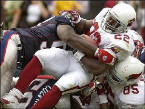
Here's one: Patriots at Cardinals, 2004. It was the last year before the modern uniforms for the Cardinals and the only time their classic uniforms met the modern Patriots.

-
1
-
-
Well there's at least two of us! I don't think the new ones are perfect, but the old ones were boring and the road look was atrocious. The time had come for a change, and I don't mind the direction they chose.As much as I like tradition, I think I'm the only person on the planet that likes the Buccaneers newest uniforms. I'm going to go run and hide now, tell me when it's safe to come out...
-
Looks phenomenal! You've done some great work in this thread! One critique I have of the XLIX field is that it should be a bit brighter. In the game, it was a really bright and strong green.
-
Just curious: how would the field have looked if they used the regional Super Bowl logo?
-
This one is really out there but... I think the Buccaneers have the best uniforms in their division.
-
I really like the new Bucs uniforms. When they were first unveiled, I thought they were hideous, but now that they've seen game action I think they look good. The font isn't perfect, but I think it is passable with the look they have.
-
I think the reason for this is because hockey jerseys are the largest, so there is more room to do interesting stripes and patterns on them.What's weird about that is that IMO Hockey uniforms are by far the most interesting of the four major sports.
I struggle to get excited about basketball or baseball uniforms, although I can appreciate a good one.
-
I think the Blackhawks road jersey is overrated. It's still a lot better than most teams, but where is the color balance? Their red jerseys are some of the most vibrant in sports, but the roads are mostly black and very drab looking. Switch the black and red and it would be a winner.
-
I think the Rams look best with either all-blue or all-white. The white-over-gold look just looks too pale to me, and the blue-over-gold isn't bad but isn't as good as the monochrome blue.
-
There's a difference between black for black's sake and black because it looks good.
Amen to that!
-
The Broncos' uniform design is a modern classic. It is clearly modern, yet isn't over the top like Seattle. I also think Broncos' and Titans' style helmet stripes look good and make for a nice break from traditional straight stripes.
EDIT: I would also consider Bengals' jerseys sans contrasting side-panels and with orange as the primary color to be modern classics.
-
I think that these are terrible uniforms:
-
These uniforms are very good.

-
I think the Seahawks have a very good font, especially with their current uniform.
-
I actually liked the Buffaslug

Unpopular Opinions
in Sports Logo General Discussion
Posted
I don't think these are that bad. They break pretty much every rule about uniforms that I have, but I still like the way they look anyway