-
Posts
2,334 -
Joined
-
Last visited
-
Days Won
11
Posts posted by fouhy12
-
-
I've had a lot of exposure to both basketball and hockey where wearing all one color is the norm (at home in hockey for most teams), so maybe that's why I have a higher tolerance than others for monochrome. It isn't my preference usually, but it also doesn't really bother me as long as it is designed well.
-
 4
4
-
-
The color of the socks should generally match a big color block that's above the waist. That can be the helmet, that can be the jersey, or that can be the numbers. I don't mind if the socks and pants match provided that 1) the socks match one of those three things and 2) the pants have a stripe that breaks up the design.
That's why I don't mind these:

or these:

or these:

There is one uniform that breaks these rules that I still like, and it's this one:

That probably has a lot to me first seeing these uniforms during a Monday Night game when I was a kid and thought they were really cool. That one has stuck with me ever since.
-
 4
4
-
-
In addition to the weird lighting, I feel like the Superdome has always had bad-looking turfs that make it an even more unappealing aesthetic. It's a cool stadium, but, on TV at least, it feels like an old stadium and not in a good way.
I've always wondered if the Saints would look better if they took two cues from their bayou brethren: white at home and contrasting endzones. Gold helmets with white jerseys and pants, gold numbers, and black socks (their color rush uniform but with black socks) as a default home uniform could be a good brand to build around. And, to incorporate the black and gold, you paint one endzone each color a la LSU.
-
 1
1
-
-
All blue for Michigan tomorrow. Not a surprise after the team beat Ohio State in this uniform back in 2021.
-
 4
4
-
-
I'm back with another trio of concepts. This time, I'm showcasing the AFC East. These three teams all have good uniforms now and strong histories to pull from. You won't see drastic departures here. Instead, I approached these by letting history clean up what the team has going now. Let's get started with the Buffalo Bills.
To me, the Bills should always wear red helmets. Yes, the white ones look good, but the red is distinctive when paired with the blue jersey. I built around that, combining aspects from the 90s jerseys with an updated version of the jersey and collar striping seen today. All put together, this is a uniform that clearly looks like the Buffalo Bills while being distinctive within the division.

Moving south to their in-state rival, let's take a look at the New York Jets. I liked a lot of what the Jets did with their rebrand. The finish on the helmet is gorgeous, and the jersey striping is modern but not in a bad way. Embracing Kelly green as their color once again did wonders for the team's identity, but muddling that with black has been a mistake. Here, I present what is essentially a cleaned up and refined version of what the Jets wear today.

Lastly, let's head east to take a look at the New England Patriots. With their redesign in 2020, the franchise unveiled what I believe to be the best jerseys in its history. Pairing the traditional shoulder stripes with the dynasty colors and double number outline was the way to go. Unfortunately, a lack of shoulder numbers and insistence on navy below the waist set this new brand back from what it could have been. I correct that here, making shiny silver pants the primary at home and adding striped, white socks to pair with the dark pants on the road.

-
 5
5
-
-
On 11/3/2023 at 7:14 PM, Silver_Star said:
They all look nice, but I would have added a red jersey and helmet for Atlanta so they can have an alt when they get tired of wearing the same thing.
As I said in the initial post, I'm limiting myself to just one dark and one light uniform per team. Perhaps I'll come back through and add more, but I'm trying to force myself to choose specific identities for each team.
On 11/5/2023 at 8:54 AM, Lights Out said:I like that Eagles concept, but I'd reverse the colors of the helmet wings - make them white with silver outlines.
If I come back through and make tweaks, I'll try this. I could see it looking good.
On 11/5/2023 at 10:34 AM, DCarp1231 said:Not a huge fan of the Titans look. I’d try something with UCLA stripes
UCLA stripes aren't something that franchise really has in its history, and their divisional rival Indianapolis has their history built around those on the jersey. I went for the shoulder yoke as a design element used frequently since the team moved to Tennessee, and I thought updating that aesthetic had the most promise.
On 11/13/2023 at 12:47 PM, ruttep said:I considered this, but with red-number-outlined-by-black also a feature of their rivals to the south, I figured sticking with the black numbers was the way to go. I do play with that set in Madden quite often, though. A great looking uniform right there.
-
 1
1
-
-
Nike and the NFL have an opportunity to make the night game on Thanksgiving their "Winter Classic" in terms of branding in uniforms. Could have specialty throwback or fauxback uniforms for both teams in that game every year and market it big-time.
-
 5
5
-
-
I like that idea. The red helmet with the red numbers and stripes should look good.
-
 2
2
-
-
I'd love to see the Bengals try out the orange-white-white-orange combination. I really enjoyed it in their old set.

-
 9
9
-
-
I don't like side panels, and I don't like monochrome, but something about this uniform has grown on me over time. I actually really enjoy seeing these now.

I think something about the big, orange stripes breaking up the monochrome works for me. In a division with red and powder blue teams, this solid navy acts as a nice contrast, too.
-
 4
4
-
-
-
Can someone tell me why the Cowboys keep wearing the French flag as their helmet stripe once a season? Is there some connection there from the franchise or something?
-
 2
2
-
-
1 hour ago, gothedistance said:
Texans have worn all white on the road on very rare occasions, like last year at Las Vegas. This week would have been a good time to do that with the Bengals going mono-black.
I'm not sure why all white should necessarily be worn against all black, but Cincy isn't wearing all black this week.
-
 1
1
-
-
-
-
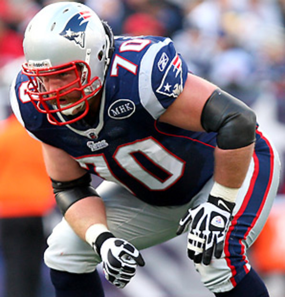
These current Patriots uniforms are a nice mix of the historic uniforms with the modern brand in terms of style. You've got the striping pattern from the 60s on the jerseys with the block font combined with the coloring of the Brady years.


If the goal was to incorporate the modern colors into a traditional Patriots uniform, you couldn't do a better job of it than this IMO.
-
 6
6
-
-
2 hours ago, ruttep said:
This is bizarre. Apparently the player in question, #75 Conor McDermott, was a sixth round pick of the Patriots in 2017 before being waived during training camp before that season. He then did not return to the Patriots until 2022, by which time the uniforms had changed. It's possible he kept his pants from his first training camp stint, but I feel like that's unlikely. In which case, why is the Patriots' equipment manager still giving out the old pants??
The Patriots still use their old pants and gear for practice, so my guess is the equipment manager just grabbed the wrong pair of pants to put in his locker. Still wild that nobody managed to catch that.
-
 4
4
-
-
Been a while! Back with a trio of NFC teams.
Let's start with the latest team to rebrand: Arizona. I like a lot about what the Cardinals did with the new uniforms. The logo treatment and helmet flake are both really nice. The addition of silver as a trim color and use of the stripe on the road uniform is fantastic. And the modernized block font from their previous set looks fantastic with the hard corners.
I built off that base to create cohesion between the home and road uniforms, remove the full monochrome sets, and add some Arizona flair. The stripes on the sleeves and pants now have a thicker silver middle with a slightly darker shade, making it more visible from a distance. The sleeve stripe now has a subtle sublimated Arizona flag in it.

Next up: the defending NFC champs. I think the Eagles have a lot right with their current set, but they make it way too complicated by using black, charcoal, and grey. I simplified the color scheme to midnight green and silver to let the rich green stand out and not get muddied in a darker palette. The dark jersey is accompanied by silver pants, creating a look that blends the Kelly-green era in with the modern one. On the road, the green pants make their appearance with white, striped socks. The number font is a modified version of what the team wears now with the stroke width made more consistent throughout.

Finally, we head down south to wrap up this edition. The Falcons keep their current helmet with its gorgeous finish and silver facemask. The rest of this uniform is inspired by what Atlanta wore in the 90s. Simple jerseys with a block font trimmed in red and the logo on the sleeve are paired with silver pants and black socks. The stripe on the pants follows the black-white-red-white-black pattern as it did in the 90s, but the outer portion is slightly tapered to match the logo.

I would love some feedback on these and any of the previous concepts!
-
 9
9
-
-
If we're talking about the format of the in-season tournament, it seems most akin to the early season multi-team events in college basketball. Those often feature games between teams in the field played on home courts followed by a tournament at a neutral site a few weeks later.
-
The Dolphins are interesting to me because they're an old team with the vibes of an expansion one. They're in a fun, young city with vibrant colors and known for flashy offensive weapons like Dan Marino and Tyreek Hill. I think you need to have an identity that caters to both the history and the modernity, which is definitely threading a needle.
-
 3
3
-
-
Just now, throwuascenario said:
I actually like Cleveland's white over brown look. The orange and white are both better, but the brown looks good too imo. They're probably the only team in the league that can really pull off three different pants colors with the same jersey. The only other one that comes close is the Ravens with the purple, white, and black pants with white jersey. But the lack of stripes on their black pants ruins them.
I actually liked the way Cleveland's white over brown looked against Seattle's throwbacks. Seattle's uniforms are full of light and mid tones, so having a nice dark brown on the other side added to the contrast.
-
 1
1
-
-
I love the Dolphins throwbacks, but that logo is definitely dated, and the sleeve striping, grey facemask, and black cleats feel too old school for a team with such vibrant colors and a flashy, modern NFL offense. I think a mashup of the throwback and modern uniforms keeping the overall identity of the older look with a modern feel is the way to go. I also think wearing the right combinations (all white with aqua socks, white over aqua with white socks, and aqua over white with aqua socks) would do wonders.
-
 9
9
-
-
Imagine being the guy in charge of calibrating the cameras for this game lol

-
 4
4
-
 5
5
-
 1
1
-
-
Patriots fans love the silver pants, so I expect them to stick around for a while. I'm pretty sure Kraft likes the mono-blue (the team tried it with the old set back in 2002 (back-to-back home games, both losses). I think their thinking was the current set was that mono-blue would be the primary and they'd break out the silver pants for the alternate uniforms. If they keep winning with silver pants and the fans stay this insistent, I could see Kraft switching it around permanently. For now, I think they ride the silver pants until they lose.


The Patriots wear navy for the next three games, including today. If they win all three, the next one is on the road at the Giants. I'd be curious to see if they went white over silver for the first time since 1999 if they keep this up.

Also, RE: Dallas in white pants. I've really come around on the silver-navy-white-navy combo for them, and I could honestly get behind it as a full-time thing, I think. Something about the silver helmet paired with that silver stripe on the pants trimmed by navy blue looks really good to me. Maybe it's just the novelty, though.
-
 4
4
-


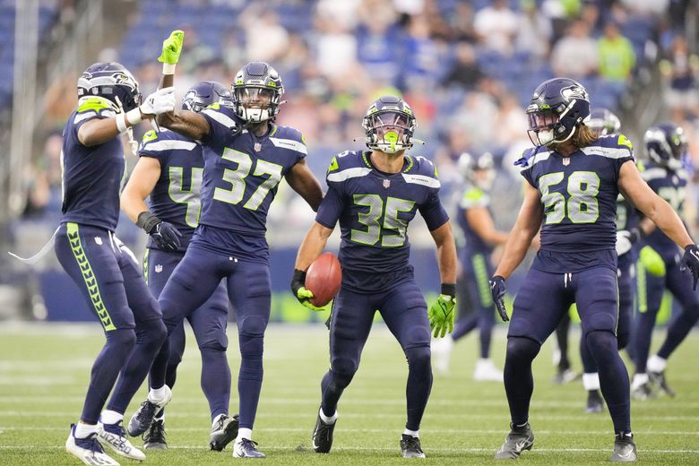


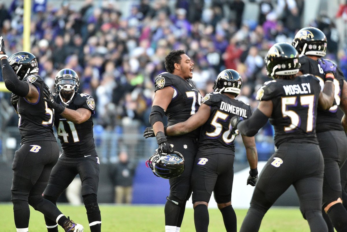


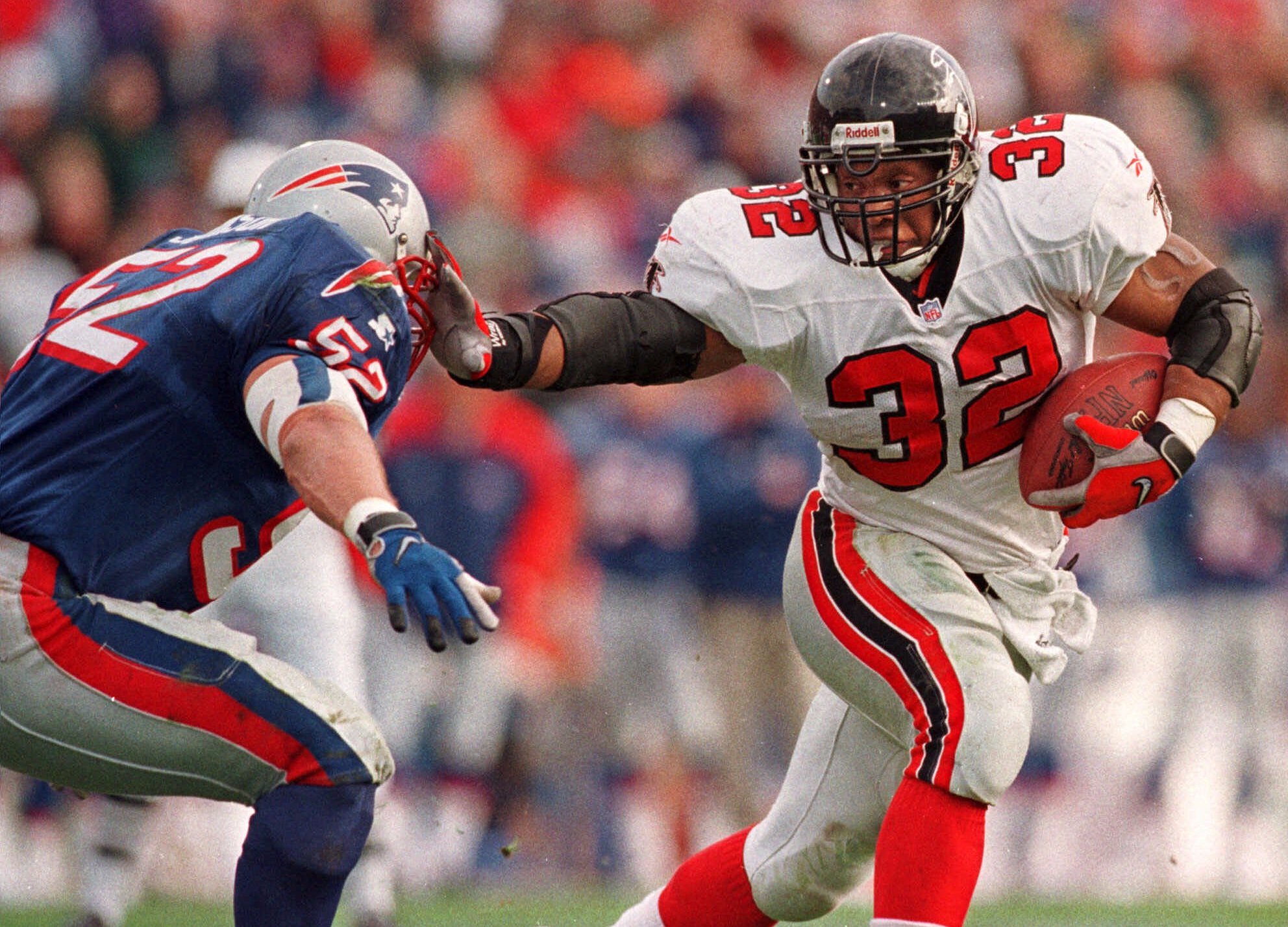


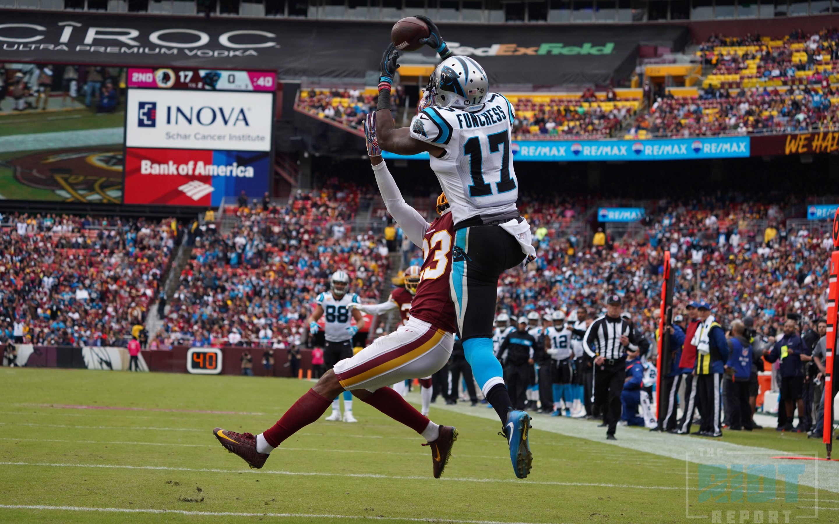

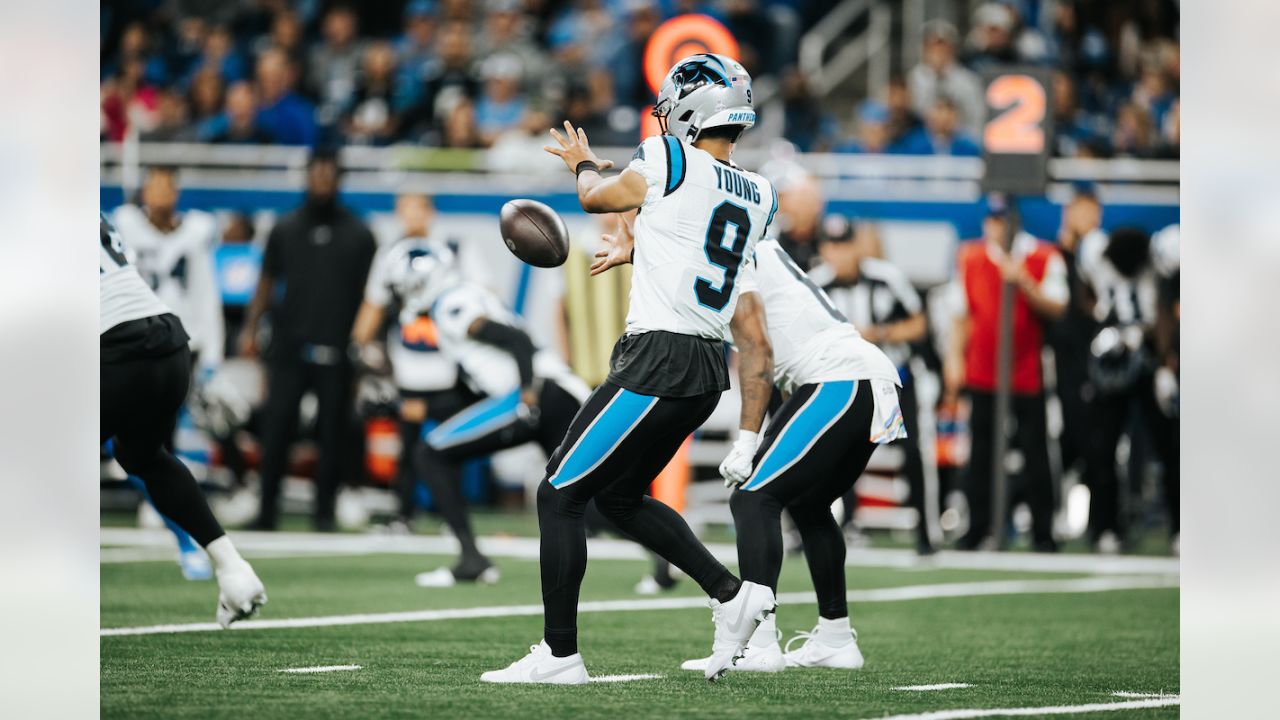
/cdn.vox-cdn.com/uploads/chorus_image/image/71789003/84836609.0.jpg)


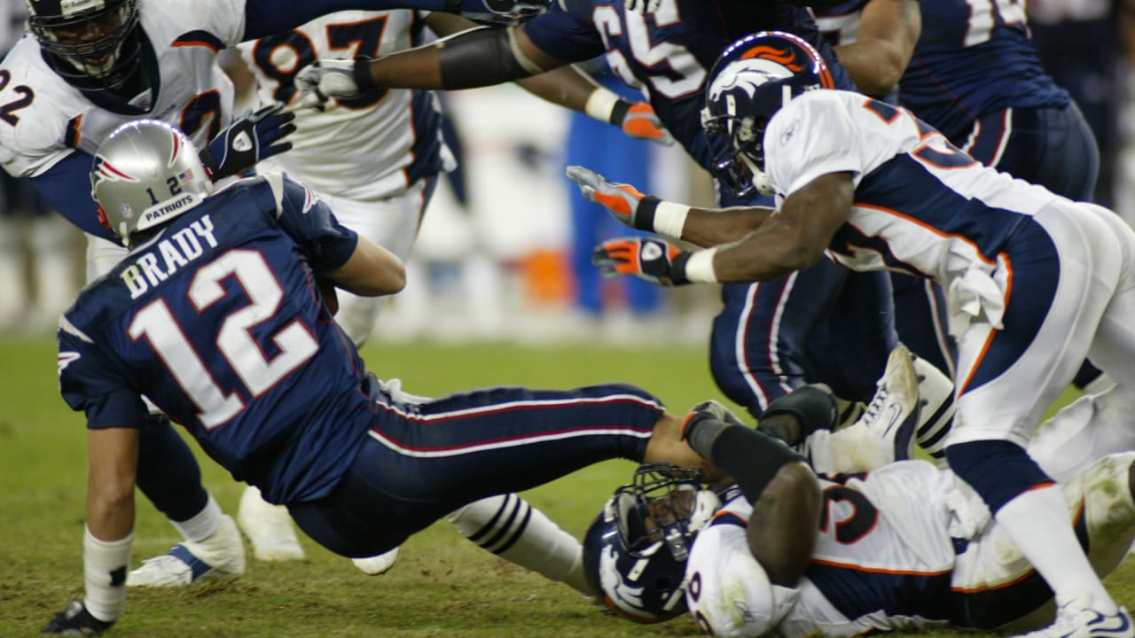

2023 NFL Season week by week uniform match-up combos: From HOF Game to Super Bowl LVIII
in Sports Logo News
Posted
I found it funny that you used this example, because this is actually one use of white socks that would fit my rule. The white socks and white helmet with blue in-between create an odd, but balanced uniform. It is certainly imperfect but better than blue from shoulder to toe IMO.