


VancouverFan69
-
Posts
1,031 -
Joined
-
Last visited
Posts posted by VancouverFan69
-
-
On 1/18/2023 at 1:57 PM, DTConcepts said:

Was at the game last night. At first, I didn't like the removal of one of the lines but it actually works with the alternating red & yellow lines..cleaner and has continuity with the Skate boot. The recoloured '70-'72 stripes look awesome.
The cheap and weak Agency font must go, just like the corporate Orca. Bring back the classic and nicer-looking Athletic block font. Black V's on those '70-'72 sleeve stripes instead of engraved V lines would look so much better...just like the white sleeve V's on the original Stick in Rink jerseys. Colour on the collar plus pants stripes would look amazing And for the cherry on top of the sundae, a recoloured Johnny Canuck on the shoulders.
Overall, great work.


 ⛸
⛸
-
On 12/18/2022 at 9:32 AM, CaliforniaGlowin said:
Love the Kings/Sharks matchup last night. Game was great too!
One of the very nicest this season. Best-ever California uniform matchup since the Kings played the Golden Seals in the 70's.
-
 1
1
-
-
Last night's Canucks-Sharks game was one of the most beautiful uniform matchups I've seen in a very long time. If the Canucks were getting blown out, I'd still be watching the game.
One important observation...the awesome turquoise font on the Sharks' white Seals jerseys shows that the Sharks need teal font on their main whites.
The turquoise pants with the white and gold stripes and leg trim are among the nicest in hockey.
-
2
-
 2
2
-
-
On 11/17/2022 at 8:58 AM, IceCap said:
The problem is that this is the era where the North Stars transitioned into the identity they'd carry into Dallas. Which gets dicey for the Wild. The North Stars aren't some dead team, they still exist. The Dallas Stars are the North Stars. And while everyone seems ok with the Wild referencing classic North Stars looks, it could get messy if they started infringing on the Stars' identity too much.
The Wild should've been/should be the Northern Lights. Love the prospective updated N logo. Would've used green instead of purple.
-
2
-
-
On 11/12/2022 at 8:26 PM, Ridleylash said:
:censored:, these jerseys are beautiful. LA really, really needs to own these colors full-time again, especially since the synergy with the Raiders is practically ancient history and their current look has worn out it's welcome.
The Kings' Reverse Retro 2.0 is what they should have gone with back in '88. Gretzky would've rocked the purple/Forum blue and yellow-gold with the classic crown. The only change I would make is use the same jersey template as the Reverse Retro 1.0 but the 80's shoulder to arm trim looks really sharp on white. This would also make beautiful uniform matchups with the Sharks and their gorgeous new teal look.
-
1
-
-
18 hours ago, DTConcepts said:
The orange pants look great with a white jersey. But if they tried going the Sharks route and used them on an orange base, it would look terrible.
I love the Sharks' all-teal look. It works. An all-orange would be nauseating. Orange helmets with black pants with orange jerseys would work though. Black yokes to separate the orange helmet from the rest of the orange jersey would help.
-
6 hours ago, uniformity said:
Can't fault them for missing that detail on the RR. Wouldn't work as well with blue and green.
I disagree. Sorry. The contrast is much better between navy blue and kelly green. White-green-white pants striping would work just well on navy pants as white-red-white striping works on the Blackhawks' black pants or the white-red-white striping on the Canadiens' royal blue pants. Pants without striping looks boring and cheap. Thankfully, the rest of the Canucks' Johnny Canuck Reverse Retro looks amazing.
-
On 10/29/2022 at 12:54 PM, Chromatic said:
Canucks full reverse retro uniform. I gotta say, it looks great in full gear.
I knew the Johnny Canuck Reverse Retro was going to look awesome and so far it's exceeded my expectations...even in spite of the TD ad and no pants striping which was indeed the case in '62. I just love the contrast between the navy blue and kelly green.
-
1
-
-
On 9/30/2022 at 7:54 PM, Delicate Genius said:
The first time in 28 years a Calgary-Edmonton game has looked like this.
I'm surprised this uniform matchup wasn't pictured on a milk carton under "MISSING".
-
2 hours ago, GFB said:
THIS I would accept even though I love and prefer the all-teal look.
As for the pants, the black pants should have white-teal-white striping(like the '91 set) and the teal pants have white-black-white striping.
Neverthekess, just make the font on the whites teal with a black outline, have the dorsal fin in the same direction on both shoulders and use the original hockey stick and triangle for the logo.
-
4 hours ago, uniguy22 said:
Big upgrade!
Totally agree. I would add stripes to the pants.
Always loved VGK's steel grey. Look forward to seeing them with the relegated steel grey uniforms as a 3rd(should still be the primary home look).
-
6 hours ago, gosioux76 said:
It's just plain ugly. I don't care if they have "golden" in their name, they will always look better using that shade of gold as a secondary color. I know garish and tacky can be synonymous with the general Las Vegas brand, but it doesn't have to be.
The metallic gold jersey works as a 3rd to complement the Golden Knights' name but the steel grey works best with the gold used as a secondary.
-
1
-
-
3 hours ago, AFirestormToPurify said:

Hey, I HATE the corporate greed that's contaminating the NHL. However, I'm just trying to find odd positive here and there. I felt sorry for Kraken fans for not having a chance to see the Seattle S logo on their team's helmets last season's inaugural year.
-
1
-
-
On 9/12/2022 at 7:17 AM, CreamSoda said:
excellent job screwing up a classic uniform. All for a few bucks a billionaire doesn’t need at all.
this one is really bad. It’s a contrasting color to the main jersey. It’s huge and ugly as hell. Absolutely pathetic new ad program for the NHL. Just trashing classic brands.
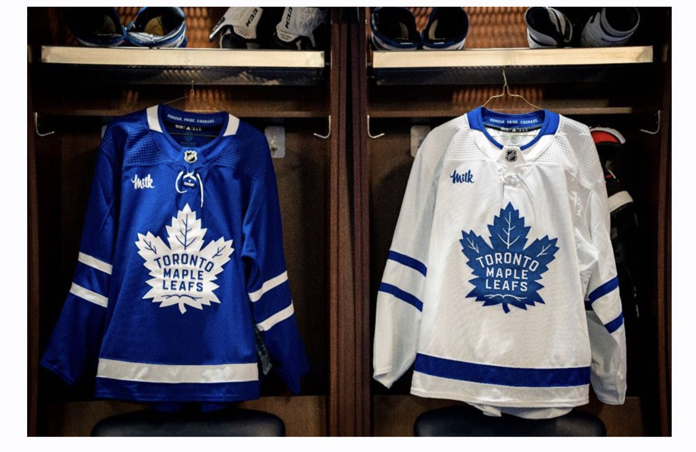
4 hours ago, spartacat_12 said:The Leafs have announced their jersey ad for this season.
If the league insists on ad patches, this is about as inoffensive as they can be. Can't wait for all the sour milk jokes when they inevitably collapse in the first round again.
Forget all the sour milk jokes, the Leafs did it right with their corporate ad, much unlike the Habs.
And you "can take that to the bank".
-
 3
3
-
-
2 hours ago, Sport said:
Black pants would've been the safe move and it would've looked good and we know that because teal numbers with black pants is what they've done since day one. I applaud the decision to use teal pants because it's trying something new and if we're using teal pants then I like black numbers over teal.
How do you feel about the Blackhawks' use of black numbers on their white jerseys? I've always thought red with black outlines would've been the better way to go.
Red numbers with black outlines would definitely work on the Blackhawks' whites because red is their primary dark colour. Like the Flyers do the same thing with orange, the Stars do with green(without any black outlines) and also the Rangers do the same with royal blue with a red 3D drop shadow outline while wearing red pants.
The thing is, is with the Blackhawks, the black font on their whites matches their black pants. They also wear black helmets with their reds to match their pants. It's the same thing with the Canadiens and their royal blue. Blue numbers with red outlines to match their blue pants on their whites while using blue helmets to match the pants on their reds.
When the pants colour is that particular team's primary dark colour, the font on their white set should be the same colour.
What the Sharks mistakenly did by using black font on their whites would be like the Canucks using green font on their whites or the Islanders doing the same thing with orange when the latter two teams both wear all-royal blue.
-
7 hours ago, chcarlson23 said:
I can’t get over how amazing the teal buckets look for the Sharks. I guess I could take or leave the rest of the equipment. I do like the teal breezers and gloves, but man that helmet is something else. They should have gone with teal helmets since day one
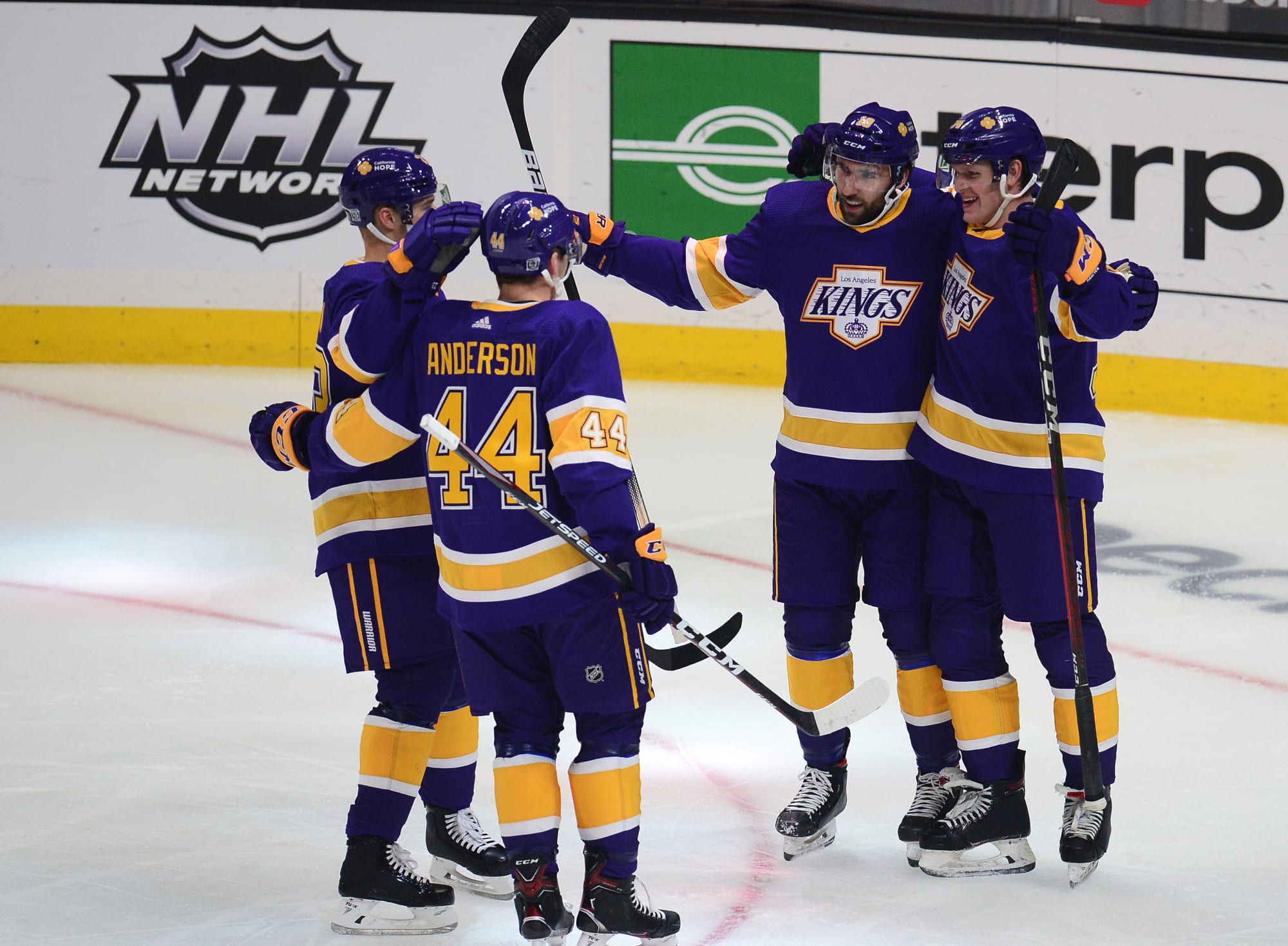
110% agree. If the Kings had kept their purple and yellow-gold, a teal vs yellow-gold uniform matchup would have looked awesome.
-
1
-
 2
2
-
-
5 hours ago, the admiral said:
Funny that you mention the pea-soup Whalers, because I was just thinking yesterday that head-to-toe teal has the same problem that Hartford's old uniforms had, where it's not bright enough (Red Wings) or dark enough (pick one) to really work. Like kelly green or slate blue or grey, it needs another color to break it up.
The MLS Sounders' rave green is a pea-soup green. The Whalers' green was a vibrant kelly green...it was a bit darker in the early 80's.
I love colour. So, all-kelly green, teal, slate blue and grey work for me. All-orange, for example, I would agree with you.
-
On 9/16/2022 at 12:22 PM, B-mer said:
Another shark siting.
Of all uniforms that have come and gone along with the clubs that have worn them, I'm truly missing the Hartford Whalers and their beautiful 80's all-kelly green uniforms along with their whites with the kelly green font plus Pucky the Sperm Whale secondary logo. Both the Sharks with their all-teal look and the Whalers would have a beautiful Battle of the Sea uniform matchup. Just make the Sharks' font on their away whites teal - would look great vs the Whalers' greens.
-
9 minutes ago, VikWings said:
Sharks:
Love them but I think I would have went with black pants. Just a little bit too much teal for me. Love the fin logos return.
Canes alt/throwback:
This should be their full time look.
Though I much prefer the unique all-teal look, I would be fine with black pants with the teal helmets, jerseys and socks and teal pants with the white set(including teal font).
-
BEAUTIFUL Sharks uniforms. LOVE IT. An all-teal uniform is going to look as gorgeous and distinctive as the all-kelly green worn by the Whalers and North Stars in the 80s. It's not going to bleed any retinas like the Seahawks' all neon green.
My ONLY nitpick is using black instead of teal for the font on the whites. Even the Wild should be using dark green font instead of red on their whites. The dark font on the light base should always match the pants unless it's the primary dark base. Ex. Rangers(primary royal blue with red pants), Flyers(primary orange with black pants). This could still be corrected at some point.
-
4
-
-
3 hours ago, BoysClub said:
As a Sharks fan, I was spooked by the idea of all teal, at first. The lighting in the graphic that Murji posted looks closest to our organization's first teal, which I would considered the worst teal option the Sharks have when it comes to a monochromatic approach. I cried myself to sleep that night (like any grown man does when an aesthetic standard isn't met) then woke up to a much better teal, provided by Kuhre's mockup. Not wanting to get my hopes up, I decided to submerge myself back into the deep Pacific for the first time in years to see if I could gain some clarity.
After seeing bits and pieces of the look from a trusted source, I am feeling much more optimistic. The biggest relief was learning that the teal will be the one used in Kuhre's mockup. Even if they end up not using different pants for home/away, I’d still consider the monochrome a huge upgrade. Everything actually looked pretty modern, and I can't wait to see the final product against teams in our division. I definitely have games against Calgary (this would be an unbelievably enjoyable color vs color matchup if they let it happen) and Vegas circled on my calendar. While it doesn’t provide much that isn’t already known, my source told me that they have not seen new, black pants in any capacity. They also mentioned that the organization has been prioritizing September 16 as a very important date. This could 100% be due to the Barracuda’s new rink hosting fans for the first time but it wouldn’t be ridiculous for them to go all in, attempting to generate sizable excitement for a team who isn’t supposed to do well this season. (This was mentioned in the article that has been posted, but I wanted to voice that the theory is backed by whispers around the facility.)
Nothing groundbreaking, but I thought it might help anyone who shared these concerns.
3 hours ago, BoysClub said:As a Sharks fan, I was spooked by the idea of all teal, at first. The lighting in the graphic that Murji posted looks closest to our organization's first teal, which I would considered the worst teal option the Sharks have when it comes to a monochromatic approach. I cried myself to sleep that night (like any grown man does when an aesthetic standard isn't met) then woke up to a much better teal, provided by Kuhre's mockup. Not wanting to get my hopes up, I decided to submerge myself back into the deep Pacific for the first time in years to see if I could gain some clarity.
After seeing bits and pieces of the look from a trusted source, I am feeling much more optimistic. The biggest relief was learning that the teal will be the one used in Kuhre's mockup. Even if they end up not using different pants for home/away, I’d still consider the monochrome a huge upgrade. Everything actually looked pretty modern, and I can't wait to see the final product against teams in our division. I definitely have games against Calgary (this would be an unbelievably enjoyable color vs color matchup if they let it happen) and Vegas circled on my calendar. While it doesn’t provide much that isn’t already known, my source told me that they have not seen new, black pants in any capacity. They also mentioned that the organization has been prioritizing September 16 as a very important date. This could 100% be due to the Barracuda’s new rink hosting fans for the first time but it wouldn’t be ridiculous for them to go all in, attempting to generate sizable excitement for a team who isn’t supposed to do well this season. (This was mentioned in the article that has been posted, but I wanted to voice that the theory is backed by whispers around the facility.)
Nothing groundbreaking, but I thought it might help anyone who shared these concerns.
1 hour ago, B-mer said:Just saw this mock-up on Twitter. Not perfect, but works in showing how it might look and really makes it look pretty nice
I am a huge fan of the Sharks' original bright teal. However, I would prefer black helmets and pants with that particular shade. An All-Pacific deep teal uniform would work and it's a look I hope Sharks fans will embrace. I believe they will love it.
-
1
-
-
19 hours ago, fl00dsm0k3 said:
Vegas looks great.
San José the away isn’t bad, but the home could improve with black equipment. Their current set has its issues, but they are one of the few teams that I thought their best look was Edge 1.0. the Home and away had great color balance. I know the orange stripes weren’t popular, but This set is in my personal top 10.The black helmets and pants with the original striping looked great with their lighter teal primary. However, being the first all-teal team is going to make the Sharks stand out in a bold and unique way. Like how the North Stars and Whalers stood out in their all-kelly green uniforms. I also would be okay if the Sharks went all-in with their original '91 look and then went with teal helmets and pants as a 3rd uniform instead of going with another bland black 3rd jersey.
-
1
-
-
14 hours ago, Nordiks_19 said:
Hopefully, it won't be too heavy for the players because thos look great !
Absolutely L
 VE the Sharks' look. Even if used as a 3rd. As much as I love the original '91 uniforms and logo, the Sharks will be the 1st all-teal team. The Golden Seals were the 1st all-turquoise team. Great to see colour and simplicity return to NHL uniforms.
-
1
-
-
On 9/1/2022 at 6:55 AM, VampyrRabbitDesign said:
For me, the closest they've got to perfecting their look were these two uniforms -
Both have the W with the representation of the Capital Monument and both have really good colour balance.110% agree. I much prefer the red look. Besides the Washington Monument W with the 3 stars, the ALL-CAPS wordmark holds true to the team name instead of an all-lowercase wordmark, which was a carry over from the NBA Bullets.
bu

 ets
ets  capi-\_-als
-
1
-


/cdn.vox-cdn.com/uploads/chorus_image/image/68716909/cut.0.png&f=1&nofb=1)
2022-2023 NHL Jersey Changes
in Sports Logo News
Posted
The Wild name needs to go, even at the expense of one of the most creative logos in sports. Going with a far more suitable major pro sports name, if not the North Stars v.2, while using some form of green and yellow/gold(without black) should be the order of the day in Minny. I still love the "Northern Lights" with the updated N.
Losing a beloved name and brand is one thing. Replacing it with a horrible name and with colours fighting for primary status is an insult to injury, no matter how creative the primary logo is.