


CDunn
-
Posts
1,310 -
Joined
-
Last visited
Posts posted by CDunn
-
-
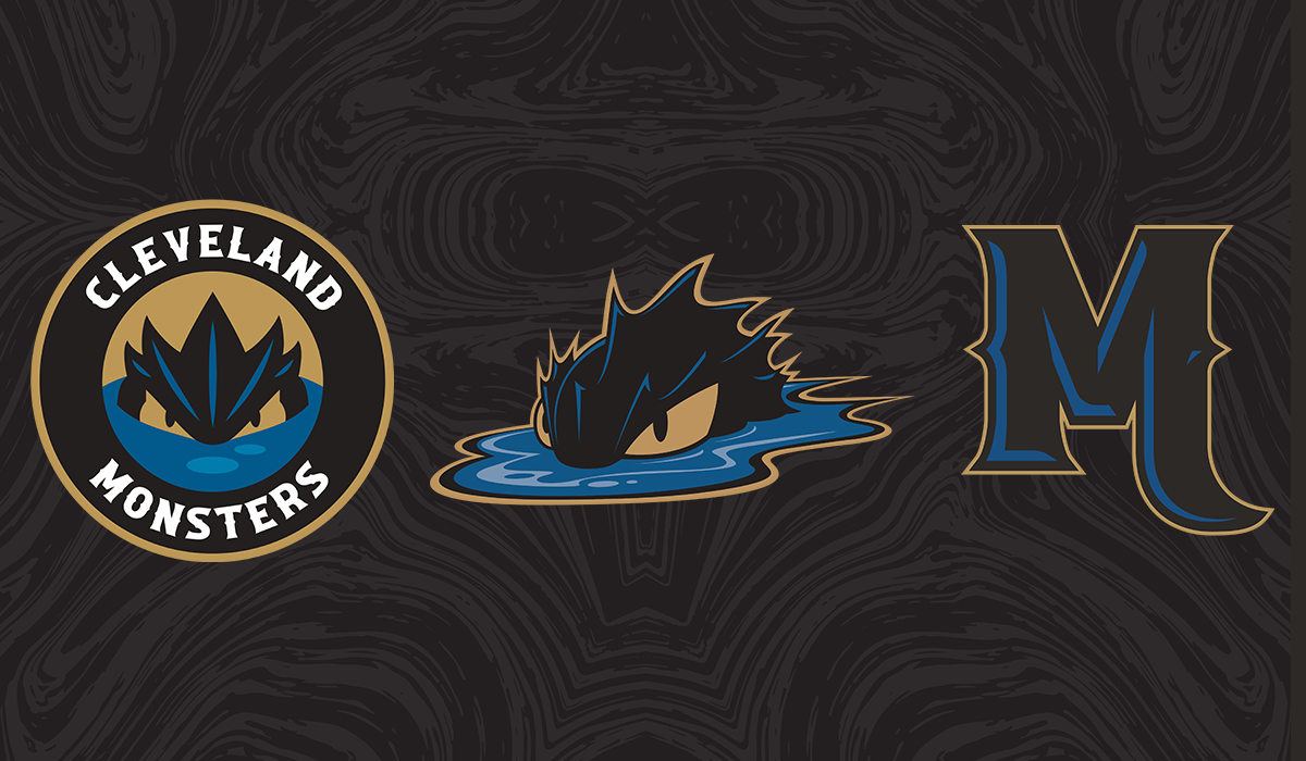
"Monsters" looks like it's off center to the left a bit. It needs to be rotated around the circle counter-clockwise a little bit to line up evenly. I don't love on the home and road jerseys that the top of the big stripe is wavy but the bottom is straight. It makes it way too thick for my liking. I think my ideal fix would be to move the blue stripe down to the cuff/bottom hem, and then flip the gold stripe to go on top of it and make it match the wave curve. Overall, pretty close to great. Way better than what they had. But that roundel type needs to be set better at least.

-
 1
1
-
-
On 10/8/2022 at 9:05 PM, uniformity said:
The only pro Seattle hockey team known to use northwestern stripes was the Ironmen in the mid 40s. It was a generic logo-less uniform that they might of used for one season. The sweater was two colour had a number on the front and featured a white shoulder yolk with NW hem stripes. It was identical to that worn by dozens of minor league teams of that era.
I was looking at some Totems photos and they used some similar striped socks at some points.
-
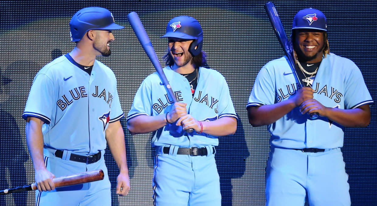
Use that beautiful blue jersey as road primary. The script and that blue and gold sans white color scheme is so good.
And yeah, I support color jerseys (and pants!) as full-time or primary roads. Gray was just something they did when they didn't have access to laundry machines every day. No reason it has to be the standard in the modern day.
Along the same lines, this should be the Jays road primary:
-
2
-
-
On 9/4/2020 at 9:35 PM, packerfan21396 said:
Tungsten Semibold and Agency Bold
Couldn't find an exact match, but AmericanCooper Block Black has a similar structure to it.
Thanks! Also found Display Gothic 1958
-
Does anybody know something relatively close to the "John Mayer" font in the top right? It's like a vintage appliance or car logo's font. I just can't think of it.
-
On 2/10/2020 at 10:24 PM, mafiaman said:
You mean other than the Gemini Athletics logo in place of the Bauer logo and yellow COLORADO COLLEGE in place of white lettering on the front?
Yeah, same jersey, new chest and shoulder logos. And I guess new manufacturer. My (poorly stated) point was that the jersey design and its silver accents predate the new logos. People were saying the logos should have silver because the unis do, but the unis aren't part of the new brand.
-
These are the same unis they've been wearing all season just with the new logos. Here's what they looked like before.
-
On 11/6/2019 at 2:26 AM, Buc said:
Now, with all that said, and in accordance with several previously stated observations of recent Brandiose work, well...
...Yeah I can definitely see a certain recurring theme or two here--most notably, the side smirk/grimacing teeth thing, which I'm guessing at this point must well be an unstated Brandiose trademark, not unlike Nike's opposing-cornered jersey number thing.
I modified this quote to show two of the latest pieces from Brandiose—the Paddleheads and Trash Pandas— and their relatively old Iron Pigs logo. Sure, they share some similarities, but Iron Pigs feels stripped back compared to the others. Bigger elements, easier to render in embroidery and small sizes. Plus Iron Pigs was a pretty clever play on pig iron mined in the region. Paddleheads, Trash Pandas, Sod Poodles, Vibes, etc. are harder to justify.
Look at their older Clearwater Threshers work, too. Clean.
Brandiose is extremely talented but has become an almost inevitable parody of itself.-
5
-
-
One of my bigger problems with this is how overly detailed this set is. Some parts are going to be completely illegible when embroidered or printed/digitally rendered at small sizes. On the logo with the moose in an innertube it has a baseball in one antler and a fishing lure and line in the other. And the pupil is green, orange, and white. That's going to be so small and muddy on a cap. The Montana outline logo is really nice, but again, I don't know how all those dots on the fish will translate when embroidered.
Can you imagine the primary logo, or any of these, printed at 1" or smaller in black and white halftone at a relatively low resolution in a newspaper boxscore?
Back in the early Clink Room days Brandiose showed off videos of them working with New Era to do cool stuff with embroidery to create depth and shading from which way the thread was running. They'd have a large element of a single color, but by running threads in different directions you could create all this texture and visual depth. I feel like that's now lost to this heavy detail.
-
4
-
-
Wings/CBE logo is fantastic. Uniforms look nice, too.
-
Okay so maybe the Thrashers-esque colors aren't totally unintentional if they're going with the single arm stripe look...
-
2
-
-
On 8/6/2019 at 10:49 AM, kiwi_canadian said:
- - -
On 8/6/2019 at 11:30 AM, the admiral said:I'll never understand recoloring an existing logo. Logos should be designed to fit team colors, not the other way around. If they're going for Atlanta Thrashers nostalgia, they're going the wrong way.
It appears that the Thrashers similarities are unintentional. I believe it's more to mesh with the arena's other tenant, the Georgia Swarm of the NLL.
This is a mess, though. The light blue looks extremely out of place. The clash when it's directly on gold like on the helmet highlights is tough. The new wordmark (Trajan?) could use some big kerning help, and the font for "Atlanta" (Kabel?) doesn't fit well. Bosack's original is so good, and this feels like a bastardization.
Some elements on the new logo are weird, like on the triangular navy definition on the neck. In the primary and head-only logos it's just a triangle. But on the middle of the secondary logos that's more like half-body, that definition is now a triangle with a little dot above it. There also looks to be a little navy dot on the mask too. Some other lines on all the logos look a little wonky now, too. Like they didn't have the vector files to recolor so they recreated them or auto-traced or something. Super weird.
-
-
1 hour ago, leopard88 said:
The wordmark is an upgrade, though I'm not sure why the U is smaller than the other letters. The D logo is a downgrade, in part because it almost doesn't read as a D (particularly in isolation) and in part because an Old English D makes sense for a team named the Dukes.
The smaller U is supposed to be a visual cue to how to pronounce Duquesne. Honestly, though, more of a cue is needed on how to pronounce the end of the word instead of the beginning. I don't hate it. The press release all says the D(u)Q arc is a nod to Pittsburgh bridges. I kinda get that.
I love the idea of a modern blackletter D. Joe Bosack just released an identity for Wheaton Academy that has a modern athletic take on blackletter. Wheaton's identity is more successful than Duquesne, though, because the D isn't instantly legible like others have said.
I also like the dual tone lighting Duquesne in their photographic style. That's always a cool effect.
I don't like the new bright blue. It does make the school more unique among the dozens of red and blue teams out there, but I'm not sure this was the way to go.
-
2 hours ago, rams80 said:
You don't understand, those ten thousand or so one-time merchandise purchases pay the bills for a team in a gate-based revenue business that has ~70 home games a year.
/sarcasm
Last year MiLB reported $70.8 million in merch sales among the 160 teams. That's an average of $442.5K per team and up from $68.3 M in 2016. Obviously not every team is not making $442.5K in merch and newer teams/names are more likely to be the ones making more than that. If you look at the top 25 teams from last year, Brandiose is responsible for 7 of the identities. I don't like a lot of their recent work, but they know what they're doing.
-
2
-
-
Roundel: The font feels really out of place compared to the rest of the set. It has a 1920s/Art Deco vibe that doesn't make sense for the logos or, to my knowledge, the city.
Full body mascot: He's got his hand up like he'd be reaching for guns, but there's nothing on his belt. Hand positioning combined with the pigeon toes makes it look like he's doing a little dance.
Texas logo: Mascot looks like he's in water. The rendering in the roundel version is clearer because 2 of the prairie dogs are head and shoulders above the hole.
Sod Poodles: All three "o"s are exactly the same, which takes away from the feel of this being custom or hand-written. They don't have to be wildly different, but slight variety in the spurs or loops would make it better.
Mascot head: Same problem as the Texas logo.
Mascot-A: Probably the best of the set. Mascot looks the best, though the boots could be a different color from the body. I think point of the elbow should align with the top of the crossbar in the A. It's ever-so-slightly above it which could be annoying in some applications like embroidery. Just get rid of that tiny bit of white negative space between the elbow and top of the crossbar and it's just a little cleaner.
-
2
-
-
On 2/8/2018 at 11:54 AM, roxfan00 said:Yard Goats will play one game as the Hartford Steamed Cheeseburgers this season. In homage to the steamed cheeseburger which was invented in Connecticut.

I keep looking at this logo, but I can't figure out what's going on the right side of the logo. What are those 4 ripply parts above the "med" in "steamed"? Is that the back of his glove? Why is the glove made out of hamburger if he is also a hamburger?
-
I hope it's not Buttons. Button Gwinnett was a liar, cheat, conman, slave owner, and general all around failure.
Big Mouths is the best option of those given. Bass fishing is pretty popular at Lake Lanier (and the state in general). A tiny part of the huge lake runs through Gwinnett, but it's not that much of a stretch for a connection. There's only a few other fish-based identities in MiLB, so it also has room to stand out without being completely absurd like Sweet Teas, Hush Puppies, or Lamb Chops. Gobblers isn't Brandiose enough. Needs a modifier or noun in front of it to be Brandiose's style.
-
wow- more teams than I expected. I guess I do remember it on the Atlanta jerseys I've seen around town( I dwell in the ATL) now that I really think about it.
-
does any NHL team use that type of collar?
-
Anyone have a COMPLETE NHL letters and numbers file(zip). The one I have now doesn't include some jerseys and doesn't have some teams at all (like the SABRES). I need a Sabres font because I have made a ton of Sabre jerseys, all having to use a block font.


Name That Font!
in General Design
Posted
Can anybody identity the font for "National Champions"? It looks kinda like Bebas with serifs.