-
Posts
631 -
Joined
-
Last visited
Posts posted by MrAstrodome
-
-
Also:

AAAAAAAAAAAHHHHHHHHHHHHHHHHHHHHHHHHHHHHHHH!!!!!!
-
 3
3
-
 1
1
-
 1
1
-
-
Me watching Texans vs. Titans now.

-
 3
3
-
-
White yoga pants. Everywhere.
-
 1
1
-
 1
1
-
-
No. 11 on SF's offense is wearing red socks.
-
 2
2
-
-
6 hours ago, GFB said:
Once again, the helmet finish makes the red too dark.
If the "candy" finish is a must for you, then they need to bump the red up a shade (from 187 C to 186 C / 185 C) to compensate.
Uniform snob!Me: Great another mono.
Texans fan!Me: But its our best mono!! And look at red! Full ketchup bottle since 2010. Frick I'm old...
Also me: now that we got red pants back, mix and match pretty please


-
 1
1
-
-
4 hours ago, ruttep said:
The bull head with the light up eyes is absolutely hilarious
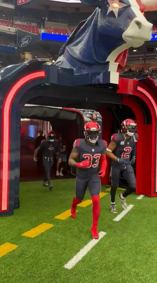
I just now noticed that they changed the entrance bull. Two years ago. Shows how apathetic I was about the team. This was the original.

The new one's a bit more regal.
5 hours ago, Chawls said:I love this.
16 minutes ago, GoGreenGoWhite said:Dobbs got pulled down by his stupid undershirt.
If that's not a warning to tuck in the undershirts, I don't know what is.
I don't hate for it like most people here but yeah. Disadvantage.
-
 1
1
-
-
Red pants or red socks. It look good none of the less. If navy is our primary again next year, then with red numbers and a red helmet I could live with it.
-
 3
3
-
-
1 minute ago, ruttep said:
Anyone notice that the color circle emojis in the tweet are red and something close to Luv Ya Blue? That has to be a hint at something
Nah that's the standard blue emoji.
27 minutes ago, Pigskin12 said:Houston is also wearing the red helmets the following Sunday against Jacksonville (with the red jerseys).
That would be the final time they can wear it this season, which means they will not be wearing it for their Christmas Eve home game, which is an interesting choice.They said the red helmets were going to be worn 3 times at home. Now that we know the first two, my prediction is we will see the third time on the season finale.
1 minute ago, ruttep said:This is all your fault, Bud Adams.
He can rot in perdition.
-
 1
1
-
-
Astros promote Joe Espada to skipper.
Everyone's thankful it's not Ausmus.
-
28 minutes ago, tBBP said:
Oh it's definitely been discussed here before...namely by me. And no, the Broncos shouldn't have made their current orange jerseys their primary. That set was so obviously designed for navy to be the primary, but as I understand it the fans pushed for the orange shirts to be the primary dark tops, so here we are.
As much as I don't like the Toughening (Thanks @timjameskohler) of the 90's and 2000's now, the Broncos new uniforms were definitely made with navy in mind. If it were up to us, we would just clone and recolor the Color Rush jerseys. Though I would keep the current numbers though.
-
1 hour ago, MCM0313 said:
Better than the
 look, but I miss the Texans wearing red socks with their white jerseys and blue pants. They were one of the first “leggings” offenders; they’ve been wearing blue pants and blue socks together since 2009.
Man I miss their proper road look. Damn losing streak.
Even the one time they wore it white socks with it was better.
-
-
-
It's darker colors in general which was the fad exiting the 90's. Heck, when the Texans entered the league, we were navy team number nine adding to the always navy Bears, the then newly-changed Bills, Patriots, Rams (from Royal), Cowboys, Chargers (both from dark Royal since the 1980's), Broncos (orange) and the Titans (Columbia).
-
 2
2
-
-
Loving Texans vs. Bucs. Some screwing up with white socks, but a nice red vs blue match up.
-
 3
3
-
-
As an UH alum, had to do double take when the uniform were announced. I was shocked that these were able to take the field. But if more Houston teams want to wear that blue, go right ahead. Was ok when the Rockets did it. Always wanted the Dynamo to do it back when they had it as an active accent color (their sister team the Dash did it but still). Houston should have that color.
But do in a way that is complementary to the brand. Like y'all, I am worried on what will be revealed by the Texans in April and after that, the current jerseys will officially be throwbacks. Depending on performance, maybe comparing the past and the future will be like comparing Bucco Bruce and the Red Jolly Roger, or the Royal, Kelly and Silver to the Beastquake and the Legion of Boom sets.
But whatever the case, I hope it looks good and not too much of an Oilers' cosplay.
And please have Battle Red as the primary.
-
19 minutes ago, ⋔ 4 ℞ ℞ $ said:
You forgot the New England Patriots, who also didn't & don't have stripes down the center of their (sparkly / speckled) silver helmets.
I guess they meant at the time of introduction back when New England was still a white helmet team and before Carolina debuted.
-
 3
3
-
-
On 9/12/2023 at 11:30 AM, BadSeed84 said:
And the money they'll make.
It looks like the logo for a Nerf product.
It's better than nothing...
-
30 minutes ago, the admiral said:
The Oilers throwbacks are imperfect, but it was really nice to see them this week. Columbia and red is a strong color scheme, the oil derrick and drop-shadowed wordmark looked terrific on the field, and all of it meant not seeing the crappy Titans uniforms. I have no position on "they should use this full-time," but I maintain that Houston should have gotten the same deal Cleveland got or, better yet, the move should have been disallowed in the first place. It's a classic identity and I think a lot of us missed it.
Eff Paul Tagliabue.
Just now, infrared41 said:The obsession with socks in this place will never stop being amusing to me. Yeah, sometimes certain socks might improve a look, but in all my years here, there's been maybe a handful of times where I thought "the socks totally ruined this." To each their own, I guess. Sockjacking (in either application, I suppose) is one of the things that make this the wild, weird, and wonderful place it is.
Multi-page fights over socks and face masks. It's ain't CCSLC without it.
-
 5
5
-
 1
1
-
-
On 10/26/2023 at 9:42 AM, Sykotyk said:
You mean... they have time to stubbornly insist that it's a great logo and identity and hope to wear their fanbase down into acceptance before 2025.
Still remember as a Dynamo fan the "1836" controversy that had the Dynamo name and crest created within weeks. It can be done if enough fans raise up a ruckus.
On 10/26/2023 at 11:58 PM, Brian in Boston said:"Fiber manufactured in San Diego County is the thread that binds our communities together. Shop local and look for the San Diego Fiber Council seal."
San Diego Fiber would have been better than this.
-
2 hours ago, ruttep said:
am dumb. meant to say "at least it's not white pants."
Well it's not too bad. No full complementary color matchup but at least no leotard or yoga pants.
-
So JJ Watt's one of our people as he talked about uniforms on the Pat McAfee Show and what to do on the Oilers/Titans/Texans situation.
-
 2
2
-
 1
1
-
-
12 hours ago, Lights Out said:
Besides how the color makes them look gross and unwashed, whatever they were trying to do with the sleeves looks horrific, and the yellow trim on the jerseys and pants vibrates against the bone color and disappears from a distance. The stripes on the bone pants having only yellow and white was a questionable decision too. They also sometimes ruin the superior blue jerseys by wearing them with bone pants.
I'm waiting for the day they go with white-over-bone or vice versa... now that will truly be an atrocity.
Hmm..


Vice-versa


EDIT: I have an older Madden that does not have the current white pants for some reason.
-
 1
1
-
-


_invasion_of_WWF.png)

NFL 2023 Changes
in Sports Logo News
Posted
We do. The name Houston comes from Sam Houston's ancestor Sir Hugh de Paduinan who founded the villiage of Houston, Renfrewshire, Scotland or Hugh's Town.
The meme is H-TINE, HOLD IT DINE.
I hope not. One maybe, but not two.