


colortv
-
Posts
1,375 -
Joined
-
Last visited
-
Days Won
3
Posts posted by colortv
-
-
On 5/16/2021 at 4:46 PM, colortv said:
I actually think the West/Chamberlain era uniforms might be the best:

Just invert the color piping on the collar/shoulder so purple is dominant.
-
 2
2
-
-
What the Showtime jerseys look like with gold numbers:
https://lakersstore.com/collections/jerseys-2/products/lakers-bryant-clot-x-mn-sweater-knit-jersey
-
4
-
-
Does anyone know why the Lakers gold jersey has Nike branding and the purple statement jersey has Jordan branding?
-
2 hours ago, Conrad. said:
I wouldn't look too far into any Statement jerseys going on sale this offseason.

Wow, that really blows. The Lakers purple jersey is just a total mess with the black.
-
11
-
-
Speaking of the Knicks from earlier in the thread, I really wish they'd emphasize orange more in their branding.
They need to own the orange/royal blue colors like the Lakers do with purple/gold, Bulls with red/black, Celtics with green/white..
Their brand has so much potential to be just as iconic as those.
-
On 5/15/2021 at 6:01 PM, Alex Houston said:
This comment conjures up an interesting question: In the same MSA with 8 million as I pointed out before, what city is considered second to San Fran? I mean, San Fran isn't even that big, as Fiddy pointed out, from square miles and population, but it's always included in the Top 3 cities when you start talking west coast markets. You'd automatically think Oakland was runner-up because of the sports teams, Berkely, proximity to SF, etc. But in the last 20 years, it really seems like San Jose has leapfrogged them.
And on that point, San Jose feels like one of the weirdest cities that has prospered in the last thirty years. Like, despite rooting for their hockey team, their city honestly seems kinda drab, like a bunch of suburbs lumped together and I know it's silly saying that since that's all SoCal is too, but there's just a different feel and impression of that spot, at least to an outsider like me.Considering there are no pro baseball teams in Sacramento or San Jose, I'm sure the Bay Area teams draw some fans from both those metros.
We're talking nearly 10 million in the SF-Oakland-San Jose combined statistical area along with another 2 million in Sacramento.
-
3 hours ago, the admiral said:
I hated those wishbone collars, the loss of the drop shadows, and the Haettenschweiler NOBs. Downgrades across the board from the quirkiness of Magic and Kareem's Lakers. I don't mind cleaning up the wordmark, and sure, maybe the drop shadows could have been scaled back a teensy bit, but they modernized too much. Always something to be said for classic cuffs and collars on basketball jerseys (see also: Bulls, Spurs).
Yes, the dropping of the traditional collar/shoulder reducing color contrast, loss of dropshadows, and bulky side panels were downgrades imo.
I actually think the West/Chamberlain era uniforms might be the best:
Just invert the color piping on the collar/shoulder so purple is dominant.
I also like this showtime era uniform with the white numbers:
I don't mind the white dropshadow numbers, they look good but I want consistency on the uniforms.
-
6
-
-
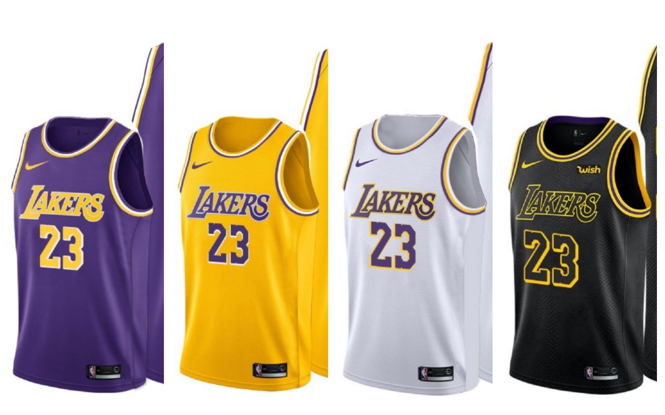
13 hours ago, Old School Fool said:
This is another thing I don't like about the Lakers Statement jersey. The yellow numbers on purple absolutely sucks and it's because the contrast with a yellow number and white drop shadow is messed up, that font is not made for it at all, that drop shadow is so minimal that it makes that specific color combo look bad. Another issue is that the shade of yellow is ass and it doesn't help.
Even the Showtime Era numbers look bad when it's yellow. You just can't do these colors with a drop shadow.
The yellow wordmark and white number was a better color balance overall.
I'm going to have to disagree, vehemently.
The gold numbers look great on tv, and contrast wonderfully with the dark purple the Lakers use.
-
1
-
-
I will say, the gold jersey numbers on the purple jerseys are a definite upgrade over the white ones, look great on tv. This is what they should look like:
-
3
-
-
19 hours ago, SCalderwood said:
I'll take what you said a step further. I do hate the look. I think it looks bad in a vacuum, and I think it looks bad in the context of their identity and history. I don't think it would be okay as an alternate jersey, because if it was an alternate jersey, that would mean that they would have 2 purple jerseys where mainly the only difference is the side panel color, which to me would be even sillier than having the black side panels to begin with.
Having said all of that, I have to admit something. I'm usually pretty anti-BFBS, but somewhat surprisingly (to myself), I found myself okay with the Lakers' black jerseys when they first came out. I think I was okay with them because 1) They branded them as "Hollywood Nights" jerseys, so it felt somewhat purposeful and not just "let's add black to try to look cool," 2) They did not alter any of their other jerseys to incorporate more black than they already did or let black otherwise creep into their identity, 3) I don't recall them overwearing that jersey, and 4) I genuinely thought they looked pretty good - strictly as an occasional alternate.
It's not just the side panel on the purple jersey, the side panel also makes the shoulder/neck piping different.
44 minutes ago, beast3 said:I think the Lakers earned uniforms are charcoal and not black, which is probably why I prefer them to their previous black alternatives
The current "black" jerseys are definitely not black. They are playing on tv right now and it's clear theyre some sort of charcoal/dark gray color.
-
13 hours ago, -Akronite- said:
Agreed. I'd add OKC as well, though their color scheme seems to give or take a color with every alt.
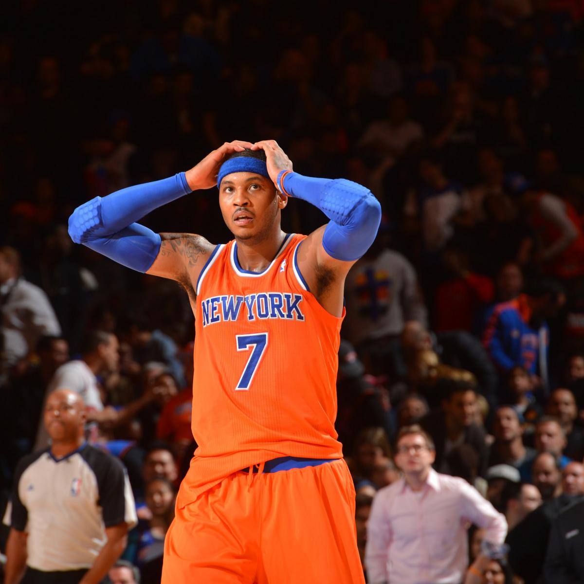
There's bad juju or whatever, but if the Knicks tossed every jersey they sucked in they'd have nothing to wear (I know I know, they're actually good this year). This is so beautiful and shelving it is a crime:
11 hours ago, kimball said:When put side by side to those Suns and Knicks orange jerseys, the more I love the shade on that OKC orange!
Eh, that pic isn't really representative of the Knicks orange, it's much richer.
-
5
-
-
1 hour ago, CaliforniaGlowin said:
Then they come out with vice pink and wolves green!
 oh how times change!
All the more confounding when you consider the Lakers gold jerseys.
-
1
-
-
On 4/24/2021 at 7:35 PM, Chawls said:
𝐈 𝐰𝐚𝐧𝐭 𝐢𝐭.
(つ .•́ _ʖ •̀.)つ
11 hours ago, TheOatsMustFlow said:
Very cool! Apparently this jersey or something very similar was close to existing. A quote from the original designer of the sunburst look:“I have sketches of an orange version of the jersey but the NBA freaked out. They thought fans would need sunglasses indoors! The orange jersey and a streaking Suns ball had a black eclipse type back shadow behind it and we literally were going to call the jersey the Eclipse.
The Suns already had white, purple and black alternates and the NBA wanted to limit the amount of options teams had to reduce operations nightmares and trainers’ confusion at the time since we were changing so many team identities. That’s why they didn’t do them.”
Here is the rest of the interview and article about the history of the sunburst uniforms.
https://sports360az.com/2016/07/espo-brief-suns-sunburst-jersey-oral-history/
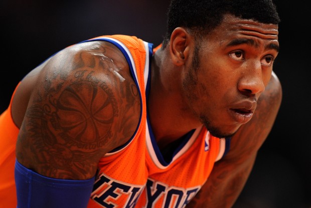
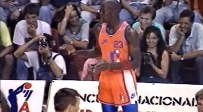
Both the Suns and Knicks need to bring back orange jerseys, they're the only teams capable of rocking the color as part of their normal color scheme.
Here's Jordan wearing one in an exhibition in Europe:
-
2
-
-
Lakers - Please remove black from the purple jersey and follow the gold jerseys template
Knicks - Please bring a true orange jersey.
-
7
-
-
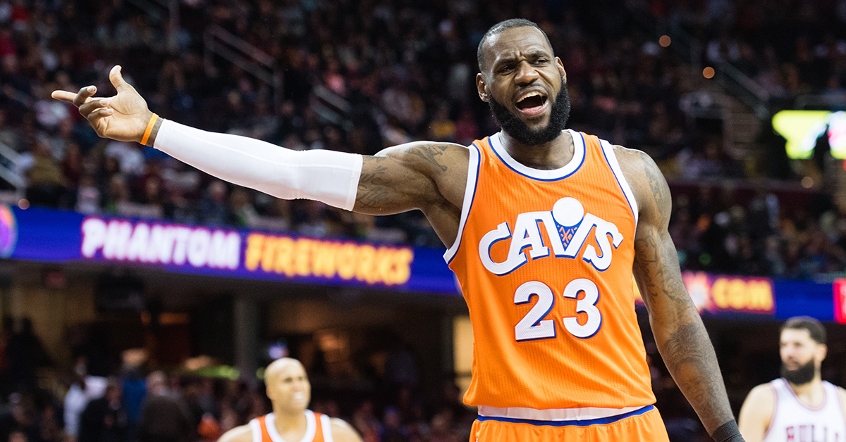
Cavs have worn so many colors:
-
1
-
-
-
Where does the Jaguars equipment manager get off saying they're the only NFL team that uses teal, they aren't even the only team in Florida.
-
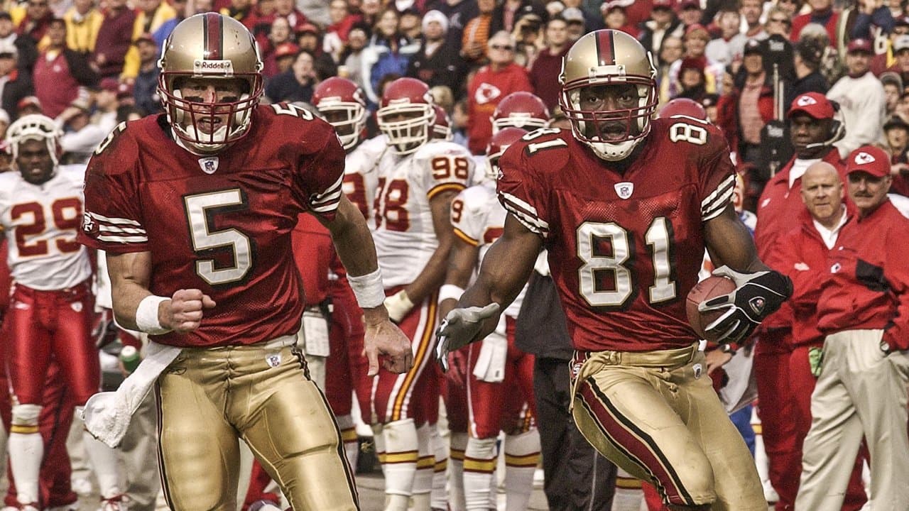
While we're on the topic of the 49ers, am I the only one who preferred the "shiny" gold pants compared to what they have now?
-
15
-
-
That gold/red and silver/blue contrast when the 49ers and Cowboys were battling atop the NFC in the 90's was perfect.
-
16
-
-
We need options people.
-
1
-
 1
1
-
-
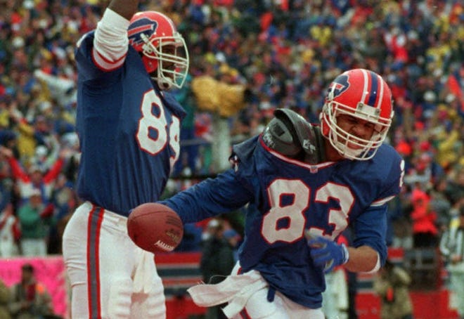
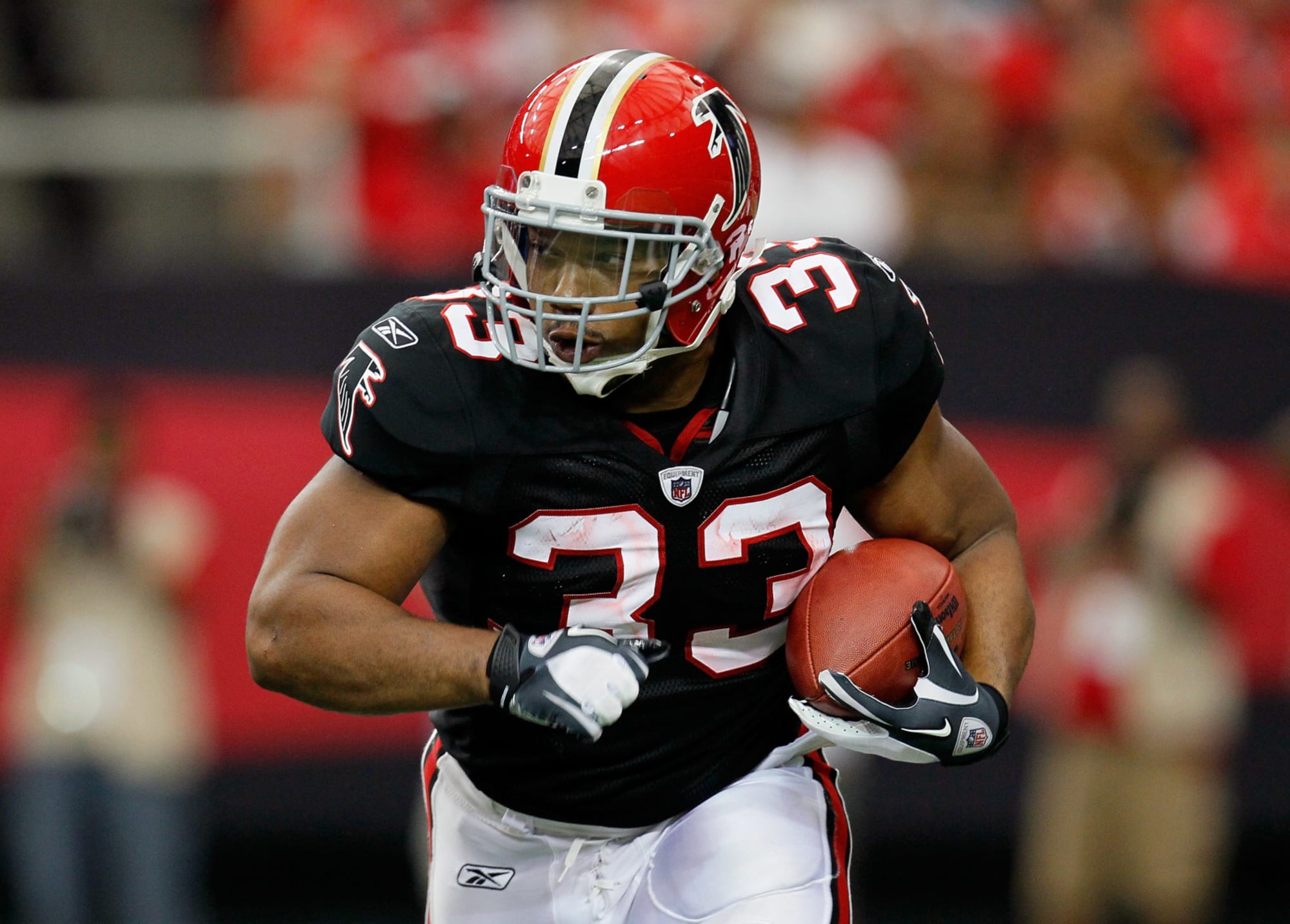
Two examples I think that show how a more than 1 helmet rule would work:
Falcons - black/red
Bills - red/current white
Would anyone think that's a problem? I think both teams are just as identifiable with either helmet.
-
3
-
 1
1
-
-
34 minutes ago, debo0775 said:
Elaborating, there are a handful of teams that I think can lay claim to their colors being their visual ID:Baltimore
Miami
Jacksonville
Tampa Bay
Minnesota
Seattle
Green Bay
NYJ
SF
Those teams are unmistakably identified by their colors. Maybe another couple of teams could be added. Beyond that, there‘s mostly a muddled mess of Blue/White, Blue/Silver, Blue/Red, Red/White teams (not to mention Chicago and Denver with remarkably similar colors).
The NFL is also defined largely by its brand rather than its players (save the superstars). Removing the helmet as the visual identifier for a club would dramatically alter how we consume the NFL in viewership and in public persona.
I would add:
Pittsburgh
LA Rams(Blue/Yellow)
Raiders
Browns/Bengals
Philadelphia
Washington
New Orleans
-
2
-
-
52 minutes ago, Gothamite said:
Jerseys are never used as standalone graphics in newspapers, on websites, and as part of television coverage. Helmets are.
Which means there's a pretty significant difference.
I mean, this is a pretty standard image in football; the helmet face-off. You don't see this with baseball caps, or basketball shorts, or hockey sweaters, or even football jerseys. Only helmets.
.
Sure, helmets are an iconic signature of football, no ones disputing that.
What I'm saying is, I don't see how a team using it's primary colors dilutes the brand...the primary colors are by definition the brand.
-
1
-
-
12 minutes ago, DG_ThenNowForever said:
Agreed. I don't trust Nike with multiple helmets.
I'm not saying multiple helmets, I'm saying I don't see the difference between a team having jerseys in their two primary colors and having helmets in their two primary colors.
-
1
-


2021-22 NBA Changes
in Sports Logo News
Posted
Wouldn't it be wonderful if we got a throwback matchup between these uniforms when the Sonics rejoin the league?