


Malpass
-
Posts
114 -
Joined
-
Last visited
Posts posted by Malpass
-
-
I don't know if we're still using this thread or not, but behind this link is a treasure trove for nu-NASL stuff, including two style guides and some very high-quality primary and alternate logos.
-
Continuing the footie theme, the Harrisburg City Islanders have created a logo for that most important of anniversaries - the 12th...
http://cityislanders.com/club-news/harrisburg-city-islanders-unveil-12th-anniversary-logo/
..and elsewhere the Tulsa Roughnecks and the Oklahoma City Energy have unrecorded alternates:


-
The Richmond Kickers have a textless logo they use on their kits...

...and also a reversed colourway version of the same.

-
Atlanta 2017 have finally got round to updating the MLS logo in their pre-launch badge.

-
http://www.strikers.com/dct/nasldct/Strikers_MediaGuide_2014_Fall_1lsipf2caqhte1qg0c43gux3jy.pdf
This Fort Lauderdale Strikers media guide features an unlisted club wordmark and an NASL one too...
-
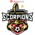
The Scorpions' logo for 2015:
EDIT: Also the 40th anniversaries of the Sounders and the 'Caps, as seen in the following links
http://www.whitecapsfcdigital.com/mediaguide/WFC-mediaguide2014.pdf
-

SKC alternate (?) in the background, top-right.
-
The 2012 Fight Hunger Bowl had a slightly different logo to the 2010 and 2011 events: namely the sponsor Kraft introduced their new logo to it.
This media guide features the 2012 logo: http://grfx.cstv.com/photos/schools/embl/sports/m-footbl/auto_pdf/2012-13/misc_non_event/12-media-guide.pdf
-
The Top Prospects Game in the Canadian Hockey League has a new sponsor and logo:

There's a French version too:

-
This isn't much a question about the forums but more about the sight.
If we find logos for teams or leagues that aren't on the sight does Chris take submissions?
Another option is to post your find to this forum post, designed for exactly this eventuality
 - http://boards.sportslogos.net/topic/96060-missing-logos-on-sportslogosnet/
 -
Couple more here:
https://en.wikipedia.org/wiki/File:Orange_Bowl_Logo_1951-1995.png (could be alternate version of existing 1951-'88 logo?)
-
Two anniversary Big Sky Conference badges (linked because they are on the large side):
http://www.bigskyconf.com/images/2013/6/28/BSC_25th_Anniv_NoTag_PMS_DBG.png
http://www.bigskyconf.com/images/2013/6/28/BSC_50th_Anniv_NoTag_PMS_DBG.png
-
Does anyone know what fonts are used here?

Can't remember the main font off the top of my head, I think I have it on my other computer though. I will check later. However, I can say that the "drug store" bit is an italicized Gill Sans weight, and the 'phone number is in Century Gothic.
Does anyone know what font or free font would be close to this? I'm assuming it is a custom font, but... given USD's athletic budget, maybe not.
Looks like ITC Machine to me.
-
A soccer example for you all now...
Wimbledon FC's aborted rebadge in 2003 featured a new badge...

which would feature on a rebadged home shirt from the previous season and on a new white away kit.
http://origin-www.mkdons.com/page/NewsDetail/0,,10420~387227,00.html
Neither the amended home nor the new away kit were used in the 2003-04, and in 2004 the club relocated to Milton Keynes, and rebranded to the Milton Keynes Dons.
-
The only fake jerseys you'd ever see people wearing at the time were teenage boys in soccer jerseys - usually either EPL or international kits. Those ones were typically well done and resembled the real thing, presumably because people actually knew what they were supposed to look like.
Soccer fakes range from ones that are damn near identical to the real thing to others that are bloody atrocious. Most of the ones here in England fall into the latter category (I suspect that's because the real thing isn't that expensive but does date rather quickly), whereas in some of the markets I've been to abroad, I've had to triple-check to believe they were fake (and I know what I'm looking for more than most).
-
Both of the above have happened to me today, in reverse order though.
EDIT: Thread on malware warning already exists.
-
Font name please!

Originally I thought it was Morpheus, but Mason looks more like it.
The VIRGINIA TECH on the shirt

I've looked around the web a pretty good bit for this one. I wouldn't think it would be custom. Any help would be much appreciated!
I think it's one of the Futura cuts, probably Pro Bold.
sportslogos.net missing logo thread
in Sports Logo News
Posted
Just the Armada, the Strikers' and the Scorpions' secondaries.