


PaleVermilion81
-
Posts
1,342 -
Joined
-
Last visited
-
Days Won
3
Posts posted by PaleVermilion81
-
-
1 hour ago, PurpleHayes said:
The blame for the rise in monochrome is squarely on the players, who in my opinion should not be put in charge of deciding what uniform to wear, or should be trusted to understand what even looks good. Every current NFL player grew up watching Any Given Sunday (or that putrid Longest Yard remake) with its' mono-black and mono-white unis, but this doesn't mean they look good on the field to the FAN.
The current NFL fan that age or younger also likes mono. So yeah we can blame the players, but it's not a player thing. It's a culture thing of that younger age. They prefer mono (in general). For example, every time I play Madden with my 14 year old nephew he always mixes and matches uniforms for a mono look regardless of the team. That's just their taste. Nike knows this and is appealing to this younger fanbase.
-
 1
1
-
-
1 hour ago, tBBP said:
This is my word...and as such is beyond contestation.*
*in my Prince Edward of Wales voice*
I will fong you...-
 2
2
-
-
33 minutes ago, ruttep said:
I hope you're talking about the Niners
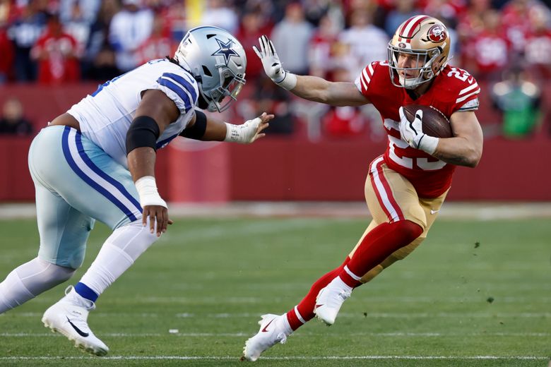
Oh I am. I hate the Cowboys white look with mismatched blues and ugly pants.
-
4
-
-
7 minutes ago, HOOVER said:
Some looks truly are timeless and don't need to be modernized. Here are two of them:

I only see 1
-
2
-
 5
5
-
-
Yeah I'd definitely wear it ironically myself.
-
This is the last I'm going to post on this kit. As a MNUFC fan it just depresses me and I'm letting it go and counting down to the 2026 replacement (and hoping we have a manager by then). But this is literally all I see when I see the new kit:
Plus
Equals
-
 1
1
-
4
-
-
18 hours ago, MinnyHockey said:
I mean we use our state motto, "l'etoile du nord" (star of the north) all throughout the branding of MNUFC so it makes sense.
if they used the star in their logo as a pattern it would. Random Galaxy image that is only missing 3 howling wolves around it doesn’t fit anything to do with “Star of the north”. I’m honestly surprised the level of love this kit is getting. It’s just a lazy design.-
2
-
 1
1
-
-
1 hour ago, hereandthere said:
Oh, come on, this has to be one of the most incredible and visually coherent home/away sets ever made.
(I understand if MNUFC fans don't love it becuase they want the wing back, but as a neutral non-US kit fan, I absolutely adore both of them)
For a team called the Loons it makes no sense and doesn't alignment to any of their kit history. That's the stupidity of it. If it was, say, a team called the Galaxy it would be the perfect kit. Or a team based in some state where they had a song that said, "The stars at night...are big and bright...". For a team who is the Loons...just dumb...
-
5
-
-
Sigh. As an MNUFC fan I'm so tired of our on the field lack of identity. Every kit is so random. "Starry night". Like, WTH? Give us the freaking wing back on our primary kit and have that be the basis of our primary identity. Do crazy, out of left field stuff on the secondary kit, fine. But literally every primary kit we have has been so disjointed and random. The lack of a consistent identity drives me mad.
-
5
-
-
6 minutes ago, SCL said:
Everything pales to the gray with wing and red button.
My only complaint with that one is that the gray is a little too light as I prefer the darker gray they switched to. But overall, yeah, such a classic design that they should've brought with to the MLS.
-
42 minutes ago, upperV03 said:
The shorts and socks for Minnesota’s new kit are black with white adidas stripes. That teaser for the shirt looks interesting, but I’m worried the kit as a whole will be mostly black and white with minimal blue accents.
In any case, they should’ve stuck with dark gray primaries anyways.
Oh I missed that the new stripes are white on the shorts/socks. Sigh. That's really disappointing. And I fully agree with the dark gray primaries. Their NASL kits are still far and away the best they've ever had.
-
2
-
-
Minnesota United has a teaser graphic in this ad. Called the Starry Night kit.
https://www.mnufc.com/legal/2024/loon-call-contest
There is one (1) grand prize awarded to the Winner (“Grand Prize”):
• (1) One team-signed Starry Night jersey
-
2
-
1
-
-
1 hour ago, Brave-Bird 08 said:
^ Yeah, I know it's the space needle, so it can only be rendered in so many ways, but it surely seems like they somehow stumbled upon your logo and used it as a framework -- the core disc area is almost identical. I'm not an expert on the legal actions to take here, or how intellectual property works, but this is quite a find. I've had my work stolen multiple times before (one time it was a college logo concept so I couldn't claim it as IP, or something like that, it was a decade ago so I can't recall the exact explanation). I can sympathize with the way you might feel seeing this, maybe ping Chris directly and see if he can give it some air play?
I think that's the tricky part in this case, too. TLChandler I think does have a case to at least raise the question of "did they take their design". But the Space Needle is trademarked property and to use it by itself in your logo requires special permission (https://www.spaceneedle.com/trademark). So even if the agency who created this logo did steal it from TLChandler, if TLChander didn't have permission but the agency did it might be moot point. (not a lawyer so really not sure how this would be handled in the courts)
-
30 minutes ago, TLChandler said:
This reminded me very much of a design I posted to this site 11 years ago, don't know where else to go with this. Here's the side by side and overlay, no dimensions were changed just resized to match and the original post as well. Is there anything I can do with this?
Considering it's based off of the Space Needle, there's bound to very similar logos out there. There's enough variation in some of the curves and other things like the middle thickness of the middle ring (yours gets narrow, the Sounders doesn't) that they could reasonably argue you both just used the same source photo when creating the illustration. Whether that's the case or not I'm not sure. It's very similar to be sure, but it's reasonable to argue that a structure created in 1962 that has had countless logos created in that time could eventually have 2 logos created that are unintentionally identical. I'm not going to defend the creator of the Sounders logo, though, but also not gonna attack them.
-
4
-
-
1 hour ago, ramsjetsthunder said:
This may go down as the worst looking game in NFL History
*cue people sending photos of Jags v Rams from 2018*
It definitely won't go down as that. It's not even in the discussion unless you've never watched the NFL before.
-
1
-
-
8 minutes ago, pepperbb said:
Most likely explains why the Rams were able to wear their alternate in the super bowl against the pats. Saved us from the mismatch mess from that year
That year it was their designated home uniform, not an alternate.
-
1
-
-
18 minutes ago, Pigskin12 said:
Anyone else disappointed that neither the Jaguars or Titans seem to have any plans to upgrade their uniforms? Both teams are entering Year 6 with the current sets, both of which are not very good uniforms.
There is no reason the Jags can’t come up with something more interesting than what they have now. I mean there was literally no effort put into this current set. It seems like they’ve just grown tired of doing this every five years and are trying to stick with an identity, even if it’s a bland one.
The Titans also probably think what they have is good (even though it’s awful) and have had enough success in it that they associate it with winning, kind of like the Seahawks and their overrated set.
Jags uniforms are just fine, provided they follow the simple rules of: jerseys NEVER match pants, pants NEVER match socks.
-
5
-
 1
1
-
-
Good. Was tired of logging in and seeing 20 reactions to posts I made over a year ago. Very much an annoying troll.
-
6
-
-
3 minutes ago, DCarp1231 said:
Probably an unpopular opinion, but throwbacks should always be worn against division rivals or longstanding conference rivals.
Also, alternate uniforms like Washington’s all black, Seattle’s wolf grey, Cincy’s all white, and Cleveland’s all brown should be worn in matchups that, historically, don’t matter.
Washington's all black can burn in hell, Seattle's all gray I believe is getting retired with the return of their throwbacks, Cincy's all white is *meh* doesn't matter as it isn't that visually offensive (just odd), and Cleveland's all brown can also burn in hell right after Washington's all black has finished burning.
-
4
-
-
2 hours ago, MCM0313 said:
The Titans’ secondary color is light blue. The silver is kind of a tertiary, then they have red and dark grey competing to be quatrary.
I don’t like the idea of two teams in the same division both having double-blue, even leaving out the red bit.
Whether or not the Texans add light blue, I’d really like to see them make red their dominant color.
The gray is more dominant than the light blue on their white and navy uniforms pieces.-
1
-
-
6 minutes ago, MCM0313 said:
So, aside from sparsely used accent colors…the same basic scheme. I would understand if they weren’t division rivals, but come on.
Gray is more than a "sparsely used accent color" for the Titans. It's secondary color used on every uniform element, and they don't use red on their uniforms other than logos. If the Texans keep red a secondary color it'll be just fine. You'll have a primary blue, secondary red team and a primary blue, secondary gray team.
-
3
-
-
This set to me is like the Jaguars set in that it will look best if it follows a few simple rules:
- Jersey and Pants are NEVER the same color
- Pants and Socks are NEVER the same color
As long as they follow those 2 rules, this set is just fine for me. (although in the Cardinals case, the red jersey/pants should never be mix and matched with the black jersey/pants).
-
2
-
10 minutes ago, MDGP said:
I can explain it. Cartoonish, amateur giant swords on the shoulders, barely legible numbers, a pointless little pit stain of color that adds literally nothing to the design, a pointless square of grey on the pants that adds literally nothing to the design and half the time doesn't include the team's two main colors, monochrome hell, and to top it all off a nice splotch of red not used anywhere else to tell everyone exactly who to thank for jerking off in our cornflakes.
You forgot the stupid "stripe" on the helmet. Every where else in the uniform it is dark gray pair with light gray (shoulders and hips). The helmet is dark gray and white.
-
7
-
-
Sigh. This weekend is really gonna suck. Tired of these parlay weekends. There's got to be a better way to do it than giving every team the same jersey.
-
6
-


2024 NFL Changes
in Sports Logo News
Posted
I actually loved that yellow jersey in Madden. The key was to pair it with white pants and black socks. Then it worked (mostly lol). But yeah. Shoulders to toes in that color? Blah. Just too much.