


thejblee
-
Posts
92 -
Joined
-
Last visited
Posts posted by thejblee
-
-
I want sponsors on NHL jerseys.
And Euro jerseys are better than North American.
I'm really curious, and am not trying to offend, on this, why do you feel Euro jerseys are better than North American jerseys?
I can live with sponsership, as I do for rugby, but I am curious on how you believe that theya re better?
The reason I prefer them is due to the fact overall euro jerseys are better designed than NA jerseys in my opinion.
For example, take the worst of the KHL/Swiss/Swede and compare it with the NHL.
Worst jersey right now in the NHL is arguably the Carolina away jersey.
It's bad because the logo is meh, and the jersey is boring, uninspired, and EA NHL quality.
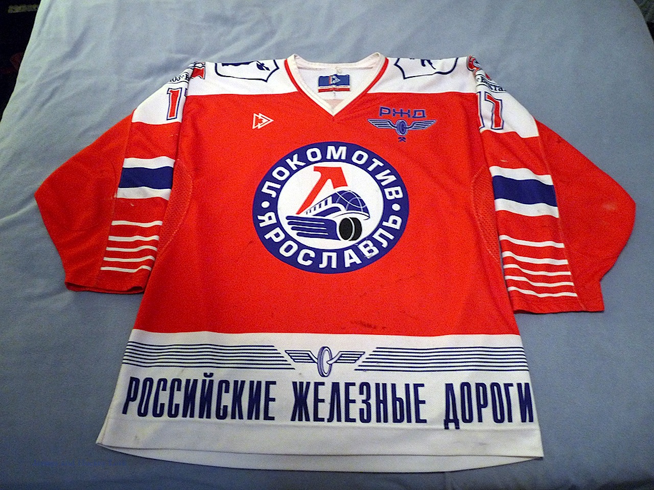
The worst in KHL is Salavat Yulaev Ufa.

Why is this bad?
Because it looks rridiculous
NHL teams overall play it safe with new Home/Away jerseys.
KHL are all over the damn place.
Some of the finest jerseys are KHL


I want sponsors on NHL jerseys.
And Euro jerseys are better than North American.
I really don't think you'll find anyone that agrees with you on this, but I am curious as to why you think this.
If you are referring to sponsors, it's just because I think a few of the NHL jerseys look too bare.
Also, I think some teams that are smaller could greatly benefit from sponsorship.
If they did implement them, they would need to restrict it to local companies (i.e. US/CA sponsors only)

-
 1
1
-
-
Okay, this is probably a highly unpopular opinion, but whatever. This?

This is a horrible jersey. Now, I'm fully aware that the Falcons' current jerseys aren't exactly top-notch, but that hardly excuses these. There's a fine line between beautiful simplicity (Green Bay) and generic movie team (Miami Sharks), and these dance all over that line. First, the color balance is off. I've never really been a fan of the "nothing matches" combo, but these particularly annoy me. Bright red helmets, nice...but where's the rest of the red to bring this together? Why are primarily black socks being worn with this jersey, confining the rest of the red mainly to pants and sock stripes, giving the impression that this is a black/white team, with red as trim (save for the helmet, of course)? And speaking of stripes, why are there none at all on the jersey? There's a clear stripe on the jersey, pants, and socks, so why is the jersey bare, save for numbers and another pet peeve...a 95% black logo, with nothing else save thin white and red outlines, on a black jersey. Brilliant. Maybe this is where some modern looks got the idea from. Truth be told, this doesn't look like an NFL jersey. This looks like a retro Texas Tech knockoff, or some random college squad. I firmly believe that this is one of those looks that only gets praise due to the majority of modern designs going off the rails. Again, there are truly classic looks, and then there are those that pitifully try to imitate them. These are the latter, in my opinion.
Yeah.....no
-
IMHO this was Maryland's best uniform set. Pity they only wore it one season. However they sorta had to since it was very similar to NC State's unis at the time.


I'm not sure how unpopular of an opinion this is on these boards
-
I actually like grey face masks. I thought the 49ers helmets looked great last night.


Unpopular Opinions
in Sports Logo General Discussion
Posted
No denying Griffey looked awesome in the vest. Everyone else not so much.