


CardsFan79
-
Posts
116 -
Joined
-
Last visited
Posts posted by CardsFan79
-
-
1 hour ago, CaliforniaGlowin said:
I love the Mariners spring training hats but not matching the green jersey is awkward.
My thoughts exactly when I saw them in action yesterday.
-
Thanks @officeglenn, I couldn’t get it to embed the pic.
-
This just popped up in an ad. First time I’ve come across this one….unless I overlooked an earlier post.

-
5 hours ago, kimball said:
Jerry was great. I had a few interactions with him as a kid here in Utah. One, where he called me a "sneaky ass kid" at a sports card show because I brought over 15+ things for him to sign.
That’s awesome! He would come home to Southern Illinois every off season. He was just another farm boy and hung out with his friends. I was just a teenager but every time I saw him mowing his yard he’d always give me a wave and a big hello. I miss that.
-
 3
3
-
-
2 hours ago, FinsUp1214 said:
To be honest, as a fan I just never got around to liking these. The biggest problem to me was the color scheme - I thought the navy and the forest green were too close in shade together and often had contrast problems, and the navy never seemed necessary when purple was the better choice anyways. But I also thought the retro wordmark looked really weird and out of place on a uniform with modern elements and a modern number font. That the side panels and numbers were supposedly cut at the same angle as the ends of the letters on the wordmark made the uniform seem more forced than clever to me. I definitely understand and respect the intention, but it was one case of “neo-retro” that fell particularly flat with me in execution.That is a perfectly valid opinion, and I can’t argue against it. I’m not opposed to a different color scheme at all. I just hate the current color scheme with a passion. I wish they’d go back to something that is an updated version of the classic look.
Ultimately, my opinion doesn’t matter. I’m a Bulls fan first and foremost. I root for the Jazz as my second team, mostly because Jerry Sloan was my neighbor throughout the 90’s.
-
 1
1
-
-
On 8/10/2023 at 8:20 AM, spartacat_12 said:
Well the Jazz will finally get to wear these alternate uniforms this season. Assuming they're a hit with the fans I'd expect the team to use them as the basis for the new set.
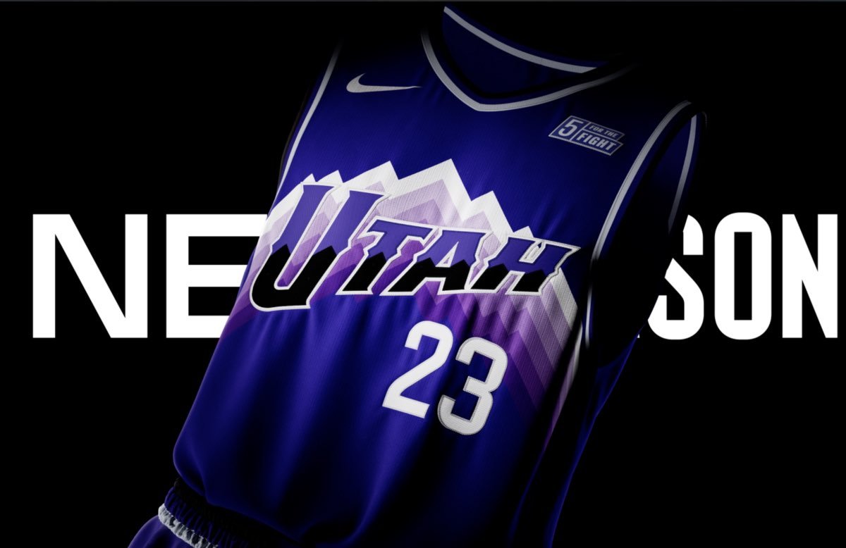
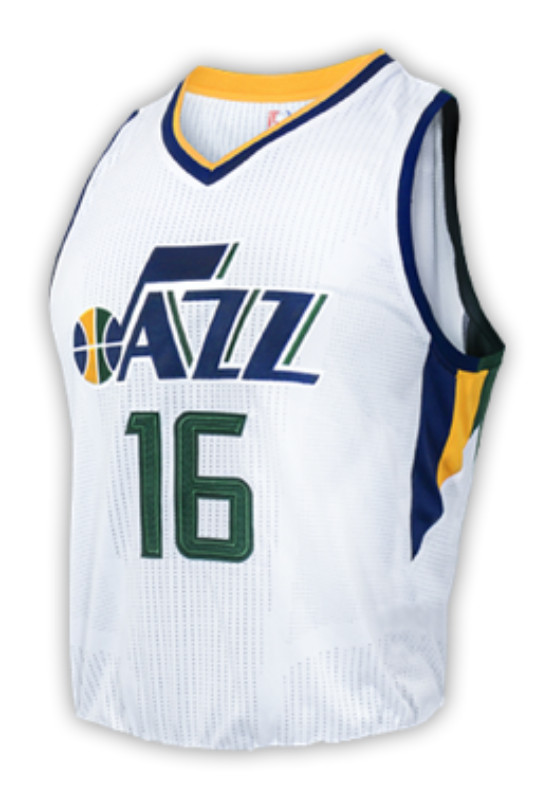
I’d prefer them to just go back to the mid-2010s set (below), as I felt they were a great update to the classic look, but these purple ones would be 100000x better than the trash they’re wearing now. I wouldn’t even mind a rotation with both. One as a main, the other as an alt.
-
2
-
-
8 hours ago, BadSeed84 said:
You don't find a jacked up bird whimsical?

I will say the Cardinals do need to go back to the "You lookin at me?" bird
Absolutely yes!!!!
-
I will say, seeing them in in-game action, the Cardinals ad patch doesn’t stand out nearly as bad as I thought it would. And it’s 1000x better than any other one I’ve seen for the other teams. I still don’t like it, but at least it seems to blend well.
-
2
-
-
2 minutes ago, WestCoastBias said:
I'm conflicted here.
The ad matches the Cardinals uniform so well that if you didn't know any better you might just think that it was part of the uniform, like a memorial patch for some ex player named Stifel or something. Is that a good thing or bad thing?
Ad patches are a bad thing all together, but since it was inevitable, I’m glad it’s one word and matches. It could’ve been worse I guess. At least it wasn’t like the original Mets patch.
-
1
-
-
-
Cardinals announce their jersey ad. I guess it could be worse, but I still hate it.
-
 4
4
-
 1
1
-
-
16 minutes ago, WSU151 said:
Other than the ads, the Marlins uniforms are just unbelievably awesome. Make them a full time alt like the Rays did with the Devil Rays set.
We need to get a grab of Jorge Soler's jersey...the fish patch is all kind of jacked up (and it may be the case on all of them). The team patch on the sleeves is nearly upside down.
I forgot how much I love these jerseys. I can’t believe they ever ditched them.
-
3
-
-
On 9/3/2022 at 2:25 PM, CaliforniaGlowin said:
Get y'all vomit buckets ready...
I can’t get an answer from New Era about why I can’t find a Cardinals navy road 59Fifty in Low Profile for the past two years, but they’re out there making this garbage! Aggravating!
-
1
-
-
-
12 minutes ago, GriffinM6 said:
Purple and green together looks great, but does anyone else always get reminded of the Hulk when those two colors are side-by-side?
I was thinking about the Hulk thing yesterday. Looks like there isn’t much purple, so no Hulk comparisons to worry about.
-
2
-
-
5 hours ago, TBGKon said:
Linking in the post so all can see
Thanks. I couldn't figure out what I did wrong.
-
1
-
-
Not everyone is happy with this year’s Spring Training caps.
https://twitter.com/burgatron13/status/1505368893065347074?s=21
-
 5
5
-
-
After reading Bronfman's statements, I wonder if he/his group were told that they'd be given a team one way or another if they play along with this joke for the time being? I can't believe that they've put in all this work to bring baseball back to Montreal to settle for a ridiculous team sharing plan, nor can I believe that they actually think it's a good idea.
-
1
-
-
Thank you Survival79!
-
I thought I read in some of the articles about yesterday's press conference that the Montreal Group was going to have their own press conference today, but I can't find any info on it. Did they hold one or did I make all that up in my mind?


 - A cardinal perched on a yellow bat wearing a cap over a baseball inside a red circle reading St. Louis Cardinals in white SportsLogos.Net")


MLB 2024 Uniform/Logo Changes
in Sports Logo News
Posted
The Cardinals are unveiling their CC on May 20, and debuting them May 25. This is going to be bad.
https://www.facebook.com/share/fBXVbGh2vr94qhDe/?mibextid=WC7FNe