-
Posts
3,828 -
Joined
-
Last visited
-
Days Won
2
Posts posted by LAWeaver
-
-
This is more of an offer than it is a request, but I created a Nike Vapor football template earlier this year for the Uniform Madness tournament and I figured I'd share it with you all as well.
-
5 hours ago, Brian in Boston said:
Maybe it's just me, but I find something odd - indeed, off-putting - about the Narwhal playing dress-up in sea-captain's garb while wielding a harpoon. It would be like the Milwaukee Bucks rolling out a primary mark that depicted a deer sporting a winter ear-flap cap, camouflage hunting jacket, and orange safety vest, while toting a bolt action rifle.
The hunted has become the hunter.
-
 1
1
-
-
-
30 minutes ago, Survival79 said:
GO GOYLES!
OK but why did I read that with Gru's voice from Despicable Me.

-
 3
3
-
-
On 8/13/2019 at 11:15 PM, Earl said:
LOL I remember requesting that design when he was doing his redesign thread awhile back. I was going to school at the Ohio University - Zanesville campus for a year when he made it. I like how they didn't even crop the design itself.
-
 4
4
-
-
14 hours ago, panthers_2012 said:
For comparison for JCU:
Old

New

The more I look at it, the more I dislike it. Two blues and no streak. John Carroll missed the mark on this. The logo needed an update, but they should've kept the streak in. Just having the JCU brand is bad.
And as a BW Alum, I have to add AWWWJACKETS.
And as a Muskingum alum, I have to add GO MUSKIES.
Gotta agree on the JCU update. The old one wasn't great by any means, but could've easily been refreshed like this: (shameless plug)

-
 3
3
-
-
1 hour ago, bkknight95 said:
This might not be the right place to be asking this, but am I the only one having issues getting to Sportslogos.net? It seems that no matter the web browser and/or network, I can't get it to load and when something does load, it loads halfway and half the logos and website are missing. I always get a ERR_EMPTY_RESPONSE from chrome and it doesn't even show up on Edge or Mozilla.
I'm able to get to it via Chrome mobile
-
The News Bot kinda confused me too when I first saw it, especially since we had the megathreads before.
Maybe @CC97 can give us an official answer, but is the news bot a way to direct some of the board traffic to the Mothership or something? That's the only reason I can see it taking precedence over the already-established megathreads.
-
22 hours ago, raysox said:
Here’s a big reveal from the Broncos logo designer with a ton of sketches of potential logos
https://www.behance.net/gallery/61221339/The-Denver-Broncos-Identity
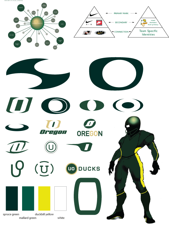
Just came here to post that. He also posted a behind-the-scenes look at his work with Oregon following the Broncos refresh
https://www.behance.net/gallery/61222729/The-University-of-Oregon-Brand-Identity-Design-(1998)
-
 2
2
-
-
-
I'm actually a fan of the Falcons logo. Abstract, but much better than the previous version(s).
The uniforms are dated, but they aren't bad. Removing the side piping on the jerseys and replacing said piping with a logo on the pants would make them much better.
Here's something that's unpopular: I prefer the cutoff shoulder stripes on football uniforms, rather than those that loop all the way around.
-
 1
1
-
-
Three teams will relocate for the 2019 season.
- AAA Colorado Sky Sox will relocate to San Antonio
- AA San Antonio Missions will relocate to Amarillo, TX
- Rookie-level Helena Brewers will relocate to Colorado Springs.
-
I like West Virginia Football's number font.
-
 2
2
-
-
Neither the Dallas Burn nor the Boise Burn had good logos. I'm not even going to call Columbus's sorry excuse of a logo as such. At least Dallas and Boise we're original. This is literally stock art.
Bottom line: Don't call your team "Burn."
-
 3
3
-
-
The Tampa Bay Lightning have never had a good logo. The current is the closest to being "good", but none of them have been good at all.
-
 8
8
-
-
18 hours ago, Geoff said:
BUT WAIT THERE'S MORE. The owner says he's designed the logo himself. H/T to MaconHockeyFan on SPHLForums.com
 On 6/21/2017 at 10:49 PM, mr.nascar13 said:
Why does it look like he paid a guy $5 online to remove the watermark from a stock image?
Called it.
-
 2
2
-
-
Why does it look like he paid a guy $5 online to remove the watermark from a stock image?
-
 2
2
-
-
5 hours ago, Griffinmarlins said:
They could also be really trendy and go with Gwinnett Migos.
Gwinnett Raindrops
Gwinnett Drop Tops
Gwinnett Crock Pots
Gwinnett Boujees
-
 8
8
-
-
7 minutes ago, FinsUp1214 said:
To be honest, I think it got pretty stupid really quick. I can't remember which was first, but I even thought Fresno Tacos was ridiculous as soon as it came out. It all needs to stop yesterday.
Sounds like these food promotions have left a bad taste in your mouth.
-
 6
6
-
-
After awhile, these food promotions are going to get kinda stale.
-
 4
4
-
-
On 3/15/2017 at 11:06 AM, JaMikePA said:
A little late to the party, but there's a bit of a story behind this logo.
A few weeks ago, my friends and I were talking about summer internships. One of them said they were going to be a videographer for the Crushers and got the position because her sister-in-law works with the team. When I asked her what her sister-in-law did, she said she designed to new logo, in which my response was "Oooohhhhh.......".
My friend didn't take offense to it as she and others told her they didn't like the idea of the logo and even thought it looked dumb.
-
 1
1
-
-
43 minutes ago, Gothamite said:
I was about to say, that looks like an updated version, which looks a lot better. Maybe the one I posted is the previous version, but I was referring to the one posted earlier.
-
-
Oh, how the mighty fall. Your work will never be forgotten, Colorwerx. You were such a big help to us all. It's a shame it had to go.







Arena Football News & Updates
in Sports In General
Posted
I had never heard of the Streets before but based on their Wikipedia page, I'm not surprised they're not coming back:
So by the NAL's logic, not having proper security and having players/cheerleaders getting robbed in the middle of the game is less detrimental to the league's image than said team not coming back on the field after literally being robbed.
Looks like personal belongings weren't the only thing the Cobras were robbed of. The league stole a victory from them.