


LAWeaver
-
Posts
3,828 -
Joined
-
Last visited
-
Days Won
2
Posts posted by LAWeaver
-
-

Could someone point me in the direction of the Angels Disney-era number font?
-
Looks like a slightly bold version of Brothers.
-

Beautiful. The Mason Jar logo is pure genius. Love the moon and the palmetto in the background of the primary as well.
-
 1
1
-
-
I'm going to assume that Manchester's roster will be moved to Ontario and the ECHL affiliate will move to Manchester, correct?
-
I actually kinda like the swinging bear. Other than that, I'm glad nothing else from that sheet was used besides Swinging Roosevelt.
-
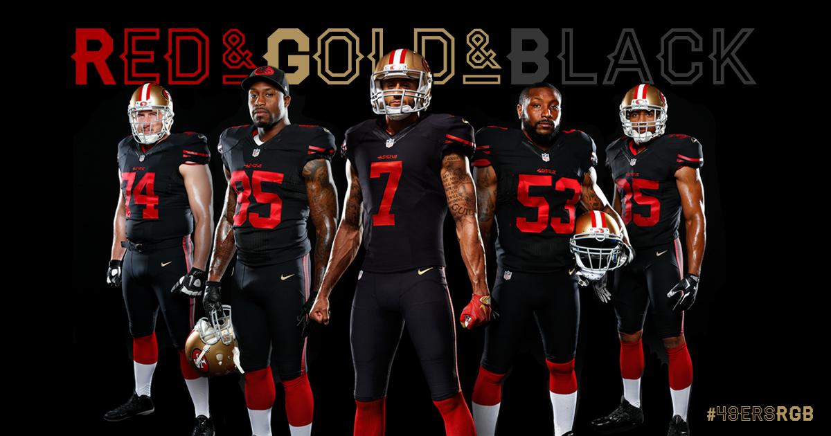
Looking for the "Red & Gold & Black" font. Thanks in advance!
-
I know for a fact that Conrad has the LA Kings font on his site in the NHL pack. I assume that the Sharks font will also be in there as well.
-
are you using the mobile version or the full/desktop version?How do you post an image on your sig on mobile (my iPad)? I want to use Silent's sigs
-
In my opinion, almost every baseball uniform is boring. The script, logo, and/or number font are usually the main design elements.I think the St. Louis Cardinals' uniforms are incredibly boring. No red alternate, no piping, nothing. Just a white or grey jersey with the logo and some numbers slapped onto it. They honestly look unfinished.
-
Whenever I try adding logos, stripes, etc to a template, I use the multiply option. It works great on white helmets, jerseys, and pants, but if it's a colored background, then it changes the color of whatever I add on. I know I'm doing something wrong. Any ideas?
First, learn how the multiply blend mode works. You will see why I am suggesting what I say below. There are many articles and youtube tutorials as this is a very commonly used layer mode. Read/watch enough of them until you understand.
It sounds like you have your layers set up the wrong way round. The template design should be at the top in multiply mode. All of the logos, stripes and other design features should be below in normal mode.
EDIT: The above only really applies to a flat template. If you are using a photorealistic template, you could put all of your stripes, logos etc into a folder and set the folder to multiply with all of the layers inside the folder set to normal.
Even in a realistic template, it's best to have your shadow/highlight layers on top, and your graphics underneath. Go back and look at the first few pages of this thread, Darth does a good job laying it out.
Thanks guys! I appreciate the response. I was able to figure it out.
-
Sorry for the back-to-back posts, but I've already ran into an issue

Whenever I try adding logos, stripes, etc to a template, I use the multiply option. It works great on white helmets, jerseys, and pants, but if it's a colored background, then it changes the color of whatever I add on. I know I'm doing something wrong. Any ideas?
-
I would like to thank both Darth Brooks and Marble21. Thanks to Darth for creating this thread and to marble for uploading that color channel video. I've been racking my brain as to how to change the color of a player's uniform until I saw the video. Then I was wondering how to add stripes when I finally read the first page rather than skimming over it. Took some exploration but I finally figured it out.
We have yet to learn any of this stuff in my graphic design class, so hopefully this will help me in my future projects. I was also able to (kinda sorta) make a custom uniform based on the Green Bay Packers jersey and a logo I created. Now that I found a nice template, I can finally start making photoshop concepts this summer! Thanks guys!
-
I will say this, I do admire Brandiose's work as their overall performance is pretty decent. However, their "mascot swingin' a bat" logos are basically the same as Adidas using three stripes on everything they do. It's annoying at first, but after awhile, it's expected and you learn to live with them. Personally, I like them, but as I said, the idea does get a little stale after awhile
-
1
-
-
I was scrolling through Twitter when I noticed that Brandiose retweeted the list of finalists for the Hartford team, so I assume that means they are in fact making the logo package for the team.
-
For comedic purposes, I'm rooting for the Honey Badgers. Out of the list, I'll put money on Whirly Birds or Hedgehogs. If it's the Whirly Birds, if Brandoise were to create the logo package, I would think they'd make logos featuring both a helicopter and an actual bird similar to the San Antonio Missions and their Davy Crockett and Jalapeno logos
-
Wow, Keurig machine for 15 bucks? And something shady called the Net-30 Killer? Plus a great deal on Pizza from some place called the Round Table?
Yep, I've got ads.
-
Another good point.There are plenty of color combinations that work in theory, or even in other medians, but not for sports. Purple and light blue might look decent on a polo shirt or a comforter, but not for a sports team. And no, don't show me a picture of the 2000's Jazz claiming they would have looked good eliminating the navy.
The only other scheme I can think of that keeps purple is to just brighten the purple and eliminate the black, creating a purple and silver scheme.
Edit: Purple and Gold?
-
Hmm... Good point. I'd say replace the black with a sky blue.
Even the purple?The Colorado Rockies need a Rebrand. By that, I mean blow it up and start from scratch. This is 2015, not 1991.
-
The Colorado Rockies need a Rebrand. By that, I mean blow it up and start from scratch. This is 2015, not 1991.
-
Watch it be something like San Jose Sharks 2, kinda like the MLS-US PRO with Timbers 2, Galaxy II, Whitecaps 2, etc.
-
I'd rather see uniforms loosely based on the host team's identity.
-
1
-
-
I'm having a hard time making out what is in the Waterloo Hawks logo. Is it dead?
-
I'm gonna take this a step further into other sports and ask this: If the Big XII dissolves in football, do they dissolve the confer in basketball, baseball, etc? Or do they dissolve in football, but stay put in Basketball?Looking at the other side of the coin in this....instead of adding two schools to get to 12, does the Big XII lose schools instead?
We aren't that far removed from the Big XII being on it's death bed. Texas and Oklahoma were rumored to be going to either the Pac-10 or Big Ten until the remaining eight schools got together and hashed a deal to stay in the Big XII. Remember, while the other conferences split the money evenly, the Big XII doesn't. Texas gets the biggest slice of the pie, Oklahoma the 2nd-largest, and the other eight get whatever scraps are left. Texas A&M told Texas "You aren't better than us!" and told the Big XII to kick rocks. Nebraska said "To hell with out history with Oklahoma" and fled to the Big Ten. Missouri and Colorado jumped ship as soon as a lifeboat came.
While TCU and Baylor are both upset with the committee's decision, the circumstances that led to their decision are the fault of the conference, and both parties aren't exactly happy with the Big XII right now. Baylor's irked that the conference didn't do anything to pimp their cause.
The SEC has 14 schools. The Big Ten has 14 schools. The ACC has 14-ish schools. The Pac-12 has just 12 schools. While the Pac-12 has publicly said they're happy with 12, they were looking to add to that, and here's a possible opportunity to add a pair of Texas schools and force the issue of some bigger-fish schools to make a choice in where to go.
-
It's a Bipolar Bear
-
7
-

Paint Users Paradise 2.0
in Concepts
Posted
Figured it was about time I posted my football paint templates.
Nike Mach Speed:
Adidas:
Under Armour: