


hawk36
-
Posts
4,015 -
Joined
-
Last visited
-
Days Won
4
Posts posted by hawk36
-
-
This is a great uniform but just needs a slight refinement... With so much going on the outlined numerals unnecessarily clutter. Look at the flag, no outlines, keep that in mind and use sold black or solid red numerals and it all comes together nicely.

-
 5
5
-
-
First thing I saw with the numerals in that color was Denver Broncos.
-
4
-
-
28 minutes ago, DustDevil61 said:
I’ve long thought that a Green/Orange color scheme fits a team named the Dragons almost perfectly.Swap out the Navy for green at home (and maybe use White or orange pants at home), and Seattle would be set.
The green/orange is a great combo... for a team in Florida, not Seattle.
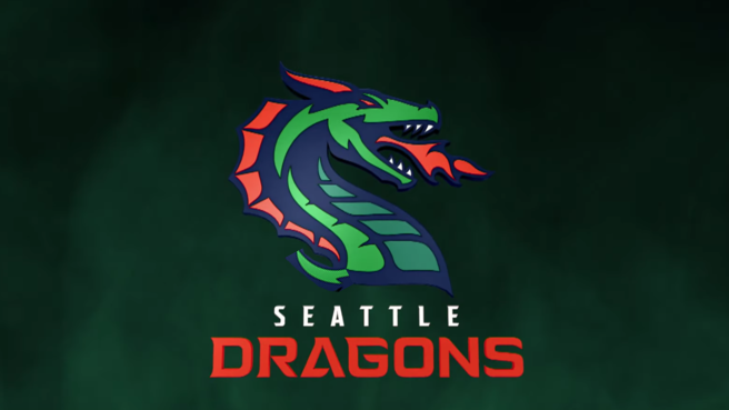
You have to look long and hard to find the color orange here but every shade of green and blue seems to exist. I get that you need fire for dragons but that just makes me go back to the thought that the mascot and color doesn't fit the region at all. Bad choice.
In addition, the dragon itself it too cartoonish. A mono-color treatment more like the Guardians did would have helped it look more like a logo/brand.
-
I'm concerned with the visuals for the Sounders, I believe March 21/22.
Sounders play a 7pm game on the 21st and then the Dragons play a 12 noon game on the 22nd. If it's dumping rain, they may not be able to repaint the field for the football game. In that case, they may have both football and soccer lines painted prior to the weekend just in case. I hope I'm wrong.
-
57 minutes ago, MJWalker45 said:
Creative market may have what you need.
Thanks, I'll take a look.
-
Anyone have a good Nike-style poster template resource? I'm going to be doing the senior posters for my son's high school football team next year. The typical fog, lights, etc. Something I can buy and make life easier and make the posters look great. Thanks for any resources.
-
On 10/9/2019 at 7:43 AM, WideRight said:
XFL Draft is next week. I wonder if they will reveal helmets or full uniforms at that event. At least helmets would be a good touch.
Would make them look more legit and I'd think it's vital to have jerseys available as the Christmas shopping season heats up in November.
-
3 hours ago, kimball said:
Eh. I'm not sure how I feel about it? The double green and template definitely gives off an Arena Football vibe. I'm not sure if that's bad or good ... considering the talent level will be on par.
I'd say it's bad. The less gimmicky the better. Looking like a minor league organization (while technically true) isn't a direction I'd recommend. Look professional, stable, solid... like you are going to last longer than every other outdoor league.
-
2
-
-
When are the uniforms being unveiled? I hope they are on the more conservative, traditional, timeless side but fear they are going to want to appeal to the gaming crowd.
-
6 hours ago, MJWalker45 said:
Different face and flames. You can say Seattle's logo is inspired by UAB but it's not a copy.
I think you'd need to have a full body dragon to do a proper S.
Right. I don't like overly forced letter/mascot forms (Falcons, WSU) so was thinking of how they could've had a subtle implied S form. Fine how it is but could've been that much better as a subtle S.
-
2
-
-
I don't know if I'm happy or not that the Dragons didn't try and force an S for Seattle into the Dragon shape. So close but cuts off.
-
3
-
-
7 hours ago, Ice_Cap said:
We have a separate concepts section for a reason.
I'm confused. So you are saying it's poor form to say in the LA Rams new uniform thread "I think the Rams throwbacks would look better without the white stripe on the pants" and then mock it up so it's easy to see? Seems odd to censor this type of discussion.
-
10 hours ago, Gothamite said:
Posting concepts to a news thread is generally frowned upon, though - there’s a whole “Concepts” board where you can do that.
Maybe we're talking about different things here but I often post "concepts" when referencing why I think something doesn't work or what changes could be made to make an existing look better. Seems a more effective way of illustrating my thoughts than simply saying "I think this would look better without the x.y. or z"
-
1
-
-
1 hour ago, mkg74 said:
Turn the Battlehawks logo upside down and it reads..... STL
That is crazy. Did they actually design it that way or is it just a crazy coincidence? Wow.
-
1
-
-
2 minutes ago, chrome14 said:
Hmmm...that Seattle dragon reminds me a little too much of the UAB dragon.
-
4
-
-
4 minutes ago, officeglenn said:
Overall I like them but the Roughnecks is simply trying too hard. Kind of a mess. I get that they didn't want to get a cease and desist from the Titans (Oilers) but there has a be a cleaner way to incorporate an H into an oil tower.
-
3
-
-
16 hours ago, Volt said:
So...no one gon’ mention this drop today?
Would love to see that left one be for Seattle. Similar colors to those seen on totem poles in Pioneer Square.
-
Guess it has to be the Seattle Thunderbirds then.
-
5 hours ago, SFGiants58 said:
The NFL should have retired the “Browns” name, much like they did with the “Oilers” sobriquet. The ‘99 expansion team could certainly dress like the Browns of old (right down to the logoless orange helmet), but dropping the name saves us a historiographic headache.
NFL should have never had the Indianapolis Colts, Tennessee Titans, and Baltimore Ravens.
-
3
-
-
On 8/12/2019 at 7:36 PM, RevNet said:
Simon Fraser University, the lone Canadian NCAA university, has released a new athletic visual identity:
Old
New
Love it. Looks much more Canadian to my non-Canadian mind. Well done (although I could do without the black).
-
2
-
-
On 4/23/2019 at 3:45 AM, Earl said:
Not D1 but in D3's USA South Athletic Conference, Greensboro College Pride of Greensboro, NC rebranded last week. I'm a fan of how the placement of the lions, Leo & Leona, were changed to be presented as equals. Lure Design of Orlando, FL assisted with the design. There is a new Lions over GC logo too. If you're not familiar with Greensboro College, it's a liberal arts college with 1000-1300 students sandwiched between UNC Greensboro & North Carolina A&T. Article
Old
New
I'd have rather see two equally crafted logos (one male, one female) and use a single head for whichever sport it matched. Unless this is intended for co-ed teams that have both males and females on them.
-
1
-
-
Always liked these.


-
3
-
-
On 7/17/2018 at 6:12 AM, whitedawg22 said:
I usually dislike double- or triple-outlining, but I think it works well with the Saints' logo. It used to have a single outline, and it looked rather plain. I much prefer the Drew Brees version to the Bobby Hebert version:


Needs to be bigger though. But tough to see anything past the gold neck roll.
-
38 minutes ago, Rj0498 said:
Goofy old school style collar notwithstanding this is actually a pretty solid look that just got the stank of the sox late 70s dark age stuck on them
Love it. Should be a Sunday alt full time.
-
3
-


College Football 2020
in Sports Logo News
Posted
What I really respond to with the Maryland flag uniform is how bold and unique it is. In a cookie cutter world of football uniforms, they stand out. That being said, I love tradition and think the Penn State, Alabama, USC, LSU looks are great, but if you don't have the tradition, don't dumb down your look to try and imitate them, make your own tradition. This does it.