


hawk36
-
Posts
4,015 -
Joined
-
Last visited
-
Days Won
4
Posts posted by hawk36
-
-
Can we also agree that double outlines are also the worst? A black outline of the blue would be tolerable but adding in the white in between just clutters beyond acceptability. Still many seem to like double and even triple outlining.
-
Looks sleeker but less legible between others comments and your own. Needs some hierarchy. Hope it's still a work in progress.
-
 1
1
-
-
In the same vein

Wow I forgot how great those old Browns uniforms actually looked. Sad.
-
3
-
-
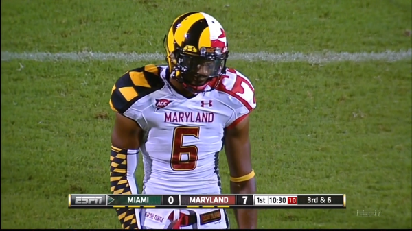
Maryland one may be my favorite College Alternate of all time.
Loved everything about this except for the numbers. With so much going on, they could have used a simple, block font, in black and it would have really been a great look.
-
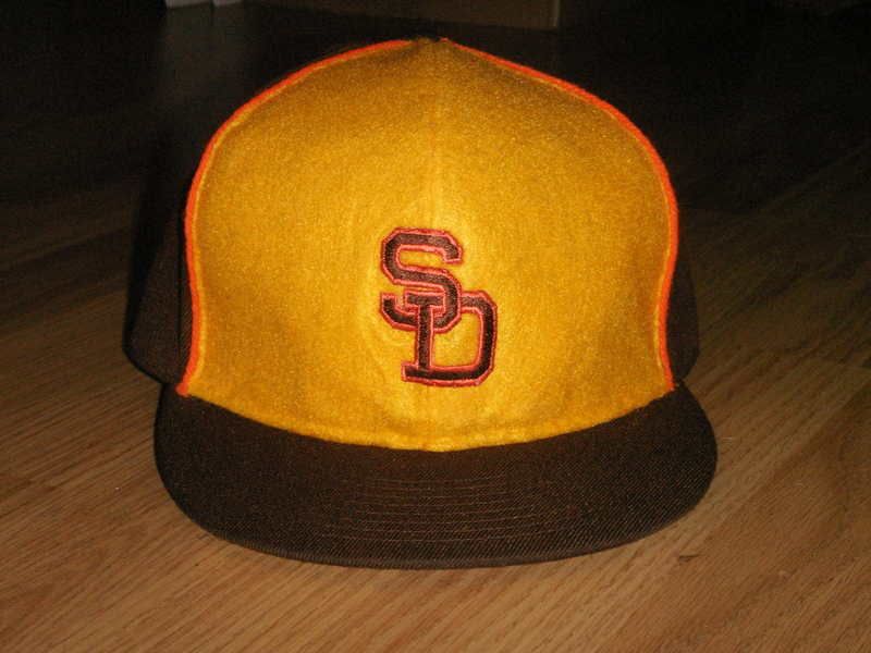
I'm guessing the bell shape has to do with the bells in the Spanish missions, which is where the original padres did their work. It's pretty clever.I hate bell-shaped front panel baseball caps.. The Padres, and anyone else who wants a colored front panel need to go full panel, not the ridiculous bell curve nonsense.
Clever, maybe.. Ugly, definitely.. I like colored panels, but crudely chopping up a normal panel for a poorly conceived semi-bell-ish shape, just to be "clever" is a swing and a miss in my book
I'll admit, it looks a lot better when it's not on someone's head.
I don't know. I prefer the bell shape. The full panel seems overly big for the Padres.

-
1
-
-

I like the lower-right logo of the dog swinging the bone, but not impressed with the rest of the set.
Really hate that "EP" logo, which doesn't seem to match anything else.
Looking at the C, looks more like a Reds' minor league team than the Padres.
-
not a game pic but still.

It will be a little different since the Broncos are going back to orange as the primary and 18 is retired in Denver.
Yup, for Frank Tripucka, who has said he would be willing to unretire it for Manning:
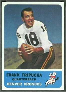
Nice gesture, and an equally nice gesture would be for Manning to respectfully decline. Taking a retired number simply shouldn't be done. Wear 9 (1+8) or 1 or 8 or 16 (college number).
-
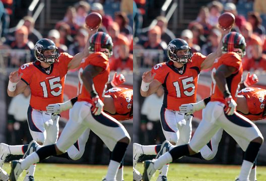
The orange is a good Alternate, but the blue is a stronger primary.
I think the problem with the orange jersey is the blue side panels. Take those off and 1) they stop looking dated and 2) it's a stronger, cleaner look.
-


I LOVED this uniform set. There, I said it.
Loved elements of this including the very appropriate and unique color scheme. Some streamlining and toning down and this would have been so amazing.
-
I like the WILD alternate uniforms, I've said this before ....
Only thing about it as they look more like a college look with the script-logo .... IMO

College or not, that is much better than anything else they have. Much better than most of the league too.

Unpopular Opinions
in Sports Logo General Discussion
Posted
Not sure if it's technically "unpopular" or not but I prefer the original Seahawks logo. It has a more authentic, less "corporate sports" feel.