


orangefaniniowa
-
Posts
633 -
Joined
-
Last visited
Posts posted by orangefaniniowa
-
-
On 5/23/2022 at 7:48 PM, Bruhammydude said:
Packers:
Week 1 at MIN: WYG v PWP
Week 2 vs CHI: GYG v WNW
Week 3 at TB: GYG v WPB
Week 4 vs NE: GYG vs WNN
Week 5 vs NYG: GGG TB vs WWR
Week 6 vs NYJ: GYG vs WGG
Week 7 at WAS: WYG vs RRW
Week 8 at BUF: GYG vs WWB TB
Week 9 at DET: WYG vs BSB
Week 10 vs DAL: GYG vs WSB
Week 11 vs TEN: GYG vs WNN
Week 12 vs PHI: GYG vs WWW
Week 13 at CHI: WYG vs OWN
Week 15 vs LAR: GYG vs BoneBB
Week 16 at MIA: WYG vs AAA
Week 17 vs MIN: GYG vs WWP
Week 18 vs DET: GYG vs WSB
You realize the game is at Philly, so I’m 100 percent certain the Eagles will wear green and the Packers the road white. Besides the Eagles haven’t worn WAH in the regular season since 2015, and this late in the season since the mid 90s. Just clarifying that.
-
 1
1
-
-
A few points about Virginia's new logo/unis/etc.
1) I like the updated "V"/sabre shaped logo. I don't understand the controversy of the logo, but not much different than the old one just modernized look.
2) The cavalier secondary logo is good not great or spectacular. I think they worked way too hard to make it look fantastic but in hindsight it may have overdid too much to have that "Wow" factor.
3) The uniforms, OTOH, don't amaze me. The numeric fonts I dislike and the "Virginia" and "Cavaliers" wording looks eerily similar to their state rival Virginia Tech. Why UVA let Nike go that route is beyond me. The basketball uniforms (with fonts, numerical and lettering) they had, was one of the best, if not the best in college hoops, why suddenly ruin it. The football uniforms were good too but now it looks like that made it "too busy" with that update.
Overall I give it a C. The logos are good, but they took a step backward with the new unis they have. We'll find out come fall if it changes, but for now I think its a fair grade.
-
I am usually a huge fan of teams wearing orange and blue (navy or royal) as their colors (Yes, call me crazy). But I love Virginia's basketball uniforms. Their numeric and NOB lettering font is unique and one of a kind. It also helps that they now won the national championship wearing them. I wish they would use the same numeric/lettering on other sports like most schools do. Still they look fantastic and have done so since 2009 (with a small minor tweaks here and there).

-
1
-
-
I miss the 1997-03 Timberwolves jersey, especially with the bigger NOBs on their unis. This was and still is their best look.
-
6
-
-
Before the Adidas Rev 30 garbage the NBA, I always loved the thick dri-fit jerseys Nike/Reebok/pre-2010 Adidas developed for teams. They looked good and stand out more than today's unis. The stitching on numerals and NOBs were a whole lot better and stood out more compared to today's Rev 30 stitching Adidas developed six years ago. Let's hope when Nike takes over the NBA contract next season, they need to go back to the thicker and better look (let's hope). BTW: It may not be an unpopular opinion, because some people do like the thick dri-fit jerseys. But it is my opinion.

-
I actually LOVE the Florida Gators gray alternate unis they wore a few years ago in college hoops!!

-
On 2/16/2016 at 7:41 AM, Crabcake47 said:
The gold pants are better than the black yoga pants that they have. I actually kind of like this too. My only concern is that they'll start wearing it with the away jersey and start looking too much like the Steelers.
Imo the white pants are still superior, but the gold pants are definitely better than the black pants. I actually liked the black pants look until I realized what yoga pants look like, and now I can't "unsee" that.
I just hope the Ravens replace the black pants they wear at home with these gold pants for a few of the home games. But I still think the white pants should still be the primary look with the purple jersey. Now for the road unis, either all white or drop the black yoga pants in favor of purple pants with a gold/white/gold stripe.
-
1
-
-
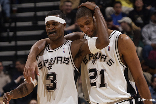
NBA- San Antonio Spurs (been a fan since the beginning of the Tim Duncan era).
NFL- Green Bay Packers (since 89 Majik Man). Baltimore Ravens are my secondary team.
MLB- St. Louis Cardinals
NCAA- Iowa, Iowa State, Florida, Clemson (in football), Illinois, UNI, UConn, Syracuse, etc. too many to choose from.
NHL- Don't have one.
-
I don't like the Packers road uniform. Too much yellow, not enough green.
Have to disagree with you there. The majority of the NFL teams have a better look for their home colored jerseys over the away white unis. The Packers are one of a very few exceptions. Personally they look a whole lot better wearing the road whites than they do with the home greens (and for that matter the throwback jerseys). Don't get me wrong, I love the forest green/gold look, but I think the road look stands out more IMO.
-
Personally, I actually like the Washington Huskies football jerseys. The purple colors are cool and represent the Pacific Northwest very well. I just hope the rumors aren't true that they are going to make a massive switch now that they have a new head football coach. BTW: The chrome helmets made their jerseys stand out even better.

-
jaguars UNIFORMS are the best in the NFL
They had one of the best from 1997 through 2008. Now they are an eyesore to watch. Way to ruin a good look.
-
1
-
-
The Cowboys white jersey is actually one of the ugliest, most non-sensical uniforms I've ever seen. Different blue on the helmet, different blue on the pants, and a different blue on the jersey. Stupid striping on the sleeves with a random and completely unnneccesary black stroke. The color of the pants looks horrible with the light blue, switch it to the navy and you're already a billion times better.
They won't, they are the Cowboys. The front office loves to alienate their own fans by wearing white jerseys at home. They have been doing a good job for that during the past 40-45 years. That is the reason I hardly watch Cowboys games on television when they are at home anymore, because everybody knows they will be wearing the ugly, most non-sensical white unis at home. Wake me up when they finally do something different, which will probably mean never!!!
-
I always thought Kansas 2008 jerseys they wore in the national championship season was the best look they ever had. Then of course, Adidas ruined a great thing with their "Revolution 30" junk they now have. Still, I love them their NOB fonts are cool, and their numeral fonts are awesome.
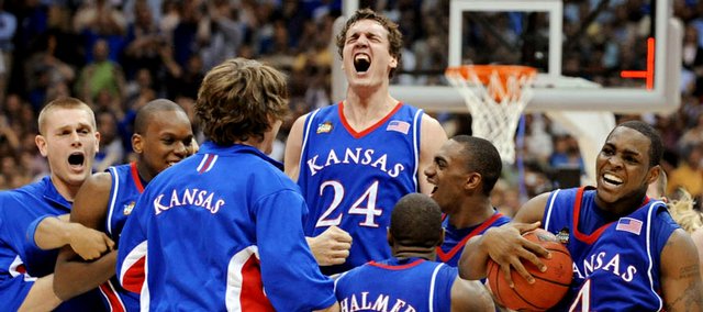

May not be an "unpopular opinion", because a lot of people will feel the same way.
-
1
-
-
I see them get a lot of flak here, but I like the Baltimore Ravens number font.

I actually love the font. It is unique and very cool. It's looks great when it works well with the Ravens' home purple jerseys.
-
I am not really a Georgia fan. But I do like their black/red combos with a touch of grey for their sports jerseys. They blend really well and it looks great. My favorite is when they wore the black helmets and black pants with their road white jerseys against Florida, I believe that was in 2009. Too bad they haven't worn them since, probably because they were getting chomped (no pun attended) by the Gators in that football game.
My wish in 2013 is they bring those unis back in the rematch against Florida (since the Bulldogs are the visiting team this year). Maybe they will have much better success this time around.


-
To piggy back that post, I really prefer the Browns with the orange pants.
Unpopular opinion- I hate the orange pants so, so much.
I think the Browns should scrap the white pants. And go with the brown jerseys/orange pants (1975-83, 2003) at home, and wear the white jerseys/brown pants (2009) on the road. BTW: Add a orange/white/orange stripe on their brown pants it would look a whole lot better.
-
I actually liked these joints.
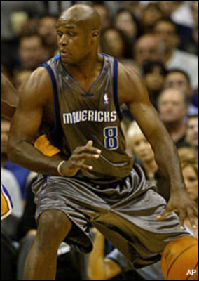
Yep, the good 'ol Hefty Bags. Why the Mavericks chose these ugly bronze unis as an alternate is beyond me? Thank goodness they ditched them after that game.
-
These jerseys were actually sweet. Best uniforms the Milwaukee Bucks ever had IMO.
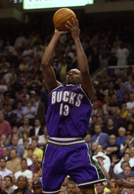
Makes me want to go to a thrift store or Ebay to get one of their jerseys. That is probably the only places that still have them.

-
I miss the Cleveland Cavaliers late 80s/early 90s uniforms.
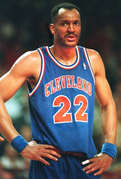
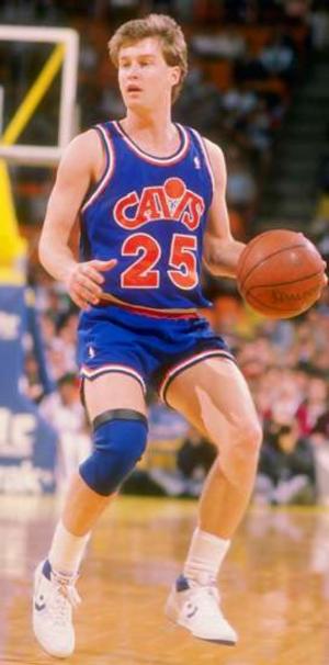
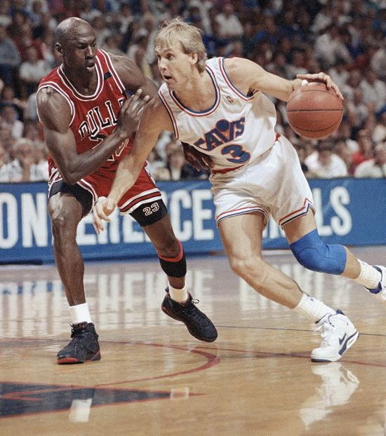
They were better than the uniforms they have today. And they had their first prolonged success in the franchise's history wearing these babies.
-
1
-
-
I honestly have no idea why everyone hates this set so much:

I'd even go as far as saying they are a top five or top ten look in the league.
Because they look like a CFL or an Arena Football franchise. I think the Falcons need to return to wearing red helmets, with silver pants, and the basic red jerseys just like they did in the late 70s through the entire 1980s. Somewhere, Steve Bartkowski would be proud!!!

-
I am actually a huge fan of the Ravens' home purple jerseys.


I personally believe their numeral font (white numerals with a metallic gold trim blends very well with their purple jerseys. Their really unique and stand out more. BTW: I'm not a huge fan of their away white jerseys, especially with the "leotard" look. They look bland and don't excite me as much as their home purples.
If the Ravens want to have a better look for the away games, I suggest ditching "black" stripeless pants, and replace it with purple pants with a metallic gold/black/metallic gold stripe. That would look much better, although it will not help improve the away jersey much. But it least it will be an improvement IMO.


2022 NFL Season week by week uniform match-up combos: From HOF Game to Super Bowl LVII
in Sports Logo News
Posted
Disagree, Dallas shouldn’t be grandfathered in anything. Wearing the Cowboys WAH 99 percent of the time with the seasick pants is annoying. But agree with teams stop wearing WAH beginning in October, that includes the Cowboys.