


Captain Tsubasa
-
Posts
200 -
Joined
-
Last visited
Posts posted by Captain Tsubasa
-
-
On 6/21/2021 at 5:36 PM, GriffinM6 said:
Japan unveiled a classy throwback kit to commemorate their 100th anniversary back on May 20th.
https://footballfashion.org/wordpress/2021/05/20/japan-fa-100th-anniversary-adidas-kit/

That Japan jersey is lovely!
Gotta get that!

-
 1
1
-
-
I smoked these sticks as a rebellious teen, feeling cool AF because of that skull with top hat.
-
On 8/2/2020 at 2:47 AM, Buc said:
...As for the club name, it seems they are dead set on spelling out the "Saint" in "St. Louis"--funny since not even the post office does that there. Any particular reason for that?
"Saint" and "Louis" are both 5-letter words, which does give it a nice balance, e.g. for logos, stadium signage, soccer scarves, etc. I guess that could be one aesthetic reason for spelling it out.
-
2
-
-
On 8/12/2019 at 5:39 PM, the admiral said:
City flags are just tattoos for bartenders who used to be in punk scenes.
Haha! Bartender tats should be in any good flag mock up!

-
On 8/8/2019 at 9:05 PM, Lafarge said:
It's an internet poll, of course #4 was going to win.
And the winner is...
-
23 hours ago, the admiral said:
Scandinavians are torn between two lovers: drinking lots of alcohol, and following intricate sets of rules.
They must have some good drinking games!

-
Interesting article about the role of Hong Kong's flag in the current protests: https://edition.cnn.com/style/article/hong-kong-flag-design-protest/index.html
-
On 7/30/2018 at 8:32 AM, ChicagoOakland said:
UPDATE: Rochester, Minnesota is down to two finalists to replace it's flag.
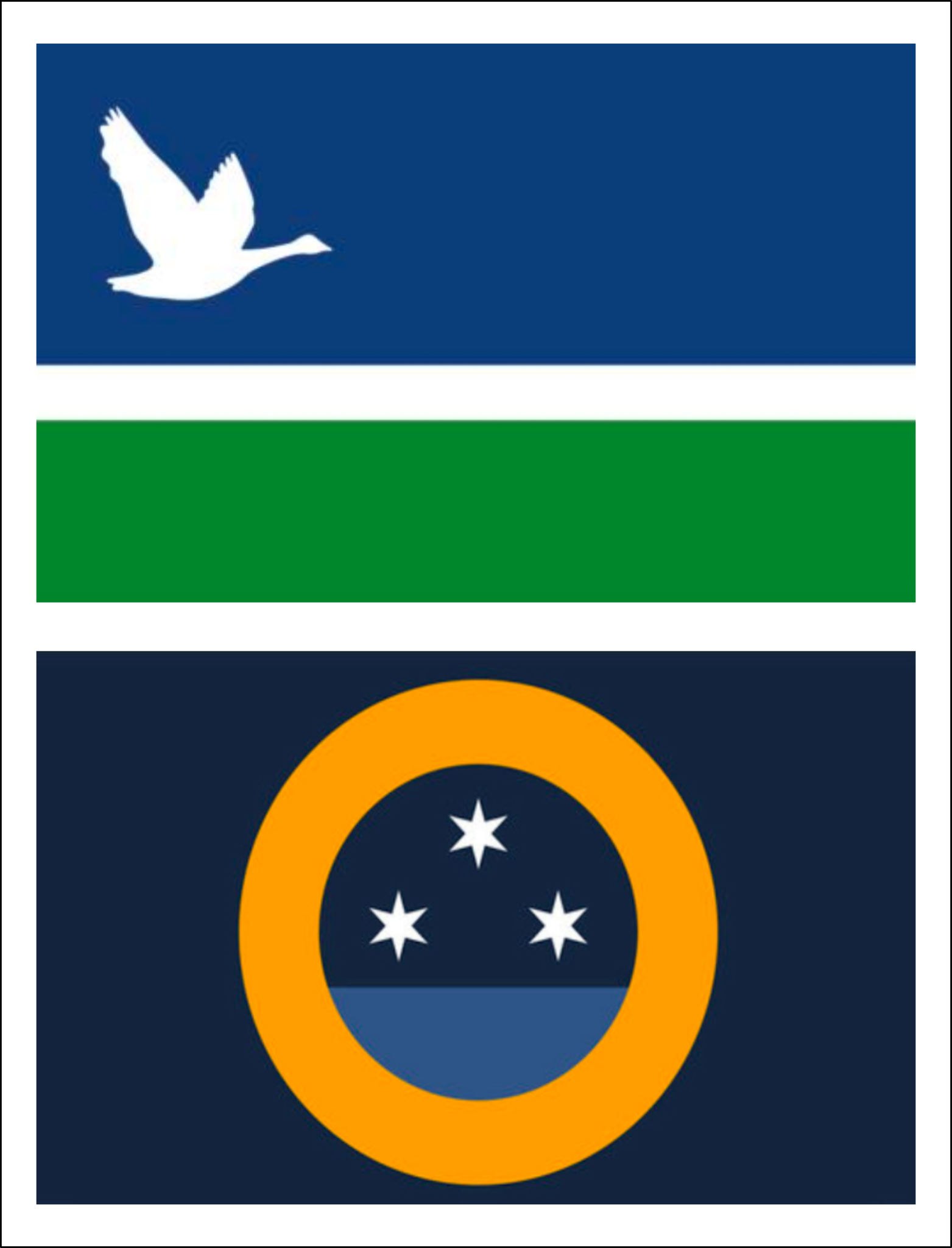
If you forgot what Rochester's flag looked like, here ya go:

Both of them would be a huge improvement over their current flag. I am hoping the goose flag gets the nod, as I feel it has a bit more personality.
-
2
-
-
On 7/28/2018 at 5:54 AM, MC Buffalo said:
[...] a blank shirt with a little speaker embedded that continuously broadcast the word Pelicans, Pelicans, Pelicans.... [...]
That'll be the design for the blind awareness jersey.

-
10 hours ago, Magic Dynasty said:
While I can't find a picture of it, that looks a LOT like one of the finalists (not the actual one though) for Orlando's new flag.
Now that you say it, yeah, it looks a bit like options 1, 2 and 3 of Orlando's finalists mashed together (see below).
And it also gives me dejavu vibes of Milwaukee's flag redesign winner:

In any case, it's still a nice design.
What are your favorites in Rochester's contest?
-
3
-
-
On 08/11/2017 at 3:44 PM, ChicagoOakland said:
So my former hometown of Rochester, Minnesota is holding a contest to replace...whatever the heck this is.

They're doing a two round voting system with the intention of unveiling a new flag next spring. (link here.)I just saw that their round 2 voting is now open, so I thought I'd bump this thread so the forumites can cast their vote. Plenty of rubbish in there but also some nice ones. Overall, I think this round has some nicer designs than the first round.
To see all the entrants and cast your vote, follow this link:
https://docs.google.com/forms/d/e/1FAIpQLSc0_WGG7kHwBDCowjN0YCz8D3Na8x2k0Uku8hDTar4Hy_TLew/viewform
Here are my five favourites:
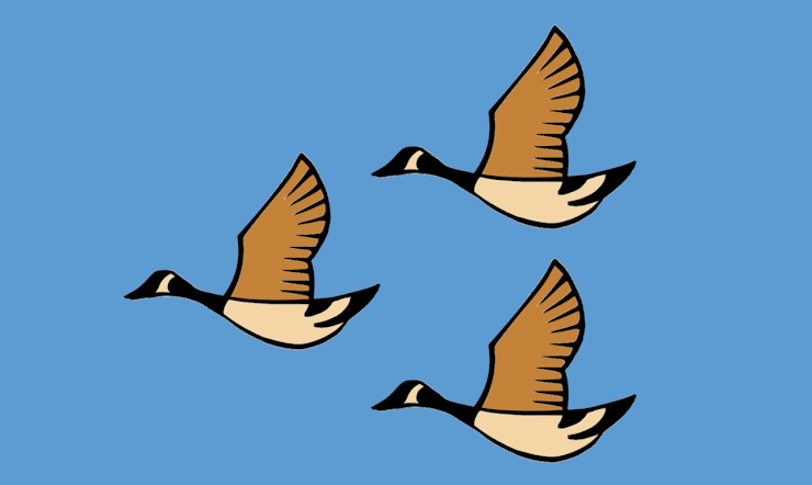
No. 0222 - A cross to symbolise St. Mary’s Hospital on the left, and an abstract Plummer Building (Mayo Clinic) on the right.
No. 0246 - Three geese in V-flight formation, symbolising "dedication", "intuition" and "care"
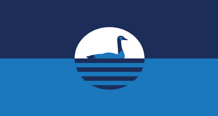
No. 0249 - A goose on the Zumbo River, in Mayo Clinic / IBM blue
No. 0268 - A quartered cross to symbolise medical care, cardinal points on a compass, "debating, cooperating, or whimsically, elegant and having fun on the ice rinks" and geese "making a bee-line (or vee-line) for Rochester". I can't quite follow most of that symbolism, but hey, the design does look nice!
")
No. 0281 - The North Star shining over Rochester
-
How about a Snowball World Series?
Some team names that come to mind:
- Antarctica Emperors
- Greenland Ox
- Himalaya Yetis
- Iceland Vikings
- Mont Blanc Glaciers
- Northern Lights
- Siberian Tigers
- ...
Sounds cool?
")
-
2 hours ago, WSU151 said:
I just want the arena to go back to being named "The Pond". Wish Honda could do something with that name, but not necessarily name it "Honda Pond".
The Mighty Pond of Honda?

-
3
-


")
2021-2022 International Club Soccer Kits
in Sports Logo News
Posted
Life's a glitch!