


daveindc
-
Posts
974 -
Joined
-
Last visited
-
Days Won
2
Posts posted by daveindc
-
-
14 hours ago, Magic Dynasty said:
I like the Reds with black. It really helps with the definition, as opposed to simply red-white. I also like the drop shadows.
However, this comes with one condition: the Reds use it sparingly, like how they use it right now. The 90s/2000s look overdid on the black, and I didn't like it. Get rid of the black bill on the road cap, and their set is perfect.
8 hours ago, Dolphins Dynasty said:The Reds' use of black is okay I guess, but I just think of them better as red and white. The thing that really gets to me (and I've said it before) is that black is excessively used in their merchandise. I mean, they're on the equivalent of being the Atlanta Falcons or Chicago Bulls. The Reds don't use that much black in their uniforms; they shouldn't be treated in the same manner those two teams are.
The Lions' previous set had limited black trim that seemingly most people didn't mind. The new uniform dropped black completely, and I haven't seen anyone complain about. I think if the Reds did the same, most people wouldn't complain. I can see the Reds creating an updated version of their pre-black sets. Instead of posting old photos of the Reds, let me post this pic of OU, which shows you how great red and white can look by itself:

-
 3
3
-
-
Make the face meaner.
-
On 12/1/2016 at 7:58 AM, the admiral said:
It's fine in and of itself but not for the Los Angeles Rams, who can be in slightly updated uniforms -- or even that very template -- but in royal and athletic gold.
My unpopular Ravens opinion is that the Ravens should definitely be in head-to-toe black at home. On the road, I don't care what's black and what's purple (but for the sake of argument let's say black names, purple numbers, black pants, purple socks), but the white should be minimal. No albino Ravens! Their whole deal is that they're supposed to be mean and scary. Maximum black works for them.
I don't think that's an unpopular opinion. I don't know if they should do it every single home game, but they need to do it several times a season. I'm surprised they already don't.
On 12/1/2016 at 10:42 AM, Rj0498 said:I agree with you on this only that they should add stripes to the black pants otherwise, they look like they are playing football in leotards.
The stripeless black pants actually works best for the all black look, imo.


-
4 hours ago, SilverBullet1929 said:
I don't get what was wrong with the Marlins 02-11 black alternates. Yeah they didn't use enough teal and it could be said they wore them too much but there was nothing wrong with them visually. They were quite nice. If anything, they're probably a really good example of how to use too much black and still look good.
They look plain and incomplete. Like the letters are just blank. The letters should have been teal, not just because the jersey needed more teal, but because it would just look better.
-
Long hair with a baseball cap looks dumb. I'm looking at you, deGrom.
Funny you said that because he just said today that he'll cut it after the WS.
-
"Miami Marlins" is much better: it's alliterative
This would be true if they were the Manchester Marlins. In Miami, the vowels are much more dominant than the M, so the alliteration loses its effect.
Florida Marlins just sounds better, any way you pronounce it. Flor-da Marlins, Flor-ih-da Marlins, Flar-da Marlins, Flar-ih-da Marlins.
To me it always feels like I have marbles in my mouth when I attempt to say it, but I get what you're saying. lol.
Colorado Rockies always sounds perfect.
-
What about Florida Marlins, which sounds a lot better than Miami Marlins IMO
How?
-
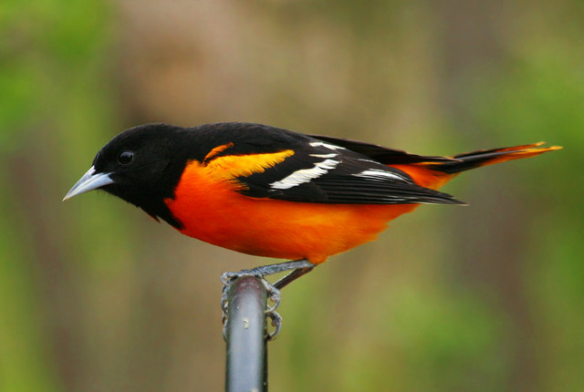
The 99-08 bird was my personal favorite. I liked the cream-ish beak and highlights better with the orange and black than the grey of the 09-11 one, and it looked a little better balanced than it also. I always thought the 09-11 bird almost looked like it was going to fall over or something. Just kind of looked awkward.
That's how they often look.


-
I remember thinking how unnecessary the 98 change was. It also looked too bloated. The 99-08 logo looked too lopsided. The 09-11 logo would have been the perfect update for the 89-97 one.
-
The Cubs' home uni looks cheesy with it's logo and pinstripes. The whole thing really just looks lame and tired to me. The road uni looks great, and they should go with something similar:
They should go with something similar to what they've worn in the past:

-
I'm a classic guy, but I love the Buccaneers helmets. There's just something about them that dosen't seem to work for any other team.

Many people reacted to the size of the logo, but you have to look at it differently from the old helmet. The flag becomes more of a background for the most interesting part of the logo- the skull and swords. It's creative. I don't see a problem with it, especially with helmets like the Bengals, Rams, Eagles, and Vikings.
-
- NFL:
- Giants: Too much separation of red and blue
Yes.


The amount of love this garbage gets is truly mind-boggling. The colour balance is horrendous - to have both jerseys completely devoid of one of your primary colours looks cheap and amateurishly inconsistent. The all-red jersey with the primarily blue helmet is comical; they look like a rec team who ordered their helmets, then found out money was tight and could afford only one colour on their jerseys. Then there's the fact that the jersey designs are completely different, which makes them look like two completely different teams. Again, horribly inconsistent. And that home jersey? Literally the only non-mandated design element is the "ny" under the collar, which is so short width-wise that is looks awkward. There's minimalist design (Colts), and then there's boring. This looks like the same rec team went "Shít! We can't even afford customized stripes, either!". This might be one of the worst looks in the entire league.
Thank you!
The blue and white jersey has no red. The white and red jersey has no blue. The gray paints seem slapped on as an afterthought since there's no gray on the helmet (mask doesn't count, tons of teams use them) or on the jersey.
No striping on the blue jerseys make them look like practice jerseys. The striping on the white ones are done very poorly.
The paints stripes are out of nowhere...they match nothing else on the uniform...in either version (road or away).
The Giants uniforms might look "classic" to some but they don't look professional to me...they're a jumbled mess with the worst offense being the deletion of a major team color on each jersey.
They had a better design here...and screwed it up royally:

Not an unpopular opinion at all. They had a great look, and they just had to go change it again. Like they thought it didn't look enough like a throwback. This was back during the throwback fashion craze.
- NFL:
-
Also, I agree that the Yankees' uniforms are extremely overrated. I don't care that it's "traditional," there's no excuse for a professional organization to be using at least three different versions of the same logo at once:

The cap version is clearly the best and should be the only one used across the board.
I can tolerate the jersey version since the cap version would get lost in the pinstripes, but there's no reason the cap version shouldn't be used everywhere but there.
The jersey version looks atrocious, especially next to the other two. The N is too short, the Y is too wide, and it looks bloated. Put the cap version on the jersey, and make it a bit bigger if it gets lost in the pinstripes.

Unpopular Opinions
in Sports Logo General Discussion
Posted
Very solid look. Love the way that bright home white pops. I always thought the pinstripes just looked boring and unnecessary on the Twins.