


upperV03
-
Posts
6,359 -
Joined
-
Last visited
-
Days Won
44
Posts posted by upperV03
-
-
I actually think those Broncos jerseys are pretty clever, the sleeves definitely seem to be at least partially inspired by the 1965/66 set. I think the zig-zag/mountain design looks better than what we’ve seen on countless concepts and photoshop mockups over the last few months. The helmets and pants will absolutely make or break the set, though.
Also, I would bet those triangles on the side will be under the armpit on the on-field jerseys like the “grommets” on Oregon’s most recent set:

While they were under the armpit on the on-field jerseys, the retail replicas had them more on the front like what we’re seeing on the Broncos leak:
-
 9
9
-
-
The silver/blue/silver is absolutely perfect. I have no notes. The wordmark on the white jersey is unnecessary, but I can’t get too worked up about it. It seems like the blue pants are stripeless so they can be worn with all three jerseys, which is unfortunate but I guess I can live with it. The black is bad, but not as bad as the gray pajamas.
-
13
-
-
3 minutes ago, Raith said:
Yes, I meant the jersey fabric not showing the same as in the Fanatic pictures. Either way, I'll be at the reveal tonight and will try to post some pictures after the fact.
The Fanatics pictures (which are photoshop mockups) are of replica retail jerseys, which do not have the perforations in the jersey fabric. The on-field jerseys do have the perforations in the jersey fabric.
-
2
-
-
3 minutes ago, Raith said:
Makes sense and apologies for the AI comment as it seems to have set people off. That said, if you look at the video the Lions posted, the perforations are not just on the numbers like the picture shows. Meaning, those pictures may not be 100% accurate.
Still apologies again for the AI comment. Was just repeating information I had read, which wasn't confirmed.
The number perforations are there. Look at the top left corner. If you’re referring to the perforations being in the jersey fabric as well as the numbers, that’s just a standard feature of this Nike template.
-
3
-
-
These are a little funky but they’re still an upgrade over the 2016 and 2020(21) blue uniforms IMO. The women’s red version is much worse than the last one, though.
-
2 hours ago, CitizenTino said:
Is that the old Majestic template? I don’t see the collar trim that all of this year’s jerseys have.
Not all of this year’s new jerseys have that collar. In fact, pinstriped jerseys specifically don’t have it (except for the Padres, because their pinstriped jerseys have brown & yellow collar trim). In addition, jerseys with sublimation (like the gradient on Philly’s City Connect or the Padres’ camo) don’t seem to have it.
-
1
-
-
Arsenal’s home shirt for next season has leaked and, much like the leaked Bayern kit, it is absolutely dreadful. The cannon is great, but the rest is garbage. This template is going to butcher a lot of teams’ looks.
-
^Yeah, that looks absolutely dreadful. I’m not sure I can come up with any redeeming qualities for it. The tonal logos remind me of their all-red Parley kits from several years back, but that was forgivable because it was a one-off. This is bound to look terrible with what I assume will have to be white numbers on the player-issue shirts.
-
31 minutes ago, MJWalker45 said:
I'm betting they end up getting used in game, since the Crew have Ohio Health as their pregame/practice shirt sponsor. I'd be happy if they aren't though. If they treat these like the Love United shirts I'll be fine with that, but with different colors it makes me think they'll be game wear.
The league is specifically calling them prematch tops on their socials and MLS Store sent out an email about them with this blurb:
“Made from recycled materials, our new 2024 One Planet pre-match tops are here! The three distinct color ways (woods, soil and water) are inspired by reforestation and our natural ecosystems. In celebration of Earth Week, all MLS clubs will be sporting these in their pre-match warmups.”
-
2
-
 1
1
-
-
I keep going back and forth between this one and the 2020/21 version, but I think this might be the best US home kit since the Centennials. I’m actually glad the Nike logo and the names/numbers are navy to match the badge, although I think the kit would be even better if all the royal blue was navy instead. Overall, though, the stripes on the collar, cuffs, and shorts are so good that the kit as a whole has a classic, almost throwback feel to it.
-
4
-
-
1 hour ago, aawagner011 said:
I saw that tweet and it made me wonder why the US crest application is different than the other Nike teams using the breathable material.
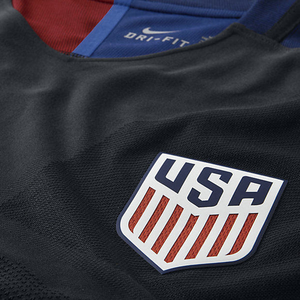
Huh, that is odd. When Nike used this badge technology in 2016/17, the red stripes on the US badge were the breathable mesh layer:
The federation must’ve opted against using it this time, which is a real shame IMO.
-
The US will be debuting the new white kits tonight vs. Mexico:
I’m excited to see it, and they should be able to wear the blue shorts without any problem. I just wish Mexico’s home kit was the classic tricolor instead of the dark red peacock kit.
-
2
-
-
22 minutes ago, SCL said:
Just terrible, the Gernman national team in something other than Adidas seems wrong. Puma I could get but Nike is sacrilegious.
Considering the origins behind Adidas and Puma, one could argue it would be more sacrilegious for Puma to have gotten the contract. It’ll definitely be strange to see DFB without the three stripes, but I’m not as torn up about it as others. Adidas has still produced some classic efforts for the Germans of late, but I think they’ve maybe rested on their laurels a bit. If another brand was going to get the contract, I’m glad it’s Nike that’ll be taking the torch. France/Adidas were a pretty iconic partnership (not to the same degree as Germany/Adidas, of course), and I would argue Nike have done a better job for France on the whole since taking over.
-
4
-
-
The US U-23’s are wearing the new away kit with blue shorts and socks right now:
I’m almost liking this more than the red shorts and socks. The blue shorts disrupt the bomb pop effect, but I think the shirt is too blue-heavy to work with both red shorts AND socks. I’d love to see this kit with the standard red shorts, but swap in these blue socks for the red ones. Blue/red/blue could be the best and most balanced combo.
-
4
-
-
Some better looks at the new Canada kits on actual players here:
I’m a big fan of the white kit, and the red kit is growing on me the more I see it. Maybe I’m in the minority, but I LOVE the oval swoosh. Gives a 90’s feel to these kits, and I like that it’s an exclusive detail for Canada. I actually think both kits look better with the red shorts.
-
4
-
-
I’m weirdly loving those France shorts, more so than the shirt actually. Very quirky, but something the French can pull off IMO. Their home kit is fantastic, too. Loving the enlarged, colorful badge on both kits. I’m a big fan of both England kits as well, though from what I’ve seen it doesn’t seem like England fans are all that fond of the away kit (not necessarily surprised about that).
As for the US kits, I think the home is pretty close to ideal. I’m fully expecting the WC26 home kit to be Waldos or something more adventurous, so I’m happy to see a relatively plain design once again for this kit cycle. The cuffs are great, and the collar is a little odd but still nice. I don’t like the away kit at all, but that’s been a common theme for a number of years now.
-
1
-
-
Seems like quite a few teams will be wearing their secondary kits at home today. We already know about Atlanta and Columbus, but NYCFC, Dallas, and Houston are all doing so as well. It won’t surprise me if SKC follows suit.
-
I really hate the monochrome crest on the Argentina home shirt. Completely unnecessary when the full-color version is already primarily gold and would’ve worked just as well with the gold adidas logo. Since it’s a home shirt, the flag stripes in the badge should be rendered correctly IMO. Plus, the black AFA logo would’ve helped to tie in the black numbers at least a little bit. I do quite like their new away kit, although I’d love to see it with white shorts. Also hard not to feel like the gold numbers do seem out of place.
I don’t like that Mexico home kit at all. I like the pattern on their away shirt a lot, but don’t love the gray/bright green color scheme.
Belgium are my clear winners of Adidas’ European range (really their entire 2024 crop). The TinTin kit is fantastic, and their home kit deserves praise too. Germany’s home kit is nice, but I don’t like it nearly as much as some other people seem to (especially paired with the white shorts). Spain’s home kit is perfectly fine, which is a lot better than I can say for some of the other efforts. Wales away kit would be my sleeper pick of the bunch. For me, I think that’s one that maybe won’t get a ton of recognition but should.
-
1
-
-
Through looking at teams’ game notes, I’ve been able to find a few of this week’s kit matchups:
NYCFC (all-light blue) vs. Portland (all-green)
Toronto (gray/red/gray) vs. Charlotte (blue/white/white)
Atlanta (red/black/red) vs. New England (all-white)
Columbus (all-black) vs. Chicago (white/light blue/white)
RSL (red/blue/red) vs. Colorado (all-light blue)
Here’s my guess at the rest of them:NYRB (red/black/red) vs. Dallas (all-white)
Orlando (all-lavender) vs. Minnesota (all-black)
Philadelphia (all-navy) vs. Seattle (green/light blue/white)
Austin (green/black/black) vs. St. Louis (all-white)
LAFC (all-black) vs. SKC (all-light blue)
San Jose (all-black) vs. Vancouver (all-white)
Cincy (royal/navy/navy) vs. DC (all-white)
Nashville (yellow/navy/yellow) vs. LAG (all-teal)Miami (all-pink) vs. Montreal (blue/black/blue)
-
I’ve got notes for all three Cascadia teams last night.
The Timbers debuted their new secondary kits and the shirts were indeed blank. I think the sponsorless look elevates the shirt substantially and also helps the centered crest be the focal point as intended. I still won’t be surprised if they end up adding their “Stand Together” community platform logo to the shirts at some point in the near future, but I’m kind of hoping they just leave them blank.
As @Digby mentioned, the Sounders ended up breaking out light blue alternate socks last night to avoid a sock clash with Austin. Just from watching highlights this morning, the contrast between the teams was… not ideal. For the Sounders, it seems like they’re going without a green sock option this year. I find that really strange since green/blue/green has been their traditional kit combo their whole time in MLS (not to mention it’s what the original NASL Sounders wore in 1974). I really think this kit desperately needs some green below the waist.
The Whitecaps debuted their new secondary kits at home and wore navy alternate socks to avoid a sock clash with Charlotte. It was a good look, although I think I prefer the white socks that were shown in the kit unveiling. Side note: I still think this Charlotte kit would look way better with blue socks. Ironically, they conceivably could’ve used the blue socks from their old home kits yesterday, which would’ve allowed Vancouver to wear the navy/navy/white combo.
-
6
-
-
Columbus and RSL both publish the kit matchups, so we know what their two games will look like today:
Columbus will be in all-yellow at Minnesota, who will be in all-black.
RSL will be debuting their new red/blue/red primaries against LAFC, who will be in their smog green kits.
From scouring teams’ social media, it seems like Dallas, Houston, Kansas City, Portland, and Vancouver will all be wearing their secondary kits at home. The latter three will all be debuting theirs, while Houston has already worn theirs in the CCC and Dallas’ is obviously carried over from last year. The other new kits getting debuted today should be Colorado’s primaries (at home vs. Nashville), Chicago’s primaries (at home vs. Cincinnati), and Toronto’s secondaries (at New England). -
I will be very curious to see the contrast between Seattle and Austin tomorrow night. It’ll very likely be green/blue/white vs. all-cream, but the green sleeves on Austin’s shirt aren’t that far off from the color of Seattle’s shirt. There will also be a sock clash unless either side has alternate socks for their respective kits.
-
41 minutes ago, MJWalker45 said:
I wonder if we'd possibly see something like this on the weekend for Portland? As was pointed out by the mothership, Chelsea simply kept wearing what they had last year when Three cancelled their partnership, but mainly because they couldn't print new shirts per UK rules concerning the club.
It’s possible, but I would be pretty surprised. Due to the deal with DaBella being signed late last year, I believe the club received blank shirts before the season and were applying the DaBella logo in house. If that is indeed the case, I would assume the EQ staff still has enough blank shirts to use going forward instead of having to apply a box like that over the top^. The Timbers’ CEO has already confirmed that the shirts will be blank tomorrow, so at the very least they won’t have to take the Chelsea route.
-
1
-
-
1 hour ago, Digby said:
I dig that one but I think their away is my favorite color application of this gradient teamwear thing. Greenish-dark grey is an interesting color and plays nicely with the red and neon yellow combination.
I would agree with you there. I also like how the red badge pops off of the darker base color.
54 minutes ago, MJWalker45 said:Looking at the NWSL and Red Stars site, and it seems like the badge on this year's kit is not the primary badge? I figured it was a team rebrand, but it doesn't appear that way looking at the team's and league's web site.
That’s a secondary logo for them, they’ve worn it on their shorts for a few years but not on the shirts (as far as I remember, at least).
-
1
-


.jpg)


2024 NFL Changes
in Sports Logo News
Posted
Navy/orange/white and navy/white/orange should be the go-to home and road combos IMO, but both need navy socks. I think navy/white/white and navy/white/navy are both solid options with contrasting socks. Unless/until the white helmets are scrapped, they should only wear those with the white/navy/white combo (with navy socks). White/navy/navy, navy/orange/orange, and especially white/navy/orange should never see the light of day.